Thursday 29 June 2017

Thesis InForm 2017

www.thesisinform.wordpress.com
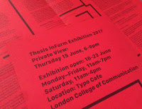
Thesis InForm is an exhibition showing work produced by a selection of students from across the Design School at the LCC in response to the ideas explored in their final year Thesis. The students were invited to transform and re-interpret these concepts in any visual or physical form imaginable.

This is the literature produced for the exhibition and symposium.
The finished size is 240mm square folding out to 720x480mm and is printed offset litho in one colour black on both sides on our Colorset 100% Recycled 120gsm in Bright Red.
The identity and publication is designed by GMD student Keenen Sutherland. The editor is Tracey Taylor and the organisation is by Andrew Slatter (Senior Lecturer linked to the Graphic Communication Programme).
The publication is expertly printed 'in house' at the LCC at the Elephant and Castle by Tony Yard and Scott House. Really well printed and folded, you can see the job coming out of the folder in the image below
My thanks to Andrew for sending me copies.

www.thesisinform.wordpress.com
https://thesisinform.wordpress.com/2017/06/13/talking-about-identity/
www.arts.ac.uk/lcc
Posted by Justin Hobson 29.06.2017

Monday 26 June 2017

Lino King

When I started writing this blog back in 2009, it was because I wanted to share printed projects (mainly on our papers) with a wider audience than I can ever hope to visit personally. As this blog has evolved over time, a rewarding aspect has been showing work which has then inspired designers working in other areas. For example I have had a designer working in fashion promotion tell me they have been inspired by an article about a property brochure ... that's a satisfying feeling!

This project I believe will be one of those that will be of interest to all readers as it combines superb design, digital technology, hand embossing and wonderful use of colour.

Ashley Hutchinson is the designer and printmaker behind Ash Leaf Printmaking Studio. He produces limited edition lino and wood cut prints with a twist, as he incorporates embossing into all of his designs. All of the prints are embossed by hand using his three etching presses including his 1920s proofing press 'GEM'. Ash has been designing and publishing contemporary greeting cards for over 10 years.

This range of eight cards is called the Stardust Floral range. They are all printed on our Stardream range of pearlescent and metallic papers in 285gsm. Colours used are Opal, Rose Quartz, Lagoon, Vista, Azalea, Citrine, Fine Gold and Flame. Stardream is made by Gruppo Cordenons in Italy.

The 4pp cards are 145mm square
Showing anything in relief with my limited photographic abilities is hard, so it's easier for me to show the card printed on Stardream Opal 285gsm above ...and the inside of the same card below:
The embossing of the designs is truly outstanding but you'll have to take my word for it. It's also the colour combination of this range which I find so inspiring...
Production at Linoking is all in house. Printing is on a Canon inkjet printer and they are hand embossed.

As I mentioned earlier, the colour combinations is something I find inspiring - this purply/blue shade printed on the Stardream Azalea (below) is stupendous.
Sarah Glennie is my colleague who deals with our products that we sell into this market. The greeting card "industry" is quite a separate area of the creative world. It's interesting to me that there is so little crossover between the "corporate" design for print market and greeting card publishers who are responsible for putting the cards on the shelves in our shops around the country.

...anyway, I hope this article will inspire all creatives out there!

https://www.ashleafprintmaking.co.uk/stardust-floral-range
http://www.cordenons.co.uk/
Posted by Justin Hobson 26.06.2017

Friday 23 June 2017

Central St Martins - Degree Show 2017

On Tuesday evening I was invited to the private view of the Central St Martins Degree Shows at King's Cross. It was a very hot London evening and given the current security situation in the country, there was security and bag checking, so it took me half an hour in the queue to get in, but that's entirely understandable.
The show was exceptionally well attended, laid out on the ground, first and second floors and including the large atrium area.
I spent most of the time at the BA Graphic Design course on the second floor.
Even though there had been a log queue outside, there was an equally long queue for the Camden Town Brewery stand, who was one of the sponsors as well as that other "Hull based" paper company!
As always, the work is well displayed and laid out - but then they are lucky to have one of the best exhibition spaces in the country and their disposal!
Thanks to all staff and people I know at CSM for the kind invitation and a chance to see the work of the new graduates.

http://2017.csmgraphicdesign.com/
http://www.arts.ac.uk/csm/whats-on-at-csm/degree-shows-2017/show-two/graphic-communication-design/
Posted by Justin Hobson 23.06.2017

Tuesday 20 June 2017

Annoushka Treasure...

This is a beautifully produced catalogue from a leading UK contemporary jewellery brand. Annoushka was founded in 2009 by Annoushka Ducas who was originally one of the founders of Links of London. There are now two London boutiques plus concessions in many luxury shops and hotels including Saks in NY and the Mandarin Oriental in HK.
The size of the catalogue is 165mm square. The cover is printed on Plike Black 330gsm, hot foil blocked in gold foil. The 76pp text is printed on our Omnia 150gsm, which is just simply stunning with the images used.
The pieces, which include many types of precious stones, are all produced from 18 carat gold, hence the way gold reproduces in the printed catalogue is incredibly important. Equally the solid colours, especially black which is used for many of the backgrounds needs to also print superbly ...and as you can see below, it does!
Reproduction of the metallic gold on the Omnia 150gsm is just superb. Excellent detail and a beautiful metallic sheen which is as close as you can get to the real thing.
The quality of the art direction, photography, repro, print and finishing is superb. The paper also happens to have performed brilliantly - fleshtones and jewellery details equally looking superb...
The below image really showing the sort of detail I'm talking about:
Even though it is a small size brochure it flows well and pages turn nicely in the hand.
The spine is 7mm thick and it is perfect bound with PUR glue. A very nice neat job as you can see from the image below.
Creative director is Annoushka Ducas. Graphic design is by the Annoushka in house design team. The excellent print is by CPI Connect with the project handled by James Howe.


Posted by Justin Hobson 20.06.2017

Friday 16 June 2017

Aldo Filiberto Cards

Aldo Filiberto is renowned portrait photographer and film director specialising in editorial and talent portraiture. His work has appeared in a wide range of newspapers and publications including The Guardian. Originally from Italy, he is now based in the UK.

Fact is the London based studio of Matt Morgan and they created a bold identity for Aldo Filiberto by creating a printed frame over the image.
The series of 2pp, A6 size cards (of which this is just one) are printed on Omnia 320gsm. Unlike many of the printed items featured on this blog, which are printed offset litho, this has been digitally printed on an HP Indigo press. The colours are strong and punchy and the cards have a tactile look and feel. Being a digital print process it also means that small quantities can be printed economically and updated frequently, without the pressure of having to do a large print run.
Although Omnia was never originally developed for digital, we now keep it as a stock item with "sapphire treatment". This treatment is often applied to more unusual papers and provides a "key" so that the inks (which are different to litho inks) work on the paper surface. The great thing is the job just doesn't look and feel like a digital job. Above is a detail shot showing the excellent reproduction in the dark areas.
...and as Matt says in his note "they look great - Fact!" You can read more about the project on the fact website here: https://www.factstudio.co.uk/aldo-filiberto/

Printing is by Identity Print, based in Paddock Wood in Kent.

http://aldofiliberto.com/
https://www.factstudio.co.uk/
http://www.identityprint.co.uk/
Posted by Justin Hobson 16.06.2017

Monday 12 June 2017

COS Greeting cards & wrap

Swedish label COS was launched in 2007 and has since become a real presence on high streets and shopping centres. COS (it stands for Collection of Style) is part of the H&M group which is one of the world's largest retail clothing groups.

Having started purely in clothing, COS now also offers a range of accessories and homeware. This article is about a simple range of greeting cards and wrapping paper.
There are just two designs - a speckled snow scene and a stripe. The size of the wrapping paper is 670x470mm. Printed offset litho in one colour on the front
...and on the inside the FSC credit. The wrapping paper is printed on Shiro Echo, White 90gsm 
The designs are produced on A6 (148x105mm) 4pp cards. The cards are printed offset litho on Shiro Echo, White 300gsm.
The cards come with C6 gummed envelopes, produced from Shiro Echo, White 120gsm
One of the things that it's difficult to show here is just how wonderful the cards feel as the design is superbly embossed. The snow dotty pattern is shown below
...and you can see the rich embossing on the inside of the card below
...and the stripes printed below
with the embossing below
Design is by the in -house design team at COS. Printing is by Severn Print who are based in Gloucester and have a variety of environmental certificates. The project was handled by Anita Barry at Severn Print.
Thanks to Anita for sending me the file copies and the lovely note.

Posted by Justin Hobson 12.06.2017