Showing posts with label Colorset Nero. Show all posts

Tuesday 18 April 2017

Strawberry Sorbet

Strawberry Sorbet is a studio which crafts beautiful letterpress wedding invitations and stationery, based in Ayelsbury Bucks. They describe themselves as "Letterpress Geeks" and have three printing presses named Charlotte, Hendrick and Henrietta!

This is an example of their work - a beautifully simple card, hot foil blocked in copper foil produced on our Colorset Nero 350gsm.
 
The card is A6, portrait and is just hot foil blocked with exceptional precision and in very fine type.
...and here's the credit printed on the reverse of the card, where they profess their geekery!
They don't just do wedding invitations, so certainly worth getting in touch if you want some fine stationery produced.

http://www.strawberrysorbet.co.uk/
Posted by Justin Hobson 18.04.2017

Thursday 1 September 2016

Jobs from the past - Number 83

Regular followers of this blog will know that my first post of every month is a "job from the past" so that I can show some of the really good work from years gone by and here's one from 2012. 

Alexander Brodsky Catalogue
Oct/Nov 2012

Founded by Nonna Materkova in 2009, Calvert 22 is focused on supporting and sharing the contemporary culture and creativity of the new east – eastern Europe, the Balkans, Russia and Central Asia – enriching perceptions of the region and furthering international understanding. Through a regular programme of exhibitions, publications and debates Calvert 22 has established itself as a significant presence in the international contemporary art scene as it continues to support both established and emerging artists.
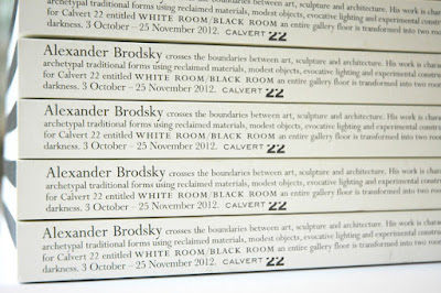
Photo courtesy of Russell Warren Fisher
This is the catalogue produced for the first UK showing of Russia’s leading avant-garde architect, Alexander Brodsky. White Room / Black Room saw Brodsky transform an entire floor of the gallery into two rooms filled with light and darkness, making for a fully immersive experience. Viewers entered through a small door and the space was divided into two contrasting rooms first encountering a seemingly endless corridor of white light and then a more confined darker chamber, hidden from view and filled with blackness.
The exhibition catalogue was designed to reflect this Black Room and White Room with a book divided in two halves, half with the text in white and half with the text in black. The publication is what I would describe as a 'double-ender' - the cover and text read one way and then you turn it over and it reads the other way. The image below, shows the way the cover works:
Click on images to enlarge
To further reflect the black and white theme, the pages of the catalogue at either end are unprinted pages which are 'Ram Punched' with a shape to represent the seemingly endless corridor of white light.
...and then a shape to represent the darker chamber:
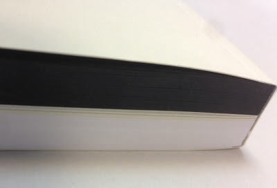
The size of the book is 243x168mm, portrait and contains a total of 322 pages, which gives the book a chunky 21mm spine. The 322 page pagination includes equal thicknesses of black and white text paper and a 32pp centre section, without ram punching, on which the story about the exhibition is told.
Click on images to enlarge
The cover and middle section of text is printed on our Redeem 100% Recycled (315gsm and 100gsm). It is printed offset litho in just one colour. The 130pp of black, uses our Colorset Nero 120gsm and the below image shows how the black/white divide works
Click on images to enlarge
Catalogue design is by Russell Warren-Fisher, who runs his studio in Corsham just outside Bath. You can see other exhibition catalogues he has created here. Russell also created the brand identity and logotype for Calvert 22.

Print is by Emtone in Bath and as you can see, it was a seriously tricksy bit of finishing with a perfect 10mm thick cut
You can read more about the exhibition here:
http://calvert22.org/exhibitions/white-room-black-room-alexander-brodsky

http://calvert22.org/
http://www.rwfhq.com/
http://www.emtone.co.uk/
Posted by Justin Hobson 01.09.2016

Tuesday 2 September 2014

Jobs from the past - Number 59

Regular followers of this blog will know that my first post of every month is a "job from the past" so that I can show some of the really good work from years gone by...

Studio8 Brochure
 
This is a particularly unusual piece of literature combining different print processes and binding. Studio8 was established by Zoë Bather and Matt Willey and by 2008 the studio had been established for few years. They had produced a wide and varied portfolio of work and were regularly asked to presentations and required a credentials "leave behind". In the interests of economy, they decided to produce a 100 copies of a digitally printed brochure.
 
Size is 308x220mm (which was the largest size that could economically be printed using the B3 size HPIndigo press) and is portrait. The 8pp dustjacket (see left) is printed letterpress with the help of Bill Bragg at Le Gun and is printed on our Redeem 100% Recycled 80gsm. This 'jacket' wraps around the cover which is unprinted on Colorset Nero 120gsm. The job is constructed using individual cut leaves which is then bound using a binding method called 'cheque book binding' ...simply named as this is the way that cheque books are bound,. basically individual sheets are collated and 'stab-stitched' (that is through all the sheets) with a wire stitch and then binding tape is applied around the spine which covers up the staples - as you can see in the picture below
Close up showing the 'cheque book binding'
The 24pp text is printed on our Marazion Ultra 90gsm. This is a lightweight paper with a matt coating but which has an amazing bulk, tactile feel and excellent opacity for 90gsm. It feels just right for this project, because it just flops over wonderfully which is one of the things with the binding - if the paper choice isn't right, it just won't work and will be virtually unreadable - because you'll be fighting to keep it open!

The beautifully designed spreads work perfectly on this paper. Print reproduction is fantastic and in no way has a 'digital' feel.
Spread showing Studio8's awesome D&AD 2008 awards gala installation
As I hope you'll be able to appreciate from these pictures this is a superb piece of design and print.

The digital print and finishing is by Mark Carey at Impressions, who are based in Essex. mark.carey@impressionscom.com. Combining the digitally printed brochure with the letterpress printed dustjacket is a masterstroke!

Needless to say, design is by Studio8 where the Creative Directors were Zoë Bather and Matt Willey. Sadly, Studio8 closed in May 2012 and Matt and Zoë now work on their own projects, many of which have also appeared on this blog.
 
www.zoebather.co.uk
www.mattwilley.co.uk
http://www.billbragg.co.uk/LE-GUN
www.impressionscom.com
Posted by Justin Hobson 02.09.2014