Showing posts with label Fenton Smith. Show all posts

Friday 13 May 2022

Amazing Cocktail Menu!

Today is World Cocktail Day! ...so what better day than to show you this amazing cocktail menu, which is a stunning piece of paper engineering:
This menu for Scarfes Bar is a highly memorable and interactive piece, featuring 14 music-inspired cocktails.

The menu was illustrated by Gerald Scarfe and based around a Victorian toy theatre with a back drop and moveable wings depicting an empty Scarfes bar. Different types of music are listed on tabs on both sides.
As you pull a tab that relates to a particular genres, so a musician or exponent of that genre glides across the stage into the bar – and the appropriate cocktails are revealed, as you can see below...
The size of the menu is 175x230mm (plus the 10mm tab). The menu is constructed from paper covered over board and each of the menu cards is paper mounted onto our Sumo Black 1mm thick board and the menu pages are held by just four brass binding posts which move along punched slots.
Designed is by Rivington Bye who work with many premium brands, principally in the hospitality sector.

Printing and production is by Fenton Smith at PrintSmith and I can't stress just how well produced this construction is, it really is superb.

What a great day for a cocktail...! https://www.daysoftheyear.com/days/world-cocktail-day/

Posted by Justin Hobson 13.05.2022

Thursday 20 January 2022

Searching for Eve in the American West

This is an catalogue for an exhibition of work by Maryam Eisler titled "Searching For Eve in the American West".

Eisler photographed female models within the desert surrounds. As the academic, editor and writer Anthony Downey has written in his essay in the exhibition’s accompanying catalogue, this approach ‘answered the need to understand the discombobulating landscape through the reassuring presence of human figures. In its isolated and sparsely inhabited environs, the region is perhaps almost too much to experience on one’s own.’ Eisler is not the first photographer to be inspired by this wild landscape – others include Ansel Adams and Edward Weston. Indeed, a statement made by Weston might equally apply to Eisler’s inspiration: ‘The camera should be used for a recording of life, for rendering the very substance and quintessence of the things itself, whether it be polished steel or palpitating flesh.'
The size of the catalogue is 395x260mm, portrait. The binding is a hybrid mixture of "swiss binding" and singer sewing, so the text is bound and glued to the inside back cover, enabling the text to sit nice and flat.
 
Detail showing the cloth tape along the spine: 
Introduction by Maryam Eisler, followed by an Essay by Anthony Downey:
The 44pp text is printed on our Omnia 150gsm which gives it that dead matt, tactile feel but with great reproduction. All printed offset litho throughout. The piece has a fantastic feel - solid flat areas of colour work amazingly well - it is difficult for me to say too much more about it - see the images below, they speak for the job...
A wonderful collection of solid colours, all printed as specials
The images are printed in two blacks (as duotones) plus a yellow special integrated with the image, the result of which is superb, as I hope you can tell from the images....
...and here we go for a bit of a plug!  - As you can see from the above images above, there is lots of colour and images with dark areas - loads of ink going down and it looks great on the Omnia, reproducing flat colours superbly whilst retaining that all important detail in the dark areas (in my opinion- but I would say that wouldn't I?)
Centre Spread with the singer sewn binding:
Detail of singer sewn threads:

Catalogue design is by Roger Fawcett-Tang of Struktur Design. It is beautifully printed and finished by Boss Print.
 
https://www.maryameisler.com/
http://www.struktur.co.uk/
https://www.bossprint.com/
Posted by Justin Hobson 20.01.2022

Friday 11 September 2020

D&AD Awards 2020

Yesterday evening it was the D&AD awards, which this year, was an online affair. I've been fortunate to have been invited to the awards dinner a few times over the years and been on the table of those who have won yellow pencils for projects for which I've had input and they have been very memorable evenings!

Given the circumstances, the awards this year were very well executed and superbly presented by D&AD President Kate Stanners Saatchi & Saatchi Global CCO).
A phenomenal 618 pencils were awarded, including 384 Wood, 150 Graphite, 68 Yellow, and 4 elusive Black Pencils. One of the black pencils worthy of note was for typeface Universal Sans, a variable typeface that allows for an extensive range of customisation and unique variations produced by Family Type.

This year, many of the studios that I have worked with over the years, including Johnson Banks, NB Studio, Magpie, Osborne Ross and Here Design, to name but a few, have been nominated and won awards.

It's always lovely to have been involved with a project which has won an award and even better, a project which has won two awards...

Twenty-five Sculptures In Five Dimensions was a self-promotional project for writer Tom Sharp. It was a demonstration of creativity within strict technical writing and design restraints, an experiment in reading and seeing, and an attempt at creating a sublime, meaningful experience with as few elements as possible.

I wrote about the actual event on my blog, last November  HERE.
Tom Sharp filled a high-ceilinged church in Covent Garden with 25 plinths. Each plinth held a text created to a strict format of five syllables per line, five lines plus a title. Each piece of writing described an original, imaginary object, so that any emotional response the reader had was because of the object they conjured up, rather than language manipulation.
The project was a collaboration with Studio Sutherl&. Tom Sharp and Jim Sutherland are the Creative Directors, writer is Tom Sharp and the designer is Rosey Trickett. The printed sheets were all printed on our wonderful Sixties paper and printed offset litho by Boss Print.

Yesterday evening this project was awarded a Graphite Pencil [Graphic Design] for Self Promotion and a Yellow Pencil [Graphic Design] for Writing for Graphic Design.

Congratulations to all participants in this year's awards. It has been a strange year, but life goes on and it's great to see that the creative industry is still producing and recognising great work, even in these unprecedented times.

You can watch the 2020 D&AD awards and check out the winners HERE

https://www.thepoetryofitall.com/
http://studio-sutherland.co.uk/
https://www.bossprint.com/
Posted by Justin Hobson 11.09.2020

Friday 29 November 2019

British Book Design & Production Awards 2019

Last week,  I was lucky enough to be at the British Book Design and Production Awards which is hosted and run by the British Printing Industries Federation (BPIF) at the Landmark Hotel in  Marylebone. A very lavish and swish occasion.
I was kindly invited by Fenton Smith and Bonnie Lo from London print company BOSS, who were shortlisted for a number of awards.
 
On arrival, the nominated entries were all out on display and it was a truly wonderful array of books and catalogues. 
 ...a gathering of over 200 people from the world of publishing, print and design - and a few paper people in there as well! Here I am with my industry colleague, Charlotte Harvey from Antalis.
Once seated in the grand dining room, the evening was opened by Charles Jarrold, Chief Executive of the BPIF...
It was particularly lovely that a project which I was involved with won the category for "Limited Edition & Fine Binding" The project is titled "Paper Dolls" by artist Hormazd Nariewella. It is designed by Ornan Rotem  and published by Concentric Editions and Sylph Editions and it was beautifully printed by Boss Print on our Gardapat 13, Kiara 135gsm 
 ...and here is the team that made the book possible, collecting the award on stage, collecting the award from the compere Konnie Huq.
 Here is a sneak preview of the book (which I write about another time)…
Here is Bonnie from Boss with the artist Hormazd Nariewella:
Boss went on to win a further three awards, including the grand finale award "Best British Book" for North Northwest designed by Les Welch, pictured below with Fenton Smith from Boss:
Congratulation to all the finalists and award winners. You can read more about the entries and the winners here: https://www.britishbookawards.org/winners-2019/

It was a great evening - good company and food and my thanks go to Boss Print for inviting me and it was great meeting up with many other old friends on the table too.

Posted by Justin Hobson 29.11.2019

Friday 23 November 2018

British Book Design & Production Awards 2018

Yesterday evening,  I was lucky enough to be at the British Book Design and Production Awards which is hosted and run by the British Printing Industries Federation (BPIF) at London's Mountcalm Hotel in Marble Arch. A very lavish and swish occasion

I was kindly invited by Fenton Smith from London print company Boss Print, who were also one of the sponsors and printed the awards catalogue. Below is pictured Fenton (left) together with photographer Giles Revell, who's book 'Cartographic Colour' published by Concentric Editions was a finalist in the awards
On arrival, the nominated entries were all out on display and it was a truly wonderful array of books and catalogues. 
The evening was opened by Charles Jarrold, Chief Executive of the BPIF...
 ...a gathering of over 200 people from the world of publishing, print and design - and a few paper people in there as well!
Congratulation to all the finalists and award winners. You can read more about the entries and the winners here: https://www.britishbookawards.org/shortlist-winners-2018/ Below shows all the winners on stage...
Boss Print sponsored the category for 'Self Published Books' and they also produced the awards catalogue and the exquisitely produced boxes, in which the catalogues were locked away until the awards concluded and the keys were distributed so everyone could get their hands on the lovely catalogues.
Click on images to enlarge
It was a great evening - good company and food and my thanks go to Boss Print for inviting me and it was great meeting up with many other old friends on the table too.

https://www.bossprint.com/
Posted by Justin Hobson 23.11.2018

Saturday 7 April 2018

Outside - David Magee

Outside is a limited run hardcover book which is a twenty-five year retrospective by landscape fine-art photographer David Magee. The book accompanies an exhibition shown at the Herrick Gallery in Mayfair in February.

The 116pp book, contains words and 48 images from the exhibition, which is a selection of Magee’s work, taking in landscape photography of scenery in Ireland, Greece, India and the US.

The book is 310mm square and is published by Concentric Editions. Printing is by Boss and uses their Vivid Colour process and the result is truly spectacular!
The book is printed on a variety of text and cover papers from our friends at that other well known "Hull based" paper merchant including the cover material on Iwahada Rockskin from Takeo in Japan, but the book also includes a number of French-folded chapter sections, as well as short page tip-ins on our lovely Offenbach Bible 60gsm.

The great news is that it's just been announced that the book has been awarded a Silver Award at the 2017 Tokyo International Foto Awards
The Tokyo International Foto Awards (TIFA) receives thousands of international entries, which are judged by an equally international Jury. During May, there is an exhibition of TIFA award winners at the CA Gallery, just in case you happen to be in Japan....

Congratulations to David Magee, who I have known for many years. Speaking about this retropsective book, he says “In my photographs, there is no real sense of time or specific place. The location is totally secondary to the feeling.The feeling is everything. I aim to portray not just what exists, but what is not obvious; that imperceptible element that stirs emotion and a sense of contemplation…”

Posted by Justin Hobson 07.04.2018

Friday 26 August 2016

Boxes in Boxes

The nature of this blog means that most of the projects I write about are either on paper supplied by Fenner Paper and more often than not, because I've had some personal involvement in the project. However, sometimes a piece of print comes along (where I have had no involvement) that is so utterly worthy of note that I feel it needs bringing to your attention and this is one of those pieces!

This is actually quite a high profile piece of work having won a yellow pencil at D&AD this April, so you may have seen it before but for those of you who haven't read on...

Firstly I'll explain the background. Boss Print are a printer based in Acton, west London, who's work has appeared on this blog many times before. Over the years when they had put out box-making to various 'trade' box-makers, they had been frustrated with the quality of the boxes they had received back and however hard they managed the project there was always some dissatisfaction with the quality of the end result. Just to clarify, we are talking about 'paper over board' rigid boxes here. Consequently, last year they invested in their own equipment, staff and  (most important of all) staff training so that they could make their own boxes 'in-house'. They started to make beautiful boxes (and they really are the most amazing quality) but were faced with the problem of letting their existing and new customers know about this new service ...enter Studio Sutherl&!

Jim Sutherland has worked with Boss for many years and having seen the amazing quality of the boxes created this superb demonstration piece using the words "There was an old lady that swallowed a fly" - from a well known cumulative children's song and working the story into the "Russian doll" type set of boxes.
To give you an idea of scale, the size of the first box (which is a lid pictured above) is 208(h) x 178(w) x 83(d)mm. The lid comes off to reveal what is described as a 'flush finish box'.
The 'flush finish box', (in white) which has a magnetic flap, opens to reveal a 'clamshell' box (in sand colour)
Click on images to enlarge
The clamshell box opens to reveal a 'flush finish lid/tray box'
 ...just look at the superb finish on these boxes - an amazing snug fit and beautifully turned edges and corners. This is real craftsmanship. 
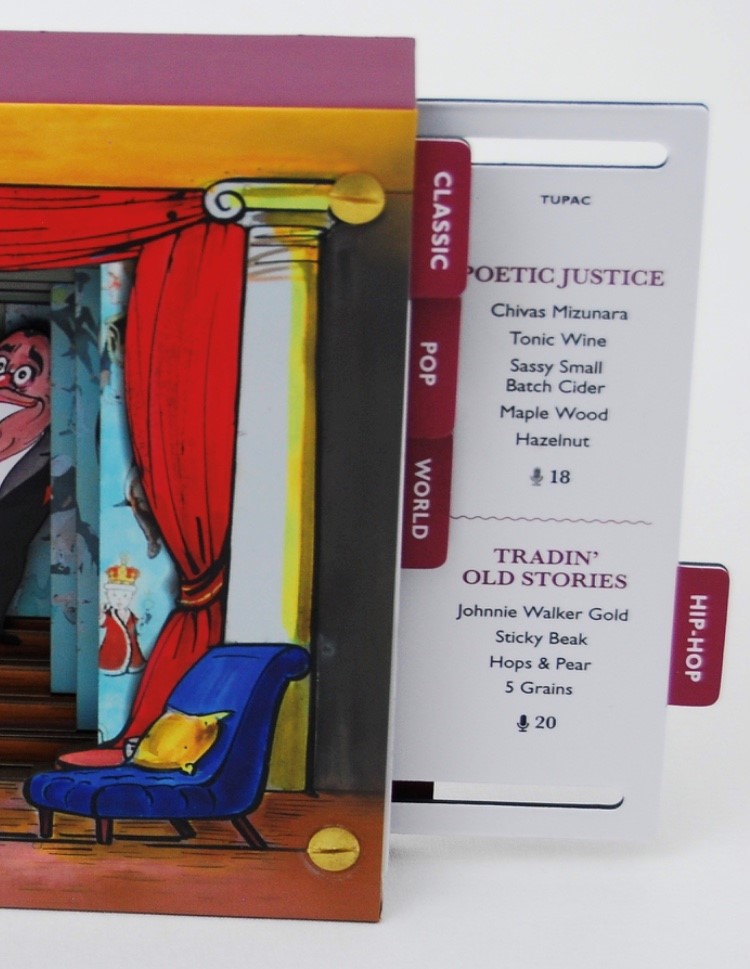
The Flush finish box opens to reveal an 'overlap lid/tray box' (pale blue)
As you can see the hot foil blocking appears on the top, sides and even insides of the boxes.  
 
Inside the overlap box is a 'matchbox' (yellow)

Opening like so... 
Inside the matchbox (which has a red liner) is a slipcase (grey)
...and inside the slipcase is a little casebound book.  
The book gives the lyrics of the whole story/poem/song written by Alan Mills with lyrics by Rose Bonne in 1952. It also lists all the styles of boxes and all the credits for those involved, including all the paper, which was supplied by Fedrigoni.
Design is by Studio Sutherl&. Creative director is Jim Sutherland and the designer on the project is Alice Tosey.

It really isn't easy to try and convey the quality of manufacture of these boxes. Everything fits superbly and there isn't a ripple or a bowing of the board to be seen on any of these boxes. The two images below, I hope will demonstrate the super tight tolerances that the boxes are made to:
This is the whole set of boxes sitting together...
You can read more about the project and see much better images that I can take on the following link:

It most deservedly won a yellow pencil at this years D&AD awards and was shortlisted in two categories of the DesignWeek Awards, winning the award for Print Communications.

...and I'm sure if you have a project, where you are looking for a beautiful bespoke rigid box, Boss print would be more than happy to hear from you! ...just email Bonnie Lo (bonnie@bossprint.com) at Boss and I'm sure she will be pleased to help.

https://www.bossprint.com/
http://studio-sutherland.co.uk/
http://www.fedrigoni.com/en/
Posted by Justin Hobson on 26.08.2016