Showing posts with label Flockage Colours. Show all posts

Monday 13 April 2020

Easter Egg Day!

Today is Easter Monday and the day that many of you will be chomping through your Easter Eggs in glorious self-isolation...
 
It has reminded me of this project in 2013 that Baxter & Bailey asked for my help with the material to make a rosette to place on a 75cm tall egg!
This is their entry to the Lindt Big Egg Hunt which comprised 101 giant Easter eggs (designed by a variety of artists and designers) which were hidden around Covent Garden in London as part of a charity egg hunt in support of Action for Children. The BB entry seeks to address the chicken and the egg quandary and is philosophically titled Eggsistentialism. Above is Dom Bailey pictured with their creation.
After the opening in London, the 101 eggs went on a month long UK tour around various cities and above you can see them at the railway station! You can read my original article from 2013 here.

Happy egg hunting...

https://baxterandbailey.co.uk/
Posted by Justin Hobson 13.04.2020

Thursday 14 February 2019

Valentine's Day

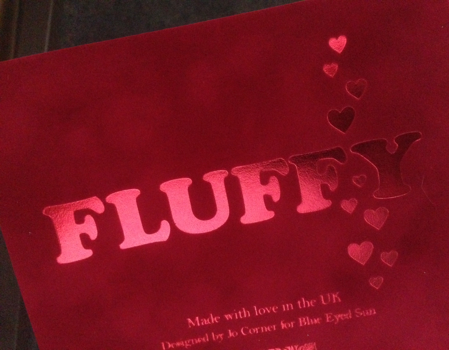
Happy Valentine's Day! What could be better than showing you a superb card, produced on our Flockage Colours...  
In fairness, this card was produced a couple of years ago by Blue Eyed Sun, so it's not now currently available, however it really is a beautifully luxurious card.

For those of you which are not familiar with this product, it is a flocked board which feels like a velvety cloth/material to the touch. It also takes hot foil blocking exceptionally well as the heat, softens the fibres allowing the foil to bed down nicely in the flock.
Flockage is a one sided material - in the case of the Bright Red, it has a coloured flock face and a red coloured board reverse.
As you will be able to see from the image above, the material has been properly creased with a 'matrix' crease, forming a perfect fold. Reverse of the card, also foiled, is below.
The cards are designed and published by Blue Eyed Sun. Design is by Jo Corner. Blue Eyed Sun is an award winning greeting card company based in Brighton established nearly twenty years ago. They specialise in handmade and high end design-led cards, which are now sold around the world by some of the best know retailers including Harrods, John Lewis etc.

Joint founder and managing director Jeremy Corner is a leading figure in the greeting card world. He is instrumental within the 'Ladder Club' which helps aspiring greeting card publishers and is on the council of the Greeting Card Association (GCA). He is a real advocate for the industry ...and he still finds time to be a regular blogger!

www.blueeyedsun.co.uk
Posted by Justin Hobson 14.02.2019

Thursday 21 December 2017

Jimmy Choo AW 2017 Invitation

If you were to think of impossibly high heels, a world renowned brand and a celebrity following as long as your arm, I'm sure you would think of Jimmy Choo. Founded in 1996, they are now one of the undisputed kings of footwear for the fashionable woman and more recently man.

This is a very luxurious looking invitation to the launch of the Autumn/Winter 2017 collection in Milan. The 2pp Invitation is 148x148mm, square is made using our Flockage Colours 400gsm in Black.
 
The front of the invitation, is hot foil blocked onto a British Racing Green shade board, but the exceptional effect on the Flockage Black on the reverse.
For those of you which are not familiar with this product, it is a flocked board which feels like a velvety cloth/material to the touch but which remarkably you can actually "flatten" the pile by use of a  "heat de-boss". In this case the Leopard skin pattern is "heat de-bossed" with a superb result.
Flockage is an expensive material, but because of the small quantity used and the fact that only one process is being used on it (and waste is therefore minimal) a luxury, high impact impression can be achieved for a relatively low cost.
 
To give these invitations extra weight (and gravitas), they have been duplexed together with a black board with the total thickness being over 3mm.
Art direction and design is by the 'in house' studio at Jimmy Choo and the designer on the project is Sinnie Chong. All aspects of production, including the duplexing, hot foil blocking and heat debossing of the Flockage was done by Add Creative, a production company based in Hong Kong and they also made the matching envelope. I think both the green board and the black inners were sourced locally in Hong Kong.
 
Posted by Justin Hobson 21.12.2017

Friday 18 November 2016

Linklaters Invitation

This is one of the most stupendous invitations to have appeared on this blog! The event is the Capital Markets Reception hosted by the legal firm Linklaters this month. The reception was held in the glamorous surroundings of the Claridge's Ballroom.


Titled with Shakespeare's erudite words "All the World's a Stage", the invitation is a genuinely theatrical production...
The invitation is a two part production - an invitation in a pocket. The finished size of the invite is A5 (210x148mm) with the black inner cards being 206x144mm, so they slip in nice and easily.
The red slipcase is produced using our Flockage Bright Red 400gsm, perfectly replicating red velvet theatre curtains. The inner invitation is on Colorplan Ebony 540gsm ( ...from the other well known, Hull based paper merchant!).
For those of you which are not familiar with this product, it is a flocked board which feels like a velvety cloth/material to the touch but which remarkably you can actually "flatten" the pile by use of a  "heat de-boss". In this case the shape of the curtains is not printed, it is "heat de-bossed" which creates the effect below:
...and it is then hot foil blocked in gold metallic foil - just look at the details on the tassels.
Below is a detail of the reverse of the slipcase, which shows what is described as the "nap" which is the pile found on velvet - just like the curtains in a theatre!
Concept and design is by GM Toucari, a London based legal communications agency. Project director is Gary Clark.

The superb execution of the project is by Benwells. They produced all the foiling and finishing - all of which is superlative. Paul Haslam at Benwells oversaw the project and thanks to Paul for sending me the samples

http://www.linklaters.com/
http://gmtoucari.com/
http://www.benwells.co.uk/
Posted by Justin Hobson 18.11.2016

Tuesday 26 July 2016

Jimmy Choo AW 2016 Invitation

This is a very luxurious looking invitation to the launch of the Autumn/Winter collection for luxury fashion brand Jimmy Choo. The 4pp Invitation is 148x110mm, portrait and is made using our Flockage Colours 400gsm in Bordeaux. 
For those of you which are not familiar with this product, it is a flocked board which feels like a velvety cloth/material to the touch. It also takes hot foil blocking exceptionally well as the heat, softens the fibres allowing the foil to bed down nicely in the flock. 
Flockage is a one sided material - in the case of the Bordeaux, it has a coloured flock face and a Bordeaux coloured board reverse. For this project the board has been duplexed, bonding the two board faces together and creating an 800gsm board with flock on both sides - and most importantly, the edge is still a Bordeaux colour.
On the inside front cover of the invitation, a mirror is affixed, so you catch your thrilled reaction at having received the invitation! The gold tinted mirror is a piece of 3mm acrylic mounted onto the Flockage surface. The hot foil blocking is in a deep crimson shade.
As you will be able to see from the image below, the material has a twin parallel creased spine to allow for the thickness of the mirror, which works superbly. 
Art direction and design is by the 'in house' studio at Jimmy Choo and the designer on the project is Sinnie Chong. All aspects of production, including the duplexing, hot foil blocking and sourcing and mounting of the mirror was overseen by David Blakeman at Identity Print based in Paddock Wood - also worth pointing out that they are one of the few printers to have hot foil blocking 'in house'!
 
Posted by Justin Hobson 26.07.2016

Thursday 8 September 2011

Flockage with real Swarovski Crystals

Here's a fantastic luxury greetings card range called TU&Co produced using our Flockage Colours. The cards are beautifully foiled and have Swarovski crystals stuck onto the cards by hand.
Not only is this a truly lovely range but the designer responsible, Phan Tu has been nominated (and is a finalist) for "The most promising Young Designer or Artist at the Henries Awards (The Henries are the Awards for the greeting card industry)
www.thehenriesawards.co.uk

 
The cards are produced by Abstract Greetings and are made in the UK. They are hot foil blocked on our Flockage Colours -Anthracite, Black and Bright Red in 400gsm and Flockage Litho White 300gsm.  They are really lovely and good luck to Phan at the awards on 11th October.


Posted by Justin Hobson 08.09.2011