Showing posts with label Matrisse. Show all posts

Monday 24 December 2018

Build by Tom Pigeon

Tom Pigeon is a creative studio founded by Pete and Kirsty Thomas in 2014. They met and started working as designers in the early 1990’s and since then have worked across design disciplines. As Tom Pigeon they design simple things for people to enjoy including prints, jewellery and stationery. 

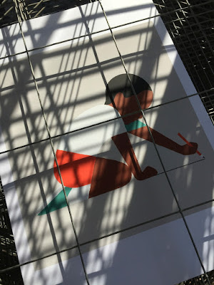
This is a print, titled 'Build' that they have designed for Social Bite Village - a development in Edinburgh which gives homeless people somewhere to live and all the support they need to get back to work and into long-term accommodation.
Click on image to enlarge
All profits from this limited edition screen print inspired by the amazing space and remarkable work of Social Bite Village will be donated to the charity. ‘Build’ celebrates both the physical construction of this remarkable community and its work to encourage new and positive futures for its homeless residents. 
http://social-bite.co.uk/the-social-bite-village/
The size of each print is A2 (594x420mm) and is hand-pulled using waterbased inks at Harvey Lloyd Screenprinting and is a limited edition of 100 signed, numbered and embossed prints. Below show the detail of the embossing...
Printed in three colours on our Matrisse 200gsm which we donated for this project. It is beautifully printed with fantastic register and detail as you can see from the image below...
If you would like one of these 100 limited edition prints, you can buy one by following the link here:
https://www.tompigeon.com/collections/new-prints/products/build

http://social-bite.co.uk/the-social-bite-village/
https://www.tompigeon.com/
http://harveylloydscreens.co.uk/
Posted by Justin Hobson 24.12.2018

Monday 1 October 2018

Jobs from the past - Number 108

Regular followers of this blog will know that my first post of every month is a "job from the past" so that I can show some of the really good work from years gone by...

Association Gallery Leaflets June/Sept 1999
The Association of Fashion & Advertising Photographers (AFAP, although it later became AFAEP when editorial photographers were embraced) was originally founded in 1968, changing its name to The Association of Photographers in 1993.
 
During the late 1990's the AOP had their gallery and exhibition space at 81 Leonard Street, EC2 and the gallery manager was Alex Steele-Mortimer. Being a self funded 'trade body', resources were extremely limited, although the subject, brief and raw material was fantastically creative.  Alex commissioned Frost Design for the promotional leaflets for quite a long period. They stick in my mind as being incredibly simple, yet because of their powerful use of cropped, interesting images, single colour print and quality paper they had a consistency and quality that stands high today.

The finished size is 210x95mm (roughly a DL format) and is 12pp, folding out to a flat size of 210x570mm.
The format of this leaflet works particularly well as the text concertinas into the folded spine. This works particularly well for this type of leaflet as because it effectively creates a spine and the foredge of text - some leaflets fall open in all directions! This is neat and tight and as a result feels less like a leaflet and more like a piece of less throwaway literature.  Picture below shows the way the text folds into the spine....
Click on images to enlarge
Text on the inside reads at 90degrees to the outer. Some people may disagree but I find this a very easy to read and inviting publication.
The paper used is Matrisse 140gsm and is printed just one colour Offset Litho. The crop of the images used on the covers was alwsy good with this series of publications and this is no exception. Photography by Craig Samuel.
Creative director was Vince Frost who now runs Frost in Australia.

Print was offset litho by The House Of Naylor, one of the last printers based in Clerkenwell, they are no longer in existence.

http://www.the-aop.org/
http://www.frostdesign.com.au/
Posted by Justin Hobson 01.10.2018

Wednesday 15 March 2017

She Lights up the Night

She Lights up the Night is an exhibition coinciding with International Women’s Day, in aid of women’s charity Refuge. Established by founder of They Made This and BBH production director Aine Donovan, it is a graphic art exhibition, where prints are available to buy and ultimately the work is sold to raise funds.

Refuge is a national charity which provides a wide range of specialist services to support women and children experiencing domestic violence and other forms of gender-based violence. On any given day their services support almost 5,000 women and children.
The exhibition was opened with a private view last Thursday evening at the Protein Gallery.
Some of the featured artists are Jean Julien, Jon Burgerman, Hattie Stewart, Siggi Eggertsson, Kindah Khalidy, Crispin Finn, Steve Wilson, Mike Perry, Daisy Emerson, Lauren Baker, Hannah Waldron, Olivia Healy, Poul Webb, Letman, Rude, Hense.
The silkscreen prints which were all on sale on the evening are printed by Harvey Lloyd Screenprint. All the print was donated to the charity and we also supplied our lovely Matrisse 200gsm free of charge to support the project.
STRONG by Morag Myerscough.
The exhibition was featured in an article in the Evening Standard here. Thanks needs to be shared all round, to the artists who gave their time and work for nothing, to Protein, Harvey Lloyd Screenprint and especially to Aine Donovan for organising and arranging the whole event - pats on the back all round!

http://www.refuge.org.uk/
http://harveylloydscreens.co.uk/
Posted by Justin Hobson 15.03.2017

Friday 24 February 2017

Bookmark it.

Museums and Galleries is a publisher and producer of greeting cards, stationery and gifts. They specialise in producing items from the world of fine art and publish cards and other items from the V&A, other London museums and galleries and the Wedgewood archive.

These bookmarks are from a series produced from work by illustrator Faye Buckingham. Size is 160x48mm, punched with a hand tied ribbon.
Printed offset litho in CMYK, the bookmarks are printed on ZETA Linen, Brilliant white 350gsm which is duplexed with Matrisse 350gsm.
Below shows the detail of the linen embossing.
Click on images to enlarge
http://www.advocate-art.com/artist.faye-buckingham
Posted by Justin Hobson 24.02.2017

Wednesday 16 November 2016

Draw a line

This is a recent collection of prints produced by Harvey Lloyd Screenprint for British graphic artist and illustrator, Adrian Johnson. His work is known for his economical, highly crafted graphic work an his working process all derives from obsessively drawing and re-drawing on paper, breaking down ideas and concepts into their purest form.
Size of the prints is 400x360mm, portrait. They are six-colour screen prints and are printed on our Matrisse 200gsm. Matrisse is a tactile uncoated white board with a high bulk and is perfect for silkscreen work.
You can see and read more about the project here:  http://www.adrianjohnson.co.uk/#/draw-a-line/
Adrian Johnson relentlessly aspires to seek balance between simplicity and sophistication, he is reductionist at heart. In October he gave a talk and workshop at the Apple Store on Regent Street, London about distilling ideas and images through reduction. In his words... "I'll be working with iPad Pro and Apple Pencil to help illustrate how my working process involves taking on board a plethora of information, and how I reduce this information into 'simple yet sophisticated' illustration and graphic art". 
Adrian Johnson's work has been exhibited in London, New York, Los Angeles, and Tokyo. He lives and works in Copenhagen, Denmark.
The prints are produced in an edition of 25 copies. and have been beautifully printed by Harvey Lloyd Screenprint, who are based in Wadhurst, East Sussex.

http://www.adrianjohnson.co.uk/
http://harveylloydscreens.co.uk/
Posted by Justin Hobson 16.11.2016

Wednesday 8 June 2016

Euro 2016 Planner

As many of you will know, the UEFA Euro 2016 Football championship begins this week on Friday.

...well yesterday morning, I had a lovely surprise as I received a smartly packaged postal tube, containing a beautiful planner for the Euros - a gift from Crispin Finn, a Kent based design and silkscreen studio.
Simply produced in their trademark red, white and blue (all of their personal work appears in just these three colours) it has been hand silkscreen printed in red and blue. A truly stunning, visually stimulating planner.
Click on images to enlarge
The size of the planner is 510x700mm and is silkscreen printed on our Matrisse 200gsm, which is a perfect weight. Matrisse is a tactile uncoated white board with a high bulk. Below is a detail showing close up of the all important group B...
Each of the posters is embossed with their Crispin Finn seal.
It looks far to nice to put on the wall and write on! ...but I will. Every good design studio should have one of these on the wall - and luckily you can, because they are available on the Crispin Finn website! You can buy one of these lovely planners for just £10 plus shipping - it's a bargain - but you'll have to be quick, the competition starts on Friday:

My thanks to Roger Kelly and Anna Fidalgo for sending it on over.
Posted by Justin Hobson 08.06.2016

Tuesday 21 July 2015

Run & Achieve

Run & Achieve is the creation of Lily Mo, an Edinburgh jewellery designer. They are bracelets for half-marathon and marathon runners with the distances engraved – each bracelet is handmade in Edinburgh using sterling silver and cord that is water resistant.

This elegant packaging was designed and produced by Evgenia Kochkina, based in Edinburgh and is a brilliant piece of packaging design.
Click on images to enlarge
The card is 95mm square and is letterpress printed in two colours - a metallic silver halftone and dark orange and dark orange on the reverse. It is printed on our Matrisse 350gsm, which is very bulky, and is then duplexed making this 700gsm and 1mm thick. There are die cut notches for the cord to sit in and the cards are also 'round cornered'. The card gets inserted into a wallet (115mm square) made from Matrisse 350gsm which is letterpress printed in the same two colours on one side only.
If you click on the image to enlarge the picture, you'll be able to see the coarse screen of the halftone in silver - wonderfully effective use of halftone and letterpress.
You can read more about the project here:
https://www.facebook.com/stoneberrypress#
Design, print and production is by Evgenia Kochkina at Stoneberry Press in Edinburgh. Her email says "I only discovered Matrisse qualities during this job. Very elegant paper and good for colours!"

This is a very simple, elegantly produced packaging solution ..and with the perfect paper!
http://lilymo.co.uk/
http://stoneberrypress.co.uk/
Posted by Justin Hobson 21.07.2015

Tuesday 2 June 2015

Jobs from the past - Number 68

Regular followers of this blog will know that my first post of every month is a "job from the past" so that I can show some of the really good work from years gone by...

Pigs are Great - 2001
This self promtional piece of literature was designed by The Partners for Gavin Martin, the printing company back in 2001. The mailing is designed to be one piece, inserted into a neat 'Oink' envelope. The photography is by Geoff Smith.
The finished size is 120x77mm, portrait and is a long concertina. This gives the mailing 5 spreads in total.
The concertina which is 987mm long, folds up as below:
One of the things to note is the 2mm, free standing spine, into which the concertina folds. This is where the choice of material is important, so that the weight/bulk is light enough that it will take a machine made crease, yet be light enough for the pages to turn over nicely.
It is printed on our Matrisse 140gsm, which is a white very bulky uncoated with a toothy feel. Images, showing the fully extended mailer, printed CMYK plus pantone special, with the inside printed with the special only...
Art direction and design is by The Partners. Print is by Gavin Martin. Photography is by Geoff Smith.
A clever and well thought out piece of literature, which maximises the format of a B1 press and sheet of paper...

http://www.gavinmartin.co.uk/old_site/
http://www.the-partners.com/
http://www.gavinmartincolournet.co.uk/
Posted by Justin Hobson 02.06.2015