Showing posts with label Singer Sewing. Show all posts

Tuesday 9 July 2019

The first time I met Freda...

Earlier this year, we heard the sad news that Freda Sack, the renowned British type designer had died. You can read more about her career here on the ISTD website.
In May there was a small memorial celebration for family and close friends which was held at the Fitzrovia Chapel (formerly the Chapel of the Middlesex Hospital) which was particularly apt as Freda's studio had been close by.

This superb little publication was produced for those at the memorial and for those who were unable to go. It very simply records people's stories about when they first met her...
Size of the publication is 150mm square and actually became an 84pp publication because so many people wished to record their first meetings.
The paper chosen is our Sixties range in 60gsm - the choice being just right as the paper is light enough to produce just a multi page booklet and because of the show through, the words are beautifully layered throughout the publication...
Click on images to enlarge
SIXTIES is a new paper which has the same translucency as a tracing paper - but it feels like a normal paper …hopefully you can see the translucency in the images:

The publication is singer sewn and the image below shows the centre spread.
Singer sewing uses a pale blue thread.
Below shows the superb singer sewn spines.
Design is by Clare Playne of Playne Design one of the many friends and colleagues who contributed to the memorial.

You probably won't have realised that this job is digitally printed. It was printed and finished by digital print company Typecast Colour and was produced on their Xerox digital press and the finished result is superb. Printing digitally made this limited run viable - even on a material such as this, which many other printers are scared of.

It is a superbly produced little publication and a wonderful way to remember Freda.

https://playnedesign.co.uk/
http://www.typecast.co.uk/
Posted by Justin Hobson 09.07.2019

Tuesday 13 November 2018

Carriage Works

Once a booming Victorian industrial town, Swindon’s reputation has suffered greatly since the Second World War. Swindon Borough Council recently commenced an ambitious regeneration plan for entire town. At its heart is the Railway Heritage Quarter, made famous by Brunel and Gough’s Great Western Railway in the 19th century.

The entire area is known as the Great Western Works (GWW) and the Carriage Works is a development for the tech and innovation business hub within GWW.
Size of the publication is 297x250mm, portrait with a 4pp cover on Omnia 320gsm and a 12pp text with two throw-outs (16pp total) printed on Omnia 150gsm.
Picture below shows the throw out...
Click on images to enlarge
The material chosen for the publication is our Omnia. This material has a high bulk, required as effectively this is only a 20pp brochure. The solid yellow, almost looks fluorescent, it is so vibrant. The photography and the CGI's have reproduced brilliantly on the Omnia.
Even though the 150gsm text paper is bulky, it still rolls and flows nicely in the hand without feeling too stiff and rigid....
Birds eye view, showing the two throw out pages:
Click on images to enlarge
A really nice feature is the singer sewn binding, which you can see here on both the exterior and interior of the publication.
Above showing exterior stitching (on the outside spine) and below showing the interior stitching on the centre pages.
The pantone special yellow is so vibrant!
Art direction and design is by Bell Integrated. You can read more about the whole project here: https://www.bell-integrated.co.uk/portfolio/great-western-works/. Printed offset litho throughout. The excellent print, repro and finishing is by Gavin Martin Colournet, based in London

https://www.bell-integrated.co.uk/
http://www.gavinmartincolournet.co.uk/
Posted by Justin Hobson 13.11.2018

Monday 8 October 2018

Warner Edwards Garden

This garden at the Chelsea Flower show is inspired by Falls Farm, Northamptonshire, where every bottle of Warner Edwards Gin is distilled. The farm is situated on the remains of medieval terraced gardens, now a beautiful stepped grass landscape, which is represented discretely in the Warner Edwards Garden’s topography. Bee-friendly plants reflect the farm’s apiary, and thyme and lemon balm, which are highly aromatic, can be used in garnishing gin and tonic.
 
This booklet explains all about the garden, the designers, the layout and the plants which are used. It is printed offset litho in CMYK throughout with hot foil blocking on the cover.
The 4pp cover is printed on Flora Tabacco 240gsm and the 12pp text is on Flora Noce 130gsm. As you can see from the image below, the Noce is a slightly lighter shade than the Tabacco used for the cover.
The size of the booklet is 148x105mm, portrait and is singer sewn with green thread.
Click on images to enlarge
Above shows the centre spread with the singer sewing in the spine and below you can see the outside spine. A superb piece of sewing...
Flora, is a part recycled text and cover paper with a deliberately recycled look and feel with specks and inclusions, so it looks deliberately flecky and specky. Flora is produced with 30% post consumer de-inked waste, together with 60% of virgin FSC pulp 10% cotton fibres, which gives the paper a wonderful tactile feel. See the image below to see the detail...
Click on images to enlarge
Design is by London based agency Hue & Cry. Designer on the project is Kate McPartland. Print is by Leycol.

https://www.warneredwards.com/
http://www.huecryagency.com/
Posted by Justin Hobson 08.10.2018

Monday 3 September 2018

Jobs from the past - Number 107

Regular followers of this blog will know that my first post of every month is a "job from the past" so that I can show some of the really good work from years gone by and here's one from 2009...

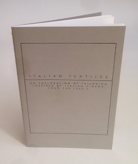
Italian Textiles
This project is a collaboration between the Italian Trade Commission and Central St Martins with the aim of promoting the use of Italian fabrics by fashion students. The students were invited to inspiration from a specific period in British fashion history - the 1960's - when the majority of men, irrespective of their social position, wore a tailored suit as normal day wear.

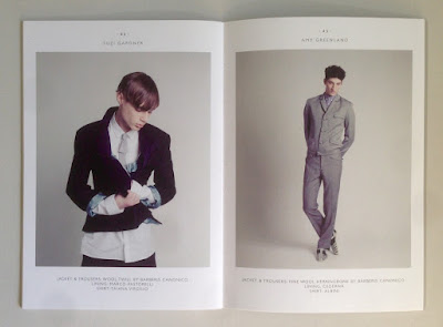
Size of the brochure is 210x148mm (A5) portrait and is singer sewn. The cover is printed on a 350gsm cover material from that other "Hull based" paper merchant! The 28pp text is printed on our Colorset White (100% Recycled) 120gsm 
Colorset has a rough, tactile "toothy" surface but it still prints extremely well, as you can see from the images with fabrics and fleshtones below...

Click on images to enlarge
The excellent printing is by London based printer, Push, who are based in Bermondsey. The singer sewn binding is superbly executed....
Creative direction is by Rob Meyers at RBPM Studio. Photography is by Pelle Crepin.

Posted by Justin Hobson 03.09.2018

Thursday 30 August 2018

Long & Waterson

 ...just the cover makes the difference!

Here's an interesting project which is well worth a look, because of the high quality finishing processes and the way the cover is used to add to the quality and feel of the whole project.
This 48pp brochure is for a new residential development but the content is much more that of a magazine with eight writers and articles about the area, the architecture and the geography. The finished size is 380x285mm, portrait and is singer sewn. The 48pp text is printed on an uncoated paper.
The cover is printed on our Crush, Corn 250gsm and in fact it isn't printed using ink, it is simply hot foil blocked in a black gloss foil on both the front and back cover.
As you can see from the image below, the foiling looks amazing and you can see the subtle specks in the paper.
Quality of the singer sewing is superb
Design is by Ignite, who are based in Hoxton Square in London. You can read more about the project here.

Print is by Gavin Martin Colournet.

https://longandwaterson.com/
http://ignitetv.com/
https://www.gavinmartincolournet.co.uk/
Posted by Justin Hobson 30.08.2018

Thursday 12 July 2018

Searching for Eve...

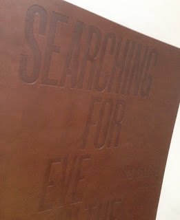
This is an catalogue for an exhibition of work by Maryam Eisler titled "Searching For Eve in the American West".

Eisler photographed female models within the desert surrounds. As the academic, editor and writer Anthony Downey has written in his essay in the exhibition’s accompanying catalogue, this approach ‘answered the need to understand the discombobulating landscape through the reassuring presence of human figures. In its isolated and sparsely inhabited environs, the region is perhaps almost too much to experience on one’s own.’ Eisler is not the first photographer to be inspired by this wild landscape – others include Ansel Adams and Edward Weston. Indeed, a statement made by Weston might equally apply to Eisler’s inspiration: ‘The camera should be used for a recording of life, for rendering the very substance and quintessence of the things itself, whether it be polished steel or palpitating flesh.'

Now this is already a pretty special project having won the category for the best catalogue design at the British Book Design and Production Awards last year
The size of the catalogue is 395x260mm, portrait. The binding is a hybrid mixture of "swiss binding" and singer sewing, so the text is bound and glued to the inside back cover, enabling the text to sit nice and flat.
 
Detail showing the cloth tape along the spine: 
Introduction by Maryam Eisler, followed by an Essay by Anthony Downey:
The 44pp text is printed on our Omnia 150gsm which gives it that dead matt, tactile feel but with great reproduction. All printed offset litho throughout. The piece has a fantastic feel - solid flat areas of colour work amazingly well - it is difficult for me to say too much more about it - see the images below, they speak for the job...
A wonderful collection of solid colours, all printed as specials
The images are printed in two blacks (as duotones) plus a yellow special integrated with the image, the result of which is superb, as I hope you can tell from the images....
...and here we go for a bit of a plug!  - As you can see from the above images above, there is lots of colour and images with dark areas - loads of ink going down and it looks great on the Omnia, reproducing flat colours superbly whilst retaining that all important detail in the dark areas (in my opinion- but I would say that wouldn't I?)
Centre Spread with the singer sewn binding:
Detail of singer sewn threads:

Catalogue design is by Roger Fawcett-Tang of Struktur Design. It is beautifully printed and finished by Boss Print who are based in Acton, West London ...interestingly they are one of the few printers I know of who have "singer sewing" in house!

As I mentioned it won the award for best catalogue at the BBD&PA awards, which you can read about here:

 
https://www.maryameisler.com/
http://www.struktur.co.uk/
https://www.bossprint.com/
Posted by Justin Hobson 12.07.2018