Showing posts with label Sixties. Show all posts

Wednesday 22 July 2020

Wedding Invitation on Sixties

Over the many years I have been  paper merchant, the trickiest of all projects to be involved with is the graphic designer's own wedding invitation! Generally speaking there are many samples involved and lots of changes in direction in a desire to impress their design savvy friends! Not so, with this invitation, as I didn't know anything about it until I received a lovely email yesterday...

I met designer Sam Moffat this time last year, who had just set up his own practice in London called  Decade Studio. One of the products I showed Sam was our new SIXTIES. Sixties is a new paper (in 60gsm, hence the name!) which has the same type of translucency as a tracing paper, but feels like a normal paper. Unbeknown to me Sam identified this as the perfect stock for his upcoming wedding in November.
Click on images to enlarge

Size of the invitation is 420x297 (A3) folding down to 105x148mm (A6). It is digitally printed by Kestrel Press, white on the front and in black on the reverse.
… you can see the translucency in the images above and below. Photography is by Huy
Digital printing is by Kestrel Press based in Irvine. Kestrel had tested the Sixties on their digital press, including the use of digital white toner, which I wrote about in an article on this blog, which Sam spotted. The end result is absolutely superb. The invitations are sealed with an orange sticker, as you can see below...
Sam moved back to Australia in January and Decade Studio is now based in Hobart, Tasmania. My best wishes to Sam and Hannah on their new life together in Oz and thanks to Sam for taking the time to share this with me, so I could share it with you.

http://www.decade.studio/
http://www.kestrelpress.com/ 
https://www.instagram.com/huy____/
Posted by Justin Hobson 22.07.2020

Thursday 21 November 2019

25 sculptures in 5 dimensions

The installation ‘Twenty-five sculptures in five dimensions’ manifested for one night only this week on Tuesday 19th November in the Swiss Church, Covent Garden. The exhibition is conceived and sculpted by poet Tom Sharp, designed by Studio Sutherl&, soundtracked by Tony-nominated composer Alex Baranowski, with an introductory essay by art writer and curator Anna Souter. In a high-ceilinged environment of contemplation the guests experienced twenty-five sculptures. They exist between the four dimensions of thirty syllables and the fifth dimension of your mind.
Words about the exhibition are as follows... "Each sculpture is made from four dimensions of thirty syllables – a five syllable title and five further lines of five syllables – combined with the material of your imagination. The sculptures do not exist without your consciousness and these sculptures are about your consciousness. How language shapes it. How distinct it is from the blood and mess of your body. Whether it is a fundamental of the universe or a materialistic phenomenon destined one day to be recreated by IBM. What art’s role in exploring consciousness is. How we create an unnatural division between our minds and the many minds of nature." 
Each of the sculptures is made from a pillar of paper - made up using sheets of our Sixties paper in 60gsm. SIXTIES is a new paper which has a similar translucency as a tracing paper - but it feels like a normal paper! … you can see the translucency in the image below:
There is also a catalogue produced using the same Sixties paper
There is an introductory essay by art writer and curator Anna Souter, placing the work in an art historical context. The catalogue is five inches square (127mm sqaure), with five Helvetica Neue 55 type sizes and is singer sewn, as you can see below...
The books are produced in a limited edition of 200.
Design is by Studio Sutherl& and the print of both the sheets and the book is by Boss Print and are printed offset litho in just one colour throughout.

https://www.poetrybytomsharp.com/collection/twentyfivesculptures
http://studio-sutherland.co.uk/
https://www.bossprint.com/
Posted by Justin Hobson 21.11.19

Monday 7 October 2019

The Shepherd’s Whistle

Earlier this year, the John Hansard Gallery, part of the University of Southampton presented an exhibition titled The Shepherd’s Whistle, a commissioned project by Stefan Gec. The exhibition centres around the artist’s fascination with top-secret maps of strategic cities worldwide that were created by Soviet intelligence during the Cold War, alongside an M-72 Soviet army motorbike and sidecar from 1957. Riding the M-72 and navigating using the Soviet maps, Gec journeyed to five UK towns and cities that were identified by the Soviets as having strategic importance.

This is the accompanying literature produced for the exhibition...
The size is A5, portrait and the format is an 8pp right angle fold.
Click on images to enlarge
The leaflet is printed offset litho on our Sixties, 60gsm ...and it works superbly as SIXTIES has the same type of translucency as a tracing paper - but it feels like a normal paper! … so it works perfectly for this publication, allowing the map to show through and provide the backdrop for the essay about the exhibition, written by Ros Carter. You can see the way the translucency works in the image below:
Front cover:
...opens to this spread
Open at full size:
Click on images to enlarge
This image shows the Soviet map which appears on the inside of the leaflet.
The publication is printed offset litho in CMYK and the colour reproduction on Sixties is excellent, as you can see in the image above.
Click on images to enlarge
The exhibition ran from February to April this year. Design is by Daly & Lyon who are a studio based in London that specialises in design for the arts. Printing is by Aldgate Press.

http://www.jhg.art/event-detail/374-stefan-gec-the-shepherd-s-whistle/
http://www.daly-lyon.co.uk/
http://www.aldgatepress.co.uk/
Posted by Justin Hobson 07.10.2019

Tuesday 9 July 2019

The first time I met Freda...

Earlier this year, we heard the sad news that Freda Sack, the renowned British type designer had died. You can read more about her career here on the ISTD website.
In May there was a small memorial celebration for family and close friends which was held at the Fitzrovia Chapel (formerly the Chapel of the Middlesex Hospital) which was particularly apt as Freda's studio had been close by.

This superb little publication was produced for those at the memorial and for those who were unable to go. It very simply records people's stories about when they first met her...
Size of the publication is 150mm square and actually became an 84pp publication because so many people wished to record their first meetings.
The paper chosen is our Sixties range in 60gsm - the choice being just right as the paper is light enough to produce just a multi page booklet and because of the show through, the words are beautifully layered throughout the publication...
Click on images to enlarge
SIXTIES is a new paper which has the same translucency as a tracing paper - but it feels like a normal paper …hopefully you can see the translucency in the images:

The publication is singer sewn and the image below shows the centre spread.
Singer sewing uses a pale blue thread.
Below shows the superb singer sewn spines.
Design is by Clare Playne of Playne Design one of the many friends and colleagues who contributed to the memorial.

You probably won't have realised that this job is digitally printed. It was printed and finished by digital print company Typecast Colour and was produced on their Xerox digital press and the finished result is superb. Printing digitally made this limited run viable - even on a material such as this, which many other printers are scared of.

It is a superbly produced little publication and a wonderful way to remember Freda.

https://playnedesign.co.uk/
http://www.typecast.co.uk/
Posted by Justin Hobson 09.07.2019

Tuesday 12 March 2019

Charleston Press No 1

Nestled in the South Downs, Charleston was the country meeting place for the writers, painters and thinkers known as the Bloomsbury group. Now run by the Charleston Trust, the house is an excellent museum and visitor attraction, presented to look as it did when the family lived here in the 1950's. The walled garden was created by the artists Vanessa Bell and Duncan Grant to designs by Roger Fry and features Mediterranean influences with plants chosen for their intense colour and silver foliage. These became the subject of many works over their long residence at Charleston.

Charleston Press is a new publication published by the Charleston Trust and includes includes newly commissioned essays exploring the themes, artists and stories of the exhibitions and programmes at Charleston, as well as articles marking important Bloomsbury anniversaries and events.
For this first issue, there are two different cover designs.
Size is 220x170mm, portrait and is perfect bound. The publication has an 8pp 'dustjacket' around the cover as you can see from the birdseye image below...
The below image shows the book (with the magenta cover) out of the dustjacket plus the wrap-around belly-band.
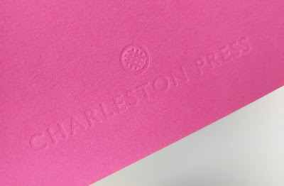
The 4pp cover is produced on our Colorset (100% Recycled) Magenta, 270gsm and is unprinted, being simply, but beautifully, embossed. 
Click on images to enlarge
The 84pp text is printed on our Omnia 120gsm. The reason that Omnia was chosen is because it would beautifully reproduce the wide variety of different media, the artworks, solid colours and dark photography and most importantly feel special - with the reproduction that you would expect on a silk or gloss but with a natural tactile uncoated feel.
...note the solid colours, not a special, made out of CMYK.
Charleston is hosting the first museum display of Vanessa Bell and Duncan Grant’s Famous Women Dinner Service since it was created for Kenneth Clarke in 1932. After this the plates disappeared from public view and their whereabouts were unknown until very recently. The plates were created by Bell and Grant when they lived at Charleston and each plate depicts one famous woman, featuring figures as various as the Queen of Sheba, Sappho, Nell Gwynn, Emily Brontë and Elizabeth I. You can read more about the Dinner Service HERE.
Click on images to enlarge
Below image shows the 6mm spine, the perfect binding. The jacket is printed on Omnia 150gsm.
The wrap around bellyband (70mm high) is printed on our Sixties, 60gsm and because of the translucency, the background images show through.
...you can see the level of show through in the detail image below.
The reproduction on the Omnia is just something else, the level of detail and reproduction is superb as you can see the image below.
The publication is designed by Playne Design who have studios in London and Hastings. Creative Director is Clare Playne with production is handled by Simon Hack. Print production is by Pureprint. This is just an excellent example of a beautifully designed and well executed piece of print, entirely right for the subject.

The publication is available for sale HERE

https://www.charleston.org.uk/
http://www.playnedesign.co.uk/
https://www.pureprint.com/
Posted by Justin Hobson 12.03.2019

Monday 24 September 2018

Margaret Howell AW2018

Margaret Howell is a contemporary British clothing designer who has worked successfully in men’s and women’s clothing for over four decades. After graduating from a fine art degree at Goldsmiths’ College, London in 1969, Howell started making accessories. Her hand -made beads and knitted accessories came to the attention of Vogue and other fashion magazines, encouraging her to go onto designing clothes.
This is the promotional literature for the new Autumn Winter collection. It is a broadsheet format. Size is 140x198mm, folding out to 594x840mm and is printed on our new paper called SIXTIES.
It is concertina folded horizontally and vertically.
Above is the front view and below is the wonderfully 'ghost-like' reverse.
Click on images to enlarge
Birds eye view showing the folding...
The whole publication is all printed offset litho on our new Sixties, 60gsm ...and it looks and feels absolutely gorgeous - it flops and folds in a delightful way when handling the publication as I hope these images demonstrate. SIXTIES is a new paper which has the same translucency as a tracing paper - but it feels like a normal paper! … you can see the translucency in the image below:
...and here too:
Click on images to enlarge
The publication is printed offset litho in CMYK and the colour reproduction on Sixties is excellent, as you can see in the detail image below. Printing is by Push in London.
Creative direction and design is by Studio Small. Photography is by Chris Moor.
Posted by Justin Hobson 24.09.2018