Showing posts with label StarFine. Show all posts

Wednesday 30 September 2020

De La Warr Events Guide

This is the Events Guide from last Autumn/Winter for the De La Warr Pavilion. The De La Warr pavilion is on the seafront in Bexhill in Sussex and is an iconic modernist building by the architects Erich Mendelsohn and Serge Chermayeff which opened in 1936. Following a major renovation in 2005, the pavilion hosts many shows, exhibitions and cultural events.
The finished size is 210x111mm, folding out to 420x553mm and is a 20pp concertina letter fold. Side view....
Below image shows the concertina folding...
This guide is printed on our StarFine White 130gsm which means that rather than feeling like the vast majority of mass produced leaflets printed on a bit of silk or gloss, this has real character and value. The design is such that the listings of the exhibitions, activities and events are all listed on one side (outside)
...with the inside being reserved for a full size image from the exhibition. The below image taken from the Renee So exhibition, Ancient and Modern.
The De La Warr identity and design (including the website) is by Playne Design who have studios in London and Hastings. Creative Director is Clare Playne. Print production is handled by Simon Hack. You can read more about the creation of the new identity here: https://playnedesign.co.uk/our-work/de-la-warr-pavilion/#branding-modernist-cultural-icon

The project is printed offset litho in CMYK by Empress Litho with Jason Maclaren handling the project - and my thanks to Jason for very kindly sending me some file copies.
https://www.dlwp.com/
Posted by Justin Hobson 30.09.2020

Tuesday 2 June 2020

Jobs from the past - Number 127

Regular followers of this blog will know that my first post of every month is a "job from the past" so that I can show some of the really good work from years gone by and this publication is from 2016. 

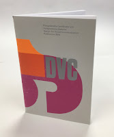
LCC - Design for Visual Communication (DVC) 2016

This publication reviews the work of 56 students who have undertaken the Postgraduate Certificate and Diploma in part-time and full-time modes at the London College of Communication (LCC) during 2016. The introductory section includes two features related to design activism and is illustrated using images taken from student submissions to the ISTD student assessment.

Size of the publication is 240x160mm (an oversize A5 which is economical to print using 'B'size paper). The cover design is by Caley Dewhurst and is letterpress printed at the LCC letterpress department by Christian Granados and Alex Cooper.
The 4pp cover is printed on our Colorset (100% Recycled) Light Grey 270gsm and printed in three colour letterpress.
The 64pp text is printed CMYK offset litho at the LCC litho printing department by Tony Yard and the result is excellent. The first pages are for the DVC Postgraduate Certificate
Click on images to enlarge
The second section is for the DVC Postgraduate Diploma...
It's also worth pointing out that one of the students on this course, Chia-Lin Lin (see r/h page below) was awarded the prestigious Vincent Steer prize at the ISTD Student Awards in that summer which you can read about here.
Click on images to enlarge
StarFine is a quality, uncoated paper and as the images show, image reproduction is excellent. The photographic images, montages and illustrations all look equally stunning - a great amount of detail for an uncoated paper.
64pp of StarFine 115gsm is about the maximum that you can successfully saddle stitch without it "gaping" in the centrefold too badly. This publication works but it would be a struggle if there were any more pages....
You can see below the "matrix" crease that means that the cover has been really well finished so that the cover sits as flat as possible and there's no cracking along the spine. Print finishing was also in-house at the LCC by Scott House.
The course leader is Tony Pritchard and this is an excellent example of a high quality publication that can be produced when like-minded individuals come together and in house facilities exist and have been fully utilised.

www.arts.ac.uk/lcc
https://www.istd.org.uk/education/2020-student-briefs
Posted by Justin Hobson 02.06.2020

Wednesday 6 May 2020

De La Warr Pavilion Summer Events Guide

This is last Summer's events guide for the De La Warr Pavilion. The De La Warr pavilion is on the seafront in Bexhill in Sussex and is an iconic modernist building by the architects Erich Mendelsohn and Serge Chermayeff which opened in 1936. Following a major renovation in 2005, the pavilion hosts many shows, exhibitions and cultural events. 
The finished size is 210x111mm, folding out to 420x553mm and is a 20pp concertina letter fold. Side view.... 
Click on images to enlarge
 Below image shows the concertina folding...
This guide is printed on our StarFine White 130gsm which means that rather than feeling like the vast majority of mass produced leaflets printed on a bit of silk or gloss, this has real character and value. The design is such that the listings of the exhibitions, activities and events are all listed on one side (outside)
Click on images to enlarge
 ...with the inside being reserved for a full size image from the exhibition. The below image taken from the HOW CHICAGO! exhibition.
Gladys Nilsson, A Cold Mouth 1968
The De La Warr identity and design (including the website) is by Playne Design who have studios in London and Hastings. Creative Director is Clare Playne. Print production is handled by Simon Hack. You can read more about the creation of the new identity here:
https://playnedesign.co.uk/our-work/de-la-warr-pavilion/#branding-modernist-cultural-icon

The project is printed offset litho in CMYK by Empress Litho with Jason Maclaren handling the project - and my thanks to Jason for very kindly sending me some file copies.
https://www.empresslitho.com/
Posted by Justin Hobson 06.05.2020


Tuesday 21 April 2020

Fault Lines

https://www.freelandsfoundation.co.uk/Freelands Foundation was founded by Elisabeth Murdoch and is based in Camden, London. The Foundation is run by Managing Director, Melanie Cassoff and Creative Director, Henry Ward. The Foundation’s mission is to support artists and cultural institutions, to broaden audiences for the visual arts and to enable all young people to engage actively with the creation and enjoyment of art.

Fault Lines is the title of the exhibition held at the foundation last year. Curated by Freelands Artist Programme Curator, Edward Ball, the show connected work from four UK-based artists whose sculptural works, and the material processes that underpin them, suggest a ripple of instability in their very foundations.
This is the literature produced to support the exhibition. The portrait format publication which consists of a 16pp outer text (186x124mm) on Offenbach Bible 60gsm and you can see the show through working positively with the word 'Lines' showing through...
The 12pp inner section is A5 (210x148mm) and is used to shows the work. The birdseye view below, shows the smaller outside text with the A5 inner.
The binding is saddle stitched, so it opens nice and flat. The outer text section on Offenbach Bible is printed in just one colour, which is a pantone special, in green.
The inner text section is printed offset litho in CMYK plus a special pantone (green) on our StarFine White 170gsm, an uncoated text paper which has printed beautifully, with the solid and the images looking brilliant.
The below image shows the superbly finished saddle stitching, nice neat and flat...
There are many posts on this blog, showing work printed on Offenbach Bible 60gsm which has lots of four colour, solid colours and really demanding printing. Arguably, this job, with just one colour type printed both sides, demonstrates more what Offenbach Bible is produced for. Genuine bible papers, are produced with exceptional opacity, good strength and archival quality. This publication shows just how good the opacity is and is just as demanding as many jobs which are covered in colour and images. The type looks exquisite - surely the combination of the typeface, the printing and the paper.
The whole publication flows beautifully - an inside out job in may ways with the heavier material on the inside and the lighter material on the outside.
The publication is designed by Utile. Creative Director is Nicholas Duggins and designer is William Lyall. Print is by Identity Print, based in Paddock Wood with Paul Martin handling the project.

You can read more about the exhibition here.

https://www.freelandsfoundation.co.uk/
https://utile.studio/
http://www.identityprint.co.uk/
Posted by Justin Hobson 21.04.2020

Thursday 18 July 2019

Leinster Square

The core theme that runs throughout the design of the 13-19 Leinster Square development is a focus on the superb quality of finish, the stunning craftsmanship and design that makes the raw natural materials take on new meaning and added value. As a result, this publication really can't be described as a "property brochure" it is so much more...
Front cover image by Virginie Khateeb
Studio 91 embraced the simple idea of 'material and craft first’ and took prospective buyers on a journey from the marble quarries and old oak forests of Italy, to the bookmatched bathrooms and fine Versailles parquetry of the finished apartments.
The photography showing the sources of the materials is stunning....
Click on images to enlarge
Size of the publication is 380x270mm, portrait and is section sewn with an 8mm spine. The cover is on a silk coated 350gsm with a soft touch lamination. The 68pp text is printed on our StarFine White 130gsm, an uncoated text paper which has printed beautifully, with the solids and the mono images looking brilliant. Additionally, there is a 12pp section printed on gloss coated paper showing detailed images of the materials. There are some superb interior images too...
...but the real gems are the images of the materials and their original environment.
Below image shows the raw materials - Brass and Marble printed on gloss coated.
This is an exquisitely produced book where the choice of paper does convey all the special materials that have gone into this very special development offers. Design is by Studio91 Design based in London. Sam Hextall is the Creative Director.

Print production is by Push based in London. The quality of reproduction on the uncoated StarFine is superb and the finishing is excellent.
 
Posted by Justin Hobson 18.07.2019

Monday 15 July 2019

ISTD Student Awards 2019

Last Friday, I was invited to  the International Society of Typographic Designers (ISTD) Student awards, hosted by Pentagram at their wonderful studio in Notting Hill. Pentagram partner, Sascha Lobe, presented the certificates to the successful students and tutors.

It was a beautiful summer evening...
As with all ISTD events it was a very warm and friendly occasion with beer, wine and nibbles all laid on, for well over a hundred guests. The evening began with an introduction by Jonathan Doney, the Chair of ISTD (below) who gave a brief re-cap of the society's history, founded over 90 years ago by Vincent Steer. Jonathan reminded us that the Student awards programme has been running continuously for over 40 years, with programmes in six regions around the world.
This presentation evening is for the main student assessment scheme held in the UK and Ireland. Students from Universities and Institutions around the UK and Ireland answered a number of briefs written by the ISTD's Education team. This is an international education scheme and the assessments for other regions of the globe are on-going.
Pentagram partner, Sascha Lobe gave a brief talk (above) and presented all the certificates (printed on our StarFine) and also an excellent goody bag (sponsored by Cass Art). There were students from universities from all over the country including eight students from the National College of Art and Design in Dublin together with their tutor Jamie Murphy (The Salvage Press)
My thanks to the ISTD board for inviting me and as I have said many times on this blog before, it's very important to support organisations such as the ISTD and events such as this. A big thank you to all those members of the ISTD board and education committee who freely give their time for the benefit of others.

Thanks must also go to Pentagram and to Sascha Lobe. It is wonderful that a respected agency such as Pentagram freely gives their resources for such an event, it is inspirational for the students and is a great way for the partnership to give something back to education.

www.istd.org.uk
www.pentagram.co.uk
Posted by Justin Hobson 15.07.2019