Showing posts with label Typecast Colour. Show all posts

Tuesday 6 April 2021

Billy Tannery Business Cards

Billy Tannery started with a discovery. Founders Jack and Rory found out that due to decades of decline in the British leather industry, many thousands of goatskins leftover from the food industry were being thrown away each year. So in 2016, building on centuries of local leather knowledge, they transformed a farm building in the Midlands into a small-batch tannery - the first to be built in the UK for well over 50 years! ...and these are their cracking business cards.
What better paper to print the publication on than a paper made using 25% upcycled leather! Remake is the range produced by Favini and is leather ‘upcycling’ on an industrial scale and represents the latest frontier in upcycling in the paper sector. This unique and innovative paper replaces 25% of wood tree pulp with leather residues. You can read more about Remake here.
Size of the cards is 53x85mm and are printed on Remake, Sand 380gsm.
Click on images to enlarge
In the detail image below you can see the visible leather fibres in the sheet and the proud statement about the paper's provenance.
The cards are printed and finished by Typecast Colour, based in Paddock Wood, Kent and was printed on their Xerox digital press. 

Posted by Justin Hobson 06.04.2021

Thursday 21 January 2021

Turning Waste into Worth

Billy Tannery started with a discovery. Founders Jack and Rory found out that due to decades of decline in the British leather industry, many thousands of goatskins leftover from the food industry were being thrown away each year. So in 2016, building on centuries of local leather knowledge, they transformed a farm building in the Midlands into a small-batch tannery - the first to be built in the UK for well over 50 years.
This simple piece of promotional literature tells the story - Turning Waste into Worth. The finished size is A6 (148x105mm) but is simply a folded piece of A4 folding down to A6 - one of the simplest and most cost effective formats available, yet also one of the most effective. 
Click on images to enlarge
Below image shows the leaflet folded out to the A4 size spread...
...and what better paper to print this publication on than a paper made using 25% upcycled leather! Remake is the range produced by Favini and Remake is leather ‘upcycling’ on an industrial scale and represents the latest frontier in upcycling in the paper sector. This unique and innovative paper replaces 25% of wood tree pulp with leather residues. You can read more about Remake here.
Click on image to enlarge
In the detail image above you can see the visible leather fibres in the sheet. Below is the proud statement about the paper's provenance.
The publication is printed on Remake, Sand 120gsm It is printed and finished by Typecast Colour, based in Paddock Wood, Kent and was printed on their Xerox digital press.

Thursday 13 August 2020

Modernism on Sea

The De La Warr pavilion is on the seafront in Bexhill in Sussex and is an iconic modernist building by the architects Erich Mendelsohn and Serge Chermayeff which opened in 1936. Following a major renovation in 2005, the pavilion hosts many shows, exhibitions and cultural events.
This is the booklet to accompany a talk titled 'Modernism on Sea' given by Stewart Drew, who is the current Director and CEO of the pavilion and who has overseen the recent development and transformation of  the Pavilion. The booklet documents the original concept for the building, the history, construction and events throughout the decades.
Click on images to enlarge
Size of the booklet is A6 (148x105mm) portrait and is saddle stitched. It is a 16pp self cover printed on Omnia Natural 120gsm.
The publication is digitally printed by Typecast Colour, based in Paddock Wood, Kent. It was printed on their Xerox digital press and the result is excellent. The great thing is the job just doesn't look and feel like a digital job, which is mainly down to the choice of substrate.
Click on images to enlarge
The 16pp, saddle stitched format, sits nice and flat.
Below showing front cover and outside back cover.
The publication is designed by Playne Design who have studios in London and Hastings. Creative Director is Clare Playne with production handled by Simon Hack. Print is by Typecast.

https://playnedesign.co.uk/
http://www.typecast.co.uk/ 
Posted by Justin Hobson 13.08..2020

Monday 6 July 2020

Hackney Winter Night Shelter Annual Report

Each winter, Hackney Winter Night Shelter (HWNS) provides food, shelter and a warm welcome to homeless people in Hackney. They help get their guests out of homelessness and into homes. A project of Hackney Doorways, HWNS is a grassroots project run by volunteers from Hackney churches and the local community providing a meal and a bed for homeless people at 7 different venues around Hackney.

This is their annual report for the latest financial year...
The size of the publication is 225x152mm, portrait and is a 28pp, self cover on our Omnia 120gsm. The design uses bold, solid colours made out of CMYK...
As you can see from the image below, there is lots of colour and images with CMYK dark areas - loads of ink going down and it looks great on the Omnia, reproducing bright vibrant colours as well and the darker shadowy areas - all with an uncoated tactile feel and unlike many of the publications featured on this blog, which are printed offset litho, this has been digitally printed on an HP Indigo press. The colours are strong and punchy and the whole publication has a matt, tactile look and feel - in fact I can honestly say, every bit as good as litho!
Although Omnia was never originally developed for digital, we now keep it as a stock item with "sapphire treatment". This treatment is often applied to more unusual papers and provides a "key" so that the inks (which are different to litho inks) work on the paper surface. The great thing is the job just doesn't look and feel like a digital job.
The look and feel of the whole publication is very uncoated and tactile but there is absolutely no loss of detail as you can see in the detail image below...
This 28pp self cover publication flows superbly in the hand.
An interesting feature is that it is saddle stitched but has a square back! ..as you can see below. It is produced on a Morgana PowerSquare machine which produces this SquareBack™ finish.
The result is the book sits nice and flat and the finishing is well done, with no cracking on the spine.
Creative Director is Louise Desborough at Loud Creative. The job was printed and finished by digital print company Typecast Colour, based in Paddock Wood, Kent.

https://www.hwns.org.uk/
https://www.loud-creative.com/
http://www.typecast.co.uk/ 
Posted by Justin Hobson 06.07..2020

Thursday 30 January 2020

Destination

Book artist Caroline Penn was asked to collaborate with thirteen other artists on a project, published by WhnicPRESS and launched at the Bristol Artist Book Event (BABE) at the end of March 2019. Project C is about inter-semiotic translation: the translation from images to words, and words to images and the paths that form between them. Each artist was given an anonymised book cover and asked to respond to it with another book form.  All of the resulting fourteen books are held within a slip case in an edition of 25 copies.

Caroline wanted the form of her book to reference dictionaries and an unfolding train journey, hence the choice of Offenbach Bible, a double-sided, single sheet of Offenbach Bible folded into a concertina, and sewn into a cover.
Click on images to enlarge
The finished size is 173x124mm with the 8pp concertina text folding out to a 494mm length. You can see from the below image how the text folds into the 4pp cover...
Concertina text fully extended...
Given the lightweight nature of the Offenbach Bible, you probably won't be able to believe that it's digitally printed! The job was printed and finished by print company Typecast Colour, based in Paddock Wood. It was printed on their Xerox digital press and the result is excellent. For a limited run, such as this (25 copies) printing digitally makes a project such as this viable.
Click on images to enlarge
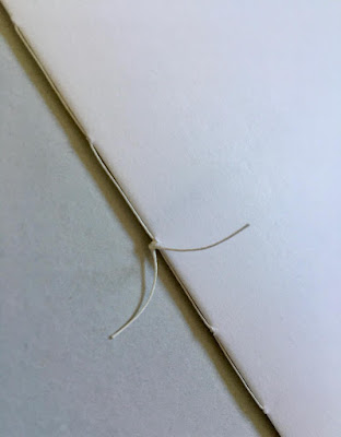
The above image shows the '5 hole sewn' binding, which is hand finished, as is the hole punching. Below shows the text fully extended:
The Offenbach Bible is enclosed within a Pergamenata paper cover which was all put into a loose cover, with the photo of the train in snow, supplied by WhnicPRESS. The other 13 artists also had their books enclosed within similar printed covers. All 14 books were then put into a slip case, see below...
Image courtesy of whnicPRESS
This was a lovely project to be involved with and many thanks to Caroline for taking the time to send me a copy of the finished publication and a handwritten note.
https://carolinepenn.com/
https://whnicpress.tumblr.com/
http://www.typecast.co.uk/
Posted by Justin Hobson 30.01.2020

Friday 13 September 2019

Victorian Blogging ...an exhibition

Yesterday evening, the opening event for the exhibition titled Victorian Blogging opened at the Conway Hall.

Conway Hall is the oldest surviving freethought organisation in the world. The only surviving ethical surviving ethical society in the world, it is named in honour of Moncure Daniel Conway (1832 – 1907), anti-slavery advocate, out-spoken supporter of free thought and biographer of Thomas Paine.
The exhibition is about the humble Pamphlet, the original type of blog. Since the invention of the printing press in the fifteenth century, pamphlets have been used for a variety of purposes – from reports of meetings and court cases to reproducing political speeches, from spreading religious messages to spreading gossip and tall stories – but their great strength lies in the weaponry of their words for political and social protest. Where previously the political elite had been able to easily keep information from the masses, pamphlets opened access to ‘ordinary people’, enabling them to begin to criticise their political and religious masters and demand involvement in the decisions that affected their daily lives.
This exhibition will showcases the key campaigns, movements and agitators represented in Conway Hall Library’s nineteenth-century pamphlet collection. It is part of the Conway Hall's National Lottery Heritage Funded project to digitise the pamphlets and make them freely available online.

This is the publication that accompanies the exhibition. It's an 18pp concertina folded publication, size is 104 x 146mm, folding out to 308 x 438mm.
It is digitally printed on our Redeem 100% Recycled 100gsm and as you can see, the result is superb. The paper is uncoated with a neutral white shade giving the publication a feel which really works with the subject and is sympathetic with the period.
Design is by Gareth Humphreys. Digital printing is by Typecast Colour in Paddock Wood.

You can read more about the exhibition which runs until the end of January here:
https://conwayhall.org.uk/event/victorian-blogging-the-pamphleteers-who-dared-to-dream-of-a-better-world/

Posted by Justin Hobson 13.09.2019

Tuesday 6 August 2019

Maghreb, Les Terrasses du Ciel

This is the exhibition catalogue of a show by photographer François-Xavier Haage. The exhibition titled "Maghreb, Les Terrasses du Ciel" (Maghreb, The Terraces of Heaven) was first shown on June 30, 1987 and shows photographs taken during trips to Algeria and Morocco between 1985 and 1987. The exhibition ran from April 30 to May 31, this year at Hang'Art in Paris.

The catalogue is a 28pp self cover publication printed on our lovely Offenbach Bible 60gsm. The size is 230x190mm, portrait and is saddle stitched. As you can see from the image above, the pages just flop and roll over beautifully.
Offenbach Bible 60gsm has a very high opacity for it's light weight, but the show through can be used as part of the design...
Click on images to enlarge
The inside back spread (below) is the key as to where the images were taken
You probably won't be able to guess, or even believe, is that it's digitally printed! The job was printed and finished by digital print company Typecast Colour, based in Paddock Wood, Kent. It was printed on their Xerox digital press and the result is superb. For a limited run, printing digitally makes a project such as this viable - and on a a material like this, which many litho printers are scared of!...just look at the print result in the detail image below...
Designers Martí Peréz Palau and Carole Haage collaborated on the design of the catalogue.

https://lehangart.eatbu.com/ 
https://www.facebook.com/events/le-hangart/maghreb-les-terrasses-du-ciel/2254560204807289/
http://www.typecast.co.uk/
Posted by Justin Hobson 06.08..2019