Thursday 14 April 2016

Coast Autumn Winter Lookbook

Coast is one of the leading occasionwear brands for women. Established in 1996, Coast now boasts 52 stand-alone stores with 184 concessions and 46 international stores. This is the latest lookbook for Autumn Winter and is an exquisite piece of literature. 
 
To begin with the cover is yummy! The cover is printed on our Astralux board - this is a one sided 'Cast Coated' board which means it has a high gloss surface and an uncoated reverse. In this instance, it's been used inside out! The uncoated reverse has been printed in a special pantone cover and hot foil blocked in gold metallic foil and used as the outer cover - the high gloss has been printed CMYK and appears on the inside front and back cover
Detail showing inside back cover, with high gloss inside:
The cover is printed on Astralux [1 sided] 350gsm. Size of the publication is 240x165mm(which is an economical size to be printed on a B2/B1 size press) 
The text material chosen was our Omnia, which would beautifully reproduce the photography with the delicate patterns and dark colours superbly - without forgetting the fleshtones ...and it looks wonderful!  The 40pp text is on Omnia White 150gsm, printed offset litho in CMYK throughout.
Click on images to enlarge
Image reproduction is paramount but it was also important that the publication also projected the tactility of the clothes and in the image above and below the detail of jewellery. An ordinary feeling silk or gloss coated paper wasn't an option, so Omnia fitted the bill perfectly
Click on images to enlarge
Omnia is a very bulky paper, so even though it is only 40pp, the Omnia 150gsm gives it a 5mm spine thickness. As with all quality publications, it is 'section sewn' and here is a close up showing the spine and end of the book with the sewn sections:
Art direction and design is by Coast. Printing, neat foiling and fastidious finishing is by Identity Print based in Paddock Wood.

http://www.coast-stores.com/
http://www.identityprint.co.uk/
Posted by Justin Hobson 14.04.2016

Tuesday 12 April 2016

Introducing Letterpress Junction

It's not everyday that a new printing company sets up and it certainly might surprise you when I tell you that this new venture only prints using Letterpress! The new press is set up in the beautiful cathedral city of Canterbury and they have some of the very latest old equipment! They are equipped with both metal and wood type, a 'Thompson British Auto Platen'  and have also acquired another press a 'Miehle V50X '.
Letterpress Junction is a partnership between letterpress printer Glenn Church and typefounder Ed Denovan, between them boasting more years experience than they want me to mention!
 
They have produced a suite of printed literature to announce their 'Jobbing Letterpress Service'
 
The posters are 450x318mm, printed in two colours
...and these 4pp cards which are 183x130mm, portrait and printed on our Modigliani Neve 260gsm
...detail below, showing all the type well bottomed out and working with the feltmarked texture of the board (Modigiani has a texture reminiscent of a watercolour paper)
Click on images to enlarge
...and another poster 450x318mm, also printed in two colours. You can see they are hanging up to dry - unlike modern printing, the inks need time to dry.
Here's a picture of their  'Thompson British Auto Platen'  in situ

 a selection of their wooden type:
and a great example showing what is called a 'printers fist'
I can only wish this intrepid printing duo the very best of luck and goodwill. They have a passion for doing what they do and unlike some "letterpressy" individuals, they don't see themselves as artists, they are describe themselves as 'jobbing printers' to serve the graphic design market ...so why not give them a job - NOW!

http://letterpressjunction.co.uk/

Friday 8 April 2016

Jane Churchill - New 2016 collection

Jane Churchill has built an international reputation for creating fresh designs specifically intended to work together to produce a wide range of looks, both contemporary and traditional. This is a promotional card for the new season's collection from the Jane Churchill collection.

The card features Holmewood, a wonderfully patterned embroidered stripe with a Suzani inspired design.
The 2pp cards are A5 (210x148mm) portrait and are printed on our Omnia 280gsm. They are printed CMYK offset litho with a special pantone grey on the reverse The colour reproduction is strong and vivid and the whole invitation has a matt, tactile look and feel.
Please just take the time to click on the image below and hopefully you'll be able to appreciate just how sharp the reproduction is...
Click on images to enlarge
Creative direction and production is handled in house at Colefax & Fowler. The designer on this project is Rachael Ashley. Print production is by Greenshires based in Leicester.

http://www.janechurchill.com/
http://www.colefax.co.uk/
www.greenshires.com
Posted by Justin Hobson 08.04.2016

Tuesday 5 April 2016

Style & Truth

London clothing company Jigsaw has unveiled its ‘Lived not modelled’ spring/summer 2016 campaign. Furthering the ‘Style and Truth’ brand message which was launched in 2014, this publication is issue number 4 and contains eighteen articles about a wide range of subjects from Linen production to an article about short story telling by novelist Sarah Butler.
 
My particular interest in this 94 page publication is the use of our Colorset 100% Recycled as a section divider, introducing a new collection for Spring Summer 2016 called Foundation.
The divider page is on the right hand side and introduces the new collection. Size is 265x220mm and it is printed in just one colour, offset litho on Colorset Light Grey 270gsm  and heavily blind embossed with the word FOUNDATION which I hope you will be able to see in the below image:
Click on images to enlarge
The reverse of the divider is printed solid in one colour and you can see the reverse of the heavy embossing here
The divider is also punched with a small hole, in the same style as a swing tag.
 
But that's not all! ...there is a "tipped in" sample of linen cloth, which has been mounted using a piece of the same Colorset:
Image showing detail of tipped in linen sample:
All in all it is a really understated, yet engaging piece of literature which has been superbly finished. One interesting facet is this 8pp gatefold insert, which has been inserted into the middle of the publication - and when I say middle I mean middle as in top to bottom or head to foot - that is a clever piece of finishing:
Editor in Chief is Ana Santi. Design is by the Jigsaw in house design team. Print is by CPI Connect with the project handled by James Howe.

http://www.jigsaw-online.com/
http://www.cpiconnect.co.uk/
Posted by Justin Hobson 05.04.2016

Saturday 2 April 2016

Jobs from the past - Number 78

Regular followers of this blog will know that my first post of every month is a "job from the past" so that I can show some of the really good work from years gone by...
Polo Ralph Lauren 2009
As part of their internal communications programme, Polo Ralph Lauren commissioned the Pink Group to create bespoke procedure manuals that could be rolled out to all their factory outlet stores across Europe. There were two manuals, each being produced as ring binders so they could be easily updated.
Image courtesy of The Pink Group
At Fenner Paper we do a very unusual product called Flaxprint Litho Printable Bookcloth. It is a genuine bookcloth which is litho printable. The cover is printed conventional offset litho in CMYK with a blue (Pantone 289) being printed as a special. Like all bookcloth, it is one sided, in this case with a lightweight paper reverse, so it can be mounted onto board to form a casebound cover or slipcase ...and as you can see, it works just perectly. 
Image courtesy of The Pink Group
The size of each binder is 310x255, portrait with a 50mm spine width. Each manual was translated into five languages and features easily updatable tabbed inserts. The covers are also hot foil blocked with a clear foil as you can see from the below image:
Detail of solid colour and hot foil blocking:
Flaxprint 74lb cover, really is an amazing product. As far as I am aware this is the only genuine bookcloth (as opposed to paper) which is litho printable and offers such amazing versatility. Having the ability to print an image and solid colours on a casebound book on a genuine cloth, rather than a paper alternative, offers a huge range of possibilities. In comparison with paper, a cloth is much, harder wearing which is why it has been used in this case. The below image shows the close detail of the weave and print detail, including reversed out white logo.
Click on image to enlarge and see the detail of the weave
....and I still happen to have one of the 'running sheets' from the job, so you can see below with the colour bars, before it was made up into a binder.
Design is by The Pink Group, Creative Director is Spencer Peppiatt.

I doubt the images are doing this project the justice it deserves but hopefully I have given some insight to this great feeling binder. If you are not familiar with Flaxprint and would like a sample, please get in touch.

http://thepinkgroup.co.uk/
Posted by Justin Hobson 02.04.2016

Friday 1 April 2016

Hobsons Beer?

Now there are some people out there who think my name is Justin Fenner! ...but actually my name is Justin Hobson. So imagine my surprise when I discovered that there is a brewery called HOBSONS. This brewer with their smart identity is based in Worcestershire and they brew many ales with interesting names such as Twisted Spire, Town Crier, Shropshire Stout and my personal favourite 'Old Prickly'
 
I am particularly impressed by this fab beermat for Old Prickly. It's actually Typewriter Art by an artist called Keira Rathbone who's featured on this blog before here. 
Detail of beermat...  
Given the date, there will be some of you who might be thinking this is another elaborate April Fool's day joke (like my now infamous Royal Wedding post!) but I can assure you it's not, just have a look at the HOBSONS website: http://www.hobsons-brewery.co.uk/
Posted by Justin Hobson 01.04.2016

Tuesday 29 March 2016

8 Lloyd's Avenue

I've written many posts on this blog which includes the phrase "...just the cover makes the difference!" The cover on this property brochure certainly does - it's simply a stunning piece of design with amazing hot foil blocking.  
The size of the brochure is A4, portrait and has a 4pp cover with a 12pp text. The cover is hot foil blocked in metallic gold foil and white matt foil. The cover is produced on our Notturno 450gsm and the text pages printed offset litho in four colour process on 'house silk' 200gsm
Click on images to enlarge
For those not familiar with the Notturno range, it is a range of black papers and boards from Cordenons. The range has a wide range of substances 90, 110, 140, 170, 200, 250, 300, 350, 390, 450 and 700gsm - a pretty big range!

A lovely finishing touch is the use of brass wire stitches
Print and the superb hot foil blocking is by CPI Colour. It's worth noting that CPI have their own 'in house' foiling facilities in Croydon, including their own blockmaking. 
Art direction and design is by London design studio Cre8te. Print is by CPI Colour with James Lager handling the project.
www.8lloydsavenue.London
http://www.cre8tedesignuk.com/
http://www.cpicolour.uk/
Posted by Justin Hobson 29.03.2016

Thursday 24 March 2016

Introducing new Crush Grape

Many of you will know about our lovely range called CRUSH from Favini. The paper is made partly using the residue from the industrial processing of crushed citrus fruit, coffee, nuts, olives, kiwi, corn, lavender and cherries. These agro-industrial "end of life" products replace up to 15% of conventional tree pulp. The range is available in 100, 120, 250 and 350gsm and the shades are natural, earthy tones and the feel of the paper is natural and tactile. We originally launched the range in 2013 and there have already been additions to the range last year.
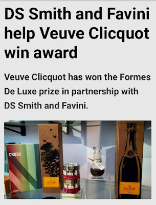
Favini has recently been working with champagne house Veuve Clicquot to develop a range of packaging using the left over grape residues from the production of their champagne, which has resulted in this new Veuve Clicquot packaging, Naturally Clicquot.
The packaging won the Formes De Luxe prize at the Luxepack exhibition in Monaco last September and you can read about the project HERE:
"Every year this prestigious prize is awarded to the most innovative and creative packaging and is selected from a group containing the best internationally renowned companies. Naturally Clicquot 3 comes from a creative reuse of byproducts from Veuve Clicquot’s own champagne production process. By implementing their vision to continually reduce their environmental impact, now means that after being pressed, the residue of grape skins can be used in a new way. Through Favini’s know-how in the creation of papers made of residues from agro-industrial productions, the skin is dried and then milled to become a raw material for the production of a unique ecological paper, saving 25% of virgin pulp. Favini introduced the residues into the paper production cycle, mixing them with water and natural fibres, which in turn reduces the use of cellulose from trees. Veuve Clicquot said the new Naturally Clicquot 3 packaging is a unique product that gives a new life to the production residues from one of the most renowned champagnes, whilst replacing a quarter of virgin fibre use. Moreover, in perfect harmony with this ecological paper, the graphics are printed using solvent-free paints and labels adhered with a sugarcane-based compound."

...and the good news is they have now applied their experiences to make a new addition to the CRUSH range - CRUSH Grape!
New Crush Grape, is available in the standard substances of the other products (100, 120, 250 and 350gsm) with the addition of an additional 90gsm with "wet strength" properties, making it suitable for labelling applications such as wine bottle labelling.
Here is the new swatch (branding by Silk Pearce)
Crush is FSC certified, GMO free, contains 30% post-consumer recycled waste and is produced with 100% green energy. The production process and the product are protected by European patent. Including the new Grape, the range now consists of ten shades.
If you would like samples, please get in contact and I'll send you a new swatch.
http://www.favini.com/gs/en/fine-papers/crush/all-about-crush/
http://www.favini.com/en/news/crush-the-grapes-and-get-paper/
http://www.favini.com/wp-content/uploads/2015/10/PPI-Paperboard-Packaging-Online-ottobre.pdf
http://www.packagingnews.co.uk/news/materials/corrugated/ds-smith-and-favini-help-veuve-clicquot-win-award-28-10-2015
Posted by Justin Hobson 24.03.2016

Tuesday 22 March 2016

Pearlfest 2016

The other week, the glamorous reception area at Pearlfisher was turned into a pop up silkscreen print studio.
Gary Parselle from The Private Press set up his temporary silkscreen print workshop, so the whole creative team got their hands dirty experiencing hand silk screen-printing for themselves.
Just using a few colours, plus a few different screens and our lovely Colorset 100% recycled paper.
...and hey presto, lots of different results
...we were asked to supply a selection of different colours from our Colorset range in 270gsm. For those of you not familiar with this collection, Colorset has 26 colours and is made from 100% Recycled fibres. All colours are available in 120, 270 and 350gsm. Amongst other uses, it's become a firm favourite with Silkscreen printers.The colours you see here are Deep Orange, Mango, Lemon, Lime, Aquamarine, Magenta, Pink Ice, Ash, Solar, Nero, White and Natural.
The workshop was run by Gary Parselle from The Private Press who's studio is based in Brighton. The event was arranged by Jenny Cairns and Managing Director Darren Foley.
Small scale events like this are such a great idea. It exposes a whole team to a shared creative experience and with a "pop up" like this, no need to travel!

www.theprivatepress.org
Posted by Justin Hobson 22.03.2016