Friday, 6 December 2013

London Centre for Book Arts (LCBA)

Last week, I was lucky enough to visit the London Centre for Book Arts (LCBA) based in East London. The LCBA has been set up by Simon Goode and is an open-access educational and resource centre dedicated to book arts. Firstly I should say that this is a fabulous space - light and airy, not a dark and dingy corner. This centre offers access to letterpress printing, hot foil blocking and binding facilities, processes which many practising designers and artists wish to utilise but where, until now, it has been difficult to access.  
There is a wide range of machinery available: a Vandercook proofing press, a F.A.G proofing press, a Korrex Berlin proof press, a Farley 25 galley proofing press, three Adana 8x5” platen presses, an Autovic platen press plus six bookbinding nipping presses, guillotine and two foil blocking presses, plus a whole range of bookbinding equipment which I couldn't even begin to describe!

The LCBA is the brainchild of Simon Goode. He has collected, paid for, stored and maintained all the equipment at the centre. After leaving university, Simon was frustrated by the fact that he couldn't continue to produce his own publications, because there wasn't a facility that he could use (not in the same way that Printclub serves the silkscreen community, for example). That frustration lead to the establishment of this new centre which is absolutely FANTASTIC!
Simon Goode - LCBA Founder and director
The LCBA ecourages collaboration and dialogue. 'Book Arts' will mean different things to different people - but the important thing is that here is centre where the skills and equipment which all contribute to the creation and production of printed objects can be experienced and learnt. There is a programme of teaching workshops which you can see here: http://londonbookarts.eventbrite.co.uk/
and an exhibition programme highlighting work being done regionally and beyond.

I suggest you have a look at the centre, make a visit, or even a group visit with friends or colleagues from work - I'm sure they'll even arrange company excursions (...I'm not a shareholder, I just think it's great!)

Details as follows: London Centre for Book Arts (LCBA) Unit 18, Ground Floor Britannia Works, Dace Road, London E3 2NQ
www.londonbookarts.org
http://londonbookarts.eventbrite.co.uk/
Posted by Justin Hobson 06.12.2013

Wednesday, 4 December 2013

Jobs from the past - Number 50

Regular followers of this blog will know that my first post of every month is a "job from the past" so that I can show some of the really good work from years gone by. It's not the first post of this month as I wrote a piece on Monday about Advent, but feast your eyes now on this fantastic job from 2005.

The Home Office Project
2005

This is quite simply one of the most stunning books that it has ever been my pleasure to have been involved with. The subject is the development of the new Home Office building which was built on a government site in Marsham Street, SW1 between 2002 and 2005. The project was a large PFI initiative and the architect on the project was Sir Terry Farrell. The book documents all aspects of the development from the history, the consortium, the construction workers, the artists etc.
Size of the book is 245x265mm. It is (just) landscape in format, has 218pp text and is section sewn and casebound. The book is printed entirely on our Omnia 120gsm with the exception of the endpapers. One of the reasons that Omnia was chosen was because of the desired use of gloss UV varnish, even on the cover (below).
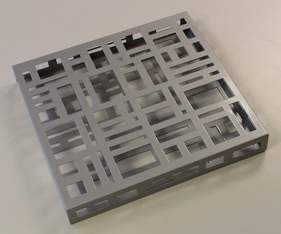
The book is presented in a solid steel slipcase.
As you can see from the following spreads, there is a wide variety of imagery used which all looks stunning. Gloss UV varnish is used sparingly and to great effect. The text on Omnia gives the book a special, tactile feel, miles away from the highly polished result that it would be on a coated paper and it has a rich, tactile, engaging feel.
...an occasional surprise, includes a gatefold
...the comic strip illustrations looks superb
Text printed pantone solid silver plus gloss UV varnish
Example of where Gloss UV varnish is used to great effect.
The cover is printed on Omnia, is matt laminated and has a gloss UV varnish. It is then mounted over a foam lined greyboard making a padded cover - feels springy and is just lovely. Hopefully the pictures below give you an idea: 
Headband and ribbon are nice touches and finish it off beautifully.
Artist Liam Gillick worked with Farrell and designed the 'brise-soleil', literally a sun-break, which adorns the main entrance. The design is reflected in the steel slipcase produced for the book, produced by AR Engineering - it's very heavy! 
Art direction and design is by Stimulate. Creative director was Stuart Cronin. Stuart has since moved on to his new company Vanilla Pod. There is a long list of photography credits, too long to list here, but the majority is by photographer Marcus Robinson. Scanning is by Bayeux and retouching by Tough Little Graphic.
 
Print was handled by Steve Lincoln at Principal Colour based in Paddock Wood in Kent. Steve has since retired, but Principal Colour are still going strong. The reproduction, print, binding et al is superb and looks just as good today as when it was produced eight years ago.

Posted by Justin Hobson 04.12.2013

Monday, 2 December 2013

An Advent Adventure

Today I received a superb little a superb little Christmas (Advent) book from London agency BOB Design. Beautifully presented, it arrived in a substantial red envelope and wrapped in glassine paper.

An Advent Adventure is 'a seasonal tale of Victorian villainy in twenty four acts' and is written by Jonathan L. Howard.
 
The size of the book is 115x85mm, portrait. It contains 200pp and is beatifully sewn in sections, with red thread, as you can see pictured below.
It features 'exposed' binding, beautifully folded sections, neatly sewn.

...and here's the clever bit, the text is made of folded, uncut sections, with the instructions to 'reveal one act per day, by tearing along the perforated top of each page' as you can see in the below picture:
On the inside of the folds is printed the story...
This is an exquisite piece of print 'even though it is not printed on lovely Fenner Paper' (as the note, below, states!) Although I don't know the actual paper used, it is an uncoated paper, around 80gsm, with a neutral white shade.

It has been produced by one of the leading book-binderies of the world, BuBu located near Zürich in Switzerland. Some years ago I visited Buchbinderei Burkhardt (BuBu) in Mönchaltorf and was amazed at the combination of the commercial bookbinding, hand bookbinding studio and digital book production. BuBu is an amazing business producing quality, long forgotten in some areas of the UK printing industry.

Design is by BOB Design. Creative directors are Mireille Burkhardt and Kieran O'Connor. Designers are Clara Goodger, Aaron Merrigan and Ed Rivers.

www.bobdesign.co.uk
Posted by Justin Hobson 02.12.2013

Thursday, 28 November 2013

CDG Literature

This is a new suite of literature produced for legal maritime specialist CDG. The publications are designed by Crescent Lodge who previously designed the CDG identity.

There is a main brochure and three complimentary, subsidiary publications.
Size for all publications is 260x220mm, portrait. The main brochure  is saddle stitched with a 4pp cover on Omnia 280gsm and 16pp text on Omnia 150gsm. The cover of the main brochure is hot foil blocked in metallic silver foil - no print at all. Not only does this approach highlight the foil but it's also a sensible budgetary option as it keeps the cover to just one process. The main brochure is printed offset litho.
 
The other three publications are all 4pp on Omnia 200gsm, printed digitally on an HP Indigo press.
The striking maritime 'mono' looking images are reproduced in three special colours, black, silver and grey which give them a depth and clarity, conveying their area of expertise in a serious and effective way.
Creative Director on the project is Lynda Brockbank and the designer is Malcolm Metcalfe. Thanks to Lynda for kindly sending me file copies.
All the publications have been printed Offset litho and digital HP Indigo by FS Moore at DG3.
 
Posted by Justin Hobson 28.11.2013

Monday, 25 November 2013

Wood it be true

Here is an exceptional new range of greeting cards from innovative card publisher, Velvet Olive. This new series of cards under the range title "Wood it be true" combines type and illustration on these fun cards. The basis of all the cards is the use of  'tree rings' in the design (these rings, or the study of rings, is apparently called 'Dendros' ...I had to look this up!) combined with wood-block style type.
The cards are 4pp, 170x120mm, portrait and are printed on our new Crush Citrus 350gsm. This is our lovely new paper from Favini, made using agro-industrial residues from the processing of citrus fruit in Italy and replacing up to 15% tree pulp. You can read about it here:
http://www.favini.com/graphic_specialities/en/crush-prd-26.php
The cards are designed by Kathryn Fletcher, who is the founder of Velvet Olive. You can see the other beautiful cards in the range here: http://www.velvetolive.co.uk/collections/new-wood-it-be-true.
Kathryn started publishing cards in 2004 and she now supplies to a wide range of shops and boutiques including Paperchase and Waterstones.

The cards are printed by Graphite Creative who are based in St Albans. Now it's just worth pointing out that although these cards have a minimal amount of print (2 colours, offset litho) Graphite, who specialise in the production of Greetings cards, have a lot of 'in house' capabilities. These include die-stamping, hot foil blocking, blind embossing, flitter (that's like glitter), film lamination and they can also do film lamination with effects. A pretty impressive range of kit!

Thanks to Kathryn for sending me the selection of cards.
 
http://www.graphite-creative.co.uk/
Posted by Justin Hobson 25.11.2013

Wednesday, 20 November 2013

Paul Smith S|S 2013

This is the gorgeous Spring/Summer look-book for Paul Smith. As you might expect from such a design lead retailer, this piece of literature is produced to the very highest standard with superb art direction, photography and print reproduction.

This look-book is A4, portrait, saddle stitched with a 4pp cover and 28pp text. The material chosen is our Omnia (280gsm and 150gsm) which gives it that dead matt, tactile feel but with great reproduction.
Art Direction, design and production is by Aboud Creative. The piece has a fantastic feel - solid flat areas of deep, dark blue work fantastically well. Lots of white space, giving the publication an airy spacious feel - it is difficult for me to say too much more about it - see the images below, they speak for the job... 
...and here's the plug for the paper!  - As you can see from these images, there is lots of colour and images with CMYK dark areas - loads of ink going down and it looks great on the Omnia, reproducing bright vibrant colours, whilst retaining detail in the dark areas (in my opinion- but I would say that wouldn't I?)
The art direction is by Alan Aboud  and the quality of the direction and photography (by Neil Bedford) is matched by the exceptional printing by Chapter Press.
 
www.aboud-creative.com
www.neilbedford.com
www.chapterpress.co.uk
Posted by Justin Hobson 20.11.2013