Monday, 7 September 2015

Studio Nicholson S|S 2015

Studio Nicholson is a contemporary design studio based in London. Creative Director and founder Nick Wakeman is obsessive about beautiful cloth and draws influences from Japanese and Italian culture. The Studio Nicholson brand embodies a total design ethos using refined materials, which is conveyed in this beautifully produced lookbook for the Spring|Summer 2015 collection printed on our Offenbach Bible.

Click on images to enlarge
Size is 240 x 190mm, portrait. It is a 24pp 'self-cover' is printed offset litho in CMYK on our Offenbach Bible 60gsm, the lightweight paper works exquisitely with the images.   
There is a combination of images printed in full colour and images in 'monochrome' but which are also printed out of CMYK.
The above image is the centre spread. This publication is saddle stitched using a white coated wire which is a lovely touch and works well. A nice, well considered finish.
The image below shows a stack of spines with the white wire stitching (staples)
The whole publication is all printed on our Offenbach Bible 60gsm ...and it looks and feels absolutely gorgeous - it flops and folds in a delightful way when handling the publication as I hope these images demonstrate:
Art direction and design is by JJ Marshall Associates. Creative Director is Jethro Marshall.

Excellent print and finishing is by Principal Colour based in Paddock Wood, Kent.
Posted by Justin Hobson .07.09.2015

Friday, 4 September 2015

New Flora swatch

We have a brand new swatch for our Flora range manufactured by Cordenons in Italy!
Click on images to enlarge
Flora is available in nine natural shades and it comes in a sensible range of weights: 100, 130, 240 and 350gsm (160gsm is also available from the mill).
For those not familiar with Flora, it is a part recycled paper (with FSC accreditation) with natural, deliberately visible, inclusions and fibres. It has a tactile, rough feel and has a character all of it's own! Below is detail showing the inclusions (and a pencil for scale!):
It really is a lovely range. Muted natural colours and excellent printability. Here are some previous projects which have used Flora to great effect:
http://justinsamazingworldatfennerpaper.blogspot.co.uk/2015/06/baines-fricker.html
http://justinsamazingworldatfennerpaper.blogspot.co.uk/2014/08/lower-mill-estate.html

If you would like one of the new swatches, just drop me an email: justin@fennerpaper.co.uk

http://www.gruppocordenons.com/en/home.html
http://www.cordenons.co.uk/
Posted by Justin Hobson 04.09.2015

Wednesday, 2 September 2015

Jobs from the past - Number 71

Regular followers of this blog will know that my first post of every month is a "job from the past" so that I can show some of the really good work from years gone by...

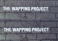
The Wapping Project - 2000
The Wapping Project was, until recently, an arts project housed in the old Wapping Hydraulic Power Station (built 1890). The building originally housed steam operated boilers to generate electricity in the early days of electrification. The works was decommissioned and mothballed in 1977. The building was converted and reopened by the Womens Playhouse Trust (WPT) which is a charity and under the management of Jules Wright, it was opened as an arts centre in October 2000.
Click on images to enlarge
The project included exhibition space in the basement and SHED54, where pieces of original equipment were still in place. On 14th October the bar and restaurant WAPPING FOOD was opened, unusually with an all Australian wine list!

This is the promotional concertina folded leaflet, produced to give the information about events and exhibitions. Size is 225x696mm folding down to a finished size of 225x89mm.
Click on images to enlarge
Many readers of this blog may be unfamiliar with the contents of the panel on the left hand page - the 'reply card' or often 'reply paid card' which was the way that people used to get onto a mailing list before the days of the internet and email! (...and well before QR codes!)
It was printed in CMYK plus a special - a metallic antique gold on one side and one colour gold, reverse. It is printed on our Neptune Unique 160gsm, which has reproduced images superbly.

The superb photography is by John Spinks.from East Photographic. Amazing images.
Art direction and design by Frost in London. Creative director was Vince Frost who now runs Frost in Australia and the designer is Sonya Dyakova, who now runs her own studio in London.

It was printed offset litho by FS Moore in London. Richard Davey handled the project and he is now Sales Director at Leycol.

Sadly the building was sold to developers in 2013 and the project has subsequently closed - a great loss for London and the Wapping area.

http://www.thewappingproject.com/
http://www.frostdesign.com.au/
www.atelierdyakova.com
http://east.co/artists/johnspinks/
http://www.mooreprint.co.uk/
http://www.leycol.com/
Posted by Justin Hobson 02.09.2015 

Thursday, 27 August 2015

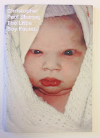
Little Boy Found

This limited edition publication is the second of two publications produced by London based photographer  and artist Christopher Paul Sharpe. This is the second book titled The Little Boy Found (the first book is called Little Boy Lost) contains images edited by Lu Bowan, with each of the photographs relating to the theme of ‘lost and found’ ...a very eclectic mix.
Click on images to enlarge
Size is 210x148mm (A5), portrait with a 4pp cover printed on Omnia 200gsm and 36pp text printed on Omnia 120gsm. 
The book is digitally printed on an HP Indigo press by Gavin Martin Colournet. Omnia is suitable for use on HP Indigo presses if it has been 'sapphire coated'. The colours are strong and punchy and the whole book has a matt, tactile look and feel, the effect of which is every bit as good as litho.
The book is 'singer sewn' with a white thread which is a perfect detail that just adds to the overall effect of this beautifully produced little book.
Outside back cover:
Design is by Studio Thomson, Creative directors are Mark Thomson and Chris Thomson. The book has a limited print edition size of 150 copies. Books are for sale online and also at Foyles. Print and finishing is by Gavin Martin Colournet.

...and for your interest, both books were recently featured as book of the day on the 'self publish be happy' website: http://www.selfpublishbehappy.com/2015/04/book-du-jour-the-little-boy-lost-the-little-boy-found-by-christopher-paul-sharpe/

http://christopherpaulsharpe.com/
http://www.studiothomson.com/
http://www.gavinmartincolournet.co.uk/
Posted by Justin Hobson 27.08.2015


Tuesday, 25 August 2015

787 and you...

At the end of last year, Virgin Atlantic launched their Boeing 787 Dreamliner. Currently they operate four 787s and by the end of 2015, there will be nine in the fleet.

This is a big commitment for the airline and in order to make sure that all crew and staff are 'on board' and fully informed about the new aircraft, they produced this charming little book.
Click on images to enlarge
Size of the booklet is A6 (148x105mm) portrait, with an 8pp cover and 20pp text and is saddle stitched. The cover is hot foil blocked in metallic gold foil, with a filigree type pattern. The below image shows the amazingly detailed hot foil blocking.
The materials chosen for this book is our Stardream from Cordenons. The 8pp cover is foiled on Stardream Bronze 285gsm and the 20pp text is printed offset litho in two colours on Stardream Crystal 120gsm.
The materials were specifically chosen with the aircraft in mind. The Stardream Bronze used for the cover is an excellent match for the materials used on the outer shells of the seats (in Upper Class) and the text pages are a good match for the pearlescent finish used in Upper Class bar area.
A point I should like to make here is just how important a piece of employee engagement literature, such as this, can be. Many organisations rely on powerpoint presentations, pdf's or even photocopied sheets for their internal communications. By producing this type of well designed, engaging publication, Virgin Atlantic demonstrate their professionalism and dedication to staff involvement.  
There are some superb 'thumbnail' illustrations on the text pages:
The brass wire used for the saddle stitching works beautifully with the gold foiling on the cover. A well considered detail....
If your finisher or printer tries to tell you that they can't get different coloured wire, or if they seem reluctant to use anything other than steel, I suggest you get in contact with these people: http://www.primewire.co.uk/
Above is 'birds eye' view showing 8pp cover. On the right hand side, there is an image showing the three stitches on the inside (centre spread). Generally, a project with an 8pp cover requires the text to be stitched with a 'security stitch' in the middle of the book and the text is then trimmed to size. The 8pp cover is then attached with two stitches in the normal position.

Below image shows the detail of the outside back cover.
Design is by the Virgin Atlantic in-house Design Team and Nik Lusardi is the Design Manager. Designer on this project is freelance designer Val Kildea and thanks to Val for sending me a copy.

Print production is by Hampton Printing based in Bristol and they have made a stunning job of the foiling and print.

http://www.virgin-atlantic.com/gb/en/the-virgin-experience/787.html
http://www.hampton-printing.co.uk/
http://www.vtype.co.uk/
Posted by Justin Hobson 25.08.2015

Thursday, 20 August 2015

Nocturne Spring/Summer

Nocturne is a London brand of integrated jewellery and ready-to-wear. Nocturne is gaining a global cult following for innovative handwork in definitive shapes with eclectic colour compositions. Nocturne has been under the creative lead of Catherine Howkins since 2011 working from their design studio based in Dalston, East London.
This is the lookbook from the last Spring/Summer collection. Size is 290x225mm. It is produced on our Marazion Ultra, with a 4pp cover on 135gsm and 20pp text on 115gsm.
Click on images to enlarge
Many of the spreads alternate between full spreads or images per page or just overlapping and on some spreads there's even a completely blank page which creates a luxurious feeling of space.
 The deliberately lightweight feel allows the pages to flow freely and to sit flat, allowing for perfect read-overs. The material is perfectly chosen with the Marazion Ultra having a lightweight, matt look and feel but with the images reproducing beautifully with great clarity and detail. It's a very engaging piece of literature. You can see from the image below, the way it flops and flows easily:
A lovely feature is the black wire used for the saddle stitching, a quality touch.
Art Direction and design is by Everything in Between, Creative partners are Arran Scott-Lidgett and Sarah Carr. Print is by Push (superb fleshtone reproduction)

http://e-i-b.com/
Posted by Justin Hobson 20.07.2015