Monday, 10 October 2016

Ten Trinity Square

Ten Trinity Square is one of London’s landmark buildings overlooking the Thames at Tower Hill. Built over a century ago to house the Port of London Authority, it has now been re-developed by the Reignwood Group as an exclusive arrangement of residences, a luxury hotel and private club, all in association with Four Seasons. This book tells the story of the historic building and has specifically been produced to be on display in the atrium of the building on a specially made plinth designed by Daniel Weil of Pentagram.
 
This is certainly the largest book to have ever appeared on this blog and is probably the most impressive I have ever had the pleasure of handling! The size of the book is 615mm square, yep that's right, well over half a metre! As a result, it's more than a bit tricky to photograph, so my apologies - click on the images to bring them up to a better size.
Unsurprisingly, this outsize book is casebound and is covered with Saffiano, which is first grade calf leather with a classical grain.  The cover is embossed and hot foil blocked in metallic gold foil.
As you would expect, there are endpapers. Because of the size of the books, the endpapers have to be over 1.2 metres long!
This is the Chinese language version, which is covered in red, there is a matching English language version which I'll write about another time.  In total there are two editions and twelve copies were produced. Six in English and six in Chinese - an extremely rare and limited run!
The book has 92pages, all printed on Omnia White 200gsm. Omnia is a very bulky paper and that's what a project like this needed, with the size of each page being over half a square metre!

The image reproduction throughout the publication is simply wonderful with both the four colour images, the cool grey pantone special and solid blacks looking great.

Click on images to enlarge
The bookblock (just the pages) itself is 13mm thick. Below is a detail showing the ribbon.
To give a sense of scale, below are two images with a pencil and a 12inch ruler by the book, which gives you some idea...

Superbly detailed hot foil blocking on the leather is beautiful.
Below is a detail showing the spine. The book is 'quarter bound' with cloth around the spine. Don't forget, the spine you are looking at is 35mm! Rather than using a bookbinding grade greyboard, the internal structure of the case is supported with a material called Promolyte. This is a lightweight alloy which was used to increase the strength, stability and integrity of this huge leather cover. 
Brand identity for the whole project, including this book, is by Pentagram. Design is by John Rushworth and Joe Stephenson. You can see more about the whole project here: http://www.pentagram.com/#/projects/121368
 
Original photography is by Richard Bryant. CGI's by Hayes Davidson and AB Concept.
 
Printing is by Gavin Martin Colournet. It is a stupendous book with stunning production values and it has been produced impeccably. If I was saying anything other than that, then the whole reason for producing this staggering publication to appear on display in the building, would be null and void. It is simply the most stunning book ever!
 
http://www.tentrinitysquare.com/
http://www.reignwood.com/
http://www.pentagram.com/
http://www.gavinmartincolournet.co.uk/
Posted by Justin Hobson 10.10.2016

Friday, 7 October 2016

The Lagom Collections 2016

Lagom Design produces beautiful greeting cards and stationery. Founded in 2007 by Kelly Hyatt, he named the company Lagom after the Swedish word that describes the feeling when something has ‘perfect balance’ or is ‘just right’ ...and in fact that word perfectly describes the literature for this years' collection.
 
The reason that this is 'just right' is that it is a whole catalogue, which in a small package, gets across the wide range in an elegant and stylish way. The range features work from a wide range of artists and designers, including the renowned Hanna Werning.
Click on images to enlarge
The finished size is 145x100mm, folding out to 600x290mm, making it a 24pp in total. You can see above the way it opens, below you can see the concertina folding out.
 The below images show both sides laid out flat:
Click on images to enlarge
It is printed on our Offenbach Bible 60gsm and it looks and feels gorgeous. The format, combined with the paper, gives the publication a light, malleable, tactile feel with excellent reproduction.
...it flows and flops beautifully.
Design is by Kelly Hyatt and as you can see from his happy note (below) ...Offenbach Bible Rocks!
Print was handled by Printoff, based in Lancashire.

Have a look at their gorgeous range of cards (many of them printed on our papers) giftwrap, notebooks and stationery.

https://www.lagomdesign.co.uk/
http://www.printoff.co.uk/
Posted by Justin Hobson 07.10.2016

Wednesday, 5 October 2016

Justin becomes a Liveryman...

Regular, eagle eyed, readers of this blog may remember that last year I became a Freeman of the Worshipful Company of Stationers and Newspaper Makers, which I wrote about here. Yesterday I was "cloathed" and became a Liveryman, which is basically a full member of the Company. The term livery originated in the specific form of dress worn to retainers of a nobleman and then by extension to special dress to denote status of belonging to a trade. So when I was "cloathed" yesterday I wore a livery gown as you can see in the picture below:
The Stationers' originally dates from 1403 and in 1557 it was awarded a Royal Charter becoming a Livery Company. You can read more about the Stationers' online here or you can speak to me!
http://justinsamazingworldatfennerpaper.blogspot.co.uk/2015/10/justin-becomes-freeman.html
Posted by Justin Hobson 05.10.2016

Monday, 3 October 2016

Jobs from the past - Number 84

Regular followers of this blog will know that my first post of every month is a "job from the past" so that I can show some of the really good work from years gone by and here's one from 2007.

Barclays Silver Incentive 2007

This project was produced for Barclays Financial Planning in 2007, just one year before the financial crash in 2008. This is an internal promotion sent to financial advisors with an incentive that if they hit a certain target, they would get a luxurious weekend away in Venice. This rather lavish internal promotional item is designed to look like a medieval map....
The size of the map is A1 size (594x420mm) folding to A4. It folds in such a way that it creates a gatefold, so that an imitation wax seal is applied to seal the document.
Detail of the seal, which is a simplified version of the Barclays eagle.
The below image shows the map closed, half open and then fully open...
The map is printed on our Flora Avorio 130gsm. Flora is a  it is a part recycled paper (with FSC accreditation) with natural, deliberately visible, inclusions and fibres. It has a tactile, rough feel and has a character which was just perfect to reproduce this old map.
Click on images to enlarge
The below image shows the reverse of the map, complete with aged water stains and wear marks.
Below are details of the map, which gives you an idea of the inclusions in the paper.

An interesting little adjunct to this story is that Flora is manufactured by an Italian paper mill called Cordenons, which is based close to Venice. In the 15th Century a group of Gutenberg's pupils established themselves in Venice and from then on, the centre of the Venetian empire became one of the most important areas for printing and publishing in Europe. By the 18th century, the records of the Senate of the Doges of Venice show there is documentary evidence of the manufacturer 'Cartiere Di Cordenons' noting the high esteem in which the mill was held. It has been widely known as "the paper mill of the Doges" since then and the winged Lion of Venice is still proudly the company's motif.
It's an excellent use of the right paper for the right job. You could have printed all the specks and flecks along with the aged look onto a white sheet of paper but it would never have had the impact or dramatic feel as this piece has achieved.
 
Design was 'in house' at Barclays Bank. Printing is Offset Litho in CMYK and it was printed by The Midas Press, who went bust in 2011 and who I wrote about here.
 
The project was handled by David Crompton at Midas Press, who sent me some copies and I still have his kind note.
David Crompton is now at Dayfold Printers in Dorset.
Posted by Justin Hobson 03.10.2016

Tuesday, 27 September 2016

Going Public: International Art Collectors in Sheffield.

Comprising five exhibitions and an international summit, Going Public brought an array of outstanding twentieth century and contemporary art to sites across the city of Sheffield last year. The shows ranged from a focused exhibition on Marcel Duchamp, to a survey of leading contemporary Chinese artists, and a presentation at Sheffield Cathedral including Jake and Dinos Chapman.
The project draws on collections from four leading art patrons: Nicolas Cattelain (London), Dominique and Sylvain Levy (dslcollection, Paris), Egidio Marzona (Berlin) and Patrizia Sandretto Re Rebaudengo (Turin).

This is the literature to accompany the project....

The main catalogue is an A5 (210x148mm) portrait format and is saddle stitched. It has a 4pp cover on our Colorset Deep Orange 120gsm (Colorset is 100% Recycled). There is a bound in 8pp section which is printed on a house gloss coated paper (I don't know which one) and this is untrimmed, so left folded at the top - see pic below- so you have to fold it up to reveal the images....
The Colorset cover featuring four die cut circles from the brand identity. Printed on an HP Indigo press using white ink which looks great against the deep orange.
The 28pp text is printed on our Redeem 100% Recycled 80gsm, which combined with the 120gsm cover giving it a nice floppy feel.The paper is uncoated with a neutral white shade giving the publication a feel which really works with the images and most importantly, the pages which are purely type.
A survey of leading contemporary Chinese artists, including Cao Fei, Yang Jiechang, Jiang Zhi, and Zhou Tao drawn from the DSL collection formed part of the project.
An interesting feature is that the booklet has a square spine, even though it is saddle stitched. This is a development by a company called Watkiss and their Spinemaster machine. For certain jobs it is a perfect way of getting a sqaure spine without having to glue bind.
The accompanying 4pp invite is on Redeem 100% Recycled 315gsm. Size is A6, portrait and is also digitally printed on the HP Indigo.
...and the summit booklet (below) is also A6 format. 4pp cover on Redeem 100% Recycled 315gsm with a 4pp text on Redeem 100% Recycled 130gsm, saddle stiched.
The identity for the project is by Dust, a multidisciplinary design collective based in Sheffield, founded by Patrick Walker. Designer of this literature is Ashleigh Armitage.

Print is by ASAP Digital who are also based in Sheffield.

You can read more about the project here: http://du.st/articles/going-public/

http://du.st/
http://www.asap-digital.com/
Posted by Justin Hobson 27.09.2016

Friday, 23 September 2016

UOP BA Hons 2016


Some readers may remember that back in the summer I went to New Designers exhibition, I also mentioned that the UOP course showcase publication which was piled up at the show was printed on our paper and that I would write about it at a later date ...well, here it is!

Size is 240x130mm, portrait and is perfect bound. It has a 4pp cover with a 64pp text and has a quality look and feel. The cover is printed (offset litho) in a stunningly bright fluorescent green which just pops off the paper!
...and as I hope you can see from the image below, the cover has been beautifully hot foil blocked in a white gloss foil.
The paper used is our Starfine White, which is an uncoated paper with a tactile feel. The cover is printed on 240gsm and the text is printed offset litho in CMYK throughout on 115gsm. This paper paper has excellent opacity for it's weight.
www.joshuaboughtondesign.com
Here are just some of my favourite spreads...
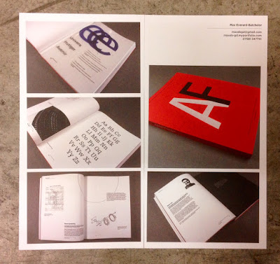
www.maxeb-gd.myportfolio.com
www.zoefouracredesign.tumblr.com
From the New Designers show, I particularly remember Thomas Mcleod's project Top Five most visited underground stations:
www.tmcleod.squarespace.com
www.dorsapedaridesign.tumblr.com
As well as showing the work of the students, it shows some insights into the life and times on the course. the spread below shows the trip to Berlin:
...and the annual charity pub quiz below...
Below is the credits page on the inside back cover:
 
The 64pp text gives the publication a 6mm spine:
The catalogue design team is Harry Lewis-Irlam and Ryan Robinson. Print is by Bishop Printers in Portsmouth, who have made an excellent job of the print production.

The academic team is Sarah Houghton, Andrew Denham, Mike Harkins, Dan McCabe, Estelle Taylor, Sandra Zellmer, Michael Wamposzyc.

www.portsmouthgraphicdesign.co.uk
http://bishops.co.uk/
http://www.port.ac.uk/
Posted by Justin Hobson 23.09.2016