Thursday, 2 November 2017

Jobs from the past - Number 97

Regular followers of this blog will know that my first post of every month is a "job from the past" so that I can show some of the really good work from years gone by...

Design for Life - DixonBaxi 2004
DixonBaxi is the studio established by Simon Dixon and Aporva Baxi in 2001. Having both worked at Attik, they set up their new studio as a partnership, to be just the two of them, working without the trappings of a large agency. Throughout the 2000's, they consistently delivered exciting and innovative design, art direction and branding, predominately for television. Their work for MTV, SciFi Channel, Five and Formula One was high profile and lauded within the industry.

Rather than produce big flashy studio brochure, the two partners deliberately produced a modest portfolio piece to show the work that they had recently produced for clients with a title reflecting their philosophy: design for life
The size is A6 (105x148mm) landscape and is perfect bound with a lovely, neat, square 4mm spine. The cover is printed on StarFine 200gsm, printed in the bright magenta.
The text is made up using "French-folded" sections on Offenbach Bible 50gsm which gives it a sensational light feel and flows beautifully in the hand. 'French Folding' is where the folded edges are on the fore-edge of the book, as in the picture below:
Of course 'french - folding' uses more paper - in fact double the amount! - so this job is actually in conventional terms a 64pp text, which is actually 32x 4pp French folded sections, so in actuality its 128pp! ...but of course it's on 50gsm, so it's only a 4mm spine.
The spreads are sublime, the information pages printed in solid magenta and the project with images from their projects over the previous three years...
Bearing in mind much of the imagery used is from RGB screen grabs, the reproduction is really good, below is the work for MTV...
...and on an introduction spread, no words or image at all - just magenta space!
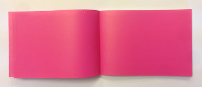
...you can see the way the text pages rolling and flopping over, flowing superbly.
It was printed offset litho by FS Moore in London and they really made a superb job of it. Richard Davey handled the project and he is now Sales Director at DG3/Leycol.

Design is, of course, by DixonBaxi. Simon and Aporva absolutely loved the finished piece and Simon was kind enough to send me file copies and a handwritten note...
DixonBaxi are now a much larger agency with 30 staff, still headed by Simon and Aporva, so sadly as is the way with bigger studios I no longer have regular contact with the two founders but it's great to have played a small part in the studio's development and history.

http://dixonbaxi.com/
http://www.leycol.com/
Posted by Justin Hobson 02.11.2017

Monday, 30 October 2017

Make Equality Reality

Equality Now is a global charity dedicated to improving the lives of women by achieving legal and systemic change to safeguard women’s rights and improve their position in society.

Skype plays an integral role in how Equality Now connects with its activists and experts across the globe. Communications consultancy Sunshine was asked to help profile the charity's extraordinary work.
Collaborating with acclaimed international photographer Stephanie Sinclair and Sunday Times journalist Jessica Brinton, Sunshine created a hardback coffee table book, which brings to life the inspirational stories of Equality Now’s work around the world.
This casebound book is covered in bookcloth with a dustjacket. Size of the book is 330x240mm, portrait.
It has a 32pp text printed on our Omnia 150gsm. For those readers not familiar with Omnia, it is an uncoated paper with a surface treatment. What this means is that it feels like an uncoated paper but because the surface treatment minimises 'dot-gain', the print result is much more like that of a coated silk or gloss coated paper.
Click on images to enlarge

The reproduction of the images by Stephanie Sinclair is simply stunning...
Click on images to enlarge
Even though the book only has 32pp, because Omnia has a high bulk, with the section sewing, it means that the spine is 6mm thick, but the text pages still flow and flop well....
Detail image below show the thread in the section sewn sections
As you can see from images, some of the photography is quite dark, but there is no loss of detail, which is what can often happen printing on a true uncoated paper. As you can see from the detail image below, the reproduction is simply stunning.
Art direction is by Simon Holmes, design by Michael Ives. Images courtesy of V11 photo agency.

Printing is by Ambrose Press. Jonathan Savory handled the project. Particular care has been taken over the repro - as with all projects for photographers, there is detail in the images which can only be truly appreciated by the photographer and it is the skill of the printer to be able to listen and interpret these comments in the finished printed job. Not always easy to do but this is a beautiful piece of printed literature.

https://www.equalitynow.org/
https://thesunshinecompany.squarespace.com/make-equality-reality
http://www.ambrosepress.co.uk/
Posted by Justin Hobson 30.10.2017

Friday, 27 October 2017

The Art of Ping Pong 2017

The Art of Ping Pong is a collaborative art concept that creates fun and colourful ping pong artworks raising a huge amount of money for charity.

Yesterday evening was the Exhibition launch party at the Protein Gallery in London EC2 and it was a great party. In particular I must give special thanks to Fullers for sponsoring the beer - Frontier Lager ...lovely!

What began life in 2013 as a ping pong party, organised by design agency Fivefootsix, it has gone on to raise over £15,000 for BBC Children in Need, The Alzheimer’s Society and the Roger Federer Foundation. Each of the contributing artists is sent a plain wooden table tennis bat which they then use for their artworks, with some truly stunning results.

...and here is the man himself, organiser Algy Batten (on the right), speaking to Paul McCarthy of Colt Press who sponsored the printing of the catalogue.
The Art of Ping Pong brand now extends to ping pong posters, t shirts, mini tables and of course stunning bat artworks. In the five years they have partnered with some of the world’s most exciting artists, such as: Anthony Burrill, Malika Favre, Noma Bar, Supermundane, Hattie Stewart, Jean Jullien, Crispin Finn, Jordy van den Nieuwendijk, Jake and Dinos Chapman, Alan Kitching, Mr Bingo, just to name a few.
...and here are some of my favourites from this year's selection:
Mr Bingo
Sam Taylor
Benedict Radcliffe
Yoni Alter
Mr Doodle
A particular treat was 'live drawing' by Mr Doodle, who in a matter of minutes, covered one of the special Art of Ping Pong tables in artwork ...watching him work was astounding:
Click on images to enlarge
...and here is the finished table:
...and here I am with Mr Doodle himself:
The party was great but of course NOW is your opportunity to join in the auction and actually make a bid. There are 27 artists in the line up and they're also auctioning off two prototypes of our Art of Ping Pong mini tables that have been painted by Charlie Oscar Patterson and Mr Doodle. The table legs fold inwards so that the tables can be hung directly on the wall as art pieces. What’s not to love?!
The charity this year is Trekstock a charity providing social and practical support to young adults in the UK facing cancer in their 20s's and 30's

You can bid here: http://www.theartofpingpong.co.uk/bats DO IT NOW!
  
Of course I should also mention that we supplied the paper for the lovely 36pp catalogue, printed by Colt Press, but I'll write about that another day...  
The 27 artists are: Yoni Alter, Mr Bingo, John Booth, Emma Brewin, Fred Butler, Alison Carmichael, Sebastian Cox, Mr Doodle, Marina Esmeraldo, Emily Forgot, George Hardie, Nigel Howlett, Kev Munday, Neasden Control Centre Nous Vous, Zuza Mengham, Hattie Newman, Charlie Oscar Patterson, Stina Persson, Saskia Pomeroy, Pref, Benedict Radcliffe, Gemma Shiel, Adam Simpson, Sam Taylor, Louis Trew and Celia Washington.

http://www.theartofpingpong.co.uk/
Posted by Justin Hobson 27.10.2017

Tuesday, 24 October 2017

The Marylebone

The Doyle Collection is a carefully curated collection of eight Irish family-owned luxury and urban hotels. Each hotel has a strong identity that is closely connected to its location. Set in the heart of London, minutes from Oxford Street, The Marylebone has 252 beautifully appointed guest rooms and suites, a host of facilities and an 18 metre swimming pool! 
Branding agency, Brave New World  undertook an extensive re-branding exercise of the parent brand and of each individual hotel. The work included everything from strategy to interior design, website, high-profile advertising campaigns and the literature for each hotel.
The size of the brochure is 260x185mm, portrait and is saddle stitched. The cover is printed on an uncoated 300gsm board.
Click on images to enlarge
The brochure is saddle stitched using three stitches:
 
The text material chosen was our Omnia, which would beautifully reproduce the photography with the rich interiors and exteriors superbly  ...and it looks wonderful! The 20pp text is on Omnia White 150gsm, printed offset litho in CMYK throughout.
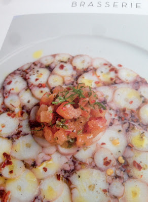
Image reproduction is paramount but it was also important that the publication also projected the tactility of the interiors and in the image below the detail of the brasserie and the reproduction of the culinary fare.  An ordinary feeling silk or gloss coated paper wasn't an option, so Omnia fitted the bill perfectly.
Click on images to enlarge
Omnia is a very bulky paper but with a 20pp text and the saddle stitching, it lays nice and flat allowing each spread to be enjoyed without 'fighting' against the binding.
Branding and creative direction is by Brave New World. The designer on this project is Caroline King. Print by 21 Colour, based in Glasgow.

https://www.doylecollection.com/hotels/the-marylebone-hotel
http://bravenewworld.co/
http://www.21colour.co.uk/
http://www.carolinelking.com/
Posted by Justin Hobson 24.10.2017

Thursday, 19 October 2017

Beatrice Warde Memorial Lecture 2017

Regular followers of the blog know that I often write about talks or lectures that I think might be an interest to readers of this blog and this is just one of those events...

This year’s Beatrice Warde Memorial Lecture is being delivered Elizabeth Ellis and David Marshall from The Counter Press. They will talk about founding a private press and design studio rediscovering the joy of designing and making purely for pleasure, and the importance of learning to slow down. They’ll be discussing their work, influences and the challenges of balancing self-initiated side projects with the demands of commercial work.
Despite the very traditional methods and equipment, they aren’t complete luddites and continue to work with a growing list of clients who appreciate craft and attention to detail but require more modern means, allowing them to combine a love of letterpress with their branding background. The projects and approaches might be varied – from rebranding the iconic London restaurant Bibendum to a new publishing imprint.
So, if you want to hear about the ups and downs of getting a design business established and pick up some interesting and useful pointers - GET A TICKET. Don't delay.

The talk is on November 2nd at 7pm and there are still tickets available on Billetto:
https://billetto.co.uk/e/the-beatrice-warde-memorial-lecture-the-counter-press-elizabeth-ellis-david-marshall-tickets-209852

Tickets are only £12.50 (concessions available). The talk is being held in the Bridewell Hall at the St Bride Foundation in London EC4 on Thursday 2nd November starting at 7pm.

http://www.sbf.org.uk/
http://www.sbf.org.uk/events/the-beatrice-warde-memorial-lecture-the-counter-press-elizabeth-ellis-and-david-marshall
http://www.thecounterpress.co.uk/
Posted by Justin Hobson 19.10.2017