Thursday, 6 September 2018

Colorset - 8 new colours

For those of you not familiar with Colorset, it is our range of coloured text and cover papers which is 100% recycled and more competitively priced than some other well known brands of coloured paper! A few years ago we started to bring in our Colorset range in 350gsm, so we now have ALL colours in 120gsm, 270gsm and 350gsm - all in B1 size (700x1000mm).
We have now further developed the range with 8 new colours, making this a collection of 36 shades.
The new shades include five light shades and three deep shades. The new shades are Blush, Warm White*, Glacier, Storm, Hopsack*, Charcoal*, Spearmint* and Deep Blue (Note: four of the new shades with an asterisk* are virgin fibre)
The Colorset brand identity and swatch design was created by The Chase, some years ago but it's still going strong! Creative director on the project was Harriet Devoy and the designer was Monica Pirovano.

If you would like the updated swatch, please drop me an email and I'll pop one in the post
justin@fennerpaper.co.uk
Posted by Justin Hobson 06.09.2018

Monday, 3 September 2018

Jobs from the past - Number 107

Regular followers of this blog will know that my first post of every month is a "job from the past" so that I can show some of the really good work from years gone by and here's one from 2009...

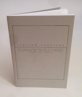
Italian Textiles
This project is a collaboration between the Italian Trade Commission and Central St Martins with the aim of promoting the use of Italian fabrics by fashion students. The students were invited to inspiration from a specific period in British fashion history - the 1960's - when the majority of men, irrespective of their social position, wore a tailored suit as normal day wear.

Size of the brochure is 210x148mm (A5) portrait and is singer sewn. The cover is printed on a 350gsm cover material from that other "Hull based" paper merchant! The 28pp text is printed on our Colorset White (100% Recycled) 120gsm 
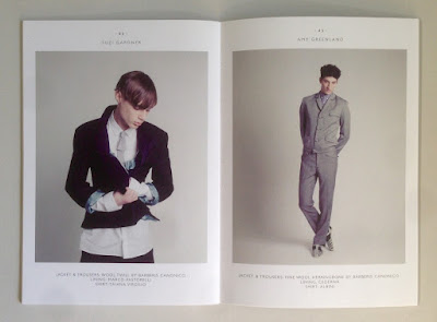
Colorset has a rough, tactile "toothy" surface but it still prints extremely well, as you can see from the images with fabrics and fleshtones below...

Click on images to enlarge
The excellent printing is by London based printer, Push, who are based in Bermondsey. The singer sewn binding is superbly executed....
Creative direction is by Rob Meyers at RBPM Studio. Photography is by Pelle Crepin.

Posted by Justin Hobson 03.09.2018

Thursday, 30 August 2018

Long & Waterson

 ...just the cover makes the difference!

Here's an interesting project which is well worth a look, because of the high quality finishing processes and the way the cover is used to add to the quality and feel of the whole project.
This 48pp brochure is for a new residential development but the content is much more that of a magazine with eight writers and articles about the area, the architecture and the geography. The finished size is 380x285mm, portrait and is singer sewn. The 48pp text is printed on an uncoated paper.
The cover is printed on our Crush, Corn 250gsm and in fact it isn't printed using ink, it is simply hot foil blocked in a black gloss foil on both the front and back cover.
As you can see from the image below, the foiling looks amazing and you can see the subtle specks in the paper.
Quality of the singer sewing is superb
Design is by Ignite, who are based in Hoxton Square in London. You can read more about the project here.

Print is by Gavin Martin Colournet.

https://longandwaterson.com/
http://ignitetv.com/
https://www.gavinmartincolournet.co.uk/
Posted by Justin Hobson 30.08.2018

Thursday, 23 August 2018

Beyond the Great Wave #2

Katsushika Hokusai (1760–1849) is widely regarded as one of Japan’s most famous and influential artists. He produced works of astonishing quality right up until his death at the age of 90. This new exhibition held last Summer at the British Museum covers the period of the last 30 years of Hokusai’s life – a time when he produced some of his most memorable masterpieces. The exhibition was a phenomenal success resulting in most tickets being sold out.

This is one of the private view invitations produced for the launch of the exhibition last May. The invitation is 8pp, A5 portrait and feature Hokusai’s artwork.
This invitation is printed on our Omnia 320gsm, which is a very bulky board with a subtle, natural texture and tactile surface. Reproduction is superb with the all the detail retained in the images. 
The images as reproduced on each of the invitations:

Click on images to enlarge
Below show the invitations laid out flat, front and back
Click on images to enlarge
Below is a birds eye view of the invitation:
Design is by the in-house team at the British Museum, headed by Ann Lumley.

The invitation is printed by Park Lane Press. It is printed offset litho but Park Lane print using a 'waterless' process that eliminates the water or dampening system used in conventional printing. The specialist plates allow the printed dot to be held more securely preventing any unwanted movement of ink and minimising dot gain to create a sharper image in ultra fine definition. They are one of the very few printers who champion the use of this waterless process.
 
Posted by Justin Hobson 23.08.2018

Monday, 20 August 2018

Hello Woolwich!

London printer, Gavin Martin Colournet have moved from their East London home in Hackney, south of the river to new premises in Woolwich. Although I just described them as 'new' the printworks is actually in a refurbished Victorian works, which I believe formed part of the old Royal Dockyard in Woolwich. It is a lovely building with period features, so I made a visit to see for myself...
The new pressroom looks great and they've decorated their Heidelberg XL102 printing press with some very lively graphics. Below is a picture of Gary Bird, modelling the new press...
Period features have been lovingly maintained in the refurbishment of the building.
Their 'Printlounge' customer suite has been safely installed and their HP Indigo digital press has much more space than at their previous premises.

A positive move and great to see a London printer staying in London rather than moving out of town.
https://www.gavinmartincolournet.co.uk/
Posted by Justin Hobson 20.08.2018

Thursday, 16 August 2018

Made of Manchester

Two years in the making this 'Made of Manchester' photo book documents more of Manchester from the photographer, Paul Grogan's, perspective. A limited first edition of only 100 copies, the book is beautifully designed by Manchester based branding and web agency Think Design Manchester.

With a foreword by local Celebrity Chef, Andrew Nutter and a contribution from local wordsmith and poet, David Scott who said of the book, “With a rich history that’s been well-documented I thought I had seen Manchester from every angle; and that’s where the charm of Paul’s photography lies. He captures our city with a fresh perspective; through his use of light, shadows and composition you get to see some our most famous landmarks with an unobserved twist; there are also plenty of surprises in how striking he can make Manchester’s deep-seeded urban decay."
Click on images to enlarge
 
Size of the book is 210mm square and is perfect bound. There is a 4pp cover on Omnia White 280gsm with a 96pp text on Omnia, White 150gsm.
The content has some wonderful spreads, with some wonderfully cropped images and a combination of colour and mono images.
Click on images to enlarge
The 96pp text is bulky but the book still flows well with the pages turning easily.
The 96pp text on 150gsm gives the book a 10mm spine
The book is printed and finished by Manchester's own Galloways Print. As it is a limited edition of just 100 copies, it is printed digitally on their Heidelberg Linoprint, which is a toner based digital press and the result is superb. 
Paul Grogan lives and works in the Manchester area, having also graduated from MMU in 1997 - so he is a Mancunian through and through, giving him this unique perspective of the city. You can buy the book here.
 
Posted by Justin Hobson 16.08.2018

Tuesday, 14 August 2018

De La Warr Pavilion Events Guide

This is the latest events guide for the De La Warr Pavilion. The De La Warr pavilion is on the seafront in Bexhill in Sussex and is an iconic modernist building by the architects Erich Mendelsohn and Serge Chermayeff which opened in 1936. Following a major renovation in 2005, the pavilion hosts many shows, exhibitions and cultural events.
The finished size is 210x111mm, folding out to 420x553mm and is a 20pp concertina letter fold (I had to look that up!). Side view....
This guide is printed on our StarFine White 130gsm which means that rather than feeling like the vast majority of mass produced leaflets printed on a bit of 115gsm silk or gloss, this has real character and value. The design is such that the listings of the exhibitions, activities and events are all listed on one side (outside)
...with the inside being reserved for a full size image of the exhibition.
As you can see from the image above, it's very dark but has reproduced superbly on the StarFine 130gsm. The project is printed offset litho in CMYK by Banbury Litho.

The new De La Warr identity and design (including the website) is by Playne Design who have studios in London and Hastings. Creative Director is Clare Playne. Print production is handled by Simon Hack. You can read more about the creation of the new identity here:

https://www.dlwp.com/
http://www.playnedesign.co.uk/
http://www.banburylitho.co.uk/
Posted by Justin Hobson 14.08.2018