Thursday, 26 August 2021

Graphic Lines

Founded in 2015 by Mark Leeds and Duncan Johnson c-ll-ct-v-ly is a London based Design and Research studio working in all media and especially editorial and moving image. As a studio project. they publish these limited edition magazines, using unpublished, reordered, remade, refound or newly created artworks. They are a quick-fire collaboration between the studio and a range of creatives ...an easy consumed, visual hit.
Graphic Lines is Number 10 by Iain Follett. Iain is based in Leicester and is Design Director at design agency Six. In 2015 he started the @mintneverhinged feed on instagram to showcase his collection of Graphic Stamps. From the exposure of the Instagram feed he collaborated with Blair Thomson (@graphilately and Creative Director at Believe In) and Unit Editions on a book called Graphic Stamps showcasing the best from their collections.
Mint Never Hinged came off the back of years spent collecting design ephemera. Way before I set up @mintneverhinged I had painstakingly been collecting and researching stamp design in order to archive the forgotten and unknown designers behind them and to put out a publication of my own on the subject matter. However in 2015 we were approached by Unit Editions to publish a book on our collections and being big admirers of Unit Editions, Tony Brook and Adrian Shaughnessy we couldn’t resist. Even that book, as full as it is, merely scratches the surface of the collection as a whole. Iain Follett
Size is A5 (210x148mm) portrait, saddle stitched. It has a 4pp cover, cut short at 105mm width with a 16pp text and a 4pp insert which is full height but 75mm wide.
The text is not a straightforward 16pp, the centre spread is actually a 8pp, which is stitched in but folds up as you can see above and below...
The cover is printed on our Colorset Solar 120gsm in black only. Text is printed on Gardapat 13 Kiara 150gsm. For readers not familiar with GardaPat 13, it's a fully coated paper but it really does have a dead flat MATT surface. There are many papers on the market which profess to be matt - some which incorporate the word matt in the name, but aren't! Apart from the high quality matt surface, this paper has an extraordinarily high bulk - this 150gsm text with a thickness of 195mics. If you would like to read more about the bulk, you can read it here.
The insert sheet (above image) is printed on Offenbach Bible 80gsm.
All materials are digitally printed using an HP Indigo digital press and the results are superb, beautifully showing the artworks. As many readers will know, many materials have to be "Sapphire Treated" to work successfully on HP Indigo presses, however both the text (Gardapat 13) and insert (Offenbach Bible 80gsm) are both printed without sapphire treatment ..and it's superb!
Printing and finishing, including the lovely white wire used on the saddle stitches (above) is by WithPrint who are based outside Bristol in Rooksbridge.
Concept and Design is by Mark Leeds and Ellie Rose. Font used is Neue Haas Grotesk from Commercial Type

Posted by Justin Hobson 26.08.2021

Monday, 23 August 2021

Mulberry Mongoose Cards

Mulberry Mongoose is a jewellery workshop, located on a well-trodden elephant path in the remote Zambian bush. Local craftswomen make all the jewellery by hand using natural materials from the South Luangwa valley. This simple 4pp piece of literature is used as an information leaflet promoting the jewellery and tours of the workshop to the tourists who stay at the local safari lodges in the local area. These simple cards and price tags are used in the shop adjacent to the workshop, where they sell directly to the tourists who stay at the local safari lodges in the local area.

Size of the cards is 85 x 55mm and they are printed Offset Litho on our lovely Flora Anice 350gsm.
Flora is a part recycled text and cover paper with a deliberately recycled look and feel with specks and inclusions, so it looks deliberately flecky and specky.

The price tags are a teeny 60 x 20mm and have a little perforation, so that the price can be written on in pen but removed by the customer if it is being given as a gift - that is a really lovely touch.

Click on the image below and you'll see the detail...
Click on images to enlarge
Flora is produced with 30% post consumer de-inked waste, together with 60% of virgin FSC pulp 10% cotton fibres, which gives the paper a wonderful tactile feel.

The Mulberry Mongoose brand identity and design is by Matt Morgan. There is some other superb collateral they've produced, which I shall write about soon. Print is by Identity Print.

https://mulberrymongoose.com/
https://mattmorgan.io/
http://www.identityprint.co.uk

Posted by Justin Hobson 23.08.2021

Friday, 20 August 2021

JetCard Welcome Pack

JetCard by Air Partner is ranked as Europe's most flexible jet card programme. A seamless private jet membership programme with fixed hourly rates, guaranteed availability and global reach with as few as 24 hours notice. This is the exquisitely produced welcome pack provided to new members of this exclusive club - people who can legitimately be described as the 'jet-set'.
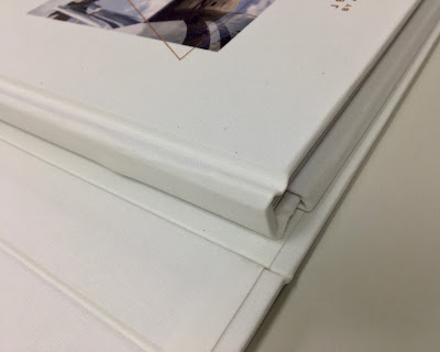
The welcome pack is a solid 'casebound' folder using our Flaxprint, Litho Printable bookcloth, which is digitally printed with a CMYK image and is also hot foil blocked in copper foil. Size is 230x350mm with a depth of 35mm.
When the folder is opened (see below pic) there is a book and an insert tray on the right hand side.
The book is held in place by the back cover inserted into a internal sleeve fixed on the box as I hope you can see in the image below...
Click on images to enlarge
The side tray, which is black foam infill tray, topped with a black Flockage covering. Inserted is a beautiful Smythson luggage tag and a metal membership card made from solid copper.
The book itself is 216mm square and is a 'casebound' hard cover using our Flaxprint, Litho Printable bookcloth, which is digitally printed with a CMYK image and is also hot foil blocked in copper foil (Foilco Ref: 6734).
As stated, both the box and book cover is printed on a very unusual product called Flaxprint. It is a genuine bookcloth which is litho printable, however in this instance it has been successfully digitally printed (for the first time that I'm aware of) using a dry toner, Ricoh C901 digital press. Like all bookcloth, it is one sided, in this case with a lightweight paper reverse, so it can be mounted onto board to form a casebound cover or slipcase ...and as you can see from the images above and below, it works just perfectly.
Click on images to enlarge
The 32pp text is digitally printed on Neptune Unique, White 160gsm on an HP Indigo press and is layflat bound, as you can see from the image below...
It looks just perfect.
I must show more about the amazing result on the Flaxprint 74lb cover...

It really is an amazing product. As far as I am aware this is the only genuine bookcloth (as opposed to paper) which is litho printable and also digitally printable (dry toner) offering such amazing versatility. Having the ability to print an image and solid colours on a casebound book on a genuine cloth, rather than a paper alternative, offers a huge range of possibilities.
The fantastic quality of the digital reproduction on this genuine cloth is really impressive...
Click on images to enlarge
In comparison with paper, a cloth is much, harder wearing which is why it has been used in this case. The images above and below show the close detail of the weave and print detail,
The excellent print and superb finishing and attention to detail is by Typecast Colour based in Paddock Wood, Kent. The below image shows the welcome pack in a custom white corrugated outer box for courier delivery...
Creative direction and design is by Fetch.

https://jetcard.airpartner.com/
http://www.typecast.co.uk/
Posted by Justin Hobson 20.08.2021

Tuesday, 17 August 2021

Alga Carta - updated range

It was in October 1995 that we were first appointed as the exclusive distributors for Alga Carta from the Favini paper mill in Italy. Favini pioneered the use of alternative fibres in the 1990's and Alga Carta was their flagship brand, which even got a mention on BBC Tomorrow's World on television here in the UK!
The range has now been refreshed and the mill have produced these lovely new swatches...
Alga Carta is manufactured partly using algae (seaweed)  harvested from the fragile marine areas, combined with FSC certified fibres. Algae blooms in abundance in certain areas, clogging up the flow of water in lagoons and endangering the eco-balance of the area.
Images showing the Algae and the dredging of Algae from the Venice lagoon

As you can see from the image below, the paper has specks which are visible in the sheet and is actually micronized algae - which contains Chlorophyll. Unlike other papers with inclusions, these specks are less noticeable and doesn't affect images or interfere with type so much. 
Click on images to enlarge
To complete the story of sustainability, Alga Carta is recyclable, biodegradable and made using EKOenergy from a hydro electric power station. Alga Carta carries the FSC™ certification, even though like the name implies it has no impact on forests.
It is available in two shades, White and Ivory. If you would like one of these lovely new swatches, please email me: justin@fennerpaper.co.uk

Posted by Justin Hobson 17.08.2021

Friday, 13 August 2021

Wood Sage & Sea Salt

Jo Malone is a London based company renowned for British bespoke fragrances for Women, Men and the Home. This is the superb promotional collateral for their Wood Sage & Sea Salt fragrance... 'Escape the everyday along the windswept shore. Waves breaking white, the air fresh with sea salt and spray. The mineral scent of rugged cliffs, mingling with earthy sage'
The finished size is 150mm square and is concertina folded out to a size of 900x150mm and you can see the birdseye image below:
Click on images to enlarge
The below image shows both sides laid out flat...
It is printed on our Kaizen 350gsm, which is a dead flat matt uncoated text and cover range with a surface treatment and the result is it prints amazingly but still doesn't feel like a coated paper.
Kaizen has a high whiteness and an excellent bulk. It isn't just CMYK that prints superbly. As you can see from the image below, solid flat colours reproduce superbly.
On a simple piece of collateral like this, the attention to detail makes all the difference. As you can see from the detail image below, it has been properly and beautifully creased. Perfectly square and perfectly executed...
Art direction and design is by the Jo Malone design team. Superb repro, print and finishing is by CPI Colour with Mark Pitman handling the project.

https://www.jomalone.co.uk/scents/woody/wood-sage-sea-salt
https://www.cpi-print.co.uk/
 Posted by Justin Hobson 13.08.2021

Tuesday, 10 August 2021

Repeat Repeat

https://www.freelandsfoundation.co.uk/Freelands Foundation was founded by Elisabeth Murdoch and is based in Camden, London. The Foundation’s mission is to support artists and cultural institutions, to broaden audiences for the visual arts and to enable all young people to engage actively with the creation and enjoyment of art.

The multidisciplinary group exhibition, Repeat Repeat, was curated by Freelands Foundation Creative Director Henry Ward. The show investigates ideas of daily practice and repeated routine while addressing questions relating to domesticity, parenting and occupation. It features internationally recognised artists alongside creative individuals who would not necessarily call themselves artists.

This is the literature produced to support the exhibition. The portrait format publication which consists of a 4pp cover on Colorset Flint 270gsm with a 24pp text printed on StarFine White 150gsm.
The cover on 100% Recycled Colorset Flint 270gsm is beautifully debossed and hot foil blocked in matt white foil.
The text pages are printed offset litho in CMYK on our StarFine White 150gsm, an uncoated text paper which has printed beautifully, with the solid and the images looking brilliant.
Birdseye image below...
The saddle stitching is nice and neat and the job sits nice and flat.
The publication is designed by Utile. Creative Director is Nicholas Duggins and designer is William Lyall. Print is by Identity Print, based in Paddock Wood with Paul Martin handling the project.

You can read more about the exhibition here.

https://www.freelandsfoundation.co.uk/
https://utile.studio/
http://www.identityprint.co.uk/
Posted by Justin Hobson 10.07.2021