Wednesday 3 July 2024

Jobs from the past - Number 176

Regular followers of this blog will know that my first post of every month is a "job from the past" so that I can show some of the really good work from years gone by - this project is from eleven years ago. 

Peter Doig - No Foreign Lands - August 2013
This is the literature and private view invitation for a major exhibition titled 'No Foreign Lands' devoted to one of Scotland's most internationally-renowned artists working today Peter Doig. Works from the previous ten years were shown in this first major exhibition in the country of his birth held at the Scottish National Gallery in Edinburgh.
The invitations are printed on our Omnia 320gsm duplexed to make 640gsm ...and as you can see, beautifully reproduces the detail of the scene in Trinidad. This invitation is a 2pp, portrait, A5 (210x148mm) format and is printed offset litho.
 
To go with the show, there is a superb 8pp concertina leaflet, size 235x170mm printed on our Omnia 120gsm.
The colour reproduction is strong and vivid and the whole publication has a matt, tactile look and feel which works perfectly with the artwork. 

...for interest, here is a close-up of the duplexed invitation which is around 1mm thick:

The invitation is printed in one colour (blue) on the reverse and the name DOIG is hot foil blocked in matt white foil. Omnia foils beautifully as it has a high bulk and flattens out leaving the foiled type, smooth and slightly de-bossed.

You can find out more about the exhibition here: https://youtu.be/_IKe529_2kM

Design and Art direction is by Freytag Anderson, a Glasgow based studio run by creative partners Daniel Freytag and Greig Anderson.

Printing is by J. Thompson Colour Printers in Glasgow

https://www.nationalgalleries.org/

https://www.freytaganderson.com/

https://jtcp.co.uk/

Posted by Justin Hobson 03.07.2024

Friday 28 June 2024

Just a little walking log...

As it says on the cover, all walks start somewhere , where they end up is up to you... This is a superb little publication designed and produced by Teresa Coles McGee. Teresa wanted a small log book to record her walks but couldn't find anything available that was what she wanted, so she created her own! The result is this really pleasing little journal which looks and feels just right.
The size is A6 (148x105mm) portrait, with a 4pp cover on our Crush Olive 250gsm and a 48pp text on our PaperWise Natural 70gsm, made using 100% agricutural waste and completely unbleached. The materials really work together well giving the notebook a purposeful look and feel.

They are very simply produced, digitally printed in just black and saddle stitched. An excellent example of how good a job can look with well thought out design, well considered materials and minimal print.

Posted by Justin Hobson 28.06.2024
Friday 21 June 2024

Print by Veronica Ditting in Japan

The work of creative director and designer Veronica Ditting is being shown at a new exhibition in Kyoto, Japan. The show is titled ‘Folio Folio Folio: Print by Veronica Ditting’ and it celebrates her influential career so far by bringing together a variety of her print work from the last 20 years. The content includes a variety of printed materials, including books, magazines, other publications, and exhibition designs. The custom made exhibition stands designed for this exhibition are set up at different heights and orientations, allowing the works to be viewed from various perspectives, thereby highlighting the materiality and three-dimensionality of the works. The printed materials collected in the gallery create a landscape, highlighting the essential characteristics of Veronica's work as a collective.
Image courtesy of Veronica Ditting
The exhibition – curated by London-based design historian Emily King – spans two decades of print projects including her time at The Gentlewoman where she worked for 12 years together with other influential printed matter for the world’s biggest brands.

The custom made exhibition stands have all been made by hand at Studio Veronica Ditting in London using SUMO White 1.5mm which is made by Favini and supplied by Fenner Paper!
Image courtesy of Veronica Ditting
Kyoto ddd gallery was formerly DNP Duo Dojima (ddd), a gallery specializing in graphic design and graphic art, established in 1991 in Dojima, Osaka, for the cultural activities of Dai Nippon Printing Co., Ltd. The name was changed to the current name when it moved to Kyoto in 2014. ddd Gallery seeks to expand the boundaries between graphic design and art by reading the new era trends and discovering new forms of creativity through exchange and dialogue.

‘Folio Folio Folio: Print by Veronica Ditting’ runs until 28 July 2024. 

Posted by Justin Hobson 21.06.2024

Monday 17 June 2024

Sorry Paper...


Last week, the Independent Paper Show came to London. On Wednesday and Thursday the Crypt on the Green in Clerkenwell was packed full of companies showing all the best and latest in paper, printing and finishing. The IPS London show has been brought to the UK and is hosted by Foilco in partnership with the  three Swiss companies who originally founded the show: Bubu, Lorenz Boegli and Sonderegger.
I hope these images will give you a flavour of the event...
We are very pleased with our stand where we had a minature tree with scrunched balls of paper, following the event's theme of "sorry paper..."
Our friends from the Reflex paper mill in Germany were on a stand next door to us, showing their label papers, superbly demonstrated on bottles of beer!
...and Reflex were giving away copies of the wonderful Euro24 wallchart printed on Zeta Hammer, Brilliant 120gsm.
Below is Lorenz Boegli giving a talk about screenprinting and about his inventing his revolutionary technique to print RGB
Below are the stands of the original founders of the show: Bubu, Lorenz Boegli and Sonderegger.
As well as the three original founders,and Foilco there were stands from Antalis, Dreyer Kliche, Fedrigoni, GF Smith, James Cropper, Manifattura Del Seveso, Mondi, Procop, Reflex Paper, Slater Harrison, Winter & Co. 

It was a really worthwhile event, absolutely packed for most of the time and was amazingly well organised by Foilco. Hopefully this will become a regular event in the calendar. Our thanks to everyone that participated but especially to Foilco.

Posted by Justin Hobson 17.06.2024

Thursday 6 June 2024

Euro 2024 Wallchart

As we count down to the opening match of the 2024 Euros, I’m pleased to show our typographic wallchart for recording the action. The tournament kicks off on 14th June at the Allianz Arena in Munich when the hosts Germany take on Scotland. 24 teams play in 6 groups. 

This is the latest in a series of beautifully designed typographic wallcharts which have all been designed by David Coates, who is an independent  designer and also a member of the ISTD (International Society of Typographic Designers) and my thanks to Dave for making it all happen - a perfect way to combine his love of type and football!
Click on images to enlarge
The flat size is 880 x 315mm. To accompany the wallchart, we have produced a ready made "sweepstake kit" so that studios, offices and businesses can easily run a sweepstake and get everyone involved.
Click on images to enlarge
The wallcharts are printed on the lovely Zeta Hammer, Brilliant 120gsm, which aptly enough is manufactured in Germany! ...by the Reflex Paper mill in Düren, which is just outside Cologne, where many of the matches are being played

For those not familiar with Zeta Hammer, it has a fantastic aesthetic, a tactile feel and a really interesting look, here is a detail of the finish...
We have sent out a number of these wallcharts to our football loving design clients, but if you want to make absolutely sure you get a copy, you can email me justin@fennerpaper.co.uk ...as long as you promise to use our papers! 
Posted by Justin Hobson 06.06.2024

Wednesday 5 June 2024

World Environment Day 2024

Today is World Environment Day. This event is the United Nations day for encouraging worldwide awareness and action to protect our environment. Since it began in 1974, the event has grown to become a global platform for public outreach that is widely celebrated in over 100 countries. Above all, World Environment Day is the "people's day" for doing something to take care of the Earth. That "something" can be local, national or global. It can be a solo action or involve a crowd.
What better day for me to remind you of a material we launched to coincide with COP26.

PaperWise is an entirely new concept, a range of paper and board manufactured from agricultural waste - this is the stems and leaves left over the harvest and which is often left in the field or burnt. There are additional benefits: PaperWise is produced in factories in India and South America that make a big difference to local communities. Investments are made in education, infrastructure, and healthcare while the manufacturing process is geared toward safety, zero waste, and preserving local ecology.
Lifecycle analysis (LCA) conducted by the University of Amsterdam (IVAM) has concluded that the environmental impact is 47% lower than FSC-paper made from trees and 29% lower than recycled paper...
The natural shade, manufactured from 100% agri-waste is also completely unbleached and has lower Co2 emissions than virgin fibre or recycled papers.
The PaperWise range is held in stock by us at Fenner Paper in Tonbridge. European stocks are held in Rotterdam and include a wide range of packaging boards and lightweight papers with food approval, copier paper and even corrugated boards. 

You can read more about this new range HERE and about how this fits with the UN sustainable development goals...
The paper and boards are suitable for all print work and packaging, with a one side coated packaging board up to 465microns.

PaperWise founder Peter van Rosmalen features on this 1 minute video here:
If you would like samples, please drop me an email justin@fennerpaper.co.uk or have a look at our website.
Posted by Justin Hobson 05.06.2024

Monday 3 June 2024

Jobs from the past - Number 175

Regular followers of this blog will know that my first post of every month is a "job from the past" so that I can show some of the really good work from years gone by - this project is from nine years ago. 

Royal Academy Summer Exhibition invitation - 2015

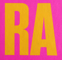
For 247 years, the Royal Academy Summer Exhibition has offered a snapshot of contemporary art – and this year’s exhibition is a riot of colour, variety and discovery with over 1,100 works. This year, the exhibition is co-ordinated by Michael Craig-Martin RA – a leading artist of his generation and the teacher who nurtured the talents of Gary Hume, Sarah Lucas and Damien Hirst. This year's choice was made from over 12,000 entries!

The Summer Exhibition is the world’s oldest open-submission exhibition: its earliest exhibitors included the likes of Reynolds, Constable and Turner.

This is the invitation to the private view on the 3rd June. In line with the exhibition's "vibrant summer of colour" theme, it is a very striking and colourful invitation.
Click on images to enlarge
Size is A5 Portrait (210x148mm). As I hope you will be able to tell from the image above, it has a pearlescent effect and this is because it is printed on Stardream Crystal, which is our pearlescent and metallic range ( ...in fact it's the largest pearlescent and metallic range on the market!). What many people don't realise is that printing a solid colour onto a pearlescent board results in the solid having a pearlescent effect - this is because litho inks are transparent.
The invitations are printed offset litho using pantone special colours (three colours) and it really does convey a riot of colour.
The Stardream Crystal 120gsm has been pasted onto a 1500micron mount board which has then been edge coloured in the matching vibrant yellow. The result is superb.
Art direction and design is by Constanza Gaggero, at her London studio Gaggero Works. Print is by Basingstoke based Liquorice Press.

https://www.royalacademy.org.uk/
http://www.gaggeroworks.co.uk/
http://www.theliquoricepress.co.uk/
Posted by Justin Hobson 03.06.2024