Friday 19 February 2010

Charlotte Building W1

This is a lovely example of a casebound book with a paper over board (hardback) cover.

The book was comissioned by property developers Derwent PLC. Design is by Made Thought.

As you will see from the spreads below they have used white mannequins in the empty buildings to great effect. Art direction is superb. Sorry I don't know who the photographer is. The black foil blocking on the cover is very effective.

Size of the book is 210x260mm with a 36pp text.

The book is produced using our Omnia 150gsm which gives it easily enough bulk for a 8mm spine (which you really need for a casebound book). This project has had a heavy "sealer" varnish put all over the sheet which gives it an unusual reflective, slightly pearlescent, finish as opposed to the normal flat, matt tactile finish that Omnia has - an unusual treatment which is effective with the images used in this job.

The job was printed by Team Impression based in Leeds and thank you to Simon Bucktrout for sending us a copy.

http://www.charlottebuildingw1.com/
http://www.madethought.com/
http://www.team-impression.com/

Thursday 18 February 2010

Ultrabold No7

I have just received my copy of the Autumn edition of Ultrabold magazine, which is the Journal of the St Bride Library - if you don't know about St. Brides - see http://www.stbride.org/

In the past Fenner Paper have supported this publication (by supplying discounted material) although sadly this sponsorship has now come to an end. However this latest edition is certainly worth a mention.

The publication is designed by Simon Loxley and is published by the Friends of St Brides. In this issue, there is a very interesting article by Kath Tudball and Julia Woollams from Johnson Banks about the new "Save the Children" identity (spread below)
There is also a fascinating article about Yulia Brodsakya's designs using the rather forgotten art of "paper rolling" or "quilling" for The Guardian.

Print is sponsored by Principal Colour.
The journal is a 40pp self cover, 190x265mm Portrait and is printed on StarFine White 130gsm

It's worth mentioning that this publication is free to friends of St Bride - so why not look into joining - might be cheaper than just buying the books!

http://www.stbride.org/
http://www.johnsonbanks.co.uk/
http://www.artyulia.com/
http://www.principalcolour.co.uk/

Tuesday 16 February 2010

Mantisworld Ethical T Shirts

Now to many of you this might look like a normal saddle stitched lookbook, but as with most of the projects I work on there's a bit more to it!

Astroman (a design company based in London) wanted a "tactile" material that had more of an uncoated feel but that wouldn't let down the brightness of the colours. The factory that makes these clothes is in the shadow of Mount Kilimanjaro in Africa and they use 100% certified organic cotton and are a pioneer in ethical manufacturing. The reproduction of the vivid African colours was an important part of the brief. Importantly this catalogue is mailed out internationally, so postal weight was an overidding consideration.

The eventual choice of materials combined the tactile Omnia as a cover but only in 200gsm (which is very bulky) with our lightweight Marazion Ultra in 90gsm which might sound very light but it works extremely well and also means that an extra saving could be made because it could be saddle stitched as opposed to perfect bound.

Here are some spreads:
The job is 4pp cover with a 72pp text and the size is 200x260mm and for your interest, the job weighed just over 200grams which kept it well within the desired postage band.
Print was by Principal Colour.
Designed by Astroman. Creative Director on the project was Doug Hurcombe. Designer on the project was Katerina Karamallaki and thank you for the lovely note...

Friday 12 February 2010

Holmes Wood is 10!

Last night I was invited to the Holmes Wood tenth birthday party and book launch at Ransome's Dock in Battersea.
What a great party! Lots of people were there that they had worked with over the last ten years. Clients, suppliers, friends and family made up the really lovely mix of people that I met. Founders Lucy Holmes and Alex Wood have established a serious company with a great reputation and a fantastic body of work but also managed to keep a real sense of fun (... for example, see their lovely aprons on this blog!)

The book called "First Ten" is a comprehensive record of their work for large clients large and small. Superbly written by David Gibbs with much of the photography by the prolific Phil Sayer. Although the material (Heaven 42) wasn't from Fenner Paper, I can easily forgive that oversight as the material is perfect for the job!

The book is pictured below with the now world famous red bag (see their website and you'll see what I mean).
Above are some spreads from the book although it hardly gives you a good idea of the quality of the publication! It has been beautifully printed by Gavin Martin.

Below are some of my truly awful pictures from the party but it gives you a flavour of the evening...


Thank you for a lovely evening


Thursday 11 February 2010

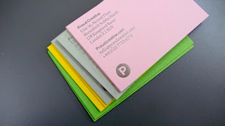
Proud to use Colorset!

Proud Creative are a design company based in London who have just refreshed their identity using our Colorset 100% recycled paper range. As you can see from the pics, a really clean identity, nice crisp foiling and a lovely range of colours!


Design by James Greenfield at Proud Creative. The cards were produced by Generation Press.

Tuesday 9 February 2010

Newsletter with a history

This is the new publication for internal communication at the Historic Royal Palaces. It has been designed in a newspaper format but not as a broadsheet which is sometimes difficult to handle, so it is an unusual but easy to handle size of 430x280mm. It is only 12pp and loose bound, so it is concertina'd into thirds which makes it much easier to distribute.
It is printed on our Redeem 100% Recycled 100gsm which adds to the "newspaper" like feel but as you can see from the centre spread below which shows the "scientific" work of the "Royal ceremonial dress collection" the paper doesn't disapoint!
Although this publication is a small run of less than 1000 and produced entirely for internal distribution, it is an excellent example of well designed and thoughtfully produced literature working really well to engage the audience.

Design is by Steve Burgess
Print is by BKT Print management.

Monday 8 February 2010

Digital just gets better and better!

This is a brochure produced for a conference hosted by the Prince's Foundation. It is A4 format and saddle stitched. It looks and feels great and yet the run was only 200 copies!

The job was printed on an Indigo digital press by Good News Press and the print result is fantastic. It is printed on our Omnia (FSC) 4pp cover on 150gsm and 20pp text on 120gsm.

Although Omnia was not developed for digital, it has been "sapphire treated" by the printer. This treatment is often applied to more unusual papers and provides a "key" so that the inks (which are different to litho inks) work on the paper surface.
As you can see from the spread below, the result is awesome!
Design is by Valerie Kildea at The Prince's Foundation and thank you for the lovely note.
Val kindly sent me a copy of the new Typographic Circle mgazine called Circular Sixteen and even though the paper was sponsored by another paper merchant (...based in Hull, guess who?), here's some pics, as it's very nice piece of work! There are articles about Lippa Pearce, Spin, Design Project to name but a few.

Have a look at www.typocircle.co.uk and join and get your own copy!