Monday 17 May 2010

Soccer Aid - World Cup 2010 Poster

Now some people might think this is a bit of a strange one to see on my blog as it's not actually printed on our paper BUT it's for charity...(and i'm hoping my reward will be in heaven)

This is a world cup poster which is being sold to raise funds for Soccer Aid, which is a UNICEF charity that raises money to help children around the world and is endorsed by Robbie Williams amongst others. http://www.socceraid.org.uk/.
This A1 size poster has been conceived and designed by David Watson/Trebleseven design.

The Poster was produced in collaboration with G&B Printers in Feltham and is printed on Phoenixmotion.

If you fancy one for the studio, please buy one - all poster sales will benefit Soccer Aid. To get your own copy, please contact david@trebleseven.com

http://www.socceraid.org.uk/
http://www.trebleseven.com/
http://www.gfsmith.com/
http://www.gbprinters.co.uk/
Posted by Justin Hobson 17.05.2010

Friday 14 May 2010

Hero #2

Here is the second issue of the new zine called Hero which is aimed at bringing fresh new international male model talent to the fashion world - "THE FACES OF TOMORROW'S FASHION"

Designed, edited and published by duo James West & Fabien Kruszelnicki under the imprint Fall Press. As before, the list of photographers is too long to list unfortunately but there are some really excellent images.

Size is 210x275mm, portrait, perfect bound with a 4pp cover and 98pp text. It is printed on our lovely uncoated StarFine White 270gsm and 115gsm. As previously, print is by Push.

Here are samples of just a few spreads:
Posted by Justin Hobson 14.05.2010

Thursday 13 May 2010

Tactical A.U. Identity

Here's a lovely new piece of identity work by D8 in Glasgow. Tactical A.U. is a new artists support and ‘creative realization’project which aims to develop, support and advance the artistic ambitions of Scottish based artists both here in the UK and abroad as well as continue to work with some of the most exciting and challenging artists in Europe.
The letterheads are on Colorset Ash 120gsm, printed 1 colour litho and "Microdot foil". The business cards are on Trojan Whiteback 400gsm with black foil and 'Microdot' foil and 3mm forme cut radius corners.

This is a really good example of mixing materials with great effect. With many of projects I work on, people are obsessed about having everything matching (including self ashesive labels!) Sometimes this is necessary but quite often if the identity is strong enough, mixing the materials used can be a really positive asset to the identity.
Print and foiling by Ian Stopford at IST http://www.istprintingservices.co.uk/

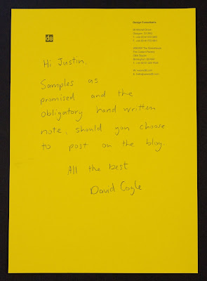
Design by David Coyle at D8 in Glasgow and thanks for the lovely note as well (you'd never guess that their letterhead was on Colorset Solar!):
http://www.weared8.com/
Posted by Justin Hobson 12.05.2010

Tuesday 11 May 2010

London Design Festival 2010

This is an invitation to a press conference in May announcing the plans for the 2010 London Design Fesitval.
The A4 size invitation (top left hand section of above) folds out to an A1 size poster (as above). It is printed on our Offenbach Bible 60gsm, which as regular readers of this blog will know, not only prints exceptionally well but folds beautifully and the paper has a lovely "rattle" in the hand. Perfect for a job like this. We also supplied bright red C4 envelopes for them to be sent out in.

Design is by Pentagram.
The designer is Beatrice Blumenthal from Domenic Lippa's team. Production by Kevin Purdy and print is by Principal Colour. Printed in two colours, black and red.
http://www.londondesignfestival.com/
http://www.pentagram.co.uk/
http://www.principalcolour.co.uk/

Wednesday 5 May 2010

Repitition is Truth

This book catalogues a series of 14 paintings by the British artist Rachel Howard, which Damien Hirst commissioned for his Murderme art collection. The series is based on the Stations of the Cross but is also a broader commentary on the universality of human rights abuses and people’s capability for cruelty towards each other. Including shots from the artist’s studio, the book also gives an insight into Rachel Howard’s practice.

The size of the book is 190mmx320mm. It has a 56pp text printed on our Marazion Ultra 150gsm. The 20 illustrations also have a gloss UV varnish applied.

The publication has a genuine bookcloth cover with black foil text. A particularly nice touch is a deboss logotype on Page 1 of text, very subtle but a really nice touch. The excellent print production is by Push (www.push-print.com)

Design is by Emma Scott-Child and published by Murderme.

http://www.damienthirst.com/
http://www.othercriteria.com/

Tuesday 4 May 2010

Jobs from the Past - Number 8

Regular followers will know that my first post of every month is a "job from the past" so that I can show some of the really good work from years gone by and here's one from three years ago.

Per Una Lookbook - Autumn 2007

This is a very luxurious looking publication published for Marks & Spencers fashion label, Per Una.

The size of the job is 230x305mm Portrait. It uses Flockage Colours 400gsm in Anthracite on the 4pp cover, which is "heat de-bossed" and foiled in pink. The catalogue has an Italian theme with the photography having been done in Venice. The lovely touch was to produce a "Venetian" mask out of the same material for the invitation to the premiere of the collection (see pic below).


The 28pp text is printed on Brand X FSC 150gsm which is a recycled and virgin fibre combination.

Design and Art Direction is by Angela Cann at Rare Creative, based in London.

The cover alone makes this a stunning job but the nice touches such as the invitation and heat de-bossing make it a really accomplished piece of work.

It is printed four colour process, offset litho by Spot On Print in High Wycombe.
Posted by Justin Hobson

Friday 30 April 2010

Daniel Lock arrives!

Now many of you may be reeling at the recent news of Ben Stott's departure from NB:Studio but there is yet another piece of news from the Bankside based studio. In a totally unrelated departure, Senior designer Daniel Lock is also leaving NB: Studio to pursue freelance work.

Over the last six years Daniel has been designer on several projects that I have worked on at NB:Studio including HOUSE magazine for Soho House (printed on Omnia, Redeem 100% Recycled and Concorde Pure Brilliance):

and a wide range of other projects including this D&AD awards promo poster (on Offenbach Bible 60gsm)
Now it's a little ironic being on this blog, that his new business cards are printed on a Dark Grey 700gsm board with a cord emboss from a paper merchant based in Hull, but I'm not bitter! (sadly, no prizes for guessing the paper range). But they have been very beautifully produced by Gavin Martin Associates using Holographic Foil.
Daniel is now actively looking for engagements, so you can find him on http://www.daniellock.co.uk/ ...and don't forget to stick my commission cheque in the post!
http://www.gavinmartin.co.uk/
http://www.nbstudio.co.uk/
ww.daniellock.co.uk
Posted by Justin Hobson