Tuesday 29 May 2012

Portsmouth Summer Show 2012


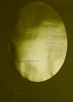
I can truly describe this project as pure Gold! This is the poster and invitation to the forthcoming University of Portsmouth, 2012 Summer Show. There is an A1 (594x820mm) poster on Colorset Solar 120gsm and an invitation (297x105mm) on Colorset Solar 270gsm. Both items are hot foil blocked only (no print) in two colours (metallic gold and pigmented white foil).
The design is by Michael Harkins, who is a senior Lecturer in Graphic Design and the course leader of the MA Graphic Design at the University of Portsmouth and I asked Mike to write some words to explain the project:

"The poster and identity for this year's Summer Show ties together many themes, as is usual in the work I produce. Firstly the show is the high point in the academic year, it is also the month where the sun reaches its zenith (in this part of the world at least), additionally we often refer to this month as 'Golden June'. This nicely fits in with the idea of the 'Gold Standard', especially this year being an olympic one, so there is a cultural echo here in the identity. This is a time of year when students are showing their best work, not for the sake of winning but completing. The circle also reflects the last element in the University logo (originally designed by Banks and Miles). This can also be interpreted as completing – leaving the University with achievement. Thus, on the poster the names of the courses within the circle have completed at this point in terms of the show. The gold foil and terrifically sunny Colorset Solar, also help to give a feeling of celebration and opulence in these somewhat austere times. Although in ethical terms, the production and paper were actually a cheaper alternative to printing at this size in two colour litho. There is also less waste in terms of make ready etc. with regards to the paper"


The foil blocking was produced at Reflections print finishers in London. Mike mentioned that Bill Fletcher at Reflections deserves a special thank you, as the job was not an easy one to produce due to the huge area of foil on the poster - it does look absolutely stunning.

The private view is this Friday (1st June) and is open for general viewing on Wednesday 6th - Wednesday 13th June at the Eldon Building at University of Portsmouth - you should go and you may see something golden!
Posted by Justin Hobson 29.05.2012

Friday 25 May 2012

Print Club London

I was pleased to receive two lovely prints in the post from Print Club London. They are from a collection of prints produced at  PICK ME UP 2012 (the contemporary graphic art fair) at Somerset House in London at the end of March.
Print Club London's space at the fair was a journey through the print process, from the designers hand to the ink on the table all the way through to the gallery - a physical journey through the process of print. Visitors were invited to "PULL A PRINT" with help from the screenprinters.

They relocated Millers Junction, Print Club's new creative studio alongside the Print Club studios and gallery so visitors could walk through each stage of design with the resident artists. Each day the artists were working and printing allowing visitors to discuss the projects in progress and see print in action. Over 40 prints were especially designed for the show.

Designers included: Arran Gregory, Dominic Owen, Alice Hoult, Pure Evil, Hugh Barrell, Esther McManus, Margot Bowman, Rose Stallard, Tal Drori, Mr Gresty and many more!

...and here are the lovely prints they kindly sent me:


Rose Stallard

Alice Hoult
These prints and all the prints produced at the show are produced on our Redeem 100% Recycled 300gsm.

If you don't know about Print Club London, you should! They are a silkscreen print studio - basically you can be a member, turn up and print! simple as that. Have a look:  

Thanks very much to Kate Newbold and Rose Stallard for the prints.

 Posted by Justin Hobson 25.05.2012

Thursday 24 May 2012

Stardream - answering your questions.

Since my post on Tuesday (below) about our new Stardream range, I've had quite a few e-mails asking for swatches (thank you - they are on the way). I've also had quite a few comments both on the blog and e-mails asking how we've ended up being the stockist.

So, how come we are now the UK distributor?

Well, there's a bit of a story here but basically up until now it has been stocked by the (once mighty) Robert Horne Group.

These days Robert Horne is a division of the loss making Australian based Paperlinx (as is Howard Smith and Paper Co). Unfortunately Paperlinx is in a financially perilous state which has been much reported in the press. There have been rafts of redundancies and other cuts which culminated last November, when Robert Horne announced that it was closing it's entire branch network.
http://www.printweek.com/news/1106823/Robert-Horne-centralises-sales-Northampton-regional-sales-offices-close/?DCMP=ILC-SEARCH

Subsequently, Italian paper manufacturer Cordenons, approached us to see if we would be prepared to work with them and improve the availability of Stardream for designers and printers in the UK. We thought about it, said OK and here we are!   

It's a tough time in the print and paper industry at the moment and although in this instance Robert Horne's loss is our gain, it's important to remember that this is against the backdrop of things being very hard in the paper/print industry. I'm sure there are many other mills also contemplating their distribution arrangements.

The following links show some backround about the Robert Horne/Paperlinx situation:
http://www.printweek.com/news/1122504/Paperlinx-sells-its-Italian-business-Lecta/?DCMP=ILC-SEARCH

Posted by Justin Hobson 24.05.2012

Tuesday 22 May 2012

Stardream ..some exciting news!

As most regular readers will know, I don't write this blog to shamelessly 'flog' our papers and I rarely just plug our products ...but I'm going to now!

I'm very pleased to announce here that we (here at Fenner Paper) are now the UK stockists of STARDREAM.

For many of you, Stardream will need no introduction, it's the market leading pearlescent and metallic paper range produced by the Cordenons paper mill in Italy. Many people have become fans of the light irridescent finishes and the dual sided deep metallic finishes which do truly shimmer.

...and it comes in 31 shimmering shades! 
Stardream is used for a wide range of applications, including cover, presentation folders, Invitations, greetings cards, luxury packaging and a whole host of other stuff that I haven't thought of!

As well as being available in the 31 shades, it comes in a good weight range. All items are available in 120gsm and 285gsm with some of the most popular items also available in 340gsm board and a 110gsm one sided (particularly used for luxury packaging - paper over board boxes and casebound covers). And if that weren't enough, the range also includes three embossings, Orion, Seta and Cannetè.

You can see the whole range here: http://www.cordenons.co.uk/

..and here's our lovely new swatch...
One of the most important things about these ranges is good availability and we certainly don't want to disappoint! So, we have put every single item of the mill's stock range into our warehouse here in Tonbridge, so availability should be truly excellent (- we hope!)

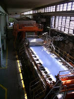
Here's a picture of the Cordenons mill and paper machine in Italy:


...and there's even a picture of me shaking hands at the mill on our new agreement, with the mill's (special) agent Terry Wakeman.
If you would like to receive one of the new Stardream swatches, just email me (justin@fennerpaper.co.uk) and I'll pop one in the post.

http://www.cordenons.co.uk/
http://www.gruppocordenons.com/en/
Posted by Justin Hobson 22.05.2012

Monday 21 May 2012

Post Office in Pictures ...take 2!

...oops! nearly forgot. Further to my post on Friday, also in the envelope is another piece of the exhibition literature. 

Size is DL (210x99mm) portrait. It is a 6pp gatefold also printed on Omnia but on 120gsm this time.

As with the invitation, the dark, rich mono images have reproduced fantastically well on Omnia - a real richness in the black areas which still retain lots and lots of detail - something that you wouldn't normally achieve on a standard uncoated paper.


As with the post below, design is by Cai and Kyn  ...and in the envelope was a lovely note from Cai.

Print is by Orchid Print.
Posted by Justin Hobson 21.05.2012

Friday 18 May 2012

The Post Office in Pictures


This is a really well considered invitation. The Post Office in Pictures is an exhibition showcasing iconic photographic images sourced from The Royal Mail Archive.

In 1933 Sir Stephen Tallents was appointed Public Relations Officer to the General Post Office (GPO) and so began a major project to promote the range of postal services to the British public.

One initiative was the establishment of The Post Office Magazine, intended to give a sense of shared community, camaraderie and endeavour. In order to do this, the GPO employed photographers to create beautiful, informative and often humorous photographs of the Post Office at work. While the photographic documentation of the Post Office at work in the community has continued to today, this exhibition will celebrate photographs from the BPMA collection covering the 1930s to the 1990s.

This piece of print is the invitation to the private view of the exhibition opening in Swindon.

The size is 148mm wide, 140mm high. It opens as a gatefold, left to right and with small flaps on top and bottom, creating a sense of mail/envelope, without actually being one!
It is printed on our Omnia 320gsm and the sepia coloured imagery post office red solids are litho printed out of CMYK which works really well with Omnia with it's matt flat nature - it also has a light natural tint on the inside spread which is sympathetic to the image. The printed red band on the outside has a gloss UV varnish giving the effect of a piece of packing tape - very simple and effective (and of course it's worth pointing out because UV varnish works exceptionally well on Omnia)

Design duo Cai and Kyn (who are brothers) were comissioned to design the exhibition including choosing the final photographs, all printed material and the exhibition stands/walls/furniture.

Repro, print and finishing is by Orchid Print.

Anyway the good news is that you haven't missed the exhibition itself, as it's actually opening in London at the Lumen Church Gallery (http://www.lumenurc.org.uk/) in Tavistock Place - tonight!
...and runs until 31st August - and the good news is it's free entry.
http://postalheritage.wordpress.com/2012/05/17/the-post-office-in-pictures-exhibition-opens-in-london/

http://www.postalheritage.org.uk/
http://www.caiandkyn.co.uk/
http://www.orchidprint.com/
Posted by Justin Hobson 18.05.2012

Wednesday 16 May 2012

William & Son - Engagement Rings

This is a beautifully produced little publication produced by William & Son of London for their range of engagement rings. It is a small 'handbag' size of 110mm square. The book has a 4pp cover with a 20pp 'French folded' text (which confusingly actually makes it 40pp!) and is perfect bound.

The text pages are printed on our Marazion Ultra 115gsm with the natural, flat mattness which works fantastically reproducing the metallics and the jewels...
The cover is a Buckram embossed board from that other, Hull based paper merchant! As you can see from the pic below the inside of the french folds are printed with the William & Son brand patterning.

Design is by Material Organisation, based in London. Creative Director is Sam Wilson, designer on the project is Rosy Tsai. There are some beautiful touches on this piece including the hand tied ribbon around the cover (see image at the top of the post).

...and thanks to Rosy for taking the time to send me  a copy and a lovely note:

Print and the excellent finishing (french folding is nice and square) is by Generation Press.

Posted by Justin Hobson 16.05.2012