Tuesday 2 February 2016

Jobs from the past - Number 76

Regular followers of this blog will know that my first post of every month is a "job from the past" so that I can show some of the really good work from years gone by...

Duke Special Songbook 2 - November 2011

Duke Special is a songwriter and performer based in Belfast. A songwriter with a romantic style and a warm, distinctly accented voice, he has distinctive long dreadlocks, eyeliner and outfits he describes as "hobo chic". His live performances have a theatrical style inspired by Vaudeville and music hall, and often incorporate 78s played on an old-fashioned gramophone, or sound effects from a transistor radio. (https://en.wikipedia.org/wiki/Duke_Special)

This songbook was published in 2011 by Duke Special and contains the words and music to 30 of his songs.
The book is 297x215mm, portrait and is limp bound, however it's deliberately designed to look like a songbook from the past, in fact almost to look like just the text that may have come separated from a casebound book. It has an 88pp text and has a 2pp tipped on cover with "exposed binding" which has been beautifully executed, as you can see below. The spine is 8mm deep.
To compliment the aged feeling, the papers used throughout are our Shiro Echo, White 100gsm for text and 250gsm for the cover. This paper has a neutral white shade, not cream, and it works perfectly with the text and pencil illustrations. It is printed offset litho throughout, two special colours on the cover and one colour black, throughout the text.
Inside spread
Click on images to enlarge
The below image shows the yellow coloured thread used for the binding.
Design is by Sparks Studio based in London. Creative partners are Gary McIlwaine and Michael Gough. Artwork and illustration is by Tim Millen based in Belfast.

I still have the nice note from Gary at Sparks Studio, who kindly sent me this file copy.
The Songbook was printed in Belfast by an unusually named printer called Northern Whig Limited. The Northern Whig was originally one of Ireland's oldest newspapers, founded in 1824. The Whig published continuously until the paper closed in 1963 and afterwards, continued as a commercial printer. Unfortunately the firm ceased trading in February 2012.

You can buy your own copy of the Songbook here:
http://www.dukespecial.com/memorabilia/item/songbook_volume_2

http://www.dukespecial.com/
https://www.sparks-studio.com/
http://www.timmillen.com/
Posted by Justin Hobson 02.02.2016

Thursday 28 January 2016

Mulberry Christmas

Inspired by the cool of the city and the craft of the countryside, Mulberry is known for its classic fashion sense and strong links to British craft and design. Founded in 1971 in Somerset, England, the brand is globally recognised for its signature natural leathers and English design influences. Mulberry has Design Headquarters in London, and two flagship factories in Somerset, close to the Roman city of Bath. Mulberry goes from strength to strength, creating an international reputation for super-desirable products with a playful English sense of eccentricity and quality.

This is the outstanding piece of literature produced for the Mulberry Christmas promotion.
The finished size is 224x160mm and is printed offset litho in CMYK with hot foil blocking in metallic gold foil.
This project is a strange format to describe, so I hope this birds eye picture will help. The cover is 6pp plus a pocket on the inside back cover. The text is a 10pp concertina, the end page of which is inserted into the pocket
Below image shows inside front cover (which is a flap) and page 1 of text on right hand side
...the next image (below) shows the flap open, revealing the image of the small 'clipper' bag in black:
More birds eye images to help explain the format...
The images below, shows the concertina text, fully extended
Click on images to enlarge
The paper used throughout is our lovely Omnia text and cover range - 320gsm for the cover and 150gsm for the text. As you can see from the images, there are many metallic tones together with deep colours and dark shades - lots of heavy ink coverage going down and it looks great on the Omnia, reproducing the metallic in the images amazingly and those bright vibrant colours, whilst retaining detail in the dark areas as shown in the image below. Flat, matt and tactile. 
The hot foil blocking is inspired and it endorses the quality of the brand.
The sublime art direction and design is by Mulberry. Designers on the project are Jack Foreman and Tom Speirs. The truly exceptional repro, print and hot foil blocking (in four languages!) is by CPI Colour with James Lager handling the project (inspire@cpicolour.co.uk)

http://www.mulberry.com/
www.cpicolour.co.uk
Posted by Justin Hobson 28.01.2016

Tuesday 26 January 2016

Acacia Villas

I've written many posts on this blog which includes the phrase "...just the cover makes the difference!" The cover on this property brochure is simply stunning as it is printed on our Flockage Litho - a fab image of rich, blue feathers printed over entire front and back cover.
This brochure is for developer Martin Grant Homes and their development in Hampton, called Acacia Villas.
The brochure is A4 portrait, saddle stitched, with a 4pp cover on Flockage Litho 300gsm and 12pp text on 200gsm 'house silk'. For those of you which are not familiar with this cover product, it is a flocked paper and board which feels like a velvet material to the touch but which remarkably you can actually litho print onto! Unfortunately it is hard (actually it's impossible) to convey the fluffy/furry nature of the way this feels, but the below cover with the superbly reproduced feathers, actually feels soft, just like feathers. As you can see, it also takes hot foil blocking beautifully as well.
The inside of the cover (Flockage Litho is a one sided product) is a plain uncoated board, which has been printed offset litho in CMYK plus a gold special.
Inside text pages printed offset litho in four colour process on 'house silk' 200gsm
Last spread, showing inside back cover printed on the reverse of the Flockage Litho.
The below image shows the full extent of the all over printing on the front and back cover, plus hot foil blocking in metallic gold foil.
Try as I might to capture the "fluffiness" on camera, I just can't! ...although you can see on the image below, just what fantastic detail can be achieved by printing on the Flockage Litho.
Creative direction and design is by property branding and specialists Sectorlight, who are  based in London's docklands.

The printing and production is by Identity Print, based in Paddock Wood in Kent and the print quality on the Flockage, in particular is superb. Thanks to Nick Stacey at Identity for getting me some file copies.

http://www.martingranthomes.co.uk/
http://www.sectorlight.com/
http://www.identityprint.co.uk/
Posted by Justin Hobson 26.01.2016

Friday 22 January 2016

2016 BuBu book

This book is produced by one of the leading book-binderies of the world: BuBu. At the beginning of each year they produce a book which demonstrates a different, unusual and innovative design of book. In previous years, they have produced books using a metal cover, a perspex cover and even a book which is curved. The books are always produced in the characteristic red and white of the swiss flag.
few years ago I was lucky enough to visit Buchbinderei Burkhardt (BuBu) in Mönchaltorf near Zürich. The company is an amazing combination of the commercial bookbinding, hand bookbinding studio and digital book production. BuBu is an amazing business producing quality, long forgotten in some areas of the UK printing industry.
The size of this book is 230x158mm. It is hard to describe and even harder to photograph! I would describe this as a 24pp concertina text mounted onto cover boards which have a 'raw' edge. The concertina text has been duplexed using 4pp sections or red and white which means that both edges have a red/white sandwich effect. The 'real' cover is asymmetric and is made using a red binding cloth over board and is affixed to the outside back cover.
Close up detail of the cloth covered cover:
Some of you maybe able to read the accompanying letter, unfortunately I can't!
Last year, I wrote about the book they produced following a competition at Kingston University: http://justinsamazingworldatfennerpaper.blogspot.co.uk/2014/12/pocket-book-by-jack-beveridge.html

How refreshing that a leading company takes the time and money to produce an item which not only shows their expertise, but which also pushes the boundaries. They produce a quality, long forgotten in some areas of the UK printing industry.

http://www.bubu.ch/
Posted by Justin Hobson 22.01.2016

Wednesday 20 January 2016

McQ Men

McQ, is the contemporary brand from Alexander McQueen which takes inspiration from street culture "evoking the varied and ever-evolving style tribes that spring up around Britain’s rich music and art scenes. Drawing on references from uniform and the military, core staples of the British wardrobe are re-imagined each season in new guises. Traditional techniques are used in contemporary ways, creating pieces that are both functional and beautiful"

Creative Director of Alexander McQueen and McQ is Sarah Burton. This is the season's lookbook for men.

The size of the publication is 450x320mm, portrait and is a 12pp self cover. It is printed on our lightweight Offenbach Bible 60gsm and is a beautifully designed publication.
The lookbook is printed in four colour offset litho and is a superb example of printing on Offenbach Bible - superb solid coverage and deep monochrome images reproduced in CMYK. 
Click on images to enlarge
Due to the lightweight nature of the paper it just flops beautifully, with a bewitching feel.
Design and art direction is by Rupert Smith who is a freelance art director based in London. This is an elegant and splendidly produced publication. To get these dark images to look this good on an uncoated paper is a real achievement. Print is by Rob Squires at Pureprint.

www.pureprint.com
Posted by Justin Hobson 20.01.2016

Monday 18 January 2016

What is ...Wiro Binding?

What is ...Number 25
Regular followers of this blog will know that in the middle of the month, I publish a "What is ....? post. The article covers various aspects of paper, printing and finishing in greater depth. However, many of these subjects are complex, so these posts are only intended to be a brief introduction to the topic.

What is ...Wire-O® Binding
Wire-O ® binding is a popular binding method where the text leaves are punched and held together in a closed metal 'ring' which allows for 360 degree rotation of the pages.


The term "Wire-O"® is actually a registered trademark of a company called James Burn International. Therefore everytime you use the word Wire-O ® it should have a little ® after it. To be honest, this ® thing is getting a bit boring and I'm pretty confident anyone reading this will now know that it is a registered trademark! ...so I'm not using the little ® again! This type of binding is also referred to as twin loop wire, wirebind, double loop wire, ring wire and double-o. To the left is an example of a typical wire-o bound job.

Here is an image of a wire before it is closed to make a ring: 
The below image shows the 'join' when the ring has been closed. You can see the way the two ends "marry" together stopping the cover and text coming apart.  This 'seam' normally appears in the inside back cover.  
Wire-O can either be produced in an office on a 'desk-top' machine or commercially on large fully automated machines where the wires are fed on huge spools. Below is an example of a "desktop" type binding machine.
Firstly the paper must be punched - either with square or round holes. The punched pages are then placed onto the "C" shaped wire. When complete it is placed into the wire closer which squeezes the spine until it is round.

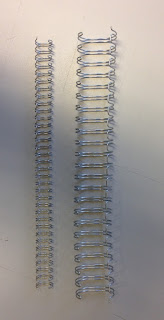
Now there is an important thing that is worth pointing out. There are two common hole patterns used for wiro. 3:1 pitch is 3 holes per inch is most commonly used for binding small sized documents between 2mm and 10mm thickness. Larger documents use 2:1 pitch which is 2 holes per inch. The physical wire is a different thickness. On the left there is an image showing A4 length wire. On the left hand side is a 3:1 pitch and on the right is a 2:1 pitch
Below is a practical demonstration of the difference between 3:1 and 2:1. It is a catalogue for artist Callum Innes at the Ikon Gallery. It was designed by Lucy Richards and printed by Summerhall Press and printed on Neptune Unique Softwhite in 1996. The catalogue on the left is 6mm thick and is bound using a 3:1 wire. The catalogue on the right is 14mm thick and uses a 2:1 wire.
Click on images to enlarge
Below is the birds eye view, showing the thicknesses and the wire.
Click on images to enlarge
One other thing that is worth pointing out here is that there are various styles that can be used to make the cover and text a bit more interesting!

Here is an example of a standard wire-o
Below is a style where the wire is concealed inside a spine in the cover and the wire is exposed on the outside back cover. This format is called a 'half canadian'
...and here is an example of a 'full canadian' where the wire is exposed on both the outside front and back cover
Below is a standard wiro, which has been bound on the end of an 8pp cover which then 'reverse folds' on itself therefore concealing the wire inside the spine.
There is a section in my Size|Format|Stock booklet which includes many of the formats for Wire-O binding. If you'd like one, just get in touch.

http://www.jamesburn.com/
http://www.jamesburn.com/home/pages/wireo_binding.html
Posted by Justin Hobson 18.01.2016