Thursday 13 July 2017

Simone Rocha Exclusive Book

http://simonerocha.com/Simone Rocha was born in Dublin, Ireland in 1986. In 2008 she graduated with a BA in Fashion from The NCAD in Dublin followed by an MA from Central Saint Martins in 2010. Simone debuted at London Fashion Week in September 2010 and her collections can be found in some of the most prestigious stockists in the world.

Last year at the British Fashion Awards Simone received the “British Womenswear Designer Award” as well as the 2016 Harper’s Bazaar Designer of Year Award. This year Simone opened her first USA store in Soho, New York.

This superbly conceived publication is a limited edition production. The scale is a luxuriously large 420x305mm, portrait format, which flops and rolls beautifully.
Front Cover....
Click on images to enlarge
Simone works on seasonal imagery and produces limited edition printed books featuring the works of collaborators and inspirations. Contributors for this book are Jacob Lillis, Eoin McLoughlin, Colin Dodgson, Louise Bourgeois, Perry Ogden, Ross McDonnell.
The publication is a collection of loose 4pp, forming spreads which Juxtapose the different subject. It is loose bound using a rubber band which holds it all together remarkably effectively for the size. The publication is a self cover, all produced on Omnia 120gsm.  Below you have Flowers and Cars (Jacob Lillis) with Pony Kids (Perry Ogden).

Click on images to enlarge
The publication is printed offset litho on our Omnia White 120gsm, the result is superb. The look and feel of the whole publication is very uncoated and tactile but there is absolutely no loss of detail in the images.
Above you have Simone Rocha collection on the left page (Colin Dodgson) with Louise Bourgeois on the right page. When the publication is disassembled, you can see the whole spread ...as you can see in the below image
Click on images to enlarge
Below shows the publication separated into individual 4pp with the band removed.
The below image shows the outside back cover and the way that the band holds the folded 4pp unbound sections in place:
Art direction and design is by Simmonds. Print production, including the binding is by Pureprint.

http://simonerocha.com/
http://www.simmondsltd.com/
http://www.pureprint.com/
Posted by Justin Hobson 13.07.2017


Monday 10 July 2017

ISTD Student Awards 2017

Last Friday, I was invited to  the International Society of Typographic Designers (ISTD) Student awards ceremony, hosted by Pentagram at their wonderful studio in Notting Hill with Pentagram partner, Angus Hyland, presenting the certificates to the successful students and tutors.

It was a beautiful summer evening, and as with all ISTD events it was a very warm and friendly occasion with beer, wine and nibbles all laid on.
This presentation evening is for the main Student Assessment scheme held in the UK and Ireland. Students from Universities and Institutions around the UK and Ireland answered a number of briefs written by the ISTD's Education team. This is an international education scheme and the assessments for other regions of the globe are on-going.
 
Below is ISTD education officer John Paul Dowling talking through the judging process.  
Pentagram partner, Angus Hyland, presented all the certificates and also an excellent goody bag. There were students from universities from all over the country and further afield, with one student from Moscow. The Vincent Steer award, which is the highest accolade, was awarded to Conor Foran a student from NCAD.
Contents of the goody bags was excellent, with items generously supplied by Cass Art and a copy of Logo published and donated by Laurence King.
My thanks to the ISTD board for inviting me and as I have said many times on this blog before, it's very important to support organisations such as the ISTD and events such as this. A big thank you to all those members of the ISTD who freely give their time for the benefit of others, in particular, Freda Sack, who has been such an important figure in the society for so many years.
Posted by Justin Hobson 10.07.2017


Thursday 6 July 2017

My Africa

This book called 'My Africa' is published by The Mo Ibrahim Foundation in celebration of the 10th anniversary of the charity. The book is a result of a competition run by the foundation where entries were submitted from all over the African continent from professional photographers, amateurs and students.

The charity was founded in 2006 with a focus on the critical importance of leadership and governance in Africa and was founded by Dr. Mo Ibrahim, a Sudanese philanthropist and businessman. As Mr Ibrahim says in the introduction "We were determined not to produce yet another impressive coffee table book, with beautiful pictures of Africa - there are already so many of these. Instead we wanted to see our continent and our future, through the eyes of our fellow citizens"

The end result is a superbly produced piece of print designed by
Maria Tsirodimitri and overseen by Pentagram in London.
The book is 275x230mm, portrait with a 27mm spine. It is casebound with a mid grey book-cloth over the cover. There is a two thirds height matt laminated 'dustjacket' around the cover.
Introduction pages....
The 192pp text of the book is printed on our Shiro Echo, White 160gsm. This paper is made from 100% recycled fibres and also has FSC Mix certification, made by Favini in Italy.
Click on images to enlarge
 

The paper is a neutral white shade which is perfect both because books really should not be bright white (high whites are great for advertising but not relaxing to look at and read) and the paper works very sympathetically with the images. 
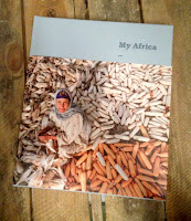
It is not possible to truly demonstrate the quality of the images (which, don't forget, are from professionals, amateurs and students - and all Africans) but I also can't do justice to the quality of the printing, which is absolutely superb. I hope the image above and the detail image below demonstrates a little of what I mean.
Image by Marco Silva (Cabo Verde)
I would like to suggest that you follow this link where you can see all the images, which will look a lot better than what I can show here: http://mo.ibrahim.foundation/my-africa/
 
There are four sections in the book, each separated with a solid colour spread of which this is one. Superb printing of a solid made out of CMYK.
This also happen to be the middle of the sewn section, so you can see the thread running neatly down the spine...
Image showing the 27mm spine with the sections and the ribbon marker.
This book has really succeeded in being a 'coffee table book' however it's been achieved with content supplied by ordinary people, thoughtful design and exemplary print and binding - not just another glossy book about Africa, so I think Dr Ibrahim's aims has been achieved.

Design is by Maria Tsirodimitri. Pentagram in London oversaw the project (Domenic Lippa's team). The superb printing is by Leycol in London with Richard Davey handling the print.

http://mo.ibrahim.foundation/my-africa/
http://mo.ibrahim.foundation/
https://www.behance.net/mariatsirodimitri
http://www.pentagram.com/
http://www.leycol.com/
Posted by Justin Hobson 06.07.2017

Monday 3 July 2017

Jobs from the past - Number 93

Regular followers of this blog will know that my first post of every month is a "job from the past" so that I can show some of the really good work from years gone by...
 
Just another seasonal trend...  July 2006
This was a self-initiated project by Leeds based agency, Vast. They produced this superb piece of work to demonstrate their skills in art direction, location and print production for the fashion industry.
The size of the publication is a very large 405x335mm - truly a piece of literature produced on a grand scale! Working with clothing from Gibson Menswear, the photography was shot on location in Whitby by photographer Kevin Peschke 
Click on images to enlarge
The publication is a 12pp loose bound (no binding) production and is printed on our Omnia 150gsm ...and it looks and feels just beautiful. It perfectly shows the images of the clothing - lots of detail and excellent reproduction.

As you can see from the above images above and below, there is lots of colour and images with CMYK dark areas - loads of ink going down and it looks great on the Omnia, reproducing bright vibrant colours as well and the dark shadowy images, retaining detail in the dark areas - all with an uncoated tactile feel (...in my opinion- but I would say that wouldn't I?)
The images above and below show how it is unbound and how well it works - it holds together beautifully ...and that is because it is the correct choice of weight of material - Omnia is very bulky and 150gsm works perfectly. As a 12pp it holds itself together as a single piece of literature.
As you can see below with my hand in the image below, which gives some sense of the scale, it shows how nicely it flows and flops.
Below image shows the detail, just how good fleshtones are on the Omnia plus the detail of the button hole.
Click on images to enlarge
The below image shows the spines - with no stitches - nice crisp folds, perfectly executed, no cracking on the spines.
Design and art direction is by Vast, the creative director is Matt Austin. Print production is by Sheffield based printer, ProCo and the print result is absolutely superb.
 
I have pristine copies of this project, which ten years after it was produced looks as good if not better than many jobs I see produced today! 
http://wearevast.com/
http://proco.com/
http://www.gibsonlondon.com/
http://www.kevinpeschke.com/
Posted by Justin Hobson 03.07.2017

Thursday 29 June 2017

Thesis InForm 2017

www.thesisinform.wordpress.comThesis InForm is an exhibition showing work produced by a selection of students from across the Design School at the LCC in response to the ideas explored in their final year Thesis. The students were invited to transform and re-interpret these concepts in any visual or physical form imaginable.

This is the literature produced for the exhibition and symposium.
The finished size is 240mm square folding out to 720x480mm and is printed offset litho in one colour black on both sides on our Colorset 100% Recycled 120gsm in Bright Red.
The identity and publication is designed by GMD student Keenen Sutherland. The editor is Tracey Taylor and the organisation is by Andrew Slatter (Senior Lecturer linked to the Graphic Communication Programme).
The publication is expertly printed 'in house' at the LCC at the Elephant and Castle by Tony Yard and Scott House. Really well printed and folded, you can see the job coming out of the folder in the image below
My thanks to Andrew for sending me copies.

www.thesisinform.wordpress.com
https://thesisinform.wordpress.com/2017/06/13/talking-about-identity/
www.arts.ac.uk/lcc
Posted by Justin Hobson 29.06.2017