Friday 17 November 2017

British Book Design & Production Awards 2017

Yesterday evening,  I was lucky enough to be at the British Book Design and Production Awards which is hosted and run by the British Printing Industries Federation (BPIF) at London's Millennium Hotel in Mayfair. A very lavish and swish occasion.
I was kindly invited by Fenton Smith and Bonnie Lo from London print company BOSS, who were also one of the sponsors and printed the awards catalogue.
 
On arrival, the nominated entries were all out on display and it was a truly wonderful array of books and catalogues. 
The evening was opened by Charles Jarrold, Chief Executive of the BPIF...
 ...a gathering of over 200 people from the world of publishing, print and design - and a few paper people in there as well!
It was particularly lovely that a project which I was involved with won the category for Exhibition catalogues.

The project is called "Searching For Eve in the American West" by photographer Maryam Eisler. It is designed by Roger Fawcett-Tang of Struktur Design and it was beautifully printed by Boss Print.

 ...and here is the team that made the book possible on stage, collecting the award from the compere Jenny Éclair.
I can just give you a teaser of what this award winning catalogue is like...
Click on images to enlarge
It is exquisitely printed offset litho throughout on Omnia 150gsm, using tritones, but I shall write about this project at length in the future.

It was a great evening - good company and food and my thanks go to BOSS for inviting me and many other old friends on the table too.
Posted by Justin Hobson 17.11.2017

Tuesday 14 November 2017

Signature Suites

The Radisson Blu Edwardian hotel in Manchester is set inside the historic Free Trade Hall, one of the city’s oldest and most iconic buildings, and is known for its musical past. The hotel has 263 luxurious rooms and suites and many of the suites are named after some of the artists that appeared at the venue before it was a hotel.

This brochure is about these "Signature Suites" and the facilities that the have to offer.
The format is A5 Landscape and is printed on our Omnia. It is an 8pp self cover printed on Omnia White 200gsm. A "self-cover" format is usually more economical as it can all be printed on one sheet, whereas if there is a different text and cover weight, they have to be printed on separate sheets.
Omnia is a very bulky paper so as just an 8pp saddle stitched, the 200gsm weight works really well.
Click on images to enlarge
Printed offset litho in CMYK throughout.
Image reproduction is paramount but it was also important that the publication also projected the tactility of the interiors and in the image below the detail of the bar area.  An ordinary feeling silk or gloss coated paper wasn't an option, so Omnia fitted the bill perfectly.
The outside front and back covers are hot foil blocked in silver foil.
Printing is by Stuart Van Den Bergh at Intaglio Communications based in London.

https://www.radissonblu-edwardian.com/manchester-hotel-gb-m2-5gp/gbmanche
http://www.intaglioltd.co.uk/
Posted by Justin Hobson 14.11.2017

Friday 10 November 2017

De La Warr Pavilion

Q: When is a leaflet, not a leaflet? ....A: When it's designed and produced like this one!
I just received some file copies of this lovely new guide for the De La Warr Pavilion and it just looks and feels great. The De La Warr pavilion is on the seafront in Bexhill on Sea in Sussex. It is an iconic modernist building by the architects Erich Mendelsohn and Serge Chermayeff which opened in 1936. The enlightened town council opened this new space which was to provide culture and entertainment for the masses – a people‘s palace. Following renovation in 2005, the pavilion hosts many shows, exhibitions and cultural events.

Ostensibly, this is a leaflet but this has been printed on our StarFine White 130gsm which means that rather than feeling like the vast majority of mass produced leaflets printed on a bit of 115gsm silk or gloss, this has real character and value. Equally the design and beautiful imagery, really work to make this feel anything but a leaflet!
The finished size is 210x111mm, folding out to 420x509mm. The design is such that the listings of the exhibitions, activities and events are all listed on one side (outside) with the inside being reserved for a full size image of the exhibition.

...and there's a really neat design feature here, which is that the last fold on the right hand side forms a 65mm wide short panel, as you can see in the below image: 
This short panel is used to print the text about the exhibition, which folds back to reveal just the image in all it's glory without any unwanted interference as you can see in the image below...
The exhibition is called "The way things are" and is by Roy Voss featuring a sculpture that stretches the length of the Pavilion's ground floor gallery space.

The below image shows both sides opened out flat:
The new De La Warr identity and design (including the website) is by Playne Design who have studios in London and Hastings. Creative Director is Clare Playne. Print production is handled by Simon Hack. You can read more about the creation of the new identity here:

This project is just an excellent example of a well thought out and well executed piece of print. Good consideration of the format, materials and printing processes is where this job scores most highly. It's not lavish or expensive and it's entirely appropriate for the client.

The project is printed offset litho in CMYK by Banbury Litho.

http://www.playnedesign.co.uk/
http://www.banburylitho.co.uk/
Posted by Justin Hobson 10.11.2017

Monday 6 November 2017

Wardian - East Tower

Wardian London is a residential-led development under construction on the Isle of Dogs, London from Eco World-Ballymore and designed by architect firm Glenn Howells. The scheme consists of two skyscrapers and groundworks were started in 2015. I wrote about the main book here in September and this is the accompanying brochure containing the floorplans.

Size of the brochure is 320x240mm, portrait and is saddle stitched with black wires. The 4pp cover is hot foil blocked in metallic gold foil on Racing Green 270gsm, from that other, well known, Hull based paper merchant!

The 4pp flysheet sets the scene of this verdant development where each apartment has it's own 'sky garden' and the emphasis is on plants and the seasons.
The 'flysheets' appears through the front and back and it is printed on our lovely Offenbach Bible 60gsm, an amazing print result on a 60gsm sheet of uncoated paper! ...it just feels beautiful.
The 44pp text is printed on our Omnia 120gsm. The reason that Omnia was chosen for the main book is because it would beautifully reproduce the photography with the rich greens of the gardens, solid colours and dark photography and most importantly feel special.
The same goes for this floorplans book. Rich solid blacks against large areas of white, looks and feels special.
Printed offset litho throughout in CMYK plus metallic gold ink, which as you can see from the image below, actually looks gold....
The black solids are deep black allowing the metallic gold to really pop.
...a nice touch is the use of the black wire on the saddle stitches
Design is by Made Thought with print by Push based in London. 

As with the main book that I wrote about, this brochure also features fantastic quality reproduction and a wonderful combination of different materials with excellent binding and attention to detail. Yet another truly stunning job.

http://www.wardianlondon.com/
Posted by Justin Hobson 06.11.2017

Thursday 2 November 2017

Jobs from the past - Number 97

Regular followers of this blog will know that my first post of every month is a "job from the past" so that I can show some of the really good work from years gone by...

Design for Life - DixonBaxi 2004
DixonBaxi is the studio established by Simon Dixon and Aporva Baxi in 2001. Having both worked at Attik, they set up their new studio as a partnership, to be just the two of them, working without the trappings of a large agency. Throughout the 2000's, they consistently delivered exciting and innovative design, art direction and branding, predominately for television. Their work for MTV, SciFi Channel, Five and Formula One was high profile and lauded within the industry.

Rather than produce big flashy studio brochure, the two partners deliberately produced a modest portfolio piece to show the work that they had recently produced for clients with a title reflecting their philosophy: design for life
The size is A6 (105x148mm) landscape and is perfect bound with a lovely, neat, square 4mm spine. The cover is printed on StarFine 200gsm, printed in the bright magenta.
The text is made up using "French-folded" sections on Offenbach Bible 50gsm which gives it a sensational light feel and flows beautifully in the hand. 'French Folding' is where the folded edges are on the fore-edge of the book, as in the picture below:
Of course 'french - folding' uses more paper - in fact double the amount! - so this job is actually in conventional terms a 64pp text, which is actually 32x 4pp French folded sections, so in actuality its 128pp! ...but of course it's on 50gsm, so it's only a 4mm spine.
The spreads are sublime, the information pages printed in solid magenta and the project with images from their projects over the previous three years...
Bearing in mind much of the imagery used is from RGB screen grabs, the reproduction is really good, below is the work for MTV...
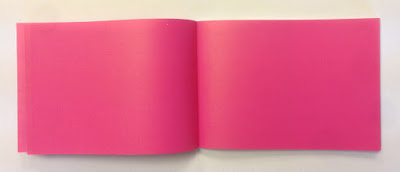
...and on an introduction spread, no words or image at all - just magenta space!
...you can see the way the text pages rolling and flopping over, flowing superbly.
It was printed offset litho by FS Moore in London and they really made a superb job of it. Richard Davey handled the project and he is now Sales Director at DG3/Leycol.

Design is, of course, by DixonBaxi. Simon and Aporva absolutely loved the finished piece and Simon was kind enough to send me file copies and a handwritten note...
DixonBaxi are now a much larger agency with 30 staff, still headed by Simon and Aporva, so sadly as is the way with bigger studios I no longer have regular contact with the two founders but it's great to have played a small part in the studio's development and history.

http://dixonbaxi.com/
http://www.leycol.com/
Posted by Justin Hobson 02.11.2017

Monday 30 October 2017

Make Equality Reality

Equality Now is a global charity dedicated to improving the lives of women by achieving legal and systemic change to safeguard women’s rights and improve their position in society.

Skype plays an integral role in how Equality Now connects with its activists and experts across the globe. Communications consultancy Sunshine was asked to help profile the charity's extraordinary work.
Collaborating with acclaimed international photographer Stephanie Sinclair and Sunday Times journalist Jessica Brinton, Sunshine created a hardback coffee table book, which brings to life the inspirational stories of Equality Now’s work around the world.
This casebound book is covered in bookcloth with a dustjacket. Size of the book is 330x240mm, portrait.
It has a 32pp text printed on our Omnia 150gsm. For those readers not familiar with Omnia, it is an uncoated paper with a surface treatment. What this means is that it feels like an uncoated paper but because the surface treatment minimises 'dot-gain', the print result is much more like that of a coated silk or gloss coated paper.
Click on images to enlarge

The reproduction of the images by Stephanie Sinclair is simply stunning...
Click on images to enlarge
Even though the book only has 32pp, because Omnia has a high bulk, with the section sewing, it means that the spine is 6mm thick, but the text pages still flow and flop well....
Detail image below show the thread in the section sewn sections
As you can see from images, some of the photography is quite dark, but there is no loss of detail, which is what can often happen printing on a true uncoated paper. As you can see from the detail image below, the reproduction is simply stunning.
Art direction is by Simon Holmes, design by Michael Ives. Images courtesy of V11 photo agency.

Printing is by Ambrose Press. Jonathan Savory handled the project. Particular care has been taken over the repro - as with all projects for photographers, there is detail in the images which can only be truly appreciated by the photographer and it is the skill of the printer to be able to listen and interpret these comments in the finished printed job. Not always easy to do but this is a beautiful piece of printed literature.

https://www.equalitynow.org/
https://thesunshinecompany.squarespace.com/make-equality-reality
http://www.ambrosepress.co.uk/
Posted by Justin Hobson 30.10.2017