Monday 4 December 2017

Jobs from the past - Number 98

Regular followers of this blog will know that my first post of every month is a "job from the past" so that I can show some of the really good work from years gone by...

Amnesty International Concert - 1998
This is a concert programme for a concert held in Paris on 10th December 1998 to celebrate the 50th Anniversary of the declaration of human rights. The concert features artists such as Peter Gabriel, Tracy Chapman, Youssou N'Dour, Shania Twain, Alanis Morissette and Radiohead to name just a few. 
London agency Stocks Austin Sice was briefed with the job - as well as being a programme, the brief was to empower the concert-goer. Contained within the programme were a set of postcards that could be detached and posted to leading government officials and politicians to protest against the unjustified holding of certain campaigners (don't forget, this was the pre-internet/email age).

When I was being consulted about the paper, Marek asked me if there was any binding which would have an industrial look and feel and would reflect the barbed wire used in the illustration (by John See). I suggested an industrial "Box staple". These flat staples are used to hold solid and corrugated boxes together as they are stronger than glue.
These flat staples are "stab stitched" through the whole book as you can see in the images above. Seriously industrial and they work a treat!

The below image shows the opening spread, with the perforated, tear out, postcards which are printed (in metallic ink) on our brown range, Kapok 400gsm.
The flap opens out to reveal a quote by Ken Saro-Wiwa:
The below image shows some of the postcards torn out - it was a really great idea.
Below shows the detail of one of the cards with the neat perforation. The cards were printed in black and two metallics, a silver and a bronze.
The size of the publication is 340x230mm, portrait. The extent is a 22pp text (which you can do because it is made up using 2pp pieces) plus front and back covers and 2 pages of perforated cards. The text and cover is printed on our Optimale Blanc Naturel, 250gsm and 140gsm. This was chosen because it had the right feel but also because it was 100% recycled and the production of the publication was sponsored by The Body Shop, so it had to be a recycled product.
The publication is printed offset litho, CMYK throughout. All the solids are made out of CMYK.
There are 6pp of collage images from the work of Amnesty International over fifty years.
The below images show detail of the box staples. With improvements in gluing technology it means that these box staples are used less and less in packaging, so it's harder to find people who have the equipment and who are prepared to do it.
Reverse side:
The report was designed by Stocks Austin Sice (SAS). Creative Director is Nick Austin. Designer is Marek Gwiazda. It's a superb example of a well executed and crafted piece of literature which has stood the test of time.

So where are they all now? SAS was a consultancy founded when three partners left Michael Peters in 1989 and I remember the three partners setting up their company in offices above a bank in Maida Vale. After sustained growth, they sold out to the MSL group in the mid noughties (I think).

Marek Gwiazda is now based in Bristol and runs his own studio and you can read more about this project on his website here:  http://www.marekdesigns.com/folio.php?f=12

The programme was printed by Principal Colour, who are still based in Paddock Wood in Kent.

http://www.marekdesigns.com/
www.principalcolour.co.uk
Posted by Justin Hobson 04.12.2017

Wednesday 29 November 2017

To The Trains

Yesterday evening I was at the St Brides Foundation in London for the launch of a wonderful notebook titled "To the Trains". The project was a collaboration between design agency Carter Wong, printer Boss Print and us! This is the fourth notebook in the series, each one with a different and equally fascinating subject!

This edition showcases the tiles on display throughout the London underground system and the rich history that accompanies them.

The evening started with lashings of beer and wine and the opportunity to look at the images that are the subject of the book taken by photographer Josh Exell.
There was then an introduction to the project by Sarah Turner, Managing Director of Carter Wong followed by a short presentation of the influence of Leslie Green, who was appointed in 1903 to design over 50 stations for the underground and introduced a wayfinding system using symbols set in tiles. As you can see, there were over 150 people who attended....
The splendour of Green's original designs continues to excite and the tile work has been joined in more recent times, as refurbishment takes place, by prestigious artists and designers such as Abram Games, Alan Fletcher, Nicholas Munro and Eduardo Paolozzi.
...and here is the actual notebook that was the centre of attention. 
The wonderfully debossed cover is on a vinyl based cover material. Flexible, durable and just right for a notebook. There are a number of different cover/colour combinations available, this is the deep, burgundy red. Below shows the opening spread...
...a birds eye view showing the binding and the pages with the images of the tiles printed, which are "french folded"
The below image shows a spread of the notebook with the image page on the right - what you cannot see and is impossible to show/photograph is that the tiles are all beautifully and superbly embossed, so they are actually in relief - a truly amazing effect.
...I hope the image below shows just how three dimensional the result is.
Below are the tiles by Abram Games (Stockwell, 1969) where I hope you can see the french folding and the embossing.
As you can see from the above image, the book lies nice and flat - because it has been sewn and cold glued, so it lays beautifully flat. The paper used in the books is our Redeem 100% Recycled 80gsm for the text pages and our new Gardapat 13, Bianka 135gsm for the tile pages.

Printing is all offset litho. Embossing, binding and finishing is all by Boss print and it is all to an exceptionally high standard.

I had a small display, showing our ranges and printed examples and was kept busy all evening! Below I'm talking to Jason Maclaren from Cantate Communications.
A big thank you to Carter Wong, Boss Print and of course, our friends at the St Brides Foundation who made the event special as always.

http://www.carterwongdesign.com/
https://www.bossprint.com/
http://www.sbf.org.uk/
Posted by Justin Hobson on 29.11.2017

Monday 27 November 2017

F&F Autumn Winter 2017

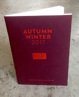
The 2017 Autumn Winter collection from F&F could be mistaken for Prada, Louis Vuitton or Ferragamo. This new collection from Tesco's in-house label is inspired by the British countryside, rugged rural landscapes, delivering a contemporary take on heritage fashion. The collection has been delivered by F&F Creative Director, Jan Marchant.

The format is A5 portrait and is saddle stitched with two wires. The cover is on a cover board from that other well known, Hull based, paper company and is beautifully hot foil blocked in a pigmented, matt red foil.
The 28pp text (plus 4pp throwouts) the text is printed on our Shiro Echo, Bright White, 120gsm which is 100% Recycled.
Click on images to enlarge
There is a "4pp throwout" at the back of the book, revealing miniature images with the picture credits.
...and let's not forget the men! The men's range is included from the centre spread backwards.
Shiro Echo 120gsm is quite bulky but 28pp sits well without the gap in the middle "gaping" too much.
The quality of the art direction, photography, repro, print and finishing is superb. The paper also happens to have performed brilliantly - fleshtones and close up detail looking superb, as you can see from the detail image below:
Art direction and design is by London creative agency Odd. The excellent print, repro and finishing is by Gavin Martin Colournet, based in London E3.

https://www.tesco.com/direct/tv-ad.event
http://www.oddlondon.com/
http://www.gavinmartincolournet.co.uk/
Posted by Justin Hobson 27.11.2017

Friday 24 November 2017

Art of Ping Pong closing party

Regular readers of this blog may remember that last month I went to the launch of The Art of Ping Pong exhibition which I wrote about here.
It was a great evening and it's not over yet! The auction to the 2017 auction closing party is next Wednesday 29th November. The event is your last chance to see the full collection before the auction ends ...and you can go!
You can can be there for an evening of ping pong, music and esspresso martinis by coffee guru's Perky Blenders. In addition to the paddles, they will be showcasing two mini ping pong tables painted by Charlie Oscar Patterson and Mr Doodle (see above) as well as prints and a t-shirt campaign in partnership with Everpress. The profits from the t-shirts also goes to charity and you can buy them here.

Entry is FREE, you just need to rsvp here:
https://www.eventbrite.com/e/the-art-of-ping-pong-creative-debuts-tickets-39877920935

The profits from this year's auction are being donated to Trekstock, a UK charity that supports young adults thrive through and beyond cancer. The auction is live now and closes at midnight on 30th November. To take part in the auction you can place your bids here – www.theartofpingpong.co.uk

The party is on Wednesday, November 29th 6:00 -11:00pm at Creative Debuts 115 Curtain Road London EC2A 3AD
www.theartofpingpong.co.uk
Posted by Justin Hobson 24.11.2017

Tuesday 21 November 2017

Puck Collected #2


Puck Collective is an evolving group of creatives from around the world. Founded in 2010 by 5 illustrators and artists, Puck has grown into one of the largest and most revered illustration collectives in the UK. What makes Puck unique is that every year they launch a call for entries in order to replenish and invigorate the group with fresh work, new ideas and exciting creatives. Each year, the roster will have a limited amount of spaces, trying to bring in the right mix of people to produce shows and exhibitions, create print runs, small press comics and generally have a whole load of fun in the process. During that year all members contribute towards the publication "Puck Collected" showcasing the groups art, talent and creativity in a beautifully produced limited edition run.

...and this is Puck Collected #2, titled Cosmic
It is a collection of 16 x A6 cards. They are held together in a wonderful folded envelope which is Riso printed in two colour - wonderful fluorescent colour.
These are launched once a year, with new content every issue. The cards (bar one) were printed Offset Litho, on a Heidelberg B2 5 colour Speedmaster at Calverts in London. One of the cards (Marylou Favre) was digitally on a Konica Minolta KM C1100 to give a 'shiny' effect.
The cards are all printed on our Neptune Unique SoftWhite 300gsm, The choice was for an off white board which would work better with the artworks rather than a harsh white. The reverse of the cards are all printed in one colour (blue)
The pack makes a thickness of 5mm.
The collective also spun off to found Puck Studio, an exhibition services and print studio based in East London. Visit the link for further details.

The job was printed and finished by Bethnal Green based print cooperative, Calverts. If you haven't come across them, maybe you should have a look. Unusually for a print company, they are a worker's cooperative, therefore the management, tasks and profits are all shared equitably - almost sounds too good to be true! Production was handled by Samuel Rogers at Calverts
www.calverts.coop
http://cargocollective.com/puckcollective
Posted by Justin Hobson 21.11.2017

Friday 17 November 2017

British Book Design & Production Awards 2017

Yesterday evening,  I was lucky enough to be at the British Book Design and Production Awards which is hosted and run by the British Printing Industries Federation (BPIF) at London's Millennium Hotel in Mayfair. A very lavish and swish occasion.
I was kindly invited by Fenton Smith and Bonnie Lo from London print company BOSS, who were also one of the sponsors and printed the awards catalogue.
 
On arrival, the nominated entries were all out on display and it was a truly wonderful array of books and catalogues. 
The evening was opened by Charles Jarrold, Chief Executive of the BPIF...
 ...a gathering of over 200 people from the world of publishing, print and design - and a few paper people in there as well!
It was particularly lovely that a project which I was involved with won the category for Exhibition catalogues.

The project is called "Searching For Eve in the American West" by photographer Maryam Eisler. It is designed by Roger Fawcett-Tang of Struktur Design and it was beautifully printed by Boss Print.

 ...and here is the team that made the book possible on stage, collecting the award from the compere Jenny Éclair.
I can just give you a teaser of what this award winning catalogue is like...
Click on images to enlarge
It is exquisitely printed offset litho throughout on Omnia 150gsm, using tritones, but I shall write about this project at length in the future.

It was a great evening - good company and food and my thanks go to BOSS for inviting me and many other old friends on the table too.
Posted by Justin Hobson 17.11.2017