Showing posts with label And Smith. Show all posts

Friday 12 November 2021

Namma by Kricket Menu

Kricket is a modern Indian restaurant group with three restaurants in Soho, Brixton and the former Television Centre (White City). Founded by partners Rik Campbell and chef Will Bowlby, Kricket has recently expanded into the takeaway market, launching a new brand Namma by Kricket.
The partners were inspired by their travels across India and while they were in Mumbai they hired a couple of Royal Enfield Bullet motorcycles. It was this trip that inspired both the takeaway brand and their dishes with a twist.

The 8pp menu is a 'pocket size' 135x90mm, folding out to 360mm long...
Click on images to enlarge

Top image shows the inside and the bottom image shows the outside, featuring a Royal Enfield Bullet Motorcycle. The below image shows the 8pp concertina fold
The Namma by Kricket branding is by &Smith and they created a suite of literature including the menus and other collateral.

Designer on this project is Cécile Dumetier. The project is printed by Gavin Martin Colournet and is produced on their HP Indigo press, printed on our  Tree Free, Cream 250gsm, which is an off white, natural board, manufactured from 100% non-tree fibres.

https://www.namma.co.uk/
https://kricket.co.uk/
http://andsmithdesign.com/
https://www.gavinmartincolournet.co.uk/
Posted by Justin Hobson 12.11.2021

Friday 21 December 2018

Namma Menu

Kricket is a modern Indian restaurant group with three restaurants in Soho, Brixton and the former Television Centre (White City). Founded by partners Rik Campbell and chef Will Bowlby, Kricket has recently expanded into the takeaway market, launching a new brand Namma by Kricket.
The partners were inspired by their travels across India and while they were in Mumbai they hired a couple of Royal Enfield Bullet motorcycles. It was this trip that inspired both the takeaway brand and their dishes with a twist.

The 8pp menu is a 'pocket size' 135x90mm, folding out to 360mm long...
Click on images to enlarge

Top image shows the inside and the bottom image shows the outside, featuring a Royal Enfield Bullet Motorcycle. The below image shows the 8pp concertina fold
The Namma by Kricket branding is by &Smith and they created a suite of literature including the menus and other collateral.

Designer on this project is Cécile Dumetier. The project is printed by Gavin Martin Colournet and is produced on their HP Indigo press, printed on our Shiro Tree Free, Cream 250gsm, which is an off white, natural board, manufactured from 100% non-tree fibres.

https://www.namma.co.uk/
https://kricket.co.uk/
http://andsmithdesign.com/
http://www.gavinmartincolournet.co.uk/
Posted by Justin Hobson 21.12.2018

Monday 15 October 2018

Namma by Kricket

https://kricket.co.uk/Kricket is a modern Indian restaurant group with three restaurants in Soho, Brixton and the former Television Centre (White City). Founded by partners Rik Campbell and chef Will Bowlby, Kricket has recently expanded into the takeaway market, launching a new brand Namma by Kricket.

The partners were inspired by their travels across India and while they were in Mumbai they hired a couple of Royal Enfield Bullet motorcycles. It was this trip that inspired both the takeaway brand and their dishes with a twist.
The Namma by Kricket branding is by &Smith and they created a suite of literature including this simple A6 postcard, showing a pair of Royal Enfield Bullets...
Designer on the project is Cécile Dumetier. The project is printed by Gavin Martin Colournet and is produced on their HP Indigo press, printed on our Shiro Echo, White 300gsm, which is an off white 100% recycled board, just perfect for the look and feel of this card.

https://www.namma.co.uk/
https://kricket.co.uk/
http://www.gavinmartincolournet.co.uk/
Posted by Justin Hobson 15.10.2018

Friday 23 October 2015

Regent Porto Montenegro Penthouses Floorplans

Porto Montenegro is being developed as the Mediterranean’s most comprehensive yacht marina. Along with the berths, there are five private residential buildings with a total of 228 apartments.

These are the floorplans for the Penthouses which form part of the collateral produced for the marina. The flat size is 525x750mmfolding down to 175x250mm.
Click on images to enlarge
The plans are concertina folded as you can see from the birds eye view below:
Folding out to the full flat size of 525x750mm (18pp)
Click on images to enlarge
The floorplans are printed on our Shiro Echo, White 80gsm which 100% recycled and FSC accredited. It is perfect as a material to print these plans on - almost conjuring up a "blue-print" type feel and rattle, They are printed offset litho and are hot foil blocked in metallic gold foil. Below is a detail of the foiling:
Another thing to note is the absence of a "crows foot" on the folds - this is because it was concertina folded. As you can see from the image below - nice clean, crisp folds and no ugly creasing.
You can read more about "Crow's feet" here:
http://justinsamazingworldatfennerpaper.blogspot.co.uk/2014/04/what-is-number-4.html

The floorplans are just one of the items in the pack of promotional literature which makes up a whole collection of collateral (below) for the exclusive Regent Porto Montenegro apartments.
Art direction and design is by London branding agency &Smith. Creative Directors are Rachel Smith and Dan Bernstein. Print and production is by Gavin Martin Colournet.

www.portomontenegro.com
www.andsmithdesign.com
http://www.gavinmartincolournet.co.uk/
Posted by Justin Hobson 23.10.2015

Monday 21 September 2015

The Marina and Boka Bay

The number of large yachts under construction has more than tripled over the past ten years and few marinas in the world can accommodate superyachts let alone offer onshore provisions and crew services.

Porto Montenegro is being developed as the Mediterranean’s most comprehensive nautical facility for yachts of any size. Currently offering 450 berths for yachts 12-180m, it is planned by completion to offer 850, of which 350 will be specifically for superyachts and complemented by five private residential buildings, totalling 228 apartments.

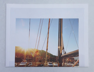
Mark Read is a photographer with wide ranging talents but who was awarded 'travel photographer of the year' in 2012. He was commissioned by London based branding studio &Smith, to photograph the marina, with the images being used in a large format, almost broadsheet newspaper format.
The size is a large 585x380mm, portrait, which is endorsement folded to 292x380mm.
Endorsement folded to 292x380mm
When I received a copy of this publication, I was absolutely bowled over. The location, art direction, quality of the images and print are simply sublime and that's even before I noticed the paper!
Click on images to enlarge
It really is impossible to show the quality of these images and the printed result in this format and you are missing the scale which is huge - the double page spreads you are looking at here are 585x760mm!
The 16pp publication is unbound and is printed on our Shiro Echo, White 80gsm which 100% recycled and FSC accredited. It has a 'nod' to a newsprint material but with amazing image reproduction! Printed in four colour process (CMYK) offset litho, the colours are vibrant, exceptional detail in the highlights and flat even solids. Below is the outside back cover
...and I hope you can see from the detailed image below, just how fab the images are
Click on images to enlarge
Front cover (below) is hot foil blocked in metallic gold foil - exquisite detail.
The Mark Read photographic journal is just one piece of promotional literature which makes us a whole collection of collateral (below) for this exclusive marina.
Art direction and design is by London branding agency &Smith. Creative Directors are Rachel Smith and Dan Bernstein. The truly exceptional repro and print is by Gavin Martin Colournet.

www.portomontenegro.com
www.markreadphotography.co.uk
www.andsmithdesign.com
http://www.gavinmartincolournet.co.uk/
Posted by Justin Hobson 21.09.2015

Tuesday 2 July 2013

Jobs from the past - Number 45


Regular followers of this blog will know that my first post of every month is a "job from the past" so that I can show some of the really good work from years gone by and here's one from 2008.

Mission - Case studies
 
Mission is leading independent PR and marketing agency with an enviable client list. They commissioned design consultants, &Smith, to create a flexible solution for their self-promotional communications.
&Smith developed a series of individual case study booklets that are also broadsheets enabling Mission to build a bespoke portfolio. The design incorporates repeating Ms of their identity with a subtle number identifier (white reversed out) on each cover.
Each booklet unfolds to reveal a project description and press coverage results, before unfolding once again to reveal a full colour campaign image - and this is where the material comes in! Part of the requirement was that the project description/press coverage pages should have a "newsprinty" or "scrapbook" type feel. However this was a little at odds with the amazing images that they had to work and which appear when you open out the broadsheet! The paper chosen is our Redeem 100% Recycled in 100gsm which is a natural looking recycled products, but as you can see from these pictures, it prints amazingly! ...although that's in no small part due to the quality of original and the printer.  


As you can see from the large images on the open broadsheet, they are exquisite and they look absolutely brilliant on this paper. The size of each booklet is 220x170mm, folding out to 440x 510mm.
Design is by &Smith. Creative directors are Rachel Smith and Dan Bernstein.
The superb print (and the finishing is good too - no buckling on the folds) was handled by Gary Bird at Gavin Martin.
 
http://www.thisismission.com/
http://www.andsmithdesign.com/
www.gavinmartincolournet.co.uk
Posted by Justin Hobson 02.07.2013


Thursday 9 August 2012

Coworth Park

Coworth Park is a 5 star country hotel which is part of the luxury British hotel group the Dorchester Collection. London based design consultancy &Smith were commissioned to create a full identity package for the hotel, its restaurants and spa, to include placemats, maps, match-books, quirky in-room collateral and everything else in between (...it nearly included the kitchen sink!)

In line with the hotel being as environmentally friendly as possible, they took the decision to print their literature on recycled materials.

The materials used in the main have been our Colorset 100% Recycled, Mango and our Avebury Recycled Wove (50% recycled plus cotton fibres) which has a gorgeous feel.

The following images demonstrate the wide variety of applications- a map for the grounds, a car key receipt, drinks coasters etc!

Map of the Coworth Park grounds


Place reservation cards - spot the different animals!
It would take far too long to list all the items and the different weights. Suffice to say that Colorset Mango comes in 120gsm and 270gsm and Avebury Recycled Wove comes in 105, 135, 170, 250 and 350gsm.

Creative Directors at &Smith are Rachel Smith and Dan Bernstein. Lead designer on the project was Anna Leaver. The complex and detailed print, foiling and finishing and stringing bits of elastic etc. is all expertly done by Kelsi Print.

http://www.coworthpark.com/
http://www.andsmithdesign.com/
www.kelsiprint.co.uk
Posted by Justin Hobson 08.08.2012

Tuesday 9 August 2011

INK

This brochure is the result of a collaboration between photographer Emilie Bailey, London based design studio & SMITH and digital printers Spring Image.

The title is "INK"  but the subject is nothing to do with printing, it's entirely about tattoos! It is 175x250mm, portrait format and saddle stitched. It looks and feels great and yet the run was only 500 copies!  The job was printed on an Indigo digital press by Spring Image and the print result is fantastic. It is printed on our new Shiro Echo, Bright White (FSC) 4pp cover on 250gsm and 32pp text on 120gsm.

Although Shiro was not developed originally for digital, it has been "sapphire treated" by the printer. This treatment is often applied to more unusual papers and provides a "key" so that the inks (which are different to litho inks) work on the paper surface - watch out for the new pre-treated Shiro digital range which is on the way!

Look and enjoy...


It really is a superb piece and goes to show that an Indigo, printing on uncoated materials really is as good as, and sometimes better than printing offset litho! I have a few copies, so if you want one, send me an e-mail and I can oblige
Posted by Justin Hobson 09.08.2011