Showing posts with label Boss Print. Show all posts

Friday 20 November 2020

PEEL Limited Edition Book

‘PEEL’ is an exploration of self-identity. As a reaction to the scrutiny young people undergo through social media, Marksteen Adamson created the PEEL programme which works with groups of young people and uses photography and poetry to help them explore their identity and who they are rather than just focussing on what they look like. Social media, self-expression and self-identity present growing problems for young people, and there is growing evidence that this pressure is contributing more and more to mental health issues.
Launched in 2017, the project is the culmination of a three-year study, that has acted as the foundation and prototype for the training programme. The PEEL project has been developed into curriculum based resources to enable educators and service providers to run the programme.
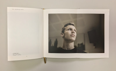
This limited edition book comprises 30 studies, each with their own unique poem and photographic portrait and containing the latest statistics. Size is A5 (210x148mm) portrait has 114pp of text (plus the throw outs) in a 'casebound' cover and section sewn binding.
Click on images to enlarge
The amazing thing about this book is that each of the 30 case studies is printed across a right handed 'throw out' in the book.
The book is printed Offset Litho on GardaPat 13, Klassica 115gsm. For readers not familiar with GardaPat 13, it's a fully coated paper but it really does have a dead flat MATT surface. There are many papers on the market which profess to be matt - some which incorporate the word matt in the name, but aren't! Apart from the high quality matt surface, this paper has an extraordinarily high bulk (thickness).
It is hard to describe the 'dead flat' mattness that is a characteristic of this coated paper but the print result is totally flat as you might see in the below images...
Click on images to enlarge
Gardapat Klassica is a pale ivory shade and is perfect for colour reproduction as well as the solid colour and metallic gold used for the statistic section...
The reproduction and printing is excellent and does the superb photography justice, however the feature that is most amazing about this book is the attention to detail in the binding - it is simply incredible.
If you look at the above image showing the foredge of the book, it looks perfectly even, in fact it's flawless - but then consider that 30pages of this book are throwouts! It is points of a millimetre perfect!

The inside sewing is perfect as you can see in the image below...
...and the spine is equally as perfect.
Marksteen Adamson is co-founder of Cheltenham marketing and brand agency ASHA. Design of the book is by the team at ASHA with designers Scott McGuffie, Simon Dryland, Emily Kane and Hannah Mapleston.

The superb print and even more exceptional binding is by Boss Print, who are based in West London. A truly amazing piece of print and binding.

Posted by Justin Hobson 20.11.2020

Monday 26 October 2020

David Magee at the Saatchi Gallery

Last week the Saatchi Gallery hosted the seventh edition of START (now STARTnet) with Parallel Contemporary Art, founded by David and Serenella Ciclitira. STARTnet and the Saatchi Gallery share a passion for discovering new art scenes and emerging artists worldwide provide this dynamic environment for artists, curators, collectors and new enthusiasts to engage with new international talent.
So in these uneasy Covid times, I made a visit to the Duke of York's in Chelsea, where the gallery was very well prepared for social distancing.
I specifically went to see the work of David Magee, who is an Irish artist. He published his twenty-five year retrospective, Oustide in 2017 which won international awards in Paris, New York, Tokyo, and London. I wrote about this award winning publication previously HERE.
This new series of pictures is from his ongoing series Atlantic.
The award winning book, Outside, was published by Concentric Editions and printed in Vivid Colour™ by Boss Print in London (with just a little paper supplied by Fenner Paper). A copy of this award winning book was on display...
“For over 30 years, I have been making photographs Outside. My aim is to provide an antidote to the world we now inhabit, a world of excess, over-branding and mass production. My intention is to offer the viewer a point in time to reflect and be drawn into a world of oneness, contemplation and tranquility. To engage the viewer with the experience of being immersed in the landscape and the spirituality of nature. Earth, Water, Air... are the recurring elements that I work with. It is my relationship with and my interpretation of these elements that forms the basis of my photographs, once I am absorbed in the landscape. The location itself is totally secondary to the feeling. The feeling is everything.”

Posted by Justin Hobson 26.10.2020

Friday 11 September 2020

D&AD Awards 2020

Yesterday evening it was the D&AD awards, which this year, was an online affair. I've been fortunate to have been invited to the awards dinner a few times over the years and been on the table of those who have won yellow pencils for projects for which I've had input and they have been very memorable evenings!

Given the circumstances, the awards this year were very well executed and superbly presented by D&AD President Kate Stanners Saatchi & Saatchi Global CCO).
A phenomenal 618 pencils were awarded, including 384 Wood, 150 Graphite, 68 Yellow, and 4 elusive Black Pencils. One of the black pencils worthy of note was for typeface Universal Sans, a variable typeface that allows for an extensive range of customisation and unique variations produced by Family Type.

This year, many of the studios that I have worked with over the years, including Johnson Banks, NB Studio, Magpie, Osborne Ross and Here Design, to name but a few, have been nominated and won awards.

It's always lovely to have been involved with a project which has won an award and even better, a project which has won two awards...

Twenty-five Sculptures In Five Dimensions was a self-promotional project for writer Tom Sharp. It was a demonstration of creativity within strict technical writing and design restraints, an experiment in reading and seeing, and an attempt at creating a sublime, meaningful experience with as few elements as possible.

I wrote about the actual event on my blog, last November  HERE.
Tom Sharp filled a high-ceilinged church in Covent Garden with 25 plinths. Each plinth held a text created to a strict format of five syllables per line, five lines plus a title. Each piece of writing described an original, imaginary object, so that any emotional response the reader had was because of the object they conjured up, rather than language manipulation.
The project was a collaboration with Studio Sutherl&. Tom Sharp and Jim Sutherland are the Creative Directors, writer is Tom Sharp and the designer is Rosey Trickett. The printed sheets were all printed on our wonderful Sixties paper and printed offset litho by Boss Print.

Yesterday evening this project was awarded a Graphite Pencil [Graphic Design] for Self Promotion and a Yellow Pencil [Graphic Design] for Writing for Graphic Design.

Congratulations to all participants in this year's awards. It has been a strange year, but life goes on and it's great to see that the creative industry is still producing and recognising great work, even in these unprecedented times.

You can watch the 2020 D&AD awards and check out the winners HERE

https://www.thepoetryofitall.com/
http://studio-sutherland.co.uk/
https://www.bossprint.com/
Posted by Justin Hobson 11.09.2020

Tuesday 28 April 2020

The Weeping Cufflinks

This is the latest poetry publication from Tom Sharp and is described as "a capitalist folk-horror cautionary tale in the manner of a Jacobean pamphlet". It is designed and woodcut illustrated by Katherina Tudball. This is their third creative collaboration and a part of the Faery Fellers project.
Size is 230x145mm, portrait and is a 24pp self cover printed on our Redeem 100% Recycled 100gsm.
Click on images to enlarge
Below is centre spread. The binding is three hole sewn, in keeping with a style of binding that would have been familiar even in the 17th century ...before the invention of staples!
The below image shows the binding, using natural thread
Redeem 100% Recycled is a neutral white shade and is just perfect for this publication - many designers might have just used a cream paper, but this is just the right paper and really works superbly with the wonderful type and woodcut.
Detail of the woodcuts...
Click on images to enlarge
The below image shows the external image of the three hole sewing,
The printing, finishing and binding is by Boss Print who are based in Acton, West London. The edition is 1000 copies and you can buy a copy here.

https://www.thepoetryofitall.com/
https://www.faeryfellers.com/
https://www.bossprint.com/
Posted by Justin Hobson 28.04.2020

Monday 10 February 2020

Pentagram Papers 48

Pentagram Papers are an anthology of documents, cataloguing areas of interest of the partners behind the world renowned design firm, Pentagram. They are produced to be given to clients and colleagues of the firm and have been produced since 1975. The quirky booklets cover a range of curious, entertaining, stimulating, provocative and occasionally controversial points of view.

This is the latest edition, produced by one of the most recently appointed partners in the London office, Luke Powell. The title of this edition is "Long Lens, Wide Angle" and the subject is the Magnum photography cooperative, founded in 1947.

Size is 210x140mm, portrait with an 8pp cover and 48pp text.
The text pages are printed on Omnia 150gsm and it is a great example of just how well this paper prints, having said that, images such as these would look pretty good on anything! The high bulk of Omnia gives this 48pp publication a respectable 6mm spine.
Click on images to enlarge
Omnia was chosen is because it would beautifully reproduce the wide variety of very different images and feel special - with the reproduction that you would expect on a silk or gloss but with a natural tactile uncoated feel.
I must make a special mention about the printing, which is exceptional. Print is by Boss Print, based in West London and it is is printed offset litho using their Vivid Colour™ process. This colour technique has been combined in this project with the mono images being printed in duotone using two blacks (see above) and as you will see from the detail image below, the colour reproduction is superb.
The publication is section sewn in 12pp sections as you can see above and the thread used is black coloured thread which coordinates with the cover (below image).
The cover is printed on an embossed coverboard from that well known "Hull-based" paper merchant! ...and I must point out that it is printed black litho onto a white board with the type and keylines reversed out - but what about the black edge? I hear you ask. Well, the cover has been colour edged black, so there is no white edge. Great attention to detail by the printer Boss Print.
Design for this edition is by Luke Powell's team at Pentagram. This is a really special piece of print. Beg or steal a copy if you can...!

https://www.magnumphotos.com/
https://www.pentagram.com/
https://www.bossprint.com/
Posted by Justin Hobson 10.02.2020

Friday 29 November 2019

British Book Design & Production Awards 2019

Last week,  I was lucky enough to be at the British Book Design and Production Awards which is hosted and run by the British Printing Industries Federation (BPIF) at the Landmark Hotel in  Marylebone. A very lavish and swish occasion.
I was kindly invited by Fenton Smith and Bonnie Lo from London print company BOSS, who were shortlisted for a number of awards.
 
On arrival, the nominated entries were all out on display and it was a truly wonderful array of books and catalogues. 
 ...a gathering of over 200 people from the world of publishing, print and design - and a few paper people in there as well! Here I am with my industry colleague, Charlotte Harvey from Antalis.
Once seated in the grand dining room, the evening was opened by Charles Jarrold, Chief Executive of the BPIF...
It was particularly lovely that a project which I was involved with won the category for "Limited Edition & Fine Binding" The project is titled "Paper Dolls" by artist Hormazd Nariewella. It is designed by Ornan Rotem  and published by Concentric Editions and Sylph Editions and it was beautifully printed by Boss Print on our Gardapat 13, Kiara 135gsm 
 ...and here is the team that made the book possible, collecting the award on stage, collecting the award from the compere Konnie Huq.
 Here is a sneak preview of the book (which I write about another time)…
Here is Bonnie from Boss with the artist Hormazd Nariewella:
Boss went on to win a further three awards, including the grand finale award "Best British Book" for North Northwest designed by Les Welch, pictured below with Fenton Smith from Boss:
Congratulation to all the finalists and award winners. You can read more about the entries and the winners here: https://www.britishbookawards.org/winners-2019/

It was a great evening - good company and food and my thanks go to Boss Print for inviting me and it was great meeting up with many other old friends on the table too.

Posted by Justin Hobson 29.11.2019