Showing posts with label Clare Playne. Show all posts

Friday 5 June 2020

Beaming

This is a really lovely piece of sales literature designed to work as a handout or a mailing piece. It has a lovely quality feel and is produced with high production values which show throughout.

Beaming is an established Internet Service Provider for businesses across the UK. They deliver reliable voice and data services and provide ongoing support ...and they're not afraid to say that they think they're the best!
The finished size is 210x128mm, portrait and the content is 12pp. Below is a birdseye view showing the way that it opens in the conventional way...
...and the below image shows the way the 8pp inner "text" concertina's into a 4pp "cover" which has been formed by parallel creases.
 ...and below is the parallel crease which forms the spine
Spine, as below (without the inner pages concertina'd inside)
The flat size is 210 x 760mm and below shows the outside, spread flat...
...and the inside
The material chosen for the publication is our Omnia in 200gsm and is printed offset litho in CMYK. For those readers not familiar with Omnia, it is an uncoated paper with a surface treatment. What this means is that it feels like an uncoated paper but because the surface treatment minimises 'dot-gain', the print result is much more like that of a coated silk or gloss coated paper. You can see the result - the solid red looks so vibrant and the tactile quality really works with the illustrations. Omnia also has a high bulk, so although this is only a 12pp it feels much more substantial.
It is a simple format and because it has been produced and finished superbly, it is beautiful. The publication is designed by Playne Design who have studios in London and Hastings. Creative Director is Clare Playne with production is handled by Simon Hack. The excellent printing and finishing is by Pureprint.

https://www.beaming.co.uk/
https://playnedesign.co.uk/
https://www.pureprint.com/ 
Posted by Justin Hobson 05.06.2020

Wednesday 6 May 2020

De La Warr Pavilion Summer Events Guide

This is last Summer's events guide for the De La Warr Pavilion. The De La Warr pavilion is on the seafront in Bexhill in Sussex and is an iconic modernist building by the architects Erich Mendelsohn and Serge Chermayeff which opened in 1936. Following a major renovation in 2005, the pavilion hosts many shows, exhibitions and cultural events. 
The finished size is 210x111mm, folding out to 420x553mm and is a 20pp concertina letter fold. Side view.... 
Click on images to enlarge
 Below image shows the concertina folding...
This guide is printed on our StarFine White 130gsm which means that rather than feeling like the vast majority of mass produced leaflets printed on a bit of silk or gloss, this has real character and value. The design is such that the listings of the exhibitions, activities and events are all listed on one side (outside)
Click on images to enlarge
 ...with the inside being reserved for a full size image from the exhibition. The below image taken from the HOW CHICAGO! exhibition.
Gladys Nilsson, A Cold Mouth 1968
The De La Warr identity and design (including the website) is by Playne Design who have studios in London and Hastings. Creative Director is Clare Playne. Print production is handled by Simon Hack. You can read more about the creation of the new identity here:
https://playnedesign.co.uk/our-work/de-la-warr-pavilion/#branding-modernist-cultural-icon

The project is printed offset litho in CMYK by Empress Litho with Jason Maclaren handling the project - and my thanks to Jason for very kindly sending me some file copies.
https://www.empresslitho.com/
Posted by Justin Hobson 06.05.2020


Tuesday 9 July 2019

The first time I met Freda...

Earlier this year, we heard the sad news that Freda Sack, the renowned British type designer had died. You can read more about her career here on the ISTD website.
In May there was a small memorial celebration for family and close friends which was held at the Fitzrovia Chapel (formerly the Chapel of the Middlesex Hospital) which was particularly apt as Freda's studio had been close by.

This superb little publication was produced for those at the memorial and for those who were unable to go. It very simply records people's stories about when they first met her...
Size of the publication is 150mm square and actually became an 84pp publication because so many people wished to record their first meetings.
The paper chosen is our Sixties range in 60gsm - the choice being just right as the paper is light enough to produce just a multi page booklet and because of the show through, the words are beautifully layered throughout the publication...
Click on images to enlarge
SIXTIES is a new paper which has the same translucency as a tracing paper - but it feels like a normal paper …hopefully you can see the translucency in the images:

The publication is singer sewn and the image below shows the centre spread.
Singer sewing uses a pale blue thread.
Below shows the superb singer sewn spines.
Design is by Clare Playne of Playne Design one of the many friends and colleagues who contributed to the memorial.

You probably won't have realised that this job is digitally printed. It was printed and finished by digital print company Typecast Colour and was produced on their Xerox digital press and the finished result is superb. Printing digitally made this limited run viable - even on a material such as this, which many other printers are scared of.

It is a superbly produced little publication and a wonderful way to remember Freda.

https://playnedesign.co.uk/
http://www.typecast.co.uk/
Posted by Justin Hobson 09.07.2019

Friday 26 April 2019

De La Warr Pavilion Events Guide

This is the latest events guide for the De La Warr Pavilion. The De La Warr pavilion is on the seafront in Bexhill in Sussex and is an iconic modernist building by the architects Erich Mendelsohn and Serge Chermayeff which opened in 1936. Following a major renovation in 2005, the pavilion hosts many shows, exhibitions and cultural events.
The finished size is 210x111mm, folding out to 420x553mm and is a 20pp concertina letter fold. Side view.... 
Click on images to enlarge
Below image shows the concertina folding...
This guide is printed on our StarFine White 130gsm which means that rather than feeling like the vast majority of mass produced leaflets printed on a bit of silk or gloss, this has real character and value. The design is such that the listings of the exhibitions, activities and events are all listed on one side (outside)
Click on images to enlarge
...with the inside being reserved for a full size image from the exhibition.
Lucy Orta , Procession Banners 1918-2018
The new De La Warr identity and design (including the website) is by Playne Design who have studios in London and Hastings. Creative Director is Clare Playne. Print production is handled by Simon Hack. You can read more about the creation of the new identity here:
https://playnedesign.co.uk/our-work/de-la-warr-pavilion/#branding-modernist-cultural-icon
 
The project is printed offset litho in CMYK by Empress Litho with Jason Maclaren handling the project - and my thanks to Jason for very kindly sending me some file copies.
http://www.playnedesign.co.uk/
https://www.empresslitho.com/
Posted by Justin Hobson 26.04.2019

Tuesday 12 March 2019

Charleston Press No 1

Nestled in the South Downs, Charleston was the country meeting place for the writers, painters and thinkers known as the Bloomsbury group. Now run by the Charleston Trust, the house is an excellent museum and visitor attraction, presented to look as it did when the family lived here in the 1950's. The walled garden was created by the artists Vanessa Bell and Duncan Grant to designs by Roger Fry and features Mediterranean influences with plants chosen for their intense colour and silver foliage. These became the subject of many works over their long residence at Charleston.

Charleston Press is a new publication published by the Charleston Trust and includes includes newly commissioned essays exploring the themes, artists and stories of the exhibitions and programmes at Charleston, as well as articles marking important Bloomsbury anniversaries and events.
For this first issue, there are two different cover designs.
Size is 220x170mm, portrait and is perfect bound. The publication has an 8pp 'dustjacket' around the cover as you can see from the birdseye image below...
The below image shows the book (with the magenta cover) out of the dustjacket plus the wrap-around belly-band.
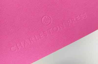
The 4pp cover is produced on our Colorset (100% Recycled) Magenta, 270gsm and is unprinted, being simply, but beautifully, embossed. 
Click on images to enlarge
The 84pp text is printed on our Omnia 120gsm. The reason that Omnia was chosen is because it would beautifully reproduce the wide variety of different media, the artworks, solid colours and dark photography and most importantly feel special - with the reproduction that you would expect on a silk or gloss but with a natural tactile uncoated feel.
...note the solid colours, not a special, made out of CMYK.
Charleston is hosting the first museum display of Vanessa Bell and Duncan Grant’s Famous Women Dinner Service since it was created for Kenneth Clarke in 1932. After this the plates disappeared from public view and their whereabouts were unknown until very recently. The plates were created by Bell and Grant when they lived at Charleston and each plate depicts one famous woman, featuring figures as various as the Queen of Sheba, Sappho, Nell Gwynn, Emily Brontë and Elizabeth I. You can read more about the Dinner Service HERE.
Click on images to enlarge
Below image shows the 6mm spine, the perfect binding. The jacket is printed on Omnia 150gsm.
The wrap around bellyband (70mm high) is printed on our Sixties, 60gsm and because of the translucency, the background images show through.
...you can see the level of show through in the detail image below.
The reproduction on the Omnia is just something else, the level of detail and reproduction is superb as you can see the image below.
The publication is designed by Playne Design who have studios in London and Hastings. Creative Director is Clare Playne with production is handled by Simon Hack. Print production is by Pureprint. This is just an excellent example of a beautifully designed and well executed piece of print, entirely right for the subject.

The publication is available for sale HERE

https://www.charleston.org.uk/
http://www.playnedesign.co.uk/
https://www.pureprint.com/
Posted by Justin Hobson 12.03.2019

Tuesday 14 August 2018

De La Warr Pavilion Events Guide

This is the latest events guide for the De La Warr Pavilion. The De La Warr pavilion is on the seafront in Bexhill in Sussex and is an iconic modernist building by the architects Erich Mendelsohn and Serge Chermayeff which opened in 1936. Following a major renovation in 2005, the pavilion hosts many shows, exhibitions and cultural events.
The finished size is 210x111mm, folding out to 420x553mm and is a 20pp concertina letter fold (I had to look that up!). Side view....
This guide is printed on our StarFine White 130gsm which means that rather than feeling like the vast majority of mass produced leaflets printed on a bit of 115gsm silk or gloss, this has real character and value. The design is such that the listings of the exhibitions, activities and events are all listed on one side (outside)
...with the inside being reserved for a full size image of the exhibition.
As you can see from the image above, it's very dark but has reproduced superbly on the StarFine 130gsm. The project is printed offset litho in CMYK by Banbury Litho.

The new De La Warr identity and design (including the website) is by Playne Design who have studios in London and Hastings. Creative Director is Clare Playne. Print production is handled by Simon Hack. You can read more about the creation of the new identity here:

https://www.dlwp.com/
http://www.playnedesign.co.uk/
http://www.banburylitho.co.uk/
Posted by Justin Hobson 14.08.2018

Friday 29 June 2018

ISTD 90th Anniversary

Yesterday evening I was lucky enough to be invited to the 90th anniversary celebration International Society of Typographic Designers (ISTD) awards held at the wonderful De La Warr pavilion in Bexhill on Sea, East Sussex. It was a wonderful evening at this amazing location.
The De La Warr pavilion is a modernist building by the architects Erich Mendelsohn and Serge Chermayeff which opened in 1936. The enlightened town council opened this new space which was to provide culture and entertainment for the masses – a true people‘s palace.

The evening started with drinks on the rooftop terrace, which was delightful as it was a beautiful evening.
The anniversary dinner was held in the dining area on the second floor, where over a hundred members and guests gathered, including some members coming from as far as Canada.
The wonderful restaurant area has the most amazing panoramic windows looking out to sea, a really perfect backdrop.
The evening began with an introduction by Jonathan Doney, the Chair of ISTD who gave a brief re-cap of the society's history, founded 90 years ago by Vincent Steer who brought together six other like-minded colleagues, for the first meeting of the British Typographers Guild, held at an Italian restaurant in Holborn, London. Jonathan reminded us of the work of the ISTD, including the Student awards which has been running for 45 years and now with programmes in six countries!
After dinner, Andy Altmann, one of the co-founders of Why Not Associates gave a very amusing talk about the influences on his career from the humble Ladybird books, his scrapbooks, to Eric Gill and Why Not's early life as a studio in Soho, shortly after leaving the RCA.
A very special moment in the evening was the award made to Freda Sack (pictured below). Freda was made an Honorary Fellow of the ISTD in recognition of her significant contribution to the Society and the typographic industry. Freda has been a member for over 30 years and has held pretty much every position on the board. Freda managed to achieve this while also running her own successful business.
It was an excellent evening which demonstrated real warmth and friendliness which the world of typography appears to engender. 

 It is so important for the design industry that we nurture and retain organisations such as the ISTD and we must take every opportunity to try and encourage membership, thus ensuring their continued viability. ...and if you aren't a member, have a look http://www.istd.org.uk/- it costs less than £10 per month - which is excellent value! 

Congratulations to the ISTD Board and the events team for arranging an excellent 90th Anniversary -- a huge amount of time and work goes into these events and it is fair that they should be recognised and applauded. 

Posted by Justin Hobson 29.06.2018