Showing posts with label Cordenons. Show all posts

Monday 23 May 2016

Wedding Invitation with a 14 carat flower

This is an exceptionally special invitation produced by Adorn, a wedding invitation specialists based in London. The ceremony was to be held in California and the invitations were entirely bespoke, created for Vanessa and Jim. Vanessa Williams is an American actress and Adorn went through an 'inspiration' process to discover what was important to the couple, to establish ideas which Adorn could then turn into reality.
The stationery set included a wedding invitation card, RSVP cards, security information card, accommodation information, custom envelopes for invitations and reply cards and place cards. The centrepiece of the set is the metallic gold lasercut 'gate' that surrounds the main printed invitation card, which was produced using Stardream Gold, 285gsm.
The above image shows the intricate details being lasercut.

During the inspiration process at Adorn, they discovered that the lotus flower had a really special meaning in the couple's relationship. The flower has a strong presence in new age spirituality and signifies new beginnings and luck. Jim had engraved the lotus flower on their engagement bands so Adorn decided that this detailing needed to be on the invitation. They designed and laser cut a 14k gold plated lotus flower that was hand applied to every invitation as you can see in the image below.
Clearly the happy couple were very pleased with the finished result and the wedding went well in the California sunshine. The feedback has been so favourable, that Adorn have agreed with Vanessa Williams to put her design into production which will make it affordable to everyday couples

...but without the 14 carat gold plated décor!

You can read more about the project here:
Posted by Justin Hobson 23.05.2016

Wednesday 16 September 2015

Packaging Innovations 2015

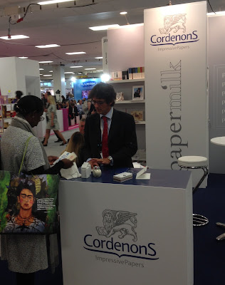
Today I visited the Packaging Innovations exhibition at Olympia. The exhibition also incorporates the Luxury Packaging show and many of the country's leading packaging suppliers are present, together with many suppliers from around the globe.

The show launched in 2010 and Luxury Packaging was introduced in 2013. With over 150 exhibitors at the two-day event it is on today and tomorrow.
http://www.cordenons.co.uk/
There are several paper mills represented at the show, including Cordenons (above) who were showing their new Papermilk range, which is manufactured using a proportion of milk fibres, which produces a luxurious feeling paper.
Last year, the show attracted 4,000 visitors with numbers expected to be far higher this year.
http://www.favini.co.uk/
Favini from Italy (above) were exhibiting a wide range of their products from their Astralux cast coated range to Shiro range of Ecological papers.

If you fancy going, you'll have to be quick! You can register for free on the following link:
http://www.easyfairs.com/events_216/packaging-innovations-london-2015_65089/packaging-innovations-london-2015_65090/
Posted by Justin Hobson 16.09.2015

Friday 4 September 2015

New Flora swatch

We have a brand new swatch for our Flora range manufactured by Cordenons in Italy!
Click on images to enlarge
Flora is available in nine natural shades and it comes in a sensible range of weights: 100, 130, 240 and 350gsm (160gsm is also available from the mill).
For those not familiar with Flora, it is a part recycled paper (with FSC accreditation) with natural, deliberately visible, inclusions and fibres. It has a tactile, rough feel and has a character all of it's own! Below is detail showing the inclusions (and a pencil for scale!):
It really is a lovely range. Muted natural colours and excellent printability. Here are some previous projects which have used Flora to great effect:
http://justinsamazingworldatfennerpaper.blogspot.co.uk/2015/06/baines-fricker.html
http://justinsamazingworldatfennerpaper.blogspot.co.uk/2014/08/lower-mill-estate.html

If you would like one of the new swatches, just drop me an email: justin@fennerpaper.co.uk

http://www.gruppocordenons.com/en/home.html
http://www.cordenons.co.uk/
Posted by Justin Hobson 04.09.2015

Tuesday 25 August 2015

787 and you...

At the end of last year, Virgin Atlantic launched their Boeing 787 Dreamliner. Currently they operate four 787s and by the end of 2015, there will be nine in the fleet.

This is a big commitment for the airline and in order to make sure that all crew and staff are 'on board' and fully informed about the new aircraft, they produced this charming little book.
Click on images to enlarge
Size of the booklet is A6 (148x105mm) portrait, with an 8pp cover and 20pp text and is saddle stitched. The cover is hot foil blocked in metallic gold foil, with a filigree type pattern. The below image shows the amazingly detailed hot foil blocking.
The materials chosen for this book is our Stardream from Cordenons. The 8pp cover is foiled on Stardream Bronze 285gsm and the 20pp text is printed offset litho in two colours on Stardream Crystal 120gsm.
The materials were specifically chosen with the aircraft in mind. The Stardream Bronze used for the cover is an excellent match for the materials used on the outer shells of the seats (in Upper Class) and the text pages are a good match for the pearlescent finish used in Upper Class bar area.
A point I should like to make here is just how important a piece of employee engagement literature, such as this, can be. Many organisations rely on powerpoint presentations, pdf's or even photocopied sheets for their internal communications. By producing this type of well designed, engaging publication, Virgin Atlantic demonstrate their professionalism and dedication to staff involvement.  
There are some superb 'thumbnail' illustrations on the text pages:
The brass wire used for the saddle stitching works beautifully with the gold foiling on the cover. A well considered detail....
If your finisher or printer tries to tell you that they can't get different coloured wire, or if they seem reluctant to use anything other than steel, I suggest you get in contact with these people: http://www.primewire.co.uk/
Above is 'birds eye' view showing 8pp cover. On the right hand side, there is an image showing the three stitches on the inside (centre spread). Generally, a project with an 8pp cover requires the text to be stitched with a 'security stitch' in the middle of the book and the text is then trimmed to size. The 8pp cover is then attached with two stitches in the normal position.

Below image shows the detail of the outside back cover.
Design is by the Virgin Atlantic in-house Design Team and Nik Lusardi is the Design Manager. Designer on this project is freelance designer Val Kildea and thanks to Val for sending me a copy.

Print production is by Hampton Printing based in Bristol and they have made a stunning job of the foiling and print.

http://www.virgin-atlantic.com/gb/en/the-virgin-experience/787.html
http://www.hampton-printing.co.uk/
http://www.vtype.co.uk/
Posted by Justin Hobson 25.08.2015

Wednesday 3 June 2015

Progressive Greetings 2015

Yesterday, the Progressive Greetings Exhibition known as "PG Live" opened at the Business Design Centre in Islington. Aimed purely at the greeting card industry, it's open on 2nd and 3rd June only.
Our modest stand of 3 x 2 metres, displays our boards that are especially suitable for greetings cards and as you can see from the display shown on the stand, we now have quite a few! 
On the stand, we display a wide range of materials from our supplying mills including Cordenons, Reflex (Zanders) and Favini and Euler to name just a few...
We also have on display some sample cards printed on a variety of our materials, by Ricoh. These cards are printed on a Ricoh ProC1900, digital press and the results are excellent.  
Our stand is designed by Vincent Design, who I must thank for their considerable input. Fenner Paper is proud to have been the first paper company to be granted Associate Membership of the Greeting Card Association (GCA), in 2013.
If you are a designer or publisher of greeting cards, please do come along today and we look forward to welcoming you - we're on stand 506.
www.progressivegreetingslive.com
Posted by Justin Hobson 03.06.2015

Tuesday 28 October 2014

New "pocket" swatch for Stardream

We've just produced a new swatch for our range of Stardream, which is the market leading pearlescent and metallic paper range produced by the Cordenons paper mill in Italy. Many people have become fans of the light irridescent finishes and the dual sided deep metallic finishes which do truly shimmer. Stardream is used for a wide range of applications, including cover, presentation folders, Invitations, greetings cards and luxury packaging.
This new swatch is a handy smaller DL size (210x99mm) but still includes the whole range, with "chips" glued on, to show the wide spectrum of colours
As well as being available in the 31 shades, Stardream comes in a good weight range. All items are available in 120gsm and 285gsm with some of the most popular items also available in 340gsm board and a 110gsm one sided (particularly used for luxury packaging - paper over board boxes and casebound covers).

You can see the whole range here: http://www.cordenons.co.uk/
If you would like to receive one of the new Stardream swatches, just email me (justin@fennerpaper.co.uk) and I'll pop one in the post.

http://www.cordenons.co.uk/
http://www.gruppocordenons.com/en/
Posted by Justin Hobson 28.10.2014

Wednesday 8 October 2014

ISTD Awards Book 2014

The ISTD 2014 awards catalogue perfectly illustrates the awards, the diversity of media and approach and an inspiring overview of international typographic design.

The cover is beautifully hot foil blocked in a combination of white and gloss black foil. The size of the publication is 185x130mm, portrait and is section sewn. The 8pp cover is printed on our Notturno 300gsm (which is our black range from the Cordenons mill in Italy - 90gsm up to 700gsm).
 
The below picture shows the 8pp cover with the 17mm thick spine - 176pp which makes quite a chunky little book.   
The hot foil blocking goes around the outside cover onto the flaps on the inside front and back covers.
The 176pp text is printed on our Omnia, White 150gsm which has reproduced fantastically - giving all the images used to show the award winners a huge amount of detail, while still making a tactile book that feels good in the hand.
It must be difficult to get an awards book like this to hold together in consistent way, showing the wide and diverse work in an interesting way, without it looking too formulaic. This book is well laid out and most readable.
Art direction and design of the awards book is by Playne Design. Designers on the project are Ade Mills, Clare Playne and Andy Scarles.
 
Photography for the awards book is by John Reynolds http://www.clickclickclick.net/
 
The excellent printing, foiling and binding is by Banbury Litho  www.banburylitho.co.uk
 
The awards book is now for sale "A three year snapshot of design (1 May 2011 to 4 June 2014) of work entered from around the world by designers who have used typography as an integral part of their design solution. An inspiring sourcebook of typographic excellence"
 
Posted by Justin Hobson 08.10.2014

Thursday 14 August 2014

Sopianae Brand Book

This project is a brandbook for Sopianae, which is the most well known cigarette brand in Hungary. This book covers the history and culture of the brand whilst explaining the relationship with the Rountable Agency who are their brand communication consultancy.
 
It is a very large book at 415mmx260mm! It comes with a slipcase and the whole print package is superb and made extra special by the binding.

This is generally described as 'Japanese Binding' as it is in the Size|Format|Stock pamphlet that I wrote, although as I've pointed out in the same publication, terminology is certainly not universal - I doubt if they call this Japanese binding in Japan!
The cover is formed by a 2mm greyboard which is silkscreened in three colours and mounted on the cover. The 64pp text is on a mixture of an uncoated ivory coloured paper (unknown) and our Stardream Crystal 120gsm from Cordenons in Italy.
Now what has made this project particularly worthy of note is that there were not that many copies produced, so in the main, this job was produced on a digital press (HP Indigo). However because of some of the 'throw outs' - such as below, some of the pages had to be printed offset litho as the format of the digital press (in this case SRA3) wasn't large enough.
So the clever thing, from a print point of view, was to get the litho and digital sheets to match! not that easy to do but the end result is superb - as you can see below digital meets litho on the same spread.
The other thing that makes it slightly less complicated is that Stardream is kept in stock as HP Indigo ready, as well as the sheets for offset litho.
Stardream is a pearlescent and metallic range which shimmers and the pic below may give some idea of how it looks:
Design is by the Roundtable Agency. Head of Art is Franco Reda.
 
Printing and the terrific binding - which was all achieved in house is by Zone Graphics. They truly have excelled.
http://www.roundtableagency.co.uk/
www.zonegraphics.co.uk
Posted by Justin Hobson 14.08.2014