Showing posts with label Gavin Martin Colournet. Show all posts

Monday 25 January 2021

Brigade Court Floorplans

Brigade Court is a new residential community in the heart of Borough, London SE1. Set in the former home of the London Fire Brigade, it connects past, present and future through a mix of Grade II listed buildings and the finest contemporary architecture, set around a central courtyard for a traditionally different take on modern living.
The branding and identity for Brigade Court, including online development is by Jack Renwick Studio and this is the Floorplans literature...
Size of the brochure is 388x278mm, portrait and is singer sewn. It has a 4pp cover with a linen embossing from that other well known "Hull based paper merchant"! The 68pp text is printed on Marazion Ultra 115gsm.
Click on images to enlarge
For readers not familiar with Marazion Ultra, it's a fully coated paper but it really does have a dead flat MATT surface. There are many papers on the market which profess to be matt (and some which incorporate the word matt in the name, but aren't!) ...but this really is - and if you don't believe me, just ask for a sample!
Reproduction of solid colour is also excellent as you can see from the solid blue above - dead flat and an excellent printed solid - what a result!
Centre spread (above) and detail below showing the singer sewing with the yellow thread which works with the gold hot foil blocking on the outside cover, which in turn is reminiscent of the heritage of the brass helmets that firemen used to wear when this Fire Station was built for the London Fire Brigade.
The brochure is printed CMYK plus the special blue and metallic gold used for headings and in the floorplans below...
Click on images to enlarge
Reproduction of the images is superb, as you can see from the detail image below... 
Marazion Ultra has a good bulk and opacity, so using the 115gsm weight works well, light enough to allow the 68pp text to be singer sewn and flows beautifully in the hand.
Brand identity and design is by Jack Renwick Studio. Their brand idea ‘Traditionally Different’ celebrates the distinctive contrasts of the development. Archival photographs of the firefighters and fire station sit with images of the apartments and local area, creating a series of collages that convey the site’s distinctive marriage of old and new. This project won gold in the Print Design category of  the Drum Awards, which you can read about HERE
Jack Renwick Studio celebrated their 9th birthday last week and with work like this in their portfolio, they have much to celebrate!

The excellent print, repro and finishing is by Gavin Martin Colournet, based in Leyton with Phil Le Monde handling the project.

Posted by Justin Hobson 25.01.2021

Thursday 2 July 2020

Jobs from the past - Number 128

Regular followers of this blog will know that my first post of every month is a "job from the past" so that I can show some of the really good work from years gone by and this publication is from 2000. 

My Ford Mondeo - Sardinia 2000
This very industrial looking notebook was produced for the Ford Motor Company by Imagination, who have worked for Ford for many years and still do. This notebook was presented to participants of a Ford Mondeo symposium held on the beautiful island of Sardinia.
The book has a deliberately "workshop manual" feel. Size is A5 (148x210mm) Landscape and is wire-o-bound with a silver wire. The covers are produced on our Construction Blackstone 1500mics and the 60pp text is printed on Neptune Unique 170gsm.
The text is printed CMYK throughout and the text in this particular edition is in Hungarian!
The cover is silkscreen printed in three colours, silver, white and dark grey.
If you aren't familiar with Construction Blackstone, it is what is often described as a "millboard". It is produced on a board machine which makes up the board using wet layers of fibres, which is similar to the way Greyboard is produced, but this is not a Greyboard! This is a hard, dense, 100% recycled board with extraordinary rigidity and stiffness. It has a dark grey colour and a very hard surface. The below image shows the recycled, flecky nature of the surface with the Ford logo silkscreened in silver on the outside back cover.
The below image shows a detail of the wiro and the 1.5mm thick covers.
Concept and design is by Imagination. The print, silkscreen and wire-o-binding is by Gavin Martin with Phil Le Monde handling the project ...back in the days when they were based in West Norwood!

https://imagination.com/
https://www.gavinmartincolournet.co.uk/
Posted by Justin Hobson 02.07.2020

Monday 8 June 2020

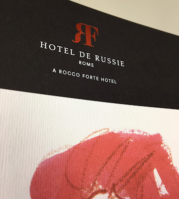
Hotel de Russie - Rome

Located between two of Rome’s most picturesque piazzas, Piazza di Spagna and Piazza del Popolo, Hotel de Russie is one of the Eternal City’s most prestigious luxury hotels. An enduring favourite of artists and writers, stars and politicians, Hotel de Russie was dubbed “paradise on earth” by French poet Jean Cocteau in 1917. The hotel incorporates a stunning Mediterranean tiered Secret Garden, with rose bushes, orange trees and mature pine.

This the brochure for the hotel, which follows the new brand identity for Rocco Forte Hotels, created by Pentagram.
Size of the brochure is 266 x 204mm, portrait and is saddle stitched. The cover is an unusual format as there is an 8pp cover with 140mm wide flaps and there is an outer jacket, only 210mm high, also with 140mm flaps. It is the first time I've seen this combination and the effect is superb...
Click on images to enlarge
The materials used for the covers is our Dali range, which is a 'felt-marked' paper with a linear effect and a natural, tactile feel. If you click on the image below, you will be able to see the texture in the paper.
Click on images to enlarge
The cover is on Dali Nero 200gsm and is hot foil blocked in matt white and copper foil. The jacket is printed on Dali, Candido, 160gsm and is litho printed in CMYK on one side only.
Click on images to enlarge
The 16pp text is printed offset litho on our Marazion Ultra 135gsm, chosen because of it's dead matt flatness which would reproduce the interior images well without a glossiness which would detract from the classic look and feel of the hotel.
click on images to enlarge
The brochure has a beautiful, quality feel and flows in the hand superbly. The combination of photography, materials and quality print makes this a wonderful piece of print.
Design is by Pentagram. The excellent print, repro and finishing is by Gavin Martin Colournet, based in Greenwich, South London.

https://www.roccofortehotels.com/hotels-and-resorts/hotel-de-russie/
https://www.pentagram.com/ 
https://www.gavinmartincolournet.co.uk/
Posted by Justin Hobson 08.06.2020

Monday 20 January 2020

Lollard Street

Lollard Street in Kennington epitomises Homes For Lambeth’s commitment to more and better homes for Londoners. The development consists of 12 private apartments and 7 townhouses, overlooking Lambeth Walk Open Space.

This is the superbly produced sales brochure for the development. The size is 380x280mm portrait, which is a size with lovely proportions.
It is 16pp self cover, saddle stitched, printed on Shiro Echo, White 160gsm and in this oversized format, it flows superbly with the large format pages working perfectly on the 160gsm weight.
The brochure is printed offset litho and the quality is superb. The colour work is excellent but the black solids (above and below) are exceptional...
Click on images to enlarge
Shiro Echo is our 100% Recycled range and also carries the FSC Recycled classification. Shiro Echo is available in two shades; there is a white shade (which is a natural/off white) and similar to the old shade of Cyclus and a Bright White shade which is similar to the old Cocoon range.
Click on images to enlarge
Simply saddle stitched but beautifully finished with the right paper in the correct weight is what makes this piece a job of real quality.
Branding, art direction and brochure design is by London based Ignite and you can read more about this project here.

The excellent print, repro and finishing is by Gavin Martin Colournet, based in Greenwich.

http://ignitetv.com/
https://www.lollardstreet.com/
http://www.gavinmartincolournet.co.uk/
Posted by Justin Hobson 20.01.2020

Friday 27 December 2019

Johnson Banks Christmas

Of the wide variety of Christmas cards I received, this one from Johnson Banks, really stands out. The size of the card is A5 (148x210mm) and is very simply printed and produced, but the content is wonderful, made up using a series of 'tick boxes' as I hope you will be able to see from the images below...
The card is made using our Colorset 100% Recycled 350gsm, duplexed - so it is Colorset White on one side and Colorset Nero on the reverse.
Click on images to enlarge
The card is printed (before duplexing) by Gavin Martin Colournet using their HP Indigo digital press which works brilliantly on the white ink on the black.

Below shows the 700gsm thickness and the duplexed black and white shades...
www.johnsonbanks.co.uk
www.gavinmartincolournet.co.uk
Posted by Justin Hobson 27.12.2019

Friday 6 September 2019

Assila Hotel, Jeddah

Offering a rooftop outdoor pool and spa center, the Assila Hotel, part of the Rocco Forte hotel group, is located in Jeddah in the Makkah Al Mukarramah province.

This superb brochure for the hotel, reveals the new Rocco Forte branding by Pentagram.

The format is A5 (210x148mm) portrait and is saddle stitched. The 8pp cover is printed and foiled on Dali, Perla 200gsm and the 36pp text is printed on our Marazion Ultra 135gsm.
Click on images to enlarge
Below shows a detail image of the 8pp cover showing the full width flaps.
The book is written and produced entirely in arabic and therefore it opens at what we in the west consider to be the back, so the image below shows the inside front spread.
The material used for the cover is our Dali range, which is a 'felt-marked' paper with a linear effect and a natural, tactile feel. If you click on the image below, you will be able to see the texture in the paper.
The 36pp text is printed offset litho on our Marazion Ultra 135gsm, chosen because of it's dead matt flatness which would reproduce the interior images well without a glossiness which would detract from the cool look and feel of the hotel.
Inside back cover with cover flap opened...
Below image showing that it sits nice and flat without 'gaping' in the centre of the spine.
The excellent print, repro and finishing is by Gavin Martin Colournet, based in London.

https://www.roccofortehotels.com/hotels-and-resorts/assila-hotel/
https://www.pentagram.com/
https://www.gavinmartincolournet.co.uk/
Posted by Justin Hobson 06.09.2019