Showing posts with label Shiro Echo. Show all posts

Thursday 22 April 2021

Today is Earth Day

Earth Day is an annual event first held on April 22, 1970. It now includes a wide range of events coordinated globally by EARTHDAY.ORG including 1 billion people in more than 193 countries.

What better day to tell you about the recently refreshed Shiro Echo 100% Recycled paper range!
Favini is a paper manufacturer based in Italy with mills in Vicenza near the city of Venice and at Crusinallo. They have taken a lead in the utlisation of non-wood pulps since the early 1990’s and they are the manufacturers of the Shiro Echo range. It was launched over a decade ago being a range of  text & cover papers manufactured using 100% post consumer waste.  
Shiro Echo was originally just two shades; a white shade, which is a natural/off white (and similar to the old shade of Cyclus) and a Bright White. With weights from 80gsm up to 350gsm, it is 100% Recycled and also carries the FSC Recycled classification.
The new additions to the range are three 'RAW' shades which have a slightly rougher/toothier surface and are in earthy tones of Grey, Sand and Black. The new shades are available in 120, 200, 250 and 350gsm. 
To accompany the brand refresh, there is a new printed sample book too...
Artist Lyndon Hayes was commissioned to capture the processes and the sheer scale and the noise of the production at the mill.
Size is 240x154mm, portrait and shows offset litho, silkscreen and hot foil blocking.
Design and art direction is by Silk Pearce. If you would like a copy of the Shiro Echo showbook and swatch, just ask me for one! Email justin@fennerpaper.co.uk

Posted by Justin Hobson 22.04.2021

Monday 4 January 2021

Jobs from the past - Number 134

Regular followers of this blog will know that my first post of every month is a "job from the past" so that I can show some of the really good work from years gone by and this publication is from only a few years ago in 2017.

The Print Shop - 40 Years of Calverts
Calverts is a workers' cooperative with a history of creating and producing eye-catching print and design. To celebrate Calverts 40th year, they invited Alice Pattullo and publishers Design For Today to work with them on a creative print animation, following the journey of an idea as it transforms into a finished product. It's a whirlwind tour through illustration, art direction, design, file set up and reprographics, with a sprinkling of handy tips along the way.
The size of the publication is 148x95mm, portrait with a 6mm spine.
The below image shows the inside spread with hot foil blocking on the right hand page...
This publication is a long concertina - it is quite simply one long sheet which concertina folds into a pre-creased spine, which forms a cover.
The below image shows a 'birdseye' view which demonstrates how it folds into the spine. Over the last 30 years, I have always referred to this format as a long concertina, however in recent years people have started using the term Leporello to describe this type of folding - personally I think this is just confusing! 
The 26pp book is actually made from two sheets of paper, carefully joined, with a glued tab, which you can just make out in the image below.
The below image shows both sides stretched out fully.
Click on images to enlarge
The publication is printed Offset Litho on our Shiro Echo, White 250gsm, which is 100% Recycled and FSC accredited. The weight of the material is crucial for this format - too heavy and it will be too springy, too light and it won't take the creases and hold together well enough, 250gsm is just perfect. Here are some of the spreads...
Click on images to enlarge
Below is the spread about Riso printing, where there is a 'tipped in' sheet, which is Riso printed on the right hand page.265x168
The page is 265x168mm and is folded once to reveal the below...
...and then folding up.
...there's even information about paper sizes.
It's a really beautifully conceived and executed publication with superb illustrations by Alice Pattullo and excellent writing.

And the great news is that if you would like to have your own copy, you can buy still buy them online HERE.

Posted by Justin Hobson 04.01.2021

Tuesday 15 December 2020

Community Clothing 04

Founded by British Fashion Designer Patrick Grant, Community Clothing is a social enterprise with a simple mission - to make excellent quality affordable clothes for men and women, to create great jobs for skilled workers and by doing this help to restore real pride in Britain’s textile communities. They do this by working with under utilised UK factories during their quiet periods, which is a great concept.

This is Community Clothing's look-book and catalogue CC4 and it is an absolutely superb publication, wonderful art direction, photography and printing. I wrote about the previous publication CC3, last year.
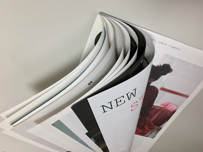
The size is 315x210mm, portrait and is a 32pp self cover which flops and rolls really nicely in the hand....
Click on images to enlarge
The publication is printed on our Shiro Echo, White 80gsm which is 100% Recycled and also carries the FSC Recycled classification. 

Shiro Echo is available in two shades; there is a white shade (which is a natural/off white) which is a bit like a newsprint/newspaper shade and a Bright White shade.
The publication is printed offset litho in CMYK throughout. The colour is bright and vibrant and the image reproduction is excellent as I hope you can see - bear in mind it's printed on an 80gsm 100% Recycled!
Below is a detail image which shows the excellent image quality - note the excellent fleshtone reproduction.
Click on images to enlarge
The below spread explains the mission and the locations in the UK where the 28 factories are located.
Design is by Moving Brands. Printing is by Principal Colour. A really superb piece of design and print.

Posted by Justin Hobson 15.12.2020

Thursday 8 October 2020

Beau Cacao

This boutique chocolate maker, based in South Eastern France, was founded in 2013 by Bo San Cheung and Thomas Delcour. Beau Cacao craft their full-bodied single-plantation chocolate in Briançon, Hautes-Alpes from cacao which is sourced directly from farmers in Malaysia.
The colours of each of the bars were chosen based on the flavour profiles of the chocolate, red to match smoky tobacco and paprika and yellow for caramel and brioche. 
The board chosen for the wrap/boxes is our Shiro Echo, Bright White 250gsm, from Favini, which is 100% recycled, FSC accredited and carbon balanced. You can read more about Shiro Echo here.
The distinctive mold of the chocolate bar (above) was designed by Adam Gill.

Each of the wraps are printed offset litho in a special colour and superbly hot foil blocked in a gloss metallic foil...
Printing is by Identity, based in Paddock Wood, Kent and they are just gorgeous - colours are bright and solids are superb - the hot foil blocking is perfectly executed (Identity are one of the few printers to have hot foil blocking facilities 'in-house')

Posted by Justin Hobson 08.10.2020

Monday 20 July 2020

Sustainable Print

Park Communications in London has an enviable reputation as being one of the Capital's foremost corporate printers and one with the highest environmental credentials, having won Printweek Environmental Printer of the year in 2017 followed by a highly commended in 2018.
Park has produced this guide aimed at providing tips about sustainable printing for brands and includes articles on sustainable materials, sustainable large format, and the creative opportunities of sustainable printing.

Size is A5 (210x148mm) portrait. The 4pp cover is printed on Crush, Corn 250gsm with the 8pp text on Shiro Echo, White 120gsm.
The above image shows a project for Spitfire Audio, printed by Park on a combination of Shiro Echo and Flora Giglio, which I wrote about on this blog here.
Our Crush range from Favini in Italy, is manufactured using 15% agro-industrial residues from the processing of corn and hopefully, in the below image, you can see the small specs and inclusions in the paper.
The guide is written, designed and printed by Park Communications and is digitally printed using their HP Indigo press. It is also available as a pdf download here.

https://www.parkcom.co.uk/
Posted by Justin Hobson 20.07.2020

Thursday 16 April 2020

Toast - The Making of a Pioneer

TOAST began with loungewear and nightwear, designed in a farmhouse in Wales. Founded by James and Jessica Seaton in 1997, the collections reflected a sense of ease and a slower, more thoughtful way of life.

Today, led by Suzie de Rohan Willner, TOAST creates and curates simple, functional, beautiful clothing and homeware. TOAST has shops throughout the UK and can be found in concept stores across the US and Europe. With studios in both London and Swansea, TOAST continues to design and develop all collections in-house and is proud to be one of the few fashion brands with its own full pattern room – lined with calico toiles and full of pins, papers, chalks and spools of thread, it is a true place of making.
This publication is their wonderful look-book for the AW19 collection titled The Making of a Pioneer and begins with this preface:
Click on images to enlarge
The look-book is A4 size (297x210mm) portrait, saddle stitched with a 90pp text and is printed offset litho in CMYK throughout. 
The superb photography of Jo Metson Scott appears throughout the publication...
The reproduction is excellent as you can see from the image below, you can even see the detail in the dark areas of CMYK
The 90pp text is printed on Shiro Echo, White 90gsm which is 100% recycled and FSC accredited and as you can see, it works just beautifully...
Throughout the publication there are essays, including this one about Eva Hesse written by Corinne Julius
Click on images to enlarge
...and an article titled Inside the Kew Herbarium written by Matt Collins, with photography by Kendal Noctor.
House and Home photography is by Noemie Reijnen.
It's hard to know where to stop, these spreads are just so good, the mono image (reproduced in CMYK) is superb.
The look-book flops and folds in the hand beautifully...
Creative Director is Luciana Newell, who's work has appeared on this blog before. Graphic designer is Mia Shurey. The excellent print and finishing is by Westdale Press, based in Cardiff.

A superbly produced publication; art direction, photography, design, writing and printing is all truly excellent.

http://www.westdale.co.uk/
http://www.jometsonscott.com/
Posted by Justin Hobson 16.04.2020