Friday 25 November 2016

New Flora Swatch

We have a brand new A5 swatch for our Flora range manufactured by Cordenons in Italy. If you aren't familiar with Flora, it is a part recycled text and cover paper with a deliberately recycled look and feel with specks and inclusions, so it looks deliberately flecky and specky. Flora is produced with 30% post consumer de-inked waste, together with 60% of virgin FSC pulp and with the "secret" ingredient of 10% of cotton fibres, which gives the paper a wonderful tactile feel.
All the shades have the specks and inclusions with the exception of the Gardenia shade which is a "clean" neutral white shade. The range consists of nine shades in total including Anice, Giglio, Avorio, Tabacco, Noce, Gardenia and three new shades...
Click on image to enlarge
...which are lovely new deeper shades: Crusca, Canella and Ginepro
Below shows the detail of the natural, deliberately visible, inclusions and fibres - this paper has a character all of it's own!
It really is a lovely range. Muted natural colours and excellent printability. Here are some previous projects which have used Flora to great effect:
http://justinsamazingworldatfennerpaper.blogspot.co.uk/2015/06/baines-fricker.html
http://justinsamazingworldatfennerpaper.blogspot.co.uk/2014/08/lower-mill-estate.html

If you would like one of the new swatches, just email: justin@fennerpaper.co.uk

http://www.gruppocordenons.com/en/home.html
http://www.cordenons.co.uk/
Posted by Justin Hobson 25.11.2016

Wednesday 23 November 2016

Mapping Progress

http://www.bioregional.com/Bioregional was founded in 1994 by Sue Riddlestone and Pooran Desai, two environmental activists and campaigners based in Sutton, South London who were keen to found practical green and sustainable initiatives. From small beginnings it has grown into an organisation which has founded several green enterprises, influences the sustainability of many thousands of new homes and works with global businesses to make their operations and strategy more sustainable.

This publication is their 2015-2016 annual review, titled "Mapping Progress"
 
The finished size is 295x170mm, and it is a broadsheet format folding out to a flat size of 850x590mm. It folds down to reveal the below...
 ...and then it concertina's out as you can see in the image below:
As one might expect from and environmental organisation, there are sustainable facets to the production of this report. To start with, it is printed on our Redeem 100% Recycled 100gsm. The paper is a neutral white shade which really works with the images whilst also giving a 'nod' to the look and feel of a map, reproduced one side. It is printed offset litho and the whole job is just printed on one sheet of paper, with no binding, making this about as environmentally friendly (from a production point of view) as you can get.

Below are the images showing the flat size on both sides:
Click on images to enlarge
 
Design is by London based design company William Joseph and the creative director on the project is Stéphane Harrison. Print is by Pureprint.

...and thank you to Julia Hawkins at Bioregional for sending me copies of the report and the lovely note!
Posted by Justin Hobson 23.11.2016

Friday 18 November 2016

Linklaters Invitation

This is one of the most stupendous invitations to have appeared on this blog! The event is the Capital Markets Reception hosted by the legal firm Linklaters this month. The reception was held in the glamorous surroundings of the Claridge's Ballroom.


Titled with Shakespeare's erudite words "All the World's a Stage", the invitation is a genuinely theatrical production...
The invitation is a two part production - an invitation in a pocket. The finished size of the invite is A5 (210x148mm) with the black inner cards being 206x144mm, so they slip in nice and easily.
The red slipcase is produced using our Flockage Bright Red 400gsm, perfectly replicating red velvet theatre curtains. The inner invitation is on Colorplan Ebony 540gsm ( ...from the other well known, Hull based paper merchant!).
For those of you which are not familiar with this product, it is a flocked board which feels like a velvety cloth/material to the touch but which remarkably you can actually "flatten" the pile by use of a  "heat de-boss". In this case the shape of the curtains is not printed, it is "heat de-bossed" which creates the effect below:
...and it is then hot foil blocked in gold metallic foil - just look at the details on the tassels.
Below is a detail of the reverse of the slipcase, which shows what is described as the "nap" which is the pile found on velvet - just like the curtains in a theatre!
Concept and design is by GM Toucari, a London based legal communications agency. Project director is Gary Clark.

The superb execution of the project is by Benwells. They produced all the foiling and finishing - all of which is superlative. Paul Haslam at Benwells oversaw the project and thanks to Paul for sending me the samples

http://www.linklaters.com/
http://gmtoucari.com/
http://www.benwells.co.uk/
Posted by Justin Hobson 18.11.2016

Wednesday 16 November 2016

Draw a line

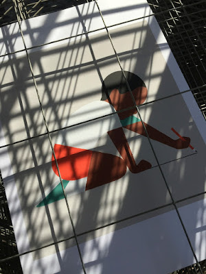
This is a recent collection of prints produced by Harvey Lloyd Screenprint for British graphic artist and illustrator, Adrian Johnson. His work is known for his economical, highly crafted graphic work an his working process all derives from obsessively drawing and re-drawing on paper, breaking down ideas and concepts into their purest form.
Size of the prints is 400x360mm, portrait. They are six-colour screen prints and are printed on our Matrisse 200gsm. Matrisse is a tactile uncoated white board with a high bulk and is perfect for silkscreen work.
You can see and read more about the project here:  http://www.adrianjohnson.co.uk/#/draw-a-line/
Adrian Johnson relentlessly aspires to seek balance between simplicity and sophistication, he is reductionist at heart. In October he gave a talk and workshop at the Apple Store on Regent Street, London about distilling ideas and images through reduction. In his words... "I'll be working with iPad Pro and Apple Pencil to help illustrate how my working process involves taking on board a plethora of information, and how I reduce this information into 'simple yet sophisticated' illustration and graphic art". 
Adrian Johnson's work has been exhibited in London, New York, Los Angeles, and Tokyo. He lives and works in Copenhagen, Denmark.
The prints are produced in an edition of 25 copies. and have been beautifully printed by Harvey Lloyd Screenprint, who are based in Wadhurst, East Sussex.

http://www.adrianjohnson.co.uk/
http://harveylloydscreens.co.uk/
Posted by Justin Hobson 16.11.2016

Monday 14 November 2016

Cooper Associates

Cooper Associates is an award winning mortgage advisory firm based in the South West. The group also combines Cooper Associates Wealth Management and Cooper Associates Accountants offering accountancy services to clients.

This brochure is for the whole group and was designed by Maidstone based design studio, Project 64.

The size of the brochure is A4 (297x210mm) portrait and is saddle stitched. The cover is striking with the image of a skeleton of a leaf, reproduced by thermography in a subtle off white shade...
...which hopefully you can see in more detail here: 
It is printed on our StarFine White, with a 4pp cover on 350gsm and 8pp text on 150gsm, giving the publication a weighty, quality feel. StarFine is an uncoated paper and as the images show, image reproduction is excellent. The solid blue and photographic images look stunning - a great amount of detail for an uncoated paper, colours are bright and vivid. Printed CMYK, offset litho, throughout.
The below image is the inside back cover - no text, just the image, which conveys a sense of space without information being crammed into every nook and cranny...
Below is a detail showing the "read-over", which is where one page meets another in the spine and I think this is spot on:
Here are two further images showing the striking cover, where the leaf skeleton covers both the front and back cover.
If you would like to read more about Thermography, you can do so here: http://justinsamazingworldatfennerpaper.blogspot.co.uk/2014/02/what-is-number-2.html
Print, including the Thermography, is by Paddock Wood based printer Typecast Colour.

Literature design (and the stationery and Website) is by Kent based consultancy Project 64. Design director on the project is Claire Hobbs.

http://www.cooperassociatesltd.com/
http://www.project64.co.uk/
http://www.typecast.co.uk/
Posted by Justin Hobson 14.11.2016

Friday 11 November 2016

RE Masters Exhibition - Etching

The Masters is a series of annual exhibitions established by the Royal Society of Painter-Printmakers focusing on a particular branch of printmaking and this year's exhibition, curated by Norman Ackroyd RA RE, is devoted to works that employ any intaglio printmaking techniques. The Royal Society of Painter-Printmakers (RE) was founded as the Society of Painter Etchers and Engravers in 1880. It was established to counter the Royal Academy’s then refusal to recognise printmaking as a creative rather than a merely reproductive art. All Members are elected on merit, based on the quality of their work alone, in a tradition reaching back over a hundred years.
I was pleased to be invited to the opening and private view of the exhibition, on Wednesday evening, at Bankside Gallery (next door to Tate Modern) which is a lovely space and is home to the Royal Watercolour Society.
The exhibition (which is free) runs from 9th -20th  November 2016 and the intaglio printmaking techniques utilised include: etching, aquatint, engraving, drypoint and mezzotint.
...as you can see below, the gallery was packed to capacity to hear Norman Ackroyd's introduction and official opening of the exhibition.
Fenner Paper sponsored one of the prizes awarded on the evening. The prize was awarded to Claire Willberg, a printmaker who is a member of the Slaughterhaus Print Studio in South London. Claire's winning entry titled Sugar Stick s an "etching and chine-collé" which I believe is made using cut out paper and is pictured below:
Claire Willberg and Michelle Avison currently have an exhibition titled Re-Pull at the Stone Space Gallery in Leytonstone.
 
I would thoroughly recommend a visit to the Bankside Gallery to see this amazingly diverse range of work - many works are also available to purchase at very reasonable prices. The exhibition runs from 9th -20th November 2016.

http://www.re-printmakers.com/
http://www.banksidegallery.com/
http://www.clairewillberg.com/
Posted by Justin Hobson 11.11.2016

Wednesday 9 November 2016

LCC Degree Show Book

The identity for this year's LCC degree shows is by Tara Hanrahan at Think/Do, which includes interior signage, exterior signage, wayfinding and literature. With over 700 graduating students showing a diverse range of work, it is a serious challenge for any identity to encompass the breadth of what is on offer. You can read more about the identity work here:
http://blogs.arts.ac.uk/london-college-of-communication/2016/05/20/interview-tara-hanrahan-on-designing-for-lcc-degree-shows-2016/

The printed collateral includes this information booklet. Size is A5 (210x148mm), portrait and is saddle stitched.
The 4pp cover is on Colorset (100% Recycled) Lemon 270gsm, printed offset litho in black only.
The 8pp text is printed on Crush, Kiwi 120gsm, printed in two colours, black and a special colour.
If you are not aware of our range called CRUSH from Favini, it is very unusual! The paper is made partly using the residue from the industrial processing of crushed citrus fruit, coffee, nuts, olives, kiwi, corn, cherries, lavender and most recently grape. These agro-industrial "end of life" products replace up to 15% of conventional tree pulp and are combined 30% post-consumer recycled waste, FSC virgin fibre and is produced with 100% green energy. As a result, the sheet is not a "clean" paper, it has identifiable pieces of residue visibly in the paper, as you can see below...
The range is available in 100, 120, 200, 250 and 350gsm and the shades are natural, earthy tones and the feel of the paper is natural and tactile. See the range here.

Printing is by Calverts, who are a London based printing cooperative who focus on sustainable printing. Another lovely design and print touch, is the use of the black wire stitches (staples) below:
Sustainability is an important facet to Tara's practice, which accounts for the selection of these sustainable papers and printer. Thanks to Tara for sending file copies (and the note) and also for supplying me with images of the book.
Posted by Justin Hobson 09.11.2016