Wednesday, 7 March 2012

...not just a business card.

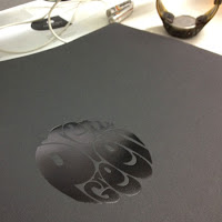
Now, it's said that a lot can be told from someone's business card and here's an identity project which makes the business card tell a story by being beautifully and cleverly interactive.

Privacy International is a human rights 'watchdog' organisation focused on privacy intrusions by government and businesses. The London based organisation has a network in 46 countries and are frequently called upon to give expert testimony to parliamentary and government committees in countries around the world including the United Nations.

The "redacted" business card is all about protecting personal information:

I certainly can't add anything to what the pictures already show - a truly brilliant piece. 

The identity (including the cards) is by London based design agency, This is Real Art. Creative Director is Paul Belford and Head of Design is Martin Brown.

I should of course mention that they are printed on our lovely Avebury Recycled Wove 250gsm (50% recycled and FSC certified). Print (and perforations of course) is by Chapter Press.

www.privacyinternational.org
www.thisisrealart.com

Posted by Justin Hobson 07.03.2012

Monday, 5 March 2012

RCA Alumni 2012

This year the RCA is celebrating 175 years. Originally founded as the Government School of Design, it went through another guise as the National Art Training School before it's elevation to the Royal College of Art.

Current membership of the organisation that represents the Alumni of the Royal College of Art, called AlumniRCA is 5,906. Each year they produce a publication to communicate with and about the Alumni and the current activities/developments at the college.

It is a simple, economical format, easy to use for both mailing and display purposes. The format is a 16pp, closed gatefold. Size is A5 folding out to A2 (420x597mm).
Front Cover:
Opening out to:
Opening out again to:

...and folding out to:
Inside, poster image is made up of two images, titled "End of Term Frolic" Students at the National Art Training School 1894: 
Design is by Europa and the designer on the project is Paul Tisdell. The publication is printed on Omnia 120gsm which was chosen because of the tactile feel and the way it would reproduce the images and most importantly the vivid fluorescent orange - which is superb - almost looks like a silkscreen result. The job was printed and finished by Pureprint.

...and thank you to Patricia for kindly sending me some file copies.
175 brand designed by Research studios (http://www.researchstudios.com/)

Posted by Justin Hobson 05.03.2011

Sunday, 4 March 2012

It doesn't all just happen in London!

Tickets for the inaugural Cheltenham Design Festival taking place over three days in April have just gone on sale and it has to be said, they have organised an excellent line up.

The festival runs on Friday 20th, Saturday 21st and Sunday 22nd April -the Parabola Arts Centre in Cheltenham hosting 26 events – a series of debates, discussions and interviews – featuring leading figures in the design world, including:

Stephen Bayley, Nick Bell, Mark Champkins, Oli Christie, Peter Clegg
Gary Collins, Bruce Duckworth, Kenneth Grange, Steve Haggarty, Sir John Hegarty, David Hillman, Stephen Hodder, Lucy Holmes, Steve Holmes, Matthew Humphries, Nick Jankel, Simon Kavanagh, Charles Landry, Steve Lloyd, Ptolemy Mann, Stephen Marshall, Stephen Marston, Roger Mavity, Ed Douglas Miller, Dan Pearson, Paul Priestman, Torsten Reil, John Roberts, Stefan Sagmeister, Brita von Schoenaich, Adrian Shaughnessy, Sir John Sorrell, Frank Stephenson, Gav Strange, Professor Daniella Tilbury, Mills ‘Chief WONKA’, Matthew Wells, Craig White, Jonathan Worth

A really impressive line up with some big names together with interesting people who don't necessarily do too many of these kinds of talks/debates/presentations.

A particular coup is the appearance of Stefan Sagmeister who is doing a talk on the Saturday (£20). Making a rare UK showing, Sagmeister will explore the possibilities of achieving happiness as a designer and explains how he ensures his work remains a calling without deteriorating into a job. He will also be designing pieces that induce happiness in the audience and showing work from the past couple of years.

Tickets are now available:
http://cheltenhamdesignfestival.com

What better way to spend a weekend in April than going to Cheltenham? Over 26 events! ...book now or risk being disappointed!

Thanks to Leanne Thomas at ArthurSteenHorneAdamson (ASHA) in Cheltenham for giving me all the details about the festival.
Posted by Justin Hobson 04.03.2012

Thursday, 1 March 2012

Jobs from the past - Number 29

Regular followers of this blog will know that my first post of every month is a "job from the past" so that I can show some of the really good work from years gone by - and in honour of it being St David's day, here's a beautiful bright, daffodil coloured job...

The Green Book - Chiswick Park 
Enjoy Work 2009

Photography: www.huftonandcrow.com
Chiswick Park is a business park developed by Stanhope PLC with architects Rogers Stirk Harbour + Partners.
 
Located on a brownfield industrial site (formerly a bus works), it is largely dependent on public transport. The spectacular green parkland forming the heart of the site is public space, open to all and includes an open-air performance area, a lake and nature reserve.
 
Now I would suggest that most companies producing a sustainability brochure for a particularly green development such as this would use lots of stunning four colour imagery, such as the picture above. ...but not this developer!
 
Stanhope comissioned Bath based design agency Northbank to produce the brochure to outline the wide variety of sustainable initiatives currently underway at Chiswick Park [Enjoy-Work] from the on-site wormeries to rainwater collection. They designed a piece of literature where each fact is communicated using a simple witty illustration alongside to-the-point copy. To further re-inforce the message, it is printed in only one colour using vegetable (soya) based ink on our Colorset 100% recycled paper.
The size is 165x230mm, portrait  and is section sewn. It has an 8pp cover and a 64pp text (it's worth pointing out here that the page count and size made this an economical job out of a B1 sheet - 2 sheets of 32pp on B1 made the whole text). The material used is our Colorset 100% Recycled in Solar, 270gsm and 120gsm and printed in just one colour. Print is by Emtone in Bath

Design is by Simon Cryer and Robert Shaw at Northbank. They also designed the website (below) with it but sadly they couldn't use Colorset for that!
It's so refreshing to see a piece of literature like this. Truly creative, hard hitting and thought provoking - I think credit is due both to Northbank for the creative design but to the client for seeing the value in producing a great piece like this and not just another four colour brochure.

www.stanhopeplc.com
www.northbankdesign.co.uk
www.emtone.co.uk
Posted by Justin Hobson 01.03.2012

Tuesday, 28 February 2012

Print does have value!

Now, I've not come across many promotional pieces from printing companies in the past that are coveted, let alone put up for sale!  However, a copy of the recently produced photographic book from London print company Push has been put up for auction on e-bay!

This beautifully produced, limited edition book, with photography by Peter Guenzel records the journey of Push's new Heidelberg press from Germany to their factory in London.

Book design is by Studio Thomson. Photography by Peter Guenzel ...and unsurprisingly it's printed by Push on their spanky new press!

You can read more about it on the ebay post:
http://www.ebay.co.uk/itm/230752823107?ssPageName=ADME:B:EF:GB:1120

I was fortunate enough to receive my own copy, so I won't be joining in the bidding but it'll be interesting to see how much it goes for!

www.studiothomson.com
www.peterguenzel.com
www.push-print.com
Posted by Justin Hobson 28.02.2012

Friday, 24 February 2012

BERG at St Bride

Following the highly successful Critical Tensions conference last November, St Bride Foundation is pleased to welcome Timo Arnall and friends to a talk about the design studio BERG.

"A growing and significant amount of design work takes place in systems, software and electronics. But these technologies are increasingly abstracted and black-boxed, so how can designers engage with these things meaningfully? How might we be involved in developing, critiquing and reflecting upon complex, opaque and invisible technologies?"

"Over the last four years BERG have produced a series of films exploring and explaining emerging technologies, building models and materials for understanding and invention.
Timo Arnall is creative director at the design studio BERG in London and a research fellow at the Oslo School of Architecture & Design. Timo has been making films, designing digital products, and researching emerging technologies for 15 years"

The lecture is on Wednesday 21 March 2012 at 7pm in the Bridewell Hall, St Bride Foundation London EC4.

The price is a very reasonable £12.00 (concessions for Students and Friends of St Bride Library available). You can book at: http://bergatstbride.eventbrite.co.uk/

PS - just an extra little note from me - if you haven't seen it, these are the guys that have developed the "Little Printer" have a look (and do watch the video!): http://bergcloud.com/littleprinter/

www.berglondon.com
Posted by Justin Hobson 24.02.2012

Thursday, 23 February 2012

Pretty Green

 There's a really good interview with Dave Uprichard on the new Principal Colour blog about the new 2012 look book for Liam Gallagher’s clothing brand Pretty Green.

It’s inspired by the British music scene of the 60s & 70s, the format is an LP size (that's 12” square!) with a black slipcase to echo a record sleeve - all produced on our Colorset Nero 270gsm with some lovely foiling.

There's no point in me re-writing Amelia Gregory's excellent interview with Dave, so please have a peek for yourself....


Posted by Justin Hobson 23.02.2012