Thursday, 3 December 2015

Noodle Street

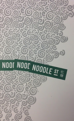
Noodle Street is a traditional Chinese restaurant based in London's busy Canary Wharf. Established in 2010, Noodle Street prides itself of using the freshest ingredients and new dishes from the many and varied regions around China
The new identity has been applied to some swanky new A4 letterheads, printed on Shiro Echo, Bright White 120gsm.
Click on images to enlarge
The stationery is printed in two colours, offset litho. Shiro Echo is 100% Recycled (and FSC accredited) and part of the criteria for this project was that the paper should be recycled.
Detail of noodles!
Print is by Aldgate Press based in London.
Branding and design is by Reason. Design Director is Catherine Hampshire. Thanks to Catherine for sending me file copies and the nice words!
http://noodlestreet.co.uk/
http://www.reasondesign.co.uk/
http://www.aldgatepress.co.uk/
Posted by Justin Hobson 03.12.2015

Tuesday, 1 December 2015

Jobs from the past - Number 74

Regular followers of this blog will know that my first post of every month is a "job from the past" so that I can show some of the really good work from years gone by...

Le Touessrok Brochure 2003
Located on the east coast of Mauritius in one of the island’s most spectacular bays, the Le Touessrok five-star resort is among the world’s most distinguished. It has three villas and 200 guestrooms and suites, all of which have sea views. Along with extensive water and land-based activities, it offers guests access to two islands: Ilot Mangenie, a private, secluded isle with 3.5 kilometres of pristine beach, and Ile aux Cerfs, where the 18-hole, par 72 championship golf course designed by Bernhard Langer is located - sounds perfect for Christmas!

As you can tell from the description above, this is anything but a normal resort and this is anything but a normal hotel brochure! It has a sense of scale and luxury that really has to be experienced to be truly appreciated and I'm afraid that it's unlikely that these images will do this project justice.
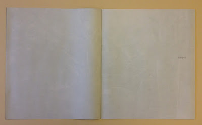
The size of the publication is 340x290mm, portrait and is a 32pp self cover. It is printed on our lightweight Offenbach Bible 60gsm and this brochure is undoubtedly one of the finest printed examples on Offenbach Bible that I have ever seen.
Above is the introduction spread, below, shows the way it the pages just beautifully flop over.
The cool grey, pantone special used on the cover runs throughout the brochure, between spreads, creating a perfect sense of pace and space, with captions. Below is ...so tropical
Click on images to enlarge
Design is by Pentagram. Creative director is John Rushworth and the designers on the project are Rob Duncan and Leigh Brownsword. The brochure is printed offset litho in four colour process plus a special grey and was printed by Gavin Martin Colournet.
Click on images to enlarge
...normally I do a "where are they now"? paragraph - as with many of these projects having been completed so long ago people and companies have often been scattered to the four winds! Not so in this case:
Rather fittingly for this article, the Le Touessrok resort (now the Shangri-La Le Touessrok Resort) reopened at the beginning of last month following a six month refurbishment. John Rushworth remains a partner at Pentagram in London. Rob Duncan now lives and works in San Francisco and is a partner at Mucho. Leigh Brownsword is a freelance design director based in London and Gary Bird is still merrily printing away at Gavin Martin Colournet!

www.letouessrokresort.com/
http://www.gavinmartincolournet.co.uk/
Posted by Justin Hobson 01.12.2015

Monday, 30 November 2015

DesignWeek Awards 2015

On Thursday I was lucky enough to be at the DesignWeek Awards, held at the Roundhouse in London's Camden Lock. I was kindly invited by Fenton Smith and Bonnie Lo from London print company BOSS, who were also one of the sponsors and printed the awards catalogue. Along with paper industry colleagues Pari Blackbeard (Fedrigoni) and Megan Simpkins (GF Smith) we were joined on a table with some of the other award sponsors. Fenton and Bonnie with Pari pictured below:
Photo courtesy of Pari Blackbeard at Fedrigoni
The Roundhouse was an excellent venue, with 40 tables packed with the design industry's finest. In total there were twenty awards covering the diverse world of design from graphics, signage, product design, interiors etc.
The awards were hosted by the ever popular Sue Perkins who did a good job of rattling through the categories as rapidly as she could!
Every one of the winners deserves massive congratulations but in particular I must mention Magpie, who were nominated for five awards and scooped three on the night! Pictured below are David Azurdia, Ben Christie and Mike Fischer from Magpie.
Image courtesy of Magpie Studio
Below shows the contents of the excellent goody bag which included the awards catalogue printed by BOSS (paper donated by Antalis) and a cute, bright red Moleskine notebook, supplied by Noted in Style.
Image courtesy of Noted in Style. http://notedinstyle.co.uk/
It was a great evening - good company and food and my thanks go to BOSS for inviting me and my fellow industry companions!
http://www.designweek.co.uk/
Posted by Justin Hobson 30.11.2015

Friday, 27 November 2015

The Big Book Bonanza Catalogue

This is the  'The Big Book Bonanza' catalogue which showcases the new Autumn releases from HarperCollins publishers. Throughout the publication are the same wonderful psychedelic Kaleidoscope style illustrations as on the invitations to the launch event (see previous post) by Emily Forgot. 
Size of the catalogue is 210mm square, saddle stitched. It is printed on our Omnia - 4pp cover on 320gsm and 32pp text on 150gsm.
Click on images to enlarge
The choice of material for this job was important, the reason being that the strong illustrations on the divider pages meant that it had to print solids really well but there's also lots of great commissioned photography included, so it was important to have a material which worked for both without compromising either and as I hope these pictures show, it looks really good.
Click on images to enlarge
The other very good reason that Omnia was chosen was the use of metallic gold pantone 'special' ink. On most traditional uncoated papers, metallics can look flat and with gold can just look a bit brown, but as I hope the below image demonstrates, metallic gold really does look metallic on Omnia.
Design and art direction is by Zoƫ Bather.

The catalogues are printed offset litho in four colour process plus metallic gold special. Print production was handled by Alan Mountain at Forward Print (sales@forward-print.com)

www.harpercollins.co.uk
www.zoebather.co.uk
http://www.emilyforgot.co.uk/
Posted by Justin Hobson 27.11.2015

Wednesday, 25 November 2015

The Private Press at Brand Union

A couple of weeks ago, the team at Brand Union, London got their hands dirty in the all-agency meeting to learn about and experience hand silk screen-printing.

...but first of all they had to climb into boiler suits and make an origami printer's hat!
Gary Parselle from The Private Press set up a temporary silkscreen print workshop in the Brand Union Studio.
He provided absolutely everything to ensure this was a truly fulfilling, creative process which involved absolutely everyone.
...and of course he also needed some paper! -so we were asked to supply a selection of different colours from our Colorset range in 270gsm. For those of you not familiar with this collection, Colorset has 26 colours and is made from 100% Recycled fibres. All colours are available in 120, 270 and 350gsm. Amongst other uses, it's become a firm favourite with Silkscreen printers.
Below are the fruits of their days printing, hung out to dry...
 Below is an image showing the printed results in the window of their Smithfield based studio:
The event was arranged by Creative Director, Clare Styles. What a fantastic thing for an agency to do. This is a truly engaging, interactive and creative activity for the whole company to get involved with - far more fun that a team building day paintballing!

www.theprivatepress.org
Posted by Justin Hobson 25.11.2015

Monday, 23 November 2015

Duh?

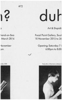
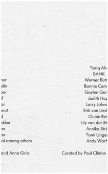
'Duh? Art & Stupidity' is an exhibition looks at stupidity as a subject and a tactic of art making, with a particular focus on its relationship to the politics and performance of identity. "High culture is meant to keep its audience from being stupid, but artists have repeatedly drawn upon stupidity, or playing stupid, as a form of dissidence, irreverence or as a means to cast off received thinking." The exhibition is at the Focal Point Gallery located in The Forum in Southend on Sea. It is curated by Paul Clinton and Anna Gritz and runs from 10 November to 26 March 2016.

This is the invitation to the opening. Echoing the theme of the exhibition, the invite is deliberately trimmed out incorrectly.
Front
 
Reverse
The size of the invitation is 130x80mm, portrait and is just a single sheet. It is an excellent example of a great idea, executed economically. The designer, Fraser Muggeridge, wanted a different type of board for this unusual idea and because it was a limited run, he called us and described the type of product he wanted. We sampled a redundant item (Bakri, Everest 250gsm from Cordenons - actually made 50% woodpulp and the other 50% is a mixture of cotton and goat's wool!) which is no longer manufactured, which was perfect! Just one pack was required which made this an economical and highly unusual piece. The below images show how it was mailed out in a cellophane bag with a piece of greyboard.
 
Design is by Fraser Muggeridge Studio. Print and the (deliberately bad) trimming is by Healeys Print Group based in Ipswich.

http://www.focalpoint.org.uk/
http://www.pleasedonotbend.co.uk/
www.healeys-printers.co.uk
Posted by Justin Hobson 23.11.2015

Friday, 20 November 2015

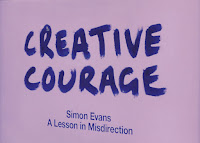
Creative Courage - A Lesson in Misdirection

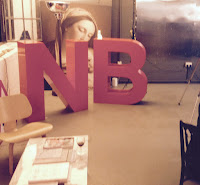
Creative Courage is NB:Studio's mantra; a rallying cry, a touchstone, a catalyst. It’s also a platform for a series of talks, events and activities. Yesterday evening, I was invited to a Creative Courage talk at NB's Bankside studio which was being given by Simon Evans. Titled 'A lesson in Misdirection' , this wasn't just a talk, it was magic!

This is the fourth in the series of talks/events hosted by NB:Studio and it is a brilliant idea. These evening events stimulate new ideas, are great for staff, clients and suppliers alike and can bring a fresh perspective and thinking to a creative environment - in my opinion more studios should host events such as this.
Simon Evans was introduced by NB:Studio partner Nick Finney(above). Simon is a Theatre director, two time Close-up Magician of the year and National Theatre Magic Consultant amongst many other activities.
Click on images to enlarge
Simon gave his masterclass in 'misdirection' explaining how magicians make you look in the right place at the wrong time – or the wrong place at the right time! This was part lecture, part performance and mostly magic show!
It's given me some great ideas for shuffling swatches and making other paper companies sample books disappear - what an illusion that would be!

It was a magical evening and my thanks go to all at NB:Studio for inviting me and to Simon Evans for an extremely insightful talk and a wonderful performance.

http://www.creativecourage.co.uk/
http://www.nbstudio.co.uk/
http://www.the-department.co.uk/simon-evans/
Posted by Justin Hobson 20.11.2015