Monday, 9 May 2016

Daiwa Foundation - Art Prize

The Daiwa Foundation is based in Japan House in London and was opened in 1994 as a centre for academic and cultural activities relating to Japan. This Anglo-Japanese Foundation holds an events programme which plays an important role in increasing the understanding of Japan in Britain, providing a forum for discussion and exchange and creates opportunities to foster new networks and collaborations.
The foundation also runs an Anglo-Japanese arts competition every three years, for which there is a prize awarded. Entries are open to British artists resident in the UK who have not previously had a solo exhibition in Japan. Last year the winner was Oliver Beer, who was shortlisted alongside Mikhail Karikis and Julie Brook.
This is the literature that accompanied the awarding of the prize at the private view last year. Size is 170x240mm. The 8pp cover is hot foil blocked in a metallic gold foil and uses ZETA Linen, Brilliant White 260gsm. 
The 16pp text is printed on our Omnia 150gsm, which works perfectly. The reason this paper was chosen is because the different artists are working in a wide range of different media and this paper works brilliantly, feeling tactile, whether reproducing illustration, photographic work or colour saturated solid colours.
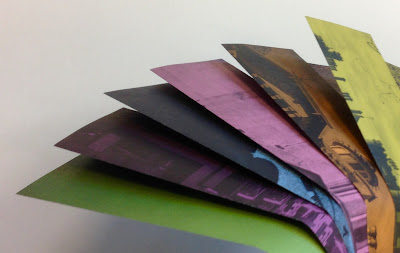
Interspersed in the text pages are another 8pp of translucent pages - printed on T2000 110gsm, which is one of our 'tracing' type papers from Reflex Paper in Germany (the same mill that manufactures ZETA)
The image above and below show the T2000 overlaying the text pages...
The use of ZETA Linen on the cover is faultless, resulting in a consummate cover - the perfect solution for a publication featuring the work of three artists, The subtle Linen embossing works with the matchless hot foiling giving an immaculate result, which I hope you can see in the image below.
Design is by Matthew Stroud.
Print production is by Jigsaw Colour based in Bermondsey, London.
http://oliverbeer.wix.com/oliverbeer
http://www.dajf.org.uk/grants-awards-prizes/daiwa-foundation-art-prize
http://www.jigsawcolour.co.uk/
Posted by Justin Hobson 09.05.2016

Thursday, 5 May 2016

Le Théâtre Graphique - Book Launch


This evening I went to the book launch of a new book published by Hato Press at the Whitechapel Gallery. The book is titled Le Théâtre Graphique and is by artist and designer Sarah Boris.

It was a beautiful evening and the Whitechapel gallery is a great place for a launch - an absolute jewel in East London's cultural landscape.
It was a busy evening and the books were flying off the shelves. Taking the form of a large flipbook, Le Théâtre Graphique is an exercise in form and colour, where the theatricality of a rising curtain is reimagined through the performative cycles of nature; night and day, sun and moon, the shifting tide...
Hato Press are a Riso printers and also a publisher. the book is printed Riso and the cover is hot foil blocked. It was a lovely evening and thanks Sarah Boris and Hato Press for inviting me.

http://sarahboris.com/
https://www.instagram.com/sarahboris_ldn/
Posted by Justin Hobson 05.05.2016

Tuesday, 3 May 2016

Jobs from the past - Number 79

Regular followers of this blog will know that my first post of every month is a "job from the past" so that I can show some of the really good work from years gone by...
Rupert Sanderson 2002 Preview Invitations
Shoe designer Rupert Sanderson founded his company after a disastrous career (his words) in advertising and design. He undertook a two year course at the Cordwainers College in East London learning to design and make shoes. After college he was working in Italy firstly for Sergio Rossi and then Bruno Magli. Rupert returned to London and founded his own company in 2001. He now has a store in London as well as Hong Kong and a global following.
This is one of the very first Rupert Sanderson invitations produced in 2001 for the preview of his 2002 Spring/Summer collection.
The invitation is a folded down shoe cutting pattern, which is presented in this translucent, pale blue pocket which is 217x156mm. It has been made to size and incorporates a thumb cut in the top, allowing the invitation to be pulled out. The pocket is made from a range called Voile de Papier Acqua 120gsm, which sadly has since been discontinued by the mill.
 The invitation itself is a 16pp concertina folded invitation - finished size of A5 (210x148mm).
The below image shows the invitation folded out to it's full extent - click on the image to bring it up to a reasonable size.

Click images to enlarge
It is printed offset litho in just one colour - a very pale blue, which it's why it is hard to see - but it's worth enlarging the images here, as it is a wonderfully clever and skilfully executed piece of design for print.
The paper used is our Offenbach Bible 50gsm, which gives a sylph like quality to the invitation,  whilst mimicking the material used for a pattern guide.
Design of the Rupert Sanderson identity was by Johnson Banks and this invitation followed shortly after, also by JB. Creative director is Michael Johnson, designer on this project was Luke Gifford, working with typographer Michael Pratley. Printing and make up of the pockets was by Gavin Martin Colournet.
Now going back to the bit at the beginning of this post where Rupert Sanderson is reported as saying that he had a 'disastrous career' in advertising. Well, back in 1990, I was one of the clients that he was looking after! He was a 'suit' (account handler) at Smith & Milton when they were in Chelsea and I thought he was actually pretty good - but I guess it's just as well he didn't think so, otherwise he wouldn't now be creating these lovely shoes. Congratulations on your success Rupert.
http://www.rupertsanderson.com/eu/
http://www.johnsonbanks.co.uk/
http://www.gavinmartincolournet.co.uk/
Posted by Justin Hobson 03.05.2016

Friday, 29 April 2016

Architect IPA

This is a good post for the Friday before a Bank Holiday weekend ..it's about beer! The Architect IPA is a limited edition Festival ale celebrating six of Glasgows most notable architects of the past, is brewed especially for the Scottish Festival of Architecture.

The Festival is a major, year-long, Scotland-wide celebration led by The Royal Incorporation of Architects in Scotland which brings Scottish architecture to life and is a key part of the 2016 Year of Innovation, Architecture and Design. The Festival of Architecture 2016 is designed to be an engaging, inclusive and Scotland-wide celebration. The Festival is a partnership of over one hundred organisations, a nationwide event that will show how architecture touches everyone’s lives. This truly global Festival is designed to reach out to the broadest audience – local, national and international.
Produced in collaboration with Drygate and Graphical House the Architect IPA is a limited edition Festival ale celebrating six of Glasgows most notable architects of the past. Alexander 'Greek' Thomson, Charles Rennie Mackintosh, Gillespie Kidd and Coia, Basil Spence, Robert Adam and Honeyman and Keppie were selected through a public vote and the work of each architect has inspired the Architect IPA labels and wraps.
The Architect IPA will be sold from the specially designed Architect Bar. A pop-up bar design which has been informed through in-depth research of the Glasgow pub typology, and its development through the years. The Architect IPA will be available at events throughout the Festival which celebrate the work and themes of each of the selected architects.
Click on images to enlarge
The size of the wraps is 190x270mm, a flap folding over to make the finished size of 136x270mm. On the reverse side of the wraps is a biography about each of the architects. A well written, interesting and useful addition to a beer label.
Each is printed offset litho onto our Offenbach Bible 60gsm. The sheets are then hand wrapped and affixed around the 750ml bottles.
Offenbach Bible is the perfect paper for this project, as it is light enough to be easily wrapped around a bottle, has an almost 'tissuey' feel and yet prints amazingly. The wraps are printed offset litho in CMYK.
Here they are in all their glory... 
The ale was launched last month (17th March) at this launch event.
Design and Art direction is by Graphical House, based in Glasgow and the creative director is Colin Raeburn. Superb printing is by J. Thompson Colour Printers in Glasgow.
A wonderful beery way to start the weekend ...!

Posted by Justin Hobson 29.04.2016

Thursday, 28 April 2016

You are invited to a book launch...

Next Thursday, a new book published by Hato Press is being launched at the Whitechapel Gallery. The book is titled Le Théâtre Graphique and is by Sarah Boris. The book takes the form of a large flipbook, Le Théâtre Graphique is an exercise in form and colour, where the theatricality of a rising curtain is reimagined through the performative cycles of nature; night and day, sun and moon, the shifting tide...

The book is printed on a Riso press and you can see it in production in the above pictures. Below is a detail image which shows the coarse screen that is typical of the Riso
There are accompanying prints, also by Sarah
You can read more about the author here:

If you would like to go to the launch on Thursday 5th May, you can get a ticket on this Eventbtrite link:
 
Posted by Justin Hobson 28.04.2016

Tuesday, 26 April 2016

Primark A/W lookbook

Primark is widely established as the destination store for keeping up with the latest looks without breaking the bank. They offer a diverse range of products, stocking everything from baby and kids, to womens, mens, home ware, accessories, beauty products and confectionery. Primark opened its first store in Dublin in 1969 under the name Penneys and today operates in over 270 stores in nine countries in Europe and growing with the first US store opening in Boston last year.
This is the beautifully produced lookbook produced for last year's Autumn/Winter season. It is a large format - 340x245mm, which economical out of a B1 sheet.
Click on images to enlarge
The publication is printed on our Shiro Echo, Bright White, which is 100% Recycled. The 4pp cover is printed on 300gsm and the 44pp text is on 120gsm. It is printed offset litho in CMYK throughout.
The cover is also hot foil blocked and embossed in a semi transparent pearlescent foil, as you can see in the image below....
...and not to forget the men! The men's range is also included going from the back cover towards the spine or what I have described before as a 'double-ender' - the cover as you can see below with the cover spread out...
 The Men's also has the cover, hot foil blocked and embossed in a semi transparent pearlescent foil.
...a particularly nice touch is the use of the 'loop stitching' as binding.
 The 48pp publication, sits nice and flat
The quality of the art direction, photography, repro, print and finishing is superb. The paper also happens to have performed brilliantly - fleshtones and jewellery details equally looking superb.
Primark's international Headquarters are in Dublin and the UK offices are in London. Art direction and design is by London creative agency Odd. Print, repro and finishing is by Gavin Martin Colournet, based in London E3.

http://www.primark.com/en/homepage
http://www.oddlondon.com/
http://www.gavinmartincolournet.co.uk/
Posted by Justin Hobson 26.04.2016

Friday, 22 April 2016

Letting in the Light

Letting in the Light is an art exhibition which was showing earlier in the year. The exhibition set to illuminate the streets of Stratford with a series of large light boxes, featuring images of paintings, drawings, digital and mixed media work by artists including Bobby Baker, Dolly Sen, Jan Arden, Phil Baird and George Harding. Produced by Bobby Baker’s pioneering Stratford-based arts and mental health organisation Daily Life Ltd, the exhibition showcased extraordinary work made by artists with personal experience of mental health issues.
 
This is the promotional leaflet for the exhibition. It is A5 (210x148mm) a 6pp format but with the front flap cut short at just 99mm wide, as I hope the image below demonstrates:


The below image shows the outside and inside folded out flat.
This piece of literature is printed on Omnia 200gsm, which means that rather than feeling like the vast majority of mass produced leaflets printed on a bit of 130gsm silk or gloss, this has real character and value - it feels superb - it also works superbly with the images. Printed CMYK offset litho.
Design is by Joe Hales, who runs his studio in Dalston, East London. It is printed by the Orphans Press, based in Leominster, Herefordshire.
http://dailylifeltd.co.uk/
www.joehales.co.uk
https://orphans.co.uk/

Posted by Justin Hobson 22.04.2016