Tuesday, 13 December 2016

Olivia von Halle - The Talisman Collection

Olivia von Halle is a British luxury nightwear brand that launched at London Fashion Week in September 2011. The brand can be found in nearly 100 stores in 20 countries including Harrods, Selfridges, Neiman Marcus, Saks Fifth Avenue and online with Net-a-Porter.com.

Focusing on beautifully cut silk pyjamas in stunning exclusive prints, Olivia von Halle has quickly made a name for itself in the world of high-end nightwear. In 2013 the company was awarded the ‘Blue Butterfly Trust Mark’, which is given to brands and companies that have a positive impact on people and the planet.
This is the lookbook for the Spring Summer 2016 "Talisman Collection". The publication is sub A4 - 290x205mm, portrait. It is a 16pp self cover format printed on Omnia 150gsm.
Click on images to enlarge
Unlike many of the fashion lookbooks featured on this blog, which are printed offset litho, this has been digitally printed on an HP Indigo press. The colours are strong and punchy and the whole publication has a matt, tactile look and feel - in fact I can honestly say, every bit as good as litho!
Although Omnia was never originally developed for digital, we now keep it as a stock item with "sapphire treatment". This treatment is often applied to more unusual papers and provides a "key" so that the inks (which are different to litho inks) work on the paper surface. The great thing is the job just doesn't look and feel like a digital job. Below is a detail shot showing the excellent fleshtone reproduction.
A nice touch is the use of the white wire for the saddle stitches
The self cover format means that it flows well with the pages turning nicely.
Graphic design is by Michael Knight, who runs his studio in East London called A New Mark. Print and finishing is by Gavin Martin Colournet.

http://oliviavonhalle.com/
http://www.anewmark.com/
http://www.gavinmartincolournet.co.uk/
Posted by Justin Hobson 13.12.2016

Thursday, 8 December 2016

LCC Postgraduate Show

The identity for this year's LCC degree shows is by Tara Hanrahan at Think/Do, which includes interior signage, exterior signage, wayfinding and literature. This week is the postgraduate show, with over 200 post graduate students showing their work. The Postgraduate shows run from 28.11.2016 to 10.12.2016.
The printed collateral includes this postgraduate information booklet. Size is A5 (210x148mm), portrait and is saddle stitched.
The 4pp cover is on Colorset (100% Recycled) Amethyst 270gsm, printed offset litho in black only
 
 The 8pp text is printed on Crush, Grape 120gsm, printed in two colours, black and a special colour.
Click on images to enlarge
If you are not aware of our range called CRUSH from Favini, it is very unusual! The paper is made partly using the residue from the industrial processing of crushed citrus fruit, coffee, nuts, olives, kiwi, corn, cherries, lavender and most recently grape. These agro-industrial "end of life" products replace up to 15% of conventional tree pulp and are combined 30% post-consumer recycled waste, FSC virgin fibre and is produced with 100% green energy. As a result, the sheet is not a "clean" paper, it has identifiable pieces of residue visibly in the paper, as you can see below...
The range is available in 100, 120, 200, 250 and 350gsm and the shades are natural, earthy tones and the feel of the paper is natural and tactile. See the range here.

Printing is by Calverts, who are a London based printing cooperative who focus on sustainable printing. Another lovely feature, is the use of the black wire stitches below:
Sustainability is an important facet to Tara's practice, which accounts for the selection of these sustainable papers and printer. You can read more about the identity work here:
http://blogs.arts.ac.uk/london-college-of-communication/2016/05/20/interview-tara-hanrahan-on-designing-for-lcc-degree-shows-2016/
Thanks to Tara for sending file copies and the note.
http://www.arts.ac.uk/lcc/events/lcc-postgraduate-shows-2016/
Posted by Justin Hobson 08.12.2016

Tuesday, 6 December 2016

Call of the Wild

As Christmas draws closer, here are some wonderful examples of Christmas cards, all printed on our lovely Shiro Echo, Bright White 300gsm,  which is 100% recycled and has FSC Mix accreditation.
The cards are from a range called "Call of the Wild" by London based card publisher Roger La Borde. They are 4pp cards printed offset litho in four colours and the cards are either laser cut or embellished with hot foil blocking.
 
The below lasercut cards are illustrated by Antoana Oreski
The below card is illustrated by Jane Ray and is embellished with gold hot foil blocking in the illustration which works brilliantly well.
...credits on the reverse of the card showing the FSC logo.
The cards are published by Roger la Borde.

The cards are printed offset litho by Lion House Press who are in West London and the foiling is by Graphite Creative who are based in St Albans. The lasercutting is by Trilogy Lasercraft.

http://www.rogerlaborde.com/
Posted by Justin Hobson 06.12.2016

Friday, 2 December 2016

Jobs from the past - Number 86


Regular followers of this blog will know that my first post of every month is a "job from the past" so that I can show some of the really good work from years gone by and here's one from 1995.  

D&AD Newsletter - December 1995
It's unlikely that D&AD needs much introduction. - Founded in London in 1962 as British Design & Art Direction by a group of creatives and art directors, it has since become a world renowned body championing design and creativity.
This piece of literature is an excellent example of the way communication worked in the pre-internet world! Back in 1995, Mary Lewis was president of D&AD and then, as now, the President's Lectures were a popular draw for creatives (back in these days, tickets were either ordered by post or telephone and sent out by post). Feedback from member indicated a desire for transcripts of the lectures to be printed, so that the content could be more widely circulated, so in this inaugural issue, the D&AD Newsletter was re-launched in December 1995, in the main, to disseminate the transcripts of the lectures.
The publication later became known as Ampersand and I will write about the later issues in the future.
Front Cover
Size of the publication is 445x315mm portrait and is a 16pp 'self cover' and is unbound. It has a wonderfully floppy and tabloid newspaper feel. It is printed on our Redeem 100% Recycled 130gsm.

This issue covered the transcripts of the lectures given by Oliviero Toscani....
Click on images to enlarge
...and Maurice Saatchi.
The paper is a neutral white shade gives the publication a 'newsy' feel which really works with the images and most importantly, the pages which are purely type, as below:
Click on images to enlarge
The publication is printed offset litho in one colour (halftone or monotone printing) and the look and feel is just perfect. A well designed and thoughtful piece of print to be delivered, spread information and disposed of - just like a newspaper!

For a sense of scale, below is the outside back cover pictured with a 300mm ruler and a ballpoint pen, remember the size of the publication is  445x315mm.
The newsletter was printed by a company called Penshurst Press based in Tunbridge Wells. Sadly the company no longer exists - they wound up at the end of the nineties.

The design of the cover and contents is by Vince Frost. Deyan Sudjic gave the advice to Mary Lewis to "keep it simple" which this publication does admirably. Content is edited by David Robson of The Independent.

Photography by Giles Revell, cover photograph: Matthew Donaldson, Saatchi Image: David Levenson/Colorific, Toscani Image: A Rau/Sygma.

Vince Frost left for the sunnier climate of Australia just over fifteen years ago and runs Frost* in Sydney.

...and Fenner Paper? ...yep, we're still here!

Posted by Justin Hobson 02.12.2016

Tuesday, 29 November 2016

Ten Trinity Square - Book II

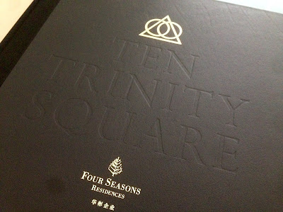
This is one of a pair of books produced for a development called Ten Trinity Square. I wrote about the other book in October here. This is one of London’s landmark buildings overlooking the Thames at Tower Hill. Built over a century ago to house the Port of London Authority, it has now been re-developed by the Reignwood Group as an exclusive arrangement of residences, a luxury hotel and private club, all in association with Four Seasons. 

This book explains about the history of the area, the city and the people who have influenced the region throughout history. The pair of books have been produced to be on display in the atrium of the building on a specially made plinth designed by Daniel Weil of Pentagram.

These are the largest books to have ever appeared on this blog and is probably the most impressive I have ever had the pleasure of handling! The size of the book is 615mm square, yep that's right, well over half a metre! As a result, it's more than a bit tricky to photograph, so my apologies - click on the images to bring them up to a better size.
To give a sense of scale, the book is pictured with a 30cm ruler and pencil. The book is casebound and is covered in black Saffiano, which is first grade calf leather with a classical grain. The cover is embossed and hot foil blocked in metallic gold foil.
The book has 92pages, all printed on Omnia White 200gsm. Omnia is a very bulky paper and that's what a project like this needed, with the size of each page being over half a square metre! 
The image reproduction throughout the publication is simply wonderful with both the four colour images, the cool grey pantone special and solid blacks looking great.
Click on images to enlarge
The bookblock (just the pages) itself is 13mm thick. Below is a detail showing the ribbon.
To give a better sense of scale, below is an image with a full size 70cl bottle of wine by the book, which gives you some idea...
Below is a detail showing the spine. The book is 'quarter bound' with cloth around the spine. Don't forget, the spine you are looking at is 35mm! Rather than using a bookbinding grade greyboard, the internal structure of the case is supported with a material called Promolyte. This is a lightweight alloy which was used to increase the strength, stability and integrity of this huge leather cover.
Hot foil blocking on the black Saffiano leather is superlative.

Brand identity for the whole project, including this book, is by Pentagram. Design is by John Rushworth and Joe Stephenson. You can see more about the whole project here: http://www.pentagram.com/#/projects/121368

Original photography is by Richard Bryant. CGI's by Hayes Davidson and AB Concept.


Printing is by Gavin Martin Colournet. It is a stupendous book with stunning production values and it has been produced impeccably. If I was saying anything other than that, then the whole reason for producing this staggering publication to appear on display in the building, would be null and void. Together with the other book, this pair of books make the most stunning books ever!

http://www.tentrinitysquare.com/
http://www.reignwood.com/
http://www.pentagram.com/
http://www.gavinmartincolournet.co.uk/
Posted by Justin Hobson 29.11.2016