Thursday, 20 April 2017

Thread

Thread is a studio specialising in design for a wide variety of clients from the art and cultural sector. Thread is the design studio of Michael Windsor-Ungureanu, who has previously worked at Tate Britain and Tate Modern. This is the second edition of his studio promotional brochure:
The format is A5 (210x148mm) portrait and is saddle stiitched. The 40pp text has a short cover, 150mm high which is centred head to foot.
There are three different coloured covers, all produced on Colorset - a mix of Ash, Lemon and Deep Orange, all printed in one special pantone (PMS 072U) blue. The "thread" design runs from the cover throughout the middle of the brochure.
Click on images to enlarge
The 40pp text is printed on StarFine Natural White 115gsm and shows the work that Thread has produced over the previous couple of years.
Click on images to enlarge
Starfine Natural White was chosen (because it prints well ...but that's a given!) mainly because of the neutral white shade which is not cream. Given the nature of the work, a stark bright white paper would not have worked with such a variety of art based subjects. Text is printed CMYK offset litho throughout.
Below shows a birds eye view of the publication
Design is by Michael Windsor-Ungureanu. Printing is by Bowmans based in Leeds and it's a very accomplished piece of print and finishing.

http://www.threaddesign.co.uk/
http://www.bowmans77.co.uk/
Posted by Justin Hobson 20.04.2017

Tuesday, 18 April 2017

Strawberry Sorbet

Strawberry Sorbet is a studio which crafts beautiful letterpress wedding invitations and stationery, based in Ayelsbury Bucks. They describe themselves as "Letterpress Geeks" and have three printing presses named Charlotte, Hendrick and Henrietta!

This is an example of their work - a beautifully simple card, hot foil blocked in copper foil produced on our Colorset Nero 350gsm.
 
The card is A6, portrait and is just hot foil blocked with exceptional precision and in very fine type.
...and here's the credit printed on the reverse of the card, where they profess their geekery!
They don't just do wedding invitations, so certainly worth getting in touch if you want some fine stationery produced.

http://www.strawberrysorbet.co.uk/
Posted by Justin Hobson 18.04.2017

Friday, 14 April 2017

Multiplicity - Brighton

Fenner Paper is really pleased to be sponsoring Multiplicity in Brighton. Hosted by Foilco, Multiplicity Brighton brings together three fantastic speakers under the same roof for one night only.

Anthony Burrill – Graphic Artist, Print-maker and Designer anthonyburrill.com
Andy Stevens – Founding member and Creative Director of Graphic Thought Facility
Hamish Makgill – Founder of design and branding agency Studio Makgill
 
The free event is ticketed and the tickets are available through Eventbrite here. The venue is The Old Market in Hove.
 
This is the third event hosted by Foilco, with the previous talks having been in Glasgow and Leeds. Foilco has been servicing the graphic arts industry for over 25 years, offering the largest range of hot stamping foils in all sectors. With a wealth of expertise on all types of applications, they have a wide range of colours and grades offering endless creative possibilities to designers the world over.
 
...so hurry and get your tickets now, before it's too late!
Posted by Justin Hobson 14.04.2017

Tuesday, 11 April 2017

Caramel - Autumn/Winter

Eva Karayiannis, founded Caramel in 1999, originally a children's clothing brand, Caramel now also encompasses Women's clothing and Homewares. 
This is the lookbook for the Children's Autumn/Winter collection. The format is a very simple 16pp broadsheet, which opens easily to read and displays a large poster type area, when fully open.
Click on images to enlarge
Size is 594mm x 420mm  folding to 210x148mm. The birds eye view below should give you the best idea of the format and the way it works.
The paper chosen is our Omnia Natural 120gsm because it would work with the intricate detail that is present in the images but that would give a natural look and tactile feel.

Outside, folded out flat:
Inside, folded out flat.

It is printed offset litho in four colour process (CMYK) and as you can see from images, some of the images have dark areas, but there is no loss of detail, which is what can often happen printing on an uncoated paper. The neutral shade of the Omnia Natural works exceptionally well with these images. The below image demonstrates the amount of detail that is retained in the dark area of the dress.
Art direction and design is by the in-house studio at Caramel based in London.  Printing is by Gemini Print, based in Brighton.

http://www.caramel-shop.co.uk/
http://gemini-print.co.uk/
Posted by Justin Hobson 11.04.2017

Friday, 7 April 2017

New Modigliani Swatch

We now have a brand new A5 swatch for our Modigliani range manufactured by Cordenons in Italy. If you aren't familiar with Modigliani, it is a 'feltmarked' text and cover paper with a texture resembling that of a watercolour paper, it has a wonderful tactile feel. 
The inside of the swatch below:
Click on images to enlarge
Modigliani is available in three shades of white, Candido, Neve, Bianco plus Camoscio (cream) and Perla (grey). All shades are available in 95, 145, 200, 260 and 320gsm.
The above image shows detail of the watercolour texture.

The swatch also incorporates Dore Modigliani which is the same paper but with a pearlescent coating applied, which together with the feltmark gives the sheet an amazing shimmer.

 If you would like one of the new swatches, just email me: justin@fennerpaper.co.uk

http://www.gruppocordenons.com/en/home.html
http://www.cordenons.co.uk/
Posted by Justin Hobson 07.04.2017

Thursday, 6 April 2017

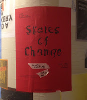
States of Change

Yesterday evening I was invited to an exhibition by 2nd year Graphic Design students at Kingston University called States of Change at Hoxton Arches.

“How does place impact on culture? How does culture permeate place? What can we learn from London and Berlin, two cities at different stages of cultural growth? ‘States of Change’ establishes the vantage point of design students examining two working environments and their surrounding culture. An assembly of printed matter, photography and moving image documenting recent encounters with the places and people of London and Berlin.” 
 
As well as the exhibits (print, photography and moving image) in the bar area, there was a 'fly-posting' wall where you could post up, write, and spray paint.  
The below image shows a superbly produced piece of literature titled 'Berliner Schnauze' by Scarlett Chetwin and Seb Price. Each page is perforated in a variety of angles opening to reveal a page below, in the same way that the fly posters in Berlin are layered.
This bunch of enterprising second years were also selling publications and ephemera from the exhibition.
As I understand it, the idea of the show was suggested by the tutors but it was entirely actioned by the students, including sorting out the venue, the beer, the publications and the invitation list, so I am pleased to have made it onto the list!

Thanks to all the students involved and the teaching staff, Zoƫ Bather, Cathy Gale, Rose Gridneff, Andrew Haslam and Marcus Leis Allion.

https://www.instagram.com/statesofchange/
https://www.facebook.com/events/774720392703875
Posted by Justin Hobson 06.04.2017

Tuesday, 4 April 2017

Jobs from the past - Number 90

Regular followers of this blog will know that my first post of every month is a "job from the past" so that I can show some of the really good work from years gone by.
 
Eva Rothschild - 2005
https://en.wikipedia.org/wiki/Eva_RothschildEva Rothschild is an Irish sculptor now living and working in London. She is interested in the transformative power of looking and this book shows her work and is accompanied by an essay written by Grant Watson. It is published by The Douglas Hyde Gallery in Dublin.
The book is 210x136mm, portrait with a 32pp text and is casebound, with red bookcloth on the cover, hot foil blocked in black foil.
The text is printed on Omnia 150gsm ...and it looks and feels just beautiful. It perfectly shows the sculptures - lots of detail and excellent reproduction and great printed solid black - no patchiness or mottle. It is totally in sympathy with the work and the background interiors - tactile and engaging.
...4pp essay at the back of the book
Image below shows the 6mm spine. The book is section sewn in 8pp sections. 
A very nice detail/point of difference is the use of different end papers. In the front, it is a plain black uncoated endpaper
...and the end-paper at the end of the book is printed on a cast coated 1 sided paper, which is gloss one side and uncoated on the reverse.
Design is by London based studio Pony and the partners are Niall Sweeney and Nigel Truswell and you can read and see more about the project here:
http://www.ponybox.co.uk/pictures/projects/eva-rothschild/

Printing was by Drukkerij Rosbeek in Holland but I believe that are no longer in business.

http://www.douglashydegallery.com/
http://www.ponybox.co.uk/
Posted by Justin Hobson 04.04.2017