Tuesday, 16 May 2017

Coal Drops Yard

Coal Drops Yard is the dramatic and dynamic centrepiece of the King’s Cross regeneration program opening in 2018. These stunning Victorian industrial buildings featuring richly coloured bricks, striking arches and solemn ironwork provide a stunning backdrop for this new retail development with design by Heatherwick Studio.

This visually stunning book sets out the retail opportunities to potential retail tenants. It features dramatic photography, high quality CGI and illustration.
Size of the book is a massive 420x250mm, portrait.
The cover has a 'bookjacket' that wraps around the 4pp cover with 175mm flaps. The below image shows the jacket open with the printed filigree pattern printed on the inside. The jacket is printed on Shiro Echo Bright White 120gsm.
The majority of the text is printed on Shiro Echo Bright White 160gsm. Shiro is a 100% Recycled text and cover paper from Favini and as I'm sure you will be able to see from the images below, it prints beautifully. The publication is printed offset litho in CMYK plus a pantone special gold throughout.
Dispersed throughout the book are six 'tip-ins' which are A6 size at the foot of the publication. They are printed on Flora Anice 130gsm which gives them a deliberately industrial look and feel.
If you aren't familiar with Flora, it is a part recycled text and cover paper with a deliberately recycled look and feel with specks and inclusions, so it looks deliberately flecky and specky. Flora is produced with 30% post consumer de-inked waste, together with 60% of virgin FSC pulp and with the "secret" ingredient of 10% of cotton fibres, which gives the paper a wonderful tactile feel.
Click on images to enlarge
There is a 16pp section which is printed on Concorde Pure Brilliance 170gsm, which is an exceptionally high gloss coated, real art paper, which contrast fantastically with the uncoated Shiro (below image, Shiro on left, Concorde on the right)
The quality of the art direction, photography, repro, print and finishing is absolutely superb. The paper also happens to have performed brilliantly! - the metallic gold in particular and the large areas of solid black look superb.
There are many fantastic elements to this job, as well as the 'tip-ins' the job is section sewn and a lovely touch is the use of dark blue thread as you can see in the image below...
Click on images to enlarge
...another thing is the superb line-ups between the inside cover and the bookjacket - stunning accuracy in the finishing.
Art direction and design is by Bell Integrated. You can read more about the whole project here: https://www.bell-integrated.co.uk/portfolio/argent/. The excellent print, repro and finishing is by Gavin Martin Colournet, based in London E3.

This is just a wonderful example of where great art direction and design has been complimented by the right choice of materials that work with the imagery and the physicality of the publication - all working together having been executed brilliantly by the printer.

https://www.bell-integrated.co.uk/portfolio/argent/
http://www.gavinmartincolournet.co.uk/
Posted by Justin Hobson 16.05.2017

Friday, 12 May 2017

St Bride Foundation Wayzgoose

The Annual St Bride Foundation Wayzgoose takes place next Sunday - 21st May
Wayzgoose is a term (unfamiliar to most people) that used to refer to an annual holiday in a printworks and was often an away-day to the coast or some other sort of day out, more often than not, paid for by the firm.
 
However, in this instance the St Bride's Wayzgoose is a kind of letterpress 'bring and buy' sale. There are companies selling type, letterpress accessories, ink and lots of letterpress printed books and cards and the proceeds from the event go towards the St Bride Foundation.
Why not come along... ?
 
For interest, this is what it was like last year:
 
Posted by Justin Hobson 12.05.2017

Wednesday, 10 May 2017

Jo Malone - Rare Teas

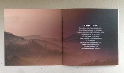
This new collection of colognes is a first in perfumery. Made using fragrance from ultra rare teas grown in the foothills of China to the Himalayas. The ancient art of the tea master is combined with the ingenuity of the perfumer to create these new scents. There are six colognes based on different teas - delicately floral Silver Needle Tea, sparkling and sweet Darjeeling Tea, herbaceous green Jade Leaf Tea, rich and earthy Oolong Tea, deeply seductive Midnight Black Tea and spicy Golden Needle Tea.

This is the promotional brochure produced by Jo Malone. Size is 150mm square and is saddle stitched.

The 4pp cover is on Omnia 280gsm with 12pp text on Omnia 150gsm. The reason that Omnia was chosen is because it would work with the rich detail that is present in the images but that would give a natural look and tactile feel.
Click on images to enlarge
It is printed offset litho in four colour process (CMYK) and as you can see from images, some of the photography is quite dark, but there is no loss of detail, which is what can often happen printing on an uncoated paper, which is why the Omnia was chosen.
Click on images to enlarge
The image below shows the outside back cover printed in solid black and as you can see, the solid looks great...
The image below shows the detail and the way the glass and fine detail has reproduced.
Art direction and design is by the Jo Malone design team. Superb repro, print and finishing is by CPI Colour with Mark Pitman handling the project.

http://www.jomalone.co.uk/rareteas
http://www.cpicolour.co.uk/
 Posted by Justin Hobson 10.05.2017

Friday, 5 May 2017

Multiplicity in Brighton


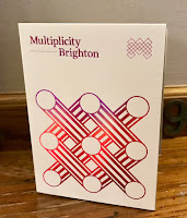
Yesterday evening, we were pleased to be the sponsor of  Multiplicity in Brighton. Hosted by Foilco, this is the third event hosted by Foilco, with the previous talks having been in Glasgow and Leeds. Just over 150 creatives came together at The Old Market in Hove to hear three great speakers.
The three fantastic speakers were Hamish Makgill, Anthony Burrill and Andy Stevens from GTF.

Hamish began the evening. His talk began by likening the amazingly simple concept and design of the JEEP to the work that they strive to achieve at his studio by "stripping away the unnecessary and drawing out the essential"
Hamish then spoke about his work for The It's Nice That 2014 Annual, Nike WE, ONCA, James Reade, the WW Chair and of course his work for that other well known paper merchant based in Hull!
 
Next up was Andy Stevens, one of the founders of Graphic Thought Facility (GTF). He spoke about their beginnings at the RCA and how they established the studio, including spending the money they won as a prize on a poster ...see below image:
Anthony Burrill gave us an insight into his beginnings at college and then at the RCA. He spoke about his years in the advertising industry and it's rather abrupt end when he made the decision that he wanted a change telling his agent not to look for new work - and how everything, including his existing work, just stopped! He then described his journey establishing himself as an independent graphic artist, print-maker and designer.
It was a great event and everyone I spoke to came away feeling enthused and charged.

Even I said a very few words at the beginning of the evening....
Afterwards may of us went to the bar until kicking out time!
This is the third event hosted by Foilco, with the previous talks having been in Glasgow and Leeds. They have been arranged by Andrew Cottam at Foilco and my thanks to Andrew and to Dave Sedgewick at Studio DBD
 
Foilco has been servicing the graphic arts industry for over 25 years, offering the largest range of hot stamping foils in all sectors. With a wealth of expertise on all types of applications, they have a wide range of colours and grades offering endless creative possibilities to designers the world over.
 
Posted by Justin Hobson 05.05.2016

Wednesday, 3 May 2017

Jobs from the past - Number 91

Regular followers of this blog will know that my first post of every month is a "job from the past" so that I can show some of the really good work from years gone by.
 
Earth Centre - 1998
The Earth Centre in Doncaster was intended to "establish a world centre for sustainable development promoting the best environmental and sustainable practice" and opened in 1999 in Conisbrough, near Doncaster, South Yorkshire.

In 1995 the Millennium Commission made an award of £41.6 million to Earth Centre which became one of its Landmark Millennium projects. From 1996 work progressed on the remediation of the remaining land and the design and construction of the many buildings and exhibitions. Phase 1 was only just completed in time for the gala opening in 1999.

This brochure was produced to promote the centre, to be received by the press and sponsors and used as a mission statement.

The brochure is covered in a full size sleeve (below)
Image below shows the brochure going into the sleeve:
Front cover....
The brochure is designed and produced by Cartlidge Levene in London. The size of the publication is 240x330mm, Landscape and is a 40pp 'self cover'.
 
Introduction by Tony Blair, the then Prime Minister
Click on images to enlarge
The whole publication is printed in just one colour, but in the middle, there is a colourful surprise! ...a 12pp concertina fold which fits perfectly and snugly in the middle spread.
Below image shows the 12pp concertina fold:
The 12pp concertina is 240x325mm, folding out to 1950mm long! ...so how was this printed? - simple, it was printed on one sheet of B1 (700x1000mm) and has a nifty 7mm 'tab' which enables the sheet to glued end to end. Neat, simple solution. 
In keeping with the subject, a paper with green credentials was required. Rather than just using a recycled range, the paper chosen was Mais Carta 120gsm. This paper was made by FAVINI in Italy and was made partly using the agricultural waste from Maize production together with recycled paper fibres ...a forerunner of our current CRUSH range. Mais Carta as a range is no longer produced. 
Click on images to enlarge
Outside back cover:
Job is saddle stitched...
Being a landscape format and on 120gsm, it flopped and folded beautifully in the hand:
Printing was by Pillans and Wilson in Edinburgh, but they collapsed in 1999. Main photography is by Peter Marlow, Magnum Photos. Design is by Cartlidge Levene ...and as I think you can appreciate from the images, this was a very contemporary piece of graphic design.

Unfortunately ...
"Following Earth Centre progress was a roller coaster ride of false starts, wild hopes and dashed plans." The Guardian

The Earth Centre sadly closed its doors after going bankrupt in 2004, having never reached it's potential or the majority of the planned features.

http://cartlidgelevene.co.uk/
Posted by Justin Hobson 03.05.2017