Monday, 14 January 2019

Spitfire Audio - The Annual

In the spring of 2018, British music technology company Spitfire Audio began compiling stories, photos, conversations and interviews with a whole host of musicians and friends of the company, collected together in a very special print publication called The Spitfire Audio Annual.
Click on images to enlarge
At a whopping 246 pages, it is 18mm thick and is shown in the image above with the black covered, debossed slipcase. The Annual boasts behind-the-scenes photography of the extraordinary Schimmel Piano factory and the hallowed Harbeth Speakers workshop, featured in the publication alongside and illustrations by Jan Buchczik.
Click on images to enlarge
Taking cues from the production of music scores, the in-house team has balanced exclusive, beautifully-commissioned stories and images with a specially-designed typeface to sit within its functional, minimal approach to design.
Said co-founder Christian Henson: “There have been many surprises on this odyssey that is Spitfire Audio, an idea born in a pub in Soho with my business partner Paul over a decade ago. All enabled by our extended family, comprised of thousands of like-minded talented people around the world who have given us trust, belief and vital feedback. So, as with any proud family, we thought it only appropriate to create a family album — an Annual — as a memento of an incredible year that we have all shared together.”
The publication size is 270x200mm, portrait and is 'spiral bound', which means it is individual 'leaves' held together with the binding loop. There are 93leaves (186pp) on Shiro Echo, Bright White 120gsm and 26 leaves (52pp) on Harvest, Straw 130gsm. The image spreads are mainly produced on the Shiro Echo and the reproduction is superb.

There are also the lovely surprise 'tip ins' which happen infrequently but work beautifully.
...and a spread showing a Spitfire, printed on Harvest, Straw
Below is a detail image showing the spiral binding (cover is on Cairn board 500 mics from Paperback)
Harvest is a part recycled text and cover paper with a deliberately recycled look and feel with specks and inclusions, so it looks deliberately flecky and specky. Harvest is produced with 30% post consumer de-inked waste, together with 60% of virgin FSC pulp 10% cotton fibres, which gives the paper a wonderful tactile feel. See the image below to see the detail...
Click on image to enlarge
Interestingly, the spread below is printed on Shiro Echo on the left hand side and on Harvest Straw on the right hand page. The printer has worked very hard to compensate for the differences in shade and printability to get a seemingly seamless end result.
The designers of the Annual are Aspa Founti and Tom Howe at Spitfire Audio.

The publication is printed offset litho, CMYK throughout. The excellent print is by Park Communications, who are based in East London, with Steve Ilott managing the project. The below image shows the full extent of the 246 page publication with a thickness of 18mm
This publication is a great piece of print, it also demonstrates a real commitment by the owners of this business that they want to celebrate 10 years, by producing something tangible. A piece of print, an object, a creation that will last (if stored correctly) for hundreds of years. It is a celebration in print and is something that these days is being produced less and less.

https://www.spitfireaudio.com/theannual
https://www.spitfireaudio.com/
https://www.parkcom.co.uk/
Posted by Justin Hobson 14.01.2019

Monday, 7 January 2019

Jo Malone Notebook

Jo Malone is a London based company renowned for British bespoke fragrances for Women, Men and the Home. The brand is renowned for it's products being immaculately wrapped in a signature cream box with black corners - packaging which defines quality and an understated style. With these values in place, it's unsurprising that the company's literature is of equal quality ...but what shows how deep the ethos of quality runs, this is a notebook produced for internal use and visitors.

The books are A5 (210x148mm) portrait, they have a 4pp cover using our new Blackgold 290gsm which is a new range of black papers which is a super intense, deep black, produced without the use of Carbon Black pigment.

The cover is simply (but beautifully) silkscreen printed in one colour, which is their signature cream colour.
 
The 32pp text just has lines printed using offset litho and is printed on our Neptune Unique SoftWhite 120gsm, which is a paper that Jo Malone has used for many years
Click on images to enlarge

The book is simply saddle stitched with two wires...
The notebook has been beautifully produced by Mayfield Press who are based in Oxford.

https://www.jomalone.co.uk/
https://www.mayfield-press.co.uk/
Posted by Justin Hobson 07.01.2019

Wednesday, 2 January 2019

Jobs from the past - Number 111

Regular followers of this blog will know that my first post of every month is a "job from the past" so that I can show some of the really good work from years gone by...

Turner Prize - Invitation 2006
Each year the Turner Prize jury shortlist four artists for an outstanding exhibition.The prize was first awarded in 1984, founded by a group called the Patrons of New Art under the directorship of Alan Bowness. They formed to encourage wider interest in contemporary art and assist the Tate in acquiring new works. The Turner Prize is awarded to a British artist although ‘British’ can mean an artist working primarily in Britain or an artist born in Britain working globally and the prize focuses on their recent developments in British art rather than a lifetime's achievement. 

This is the invitation to the award event - one of the hotest tickets in town for the art world. The award was being presented by Yoko Ono. The four nominated artists are Tomma Abts, Phil Collins, Mark Titchner and Rebecca Warren...
The invitation is a 6pp gatefold. The size is 230x140mm, portrait, folding out to 230x420mm. It is printed on our sturdy Omnia 320gsm.

During this period (2006/2007) all private view invitations produced for the Tate were produced on Omnia at the instigation of designer Melanie Mues. All the invitations featured an image of the work of the artist combined with a solid colour on the reverse - you can see many of the invitations on the link here. Omnia was chosen because it would reproduce the wide range of media superbly plus the solid would always look excellent. This invitation followed the style but as it was not possible to reproduce the work of four artists, the names are simply (and beautifully) hot foil blocked on the outside of the invitation, and this time the solid colour is a metallic amethyst ...and because metallic inks actually look metallic on Omnia, the result is superb.
The foiling is a multicolour, holographic foil, which I hope you can see from the image below, really does shimmer and change shade as it catches the light.
Birds eye view...
Detail of the holographic foil
...and that literally is it - simply printed offset Litho in one special metallic pantone shade, well creased, beautifully designed, superbly hot foil blocked and no images - what more can I say?

Designer is Melanie Mues. Production is by the graphic design department at the Tate. Print is by Push print in London.

http://www.muesdesign.com/
Posted by Justin Hobson 02.01.2019

Friday, 28 December 2018

ZRS

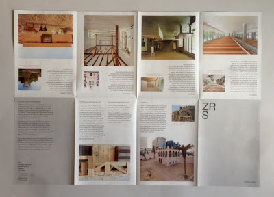
ZRS Architekten are a Berlin based architecture and engineering practice specialising in the use of natural building materials, especially Earth, Timber and Bamboo. Formerly, Ziegert, Roswag, Seiler Architekten engineers, London based designer, Dan Cottrell created a new visual identity for ZRS, uniting their previously separate offerings and positioning them as a modern, forward-thinking and holistic company. The new logotype, stationery, publications and website were developed to coincide with the company's 15th birthday.
This 16pp broadsheet is one of the publications produced for their anniversary, showing a selection of their projects from 2003-2018. 

The finished size is 176x125mm folding out to 500x352mm.
The front side shows individual projects, allowing the space on the inside to be used for a large scale image (below) - showing the interior of Firmengebäude Flexim, Berlin.
The publication is printed offset litho on our Offenbach Bible 60gsm ...and it looks and feels absolutely gorgeous - it flops and folds in a delightful way when handling the publication as I hope these images demonstrate.
The 'birds eye' image, below shows the concertina fold...
Visual Identity and design is by Dan Cottrell.
Printing is by Push Print based in London with Anthony Dearlove handling the project ...and the reproduction on our Offenbach Bible 60gsm is exceptional, as usual.

https://zrs-berlin.de/
www.dcottrell.com
http://www.push-print.com/
Posted by Justin Hobson 28.12.2018

Monday, 24 December 2018

Build by Tom Pigeon

Tom Pigeon is a creative studio founded by Pete and Kirsty Thomas in 2014. They met and started working as designers in the early 1990’s and since then have worked across design disciplines. As Tom Pigeon they design simple things for people to enjoy including prints, jewellery and stationery. 

This is a print, titled 'Build' that they have designed for Social Bite Village - a development in Edinburgh which gives homeless people somewhere to live and all the support they need to get back to work and into long-term accommodation.
Click on image to enlarge
All profits from this limited edition screen print inspired by the amazing space and remarkable work of Social Bite Village will be donated to the charity. ‘Build’ celebrates both the physical construction of this remarkable community and its work to encourage new and positive futures for its homeless residents. 
http://social-bite.co.uk/the-social-bite-village/
The size of each print is A2 (594x420mm) and is hand-pulled using waterbased inks at Harvey Lloyd Screenprinting and is a limited edition of 100 signed, numbered and embossed prints. Below show the detail of the embossing...
Printed in three colours on our Matrisse 200gsm which we donated for this project. It is beautifully printed with fantastic register and detail as you can see from the image below...
If you would like one of these 100 limited edition prints, you can buy one by following the link here:
https://www.tompigeon.com/collections/new-prints/products/build

http://social-bite.co.uk/the-social-bite-village/
https://www.tompigeon.com/
http://harveylloydscreens.co.uk/
Posted by Justin Hobson 24.12.2018

Friday, 21 December 2018

Namma Menu

Kricket is a modern Indian restaurant group with three restaurants in Soho, Brixton and the former Television Centre (White City). Founded by partners Rik Campbell and chef Will Bowlby, Kricket has recently expanded into the takeaway market, launching a new brand Namma by Kricket.
The partners were inspired by their travels across India and while they were in Mumbai they hired a couple of Royal Enfield Bullet motorcycles. It was this trip that inspired both the takeaway brand and their dishes with a twist.

The 8pp menu is a 'pocket size' 135x90mm, folding out to 360mm long...
Click on images to enlarge

Top image shows the inside and the bottom image shows the outside, featuring a Royal Enfield Bullet Motorcycle. The below image shows the 8pp concertina fold
The Namma by Kricket branding is by &Smith and they created a suite of literature including the menus and other collateral.

Designer on this project is Cécile Dumetier. The project is printed by Gavin Martin Colournet and is produced on their HP Indigo press, printed on our Shiro Tree Free, Cream 250gsm, which is an off white, natural board, manufactured from 100% non-tree fibres.

https://www.namma.co.uk/
https://kricket.co.uk/
http://andsmithdesign.com/
http://www.gavinmartincolournet.co.uk/
Posted by Justin Hobson 21.12.2018

Tuesday, 18 December 2018

Panettone Wrap

This is a lovely project which was produced last year at Christmas time. I received a call from Richard Davey at London based printer Leycol, who asked if we could supply a 60gsm in a red and black paper. We discussed the project further and it turned out that paper was to be printed with a metallic gold text and sent to Italy to wrap the traditional Panettone cake for sale in the Wildwood Deli.

Unfortunately I couldn't find a readily available red/black 60gsm stock paper available from one of our supplying mills and the quantity wasn't enough for a 'mill making',  so I suggested that he could successfully print a solid colour onto our Offenbach Bible 60gsm and the metallic gold text with excellent results. I sent Richard a printed sample of a McQ project to show how well a solid could work.  
The sheets were printed on a B1 Heidelberg offset litho press, in a solid pantone (not panettone colours!) colour plus a metallic gold and as you can see, the paper has printed beautifully. The size of the finished sheets are 550x750mm.
Not only does Offenbach Bible print beautifully, it also is very strong and "scrunches" beatifully! making it ideal for this type of wrapping, where a tissue paper (which you wouldn't be able to Litho Print) would actiually not be strong enough ...and here is the finished packaged article
Couldn't resist trying a slice!
Thanks to Richard Davey for giving us the opportunity to be involved with this very tasty project!

http://www.leycol.com/
Posted by Justin Hobson 18.12.2018