Monday, 11 February 2019

Landmark

Landmark is a Samuel Heath collection consisting of two Bauhaus-inspired designs and this is a superb piece of literature produced to show the restrained minimalist design and to fully communicate its craftsmanship and depth of inspiration.
I cannot describe the project better than on the Sanders website..."The challenge of this project was to present the product collection in a clear and precise manner, whilst ensuring design language and ease of use remained true to the Bauhaus principles that inspired the initial sketches of the product design. The use of carmine colouring boldly compliments the pure white texture throughout and the photography used has minimal shine and shading which bequeaths an understated confidence and stays true to the industrial aesthetic established. Implementing both of these themes we stayed true to the Bauhaus brilliance used to formulate the original design"

... and this is quite true! It is one of the most beautiful and well produced pieces of literature to appear on this blog (in my opinion!)
Size of the brochure is 297x245mm, portrait and is saddle stitched with a 4pp cover and 16pp text. It is printed on our lovely Omnia 320gsm (cover) and 200gsm (text). The carmine special colour is flat, matt and tactile just like you would want it and with a real depth and intensity of colour.
As the Sanders introduction states, the design had to be simple and superbly executed and the cover is the perfect demonstration. Along the spine there is a 45mm band (front and back cover) which is printed in the Carmine and blind embossed, perfectly simulating a cloth binding tape. The result is simply stunning...
Our Omnia was chosen which gives it that dead matt, tactile feel but with great reproduction, the solids are quite simply stunning.
As you can see from the images, there is lots of colour and images with CMYK dark areas - loads of ink going down and it looks great on the Omnia, reproducing bright vibrant solids, whilst retaining detail in the dark areas (in my opinion- but I would say that wouldn't I?)
The outside back cover - with the 45mm embossing running parallel to the spine. 
Creative direction and design is by Sanders Product Design & Branding and the designer on the project is Jameila Thomas. Printing is by Leicester based Greenshires with Rob Hughes handling the project. The publication is printed offset litho in CMYK plus a special red. Printing and finishing are superb - a really well produced piece.

https://landmark-collection.com/
https://www.sanders-design.com/
http://www.greenshires.com/
Posted by Justin Hobson 11.02.2019

Thursday, 7 February 2019

Notey or Nice?

Studio Small are a London based studio, specialising in the fashion, design and luxury sectors. Every year they produce a Christmas card, but rather than just producing a a clever card, they always produce something a little unusual and hopefully useful. This last Christmas it was this lovely notepad...
The pad is A5, size and includes 80 plain leaves (160pp) on which to write.
Click on images to enlarge
The cover of the pad is simply silkscreened in three colours (white ink and two fluorescents) on our Colorset, Bright Red 350gsm. The front is pictured above on the left. On the back of the pad is printed the Christmas greeting.
The pad is glued at the top - the term for this is 'glued at the head'. The text pages are using our Redeem 100% Recycled 60gsm.
The pad is bound using "Padding Glue", so the sheets can be torn off easily. The image below shows the glued head and the perfectly creased spine...
Binding is by Wayte Binding who are based in Tunbridge Wells.
Design is by Darcy Ward at Studio Small. The covers have been beautifully printed by Harvey Lloyd Screenprint, who are based in Wadhurst, East Sussex. It is worth having a look at their website for some of the great work they do for the likes of Anthony Burrill and Mr Bingo.

http://www.studiosmall.com/
http://harveylloydscreens.co.uk/
http://www.waytebinding.co.uk/
Posted by Justin Hobson 07.02.2019

Monday, 4 February 2019

Jobs from the past - Number 112

Regular followers of this blog will know that my first post of every month is a "job from the past" so that I can show some of the really good work from years gone by. This project is from the year 2000.

Traveller - Pictor.com
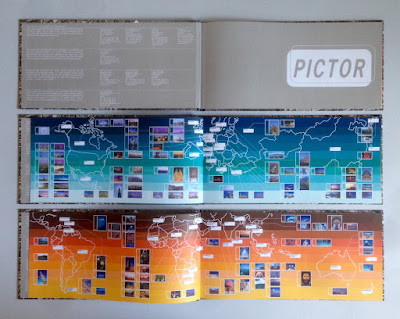
In the pre-internet age, if you wanted an image, you used to have to search through printed catalogues supplied by photo libraries. You would then either, phone, fax or even write a letter (!) ordering the transparency for which you would be charged. As digital technology developed, photo libraries were able to provide a larger volume of images on disc, but to promote the images from the library, they would often also send a book showing a selection of printed images. This is one such publication produced in the Summer of 2000, just at the time when the internet was enabling the exchange of digital files and at the time of the first dotcom boom.
It is an unusual format of 140x297mm, Landscape. It is section sewn and casebound with a 56pp text plus printed endpapers.
The images are of the highest quality and this publication is just to give a flavour of the bigger selection of images available on disk, so the first couple of pages show the areas in the world where the different sections have been shot...
Click on images to enlarge
The text is printed on Neptune Unique FSC 135gsm and looks truly amazing! Neptune is smooth uncoated with a high white shade and the images have reproduced amazingly (in no small way, due to the printer as well). Printed offset litho in CMYK plus a special pantone color for the printed end papers. At this time, most stock photography catalogues were printed on coated papers, so that reproduction was ensured, but at this time, although image reproduction was important, it was also important to show how images might look in use and it was at a time when the use of quality uncoated papers was becoming more prevalent.
In those days there needed to be a disc included as file transfer over the internet was still to come, so as you can see below, a disc affixed on the inside back cover...
Image showing the thread of the section sewing...
Creative direction and design is by the in house team at Pictor. It seems that Pictor no longer exists as a picture library, but I guess the world of stock image photography has changed beyond all recognition since the millennium.

The excellent printing and binding was by Fulmar, based in Croydon, Surrey and this project was handled by Keith Marley. Fulmar was a printer founded in 1971 by Mike Taylor and was a forward thinking, successful and large print group. Mike Taylor sold Fulmar in 2006 to the CPI group and they are still printing in the same factory and still producing lovely work!

Keith Marley now runs his own printing consultancy: http://keithmarley.co.uk/

http://www.cpi-print.co.uk/
https://bapla.org.uk/
Posted by Justin Hobson 04.02.2019

Thursday, 31 January 2019

Archerfield Gift Voucher

Fletcher’s Cottage Spa is the luxurious spa set on the Archerfield Estate, which is less than an hour from Edinburgh. The estate features a golf course and several houses which can be booked in their entirety for weddings and celebrations. The spa has been featured in the Sunday Times Travel Top 6 British Spas and the Tatler Spa Guide.
This is the printed gift voucher, the format is a 6pp, A4 gatefold with two "thumbcuts" which hold in the voucher (195x92mm) as you can see in the images below.
Click on images to emlarge
The below image shows the outer cover, flat.
This literature is all printed on Crush, Corn 200gsm. It has been digitally printed (beautifully) on a Ricoh 5100 by DTP Print in Edinburgh as you can see from the detail image below...
Creative direction and design is by Katherine Scott at Studio Thought Process based in Edinburgh.
 
If you aren't familiar with Crush, it is one of our ranges made by FAVINI in Italy and is made using 15% residues from the industrial processing of agricultural processing. As a result, the paper does have inclusions and a "rustic" feel, which you might just be able to see from the image detail below:
Click on images to enlarge
With thanks to Sonya Beaumont at DTP Print for sending file copies.

https://www.archerfieldhouse.com/spa/
http://studiothoughtprocess.com/
http://www.dtpprint.co.uk/
Posted by Justin Hobson 31.01.2019

Monday, 28 January 2019

David Hebrew Typeface Family

Ismar David was a prolific type designer, calligrapher, graphic designer and illustrator. He also engaged in architectural design and taught calligraphy. From the 1930s to the 1990s, he created exquisite designs, studying in Berlin in 1928, emigrating to Jerusalem in 1932 and to New York City in 1952.
His most important work is considered to be the David Hebrew Typeface family. It was the first of its kind when it was issued in 1954 and up until today it is the pinnacle of Hebrew type design.

What are the challenges entailed in designing a Hebrew typeface family? How did David tackle these obstacles? Why is this work paramount and what has become of it over the years ...?
You can hear the answers to these questions at a talk being given by Shani Avni, based on her  research for her MA dissertation at the University of Reading. Her talk will shed some light on David’s fascinating design process and ground-breaking results.
Shani Avni is an independent designer and researcher. She holds a BA from Shenkar College of Design in Tel Aviv and an MA in Typeface Design from the University of Reading. Shani has been chosen for the 2017 Cary Collection Research Fellowship at the Rochester Institute of Technology (RIT), USA, where David’s work is archived.

Unfolding the First Hebrew Typeface Family by Ismar David is at the St Bride Foundation on 6th February 2019 7pm – 9pm. Tickets cost £8 – £12.50 and you can book tickets HERE

www.shaniavni.com
https://billetto.co.uk/e/unfolding-the-first-hebrew-typeface-family-by-ismar-david-shani-avni-tickets-317064
Posted by Justin Hobson 28.01.2019

Wednesday, 23 January 2019

Colorset for every month of the year

The Absolute group are specialist manufacturers and printers of Luxury Packaging, Gifting, Trims and Wovens, Invitations, Fashion Lookbooks etc. Based in East London, their tagline is FIRST WE LISTEN, THEN WE MAKE....
 
I received this lovely 2019 calendar which they produced in house. The size is 113x164mm, plus a 12mm tab. 
The calendar is produced on our Colorset 100% Recycled 350gsm board in the shades of Sandstone, Natural, Ash and Light Grey, which is a great colour pallet.
Click on images to enlarge
Each of the cards is duplexed, with a different colour on the reverse, so each of the cards is a 700gsm thick card. The below image shows the reverse of the cards...
Below image shows the detail of the duplexed edge
The calendar is printed in just one colour (a special green) - a perfect example of the impact of just using one colour.

https://www.theabsolute.co.uk/
Posted by Justin Hobson 23.01.2019

Monday, 21 January 2019

Today is Blue Monday

According to the newspapers, today is supposedly the most depressing and gloomiest day of the year. As people come down from holiday-highs, start to receive their credit card bills, and start to experience ever colder weather ...and the fact that it's a Monday, it's easy to see why you can get down in the dumps.

Not me! ...I'm using it as an excuse to tell you that here at Fenner Paper, many of our paper ranges include shades of blue, which when you add them up total 27 different shades of blue!!!!
Yes, it's a cynical ploy, but then apparently Blue Monday was itself a cynical invention back in the early 2000's developed as a way of selling summer holidays in January!

27 different blues is as many as some of those other bigger companies can offer...

So if you feel like a blue today, get in contact.
Posted by Justin Hobson 21.01.2019