Tuesday, 18 June 2019

World Cup Wallchart

Our Typographic Wallchart that we have produced for the Women's World Cup has been going down a storm with all you football fans out there

This A1 size typographic wallchart is very simply produced in just two colour offset litho and is printed on our new Creative Print, Diamond 90gsm from German paper manufacturer Euler and is made using 100% recycled fibres.

The wallchart has appeared on the Koehler website here

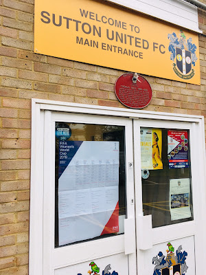
...and our wallchart has also had professional recognition! Below you can see the wallchart at Sutton United FC, where it is proudly displayed on the door and the bar
Design of the wallchart is by David Coates, who is also an ISTD (International Society of Typographic Designers) board member and my thanks to Dave for making it all happen - a perfect way to combine his love of type and football! Printing is by Typecast Colour in Paddock Wood.
 
We are now coming to the end of the group stages and the competition is really hotting up now. We have a few of the wallcharts left, so if you would like one, you can email me Justin@fennerpaper.co.uk
 
Posted by Justin Hobson 18.06.2019

Friday, 14 June 2019

The Burns Series

The Burns series is a range of greeting cards produced in Scotland by Solway Print who are based in Dumfries and Galloway. The cards feature quotations by Robert Burns accompanied by a small illustration. What makes these cards extra special is that they are printed letterpress.
Here are two cards from the series. The cards are 125mm square and are left blank on the inside. The outside of the cards is letterpress printed in 2 colours, black and deep red. Each of the cards has an explanatory note about each of the quotations on the reverse of the card.
Click on images to enlarge
The cards are printed on our Pure Cotton 350gsm, which is a range made using 100% cotton fibres. The board has a wonderful feel and prints letterpress superbly as cotton papers have a wonderful compressibility, allowing the type to sink into the paper (without having to crash/bash it!) You can see from the image below, just how good the crease works.
The cards are designed by Miranda Cloy who is a designer and illustrator at Solways. Many thanks to Miranda for giving these cards to my colleague Kerry and allowing them to be shown.

https://www.solwayprint.co.uk/
Posted by Justin Hobson 14.06.2019

Tuesday, 11 June 2019

Naomi's Poem

This project is a collaboration between Tom Sharp – poet, writer and founder of The Poetry of it all and Katherina Tudball, Creative Director at Superunion
In a limited edition of 200 copies, the publication confronts some cliff-edge health news Tom’s sister received in August last year. Through poetry, Tom began documenting the siblings’ emotional journey – as fears, nostalgia, regrets and love became the focus of their conversations.
The size of the book is 230x100mm, portrait.The only immediately readable type is the title and a short introduction on the inside front cover (above)
...as each section of the poem is bound within a French-folded text printed on our lightweight Offenbach Bible 60gsm, meaning that it is hidden from sight and requires the reader to tear the paper in order to read. Below you can see the torn pages revealing the poem.
Click on images to enlarge
‘Naomi’s Poem’, is a single epistolary poem in twelve sections, shared between brother and sister as part of a therapeutic creative conversation.

The text is made from 12x 4pp French folded sections. Below shows one unopened book and one with the torn pages...
Rich with drowning imagery, the poetry is set in 8pt Doves Type, the typeface famously lost under the waters of the Thames for 100 years before being rescued and accurately recreated by Robert Green.
The truly amazing binding is stitching that mirrors surgical patterns. As part of the design process, Katherina and Tom consulted with Fleur Oakes, Imperial College’s Vascular Surgery Department’s Lacemaker in Residence.
Click on images to enlarge
The printing, finishing and binding is by Boss Print who are based in West London and it is truly superb - yes, they managed to sew the book like this! The text is all printed on Offenbach Bible 60gsm and the cover is printed on Colorset Natural 270gsm

This is a highly personal project which has been produced in a truly amazing way. I am very grateful to have received my copy - No 172 of 200.

https://www.superunion.com/
https://www.thepoetryofitall.com/
https://www.bossprint.com/
Posted by Justin Hobson 11.06.2019

Friday, 7 June 2019

Laings 2018/19

Just the cover makes the difference! I've written on this blog about many projects where the cover "makes the difference" and this is just one of those projects....

Laings is a prestigious family-run jewellers with over 177 years’ experience in the industry. Established in 1840 they are now one of the largest independent jewellery businesses operating six stores across the UK.
The cover of their latest catalogue is printed on one of our new Colorset shades - Colorset Deep Blue in 350gsm. The size of the catalogue is 250x200mm, portrait and is perfect bound with 102pp text, printed on 'house silk' coated 170gsm paper.
The cover is beautifully hot foil blocked in silver metallic foil...
...and the spine is also foiled
Print is by Kestrel Press, as with Laings, Kestrel are also a family owned company. They are based in Irvine in Scotland and were founded over 40 years ago. My thanks to Graeme Ferguson at Kestrel for sending me these copies.

https://www.laingsuk.com/
http://www.kestrelpress.com/
Posted by Justin Hobson 07.06.2019

Wednesday, 5 June 2019

Creative Print Launch

Today is World Environment Day. This event is the United Nations day for encouraging worldwide awareness and action to protect our environment. Since it began in 1974, the event has grown to become a global platform for public outreach that is widely celebrated in over 100 countries. Above all, World Environment Day is the "people's day" for doing something to take care of the Earth. That "something" can be local, national or global. It can be a solo action or involve a crowd.
What better day for us to launch the latest addition to our range of recycled and environmentally friendly papers...
 
Creative Print is our new range of 100% recycled, uncoated text and cover materials. 
The paper has an uncoated, natural surface and is produced on the "Rolls Royce" of papermaking machines - a twin wire machine which ensures even-sidedness which improves printability over other inferior products. The range is available in two shades, Diamond and Champagne and the weight range is 90, 120, 170, 210, 270 and 350gsm.
 
Creative Print is manufactured by Euler in Germany, which is part of the Koehler Paper Group. The range carries the "Blue Angel" certification. Introduced in 1978, the Blue Angel scheme is the oldest ecolabel in the world, and it covers some 10,000 products in some 80 product categories. After the introduction of Germany's Blue Angel in 1978 as the first worldwide environmental label, other European and non-European countries followed this example and introduced their own national and supra-regional environmental labels. The common goal of these labels is to inform consumers about environmentally friendly products thereby giving global support to product-related environmental protection - perfect for highlighting on World Environment Day!
 If you would like a swatch of this new range, just drop me an email Justin@fennerpaper.co.uk
 
Posted by Justin Hobson 05.06.2019

Monday, 3 June 2019

Jobs from the past - Number 116

Regular followers of this blog will know that my first post of every month is a "job from the past" so that I can show some of the really good work from years gone by - this project is from 2006.

Paul Smith Black A|W 2006
The Paul Smith Black collection combines luxurious tailoring, identified by its witty twist on classics with directional and modern seperates. for this season the collection takes it's inspiration from elegance of the transatlantic jet set traveller of the 1950's
This is the lookbook for the Autumn Winter collection. The finished size is A5 (210x148mm) portrait with a 4pp cover and 28pp text.printed on Omnia 320gsm and 150gsm.
 
Click on images to enlarge
The material chosen is our Omnia which gives it that dead matt, tactile feel but with great reproduction.
Click on images to enlarge
...and here's the plug for the paper!  - As you can see from these images, there is lots of colour and images with CMYK dark areas - loads of ink going down and it looks great on the Omnia, reproducing bright vibrant colours, whilst retaining detail in the dark areas (in my opinion- but I would say that wouldn't I?) See the detail in the bag image below
The 28pp text flow nicely throughout the book...
Sewn sections and glued binding making a 3mm spine
Art Direction, design and production is by London design agency Aboud Sodano, which has sinec become Aboud + Aboud. The creative director on this project was Alan Aboud.  The piece has a fantastic feel - lots of space (just one image per spread) giving the publication an airy spacious feel - it is difficult for me to say too much more about it - the images speak for the job...

The superb print is by Generation Press.

http://aboud-aboud.com/
https://generationpress.co.uk/
Posted by Justin Hobson 03.06.2019

Thursday, 30 May 2019

Arrows of love

This superb book was published to accompany the Quentin Blake exhibition titled Arrows of Love which took place last year at the House of Illustration. This was an exhibition of Quentin Blake’s rarely-seen nudes consisting of 18 exuberant pencil drawings depicting women avoiding or embracing Cupid’s arrow. The original works are pencil on paper and were drawn circa 1974.

Having opened on Valentine’s Day, this exhibition reveals Quentin Blake's personal reflections on the joy, folly and sorrow of love with his characteristic humour. You can read about the exhibition here.
The size of the book is 265x220mm, portrait and comprises of 64pp plus endpapers. The text pages are printed on our Omnia, Natural 120gsm which gives the book a 'toned' look but which sympathetically reproduces the pencil illustrations.

The books starts with arrows...
Click on images to enlarge

Click on images to enlarge

Birds eye view showing the sewn sections and the 'quarter bound' binding. Spine is 7mm
Detail showing reproduction of the pencil illustration....
This is a beautifully produced publication, which you can buy here. The excellent printing is by Jigsaw Colour who are based in Bermondsey, London

https://www.quentinblake.com/
http://www.houseofillustration.org.uk/home
http://www.jigsawcolour.co.uk/
Posted by Justin Hobson 30.05.2019