Monday, 16 December 2019

Fenner Paper 2020 Diary

If you are a wonderful customer and therefore a deserving user of our papers! ... you will be receiving your new 2020 diary in the post this week. Here's a sneak preview...
As in previous years, the diary is 230x162mm, portrait and retains the popular 'month to view' format. The cover board is printed offset litho in just one colour - silver pantone colours 877 on three shades of Colorset 100% Recycled 270gsm - Nero, Solar and Mango - which one will you get???
This year we have collaborated with international typeface designers Dalton Maag who have created the cover. The typeface chosen is Calmetta and using 'glyphs' of 0 and 2 in different weights, they have created the cover image, which is stunning. My thanks to the wonderful team at the London studio of Dalton Maag, who were a pleasure to work with.

The 40pp text is set in Calmetta Light and is simply printed in one colour, offset litho, on our lovely Offenbach Bible 60gsm, which has a superb opacity and a good writing surface making this an ideal paper for a diary or notebook.
Tucked into your diary is also a handy Stardream desk calendar to remind you that the Stardream range of pearlescent and metallic papers from Cordenons in 32 shades is available through Fenner Paper...
https://www.daltonmaag.com/
Posted by Justin Hobson 16.12.2019

Thursday, 12 December 2019

Christmas time on Dali...

James Ellis are a greeting card publisher who have been publishing their own ranges of cards since 1997. Based in Bristol, they actually print and make all their cards in the UK (so no horrible carbon footprint to China!). You'll find their ranges of cards in Paperchase, Waitrose, Harrods and John Lewis and all good card shops!
 
They’ve been manufacturing their 'shakies' cards since 2003 and they have undergone quite a few style changes, but the glitter and confetti (biodegradeable glitter and confetti, of course) shaking around within the card idea has more or less remained the same.
The latest change  has been to change the board which form the cards and the window to our Dali range. If you aren't familiar with the Dali range, it is a 'felt-marked' paper with a linear effect and a natural, tactile feel. If you click on the image below, you will be able to see the texture in the paper.
Click on image to enlarge
Dali is available in a range of shades and these Christmas cards are produced using Dali, Candido (white) and Dali Rosso (red) 285gsm.
 
The other thing that is new is that this range is now bagless - meaning that they don't now come in a cellophane bag, reducing plastic waste. The cards are held together with peelable labels, as you can see in the images below...
Below is a detail image showing the way the label holds the envelope together...
Thanks to James Ellis for sharing these samples with me and a magical Christmas to all!

https://www.jamesellis.com/
Posted by Justin Hobson 12.12.2019

Tuesday, 10 December 2019

Type Directory - Launch

Last Wednesday evening, I was privileged to be at the launch of a new book which is set to be required reading for anyone studying design and type.  This new book contains over 1,800 typefaces which are organized by category – Serif, Sans Serif, Display and Script – and subsequently arranged by recognized sub-categories. This allows the reader to make a direct comparison of typefaces with a similar appearance, thus facilitating a deeper understanding of the design and selection process.
The launch was held at the St Brides Foundation, the heritage home for type and surely the most appropriate place to launch a book such as this. The evening began with an introduction by the St Bride Foundation librarian, Sophie Hawkey-Edwards followed by a short speech by author Peter Dawson.
There were over a hundred people at the launch. There were also many typographic objects from the St Bride collection on display, including some original work from Margaret Calvert.
Click on images to enlarge
...and here is the book itself
"Wherever we go and whatever we do, the printed word plays a part in every aspect of our day-to-day lives. Behind all the messages we see, read, and absorb, the design and choice of typeface dictate the tone, context and immediacy of these words. From advertising and news headlines to book jackets or wayfinding at an airport, choosing the most appropriate typeface is not an easy task, nor one based on aesthetic alone. With such a diverse and inspiring range of types now on offer, Type Directory separates and identifies these forms to provide a comprehensive selection of available typefaces."
Click on images to enlarge
The visual celebration of the craft, innovation and beauty of these letterforms is presented throughout, from classic typefaces like Garamond, Bodoni and Times through to the contemporary Bliss, Gotham and Meta. It is the ultimate visual encyclopedia...
The size of the book is 235x225mm, portrait, and is packed with 672pp making the spine a massive 50mm! Hopefully you can see the scale of the size of book from the image below...
This is a major work and I'm sure it is set to be the type bible for the forseeable future. You will be pleased to know that the book is available for sale and that you can get it in time for Christmas! You can buy it here.

https://www.gradedesign.com/
Posted by Justin Hobson 10.12.2019

Friday, 6 December 2019

Harvey Lloyd - new prints, new shop...

Harvey Lloyd Screenprint is a silkscreen print studio based in the South East of England and their work has appeared on this blog many times over the years. Established 40 years ago, they produce work for some of the best names in the industry, Anthony Burrill, Mr Bingo, Spin Design, Pentagram, Tom Pigeon, Morag Myerscough, Adrian Johnson to name a few. Harvey Lloyd have gained a reputation for having artists at their studio (often with film crews) and working together to produce their images. By working interactively, they find different techniques which are developed collaboratively.

...and now, for the first time, Harvey Lloyd Screenprint have produced a series of their own prints:
Bale (pictured above and below) is produced in 3 colour ways - Fluorescent Pink, Green and yellow. The finished size is 600mm x 600mm.
The series Connect, Metropolis and Pyramid are all 400mm square
Connect
Metropolis
Pyramid
Spheres and Weave are A2 size and printed using 3 colours using an unusual technique- getting away from digital technology and back to analogue, a technique which Steve Fachiri and Tracey Day at Harvey Lloyd don't want to reveal, save telling me that the screens were created using torn paper for the stencils.
Spheres
Weave
...and of course I should have mentioned that they are all printed on our wonderful Matrisse 250gsm, which is an uncoated, white board range with a high bulk (330microns) is FSC certified and Acid Free.

These beautiful prints are available directly from their online shop here:
Posted by Justin Hobson 06.12.2019

Wednesday, 4 December 2019

Zanders - see a paper mill in 1 minute!

This new video has recently been posted by Zanders in Germany. It is just one minute long but gives a great insight of the size of machines, the number of coaters and the capacity at the mill ...it's got to be worth taking one minute to watch it:  
As many of you will know, we are the UK stockists for the Chromolux range of cast coated papers...
If you would like Chromolux samples, just drop me an email justin@fennerpaper.co.uk

https://zanders.de/en/
Posted by Justin Hobson 04.12.2019

Monday, 2 December 2019

Jobs from the past - Number 122

Regular followers of this blog will know that my first post of every month is a "job from the past" so that I can show some of the really good work from years gone by and this invitation is from 2006.

Aquascutum - Spring Summer 2006 
Set up by John Emary, Aquascutum began as a Mayfair tailors in 1851. Seeing an opportunity for more refined rainwear, Emary created and patented the first waterproof wool. This unique creation led to inspire the brands name, which translates as "water shield" from Latin and was the first company to provide the British army with innovative waterproof cloth during the Crimean war.

This is the invitation to the Spring/Summer 2006 private view. The size is 148x210mm folding out to 297x420mm (A3)
The above and below images show the printing on the 'outside' showing SS06
Above is the front showing the SS, which folds out to reveal the below image:
...which then folds upwards to reveal the whole invitation:
I have the description, given to me at the time by Mark Thomson "The invite was inspired by the Aquascutum collection which had a shipwreck theme - the invite is meant to resemble a transparent boat sail, when you hold it up to the light you can read the whole title of the show". The invitation is printed offset litho in CMYK in both sides by Generation Press.

Below you can see the detail of the translucency achieved between the printing on either side of the paper...
It is printed on our Offenbach Bible 60gsm and it looks and feels gorgeous. The format, combined with the paper, gives the publication a light, malleable, tactile feel and as I'm sure you can see from the below image.
Art direction and design is by brothers Mark and Chris Thomson at Studio Thomson and I still have the note that Mark kindly sent me with the file copies:
Print and finishing is by Generation Press, based near Brighton in Sussex. A wonderfully simple job, beautifully printed and finished ...yet another one of those projects that looks as fantastic now as it did thirteen years ago! In fact I wrote about Studio Thomson celebrating their 5th Birthday in 2009 here!

https://www.aquascutum.com/
https://studiothomson.com/
https://generationpress.co.uk/
Posted by Justin Hobson 02.12.2019

Friday, 29 November 2019

British Book Design & Production Awards 2019

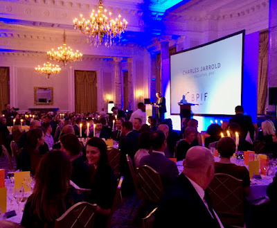
Last week,  I was lucky enough to be at the British Book Design and Production Awards which is hosted and run by the British Printing Industries Federation (BPIF) at the Landmark Hotel in  Marylebone. A very lavish and swish occasion.
I was kindly invited by Fenton Smith and Bonnie Lo from London print company BOSS, who were shortlisted for a number of awards.
 
On arrival, the nominated entries were all out on display and it was a truly wonderful array of books and catalogues. 
 ...a gathering of over 200 people from the world of publishing, print and design - and a few paper people in there as well! Here I am with my industry colleague, Charlotte Harvey from Antalis.
Once seated in the grand dining room, the evening was opened by Charles Jarrold, Chief Executive of the BPIF...
It was particularly lovely that a project which I was involved with won the category for "Limited Edition & Fine Binding" The project is titled "Paper Dolls" by artist Hormazd Nariewella. It is designed by Ornan Rotem  and published by Concentric Editions and Sylph Editions and it was beautifully printed by Boss Print on our Gardapat 13, Kiara 135gsm 
 ...and here is the team that made the book possible, collecting the award on stage, collecting the award from the compere Konnie Huq.
 Here is a sneak preview of the book (which I write about another time)…
Here is Bonnie from Boss with the artist Hormazd Nariewella:
Boss went on to win a further three awards, including the grand finale award "Best British Book" for North Northwest designed by Les Welch, pictured below with Fenton Smith from Boss:
Congratulation to all the finalists and award winners. You can read more about the entries and the winners here: https://www.britishbookawards.org/winners-2019/

It was a great evening - good company and food and my thanks go to Boss Print for inviting me and it was great meeting up with many other old friends on the table too.

Posted by Justin Hobson 29.11.2019