Thursday, 25 June 2020

Stardream Print Processes book

Stardream is a market leading pearlescent and metallic paper range produced by the Cordenons paper mill in Italy. Many designers and printers have become fans of the light irridescent finishes and the dual sided deep metallic finishes which do truly shimmer. Stardream is used for a wide range of applications, including cover, presentation folders, invitations, greetings cards and luxury packaging.

This is the new "Print Processes book" which demonstrates the wide variety of print processes that you can achieve using this paper range.
The cover image is printed offset litho in CMYK on Stardream Copper 285gsm and the result is stunning - just look how good a CMYK image can look, even on a relatively deep shade such as the Copper. What many people forget is the litho inks are transparent, what this means is that if you print on a colour, the colour will come through and it also means that if you print on a pearlescent/metallic substrate, the printed result will be pearlescent/metallic and take on the shimmer of the surface printed on.
The size of the presenter is 230x220mm and the wiro-bound inserts are 210mm square. The first page is hot foil blocked using Foilco Ref 6815 copper foil on Stardream Anthracite 285gsm.
Click on images to enlarge
Page two is is printed using Thermographic printing (thermography) in red and black.
Thermo (as it is commonly called) is a great process and can produce a gloss or matt raised surface. In this instance, the result is a gloss finish, printed on Stardream Rose Quartz 120gsm
Stardream is also suitable for digital print processes and the below rainbow image is printed on Stradream Crystal Digital 240gsm on an HP Indigo Press
The next page is french folded and is lasercut...
Click on images to enlarge
The sample printed on the Stardream Silver (above & below) is just the most simple and yet effective sample. It is printed in just 1 colour offset litho as a halftone (or some people refer to it as a montone) and as mentioned before, because litho inks are transparent, the printed result is pearlescent/metallic and takes on the shimmer of the Stardream surface.
and the grand finale of the book, really is amazing at is is the simplest, yet crazily effective process. The below watchface is digitally printed in white using a dry toner press (this was a Ricoh)
...and here is a detail image
...and below shows the deep blue colour (Stardream Lapislazuli 285gsm) that it was printed on.
Digital white (toner) is an incredibly stunning effect and a very economical price, so it's definitely worth looking into.

My thanks to the paper mill, Gruppo Cordenons for supplying us with the tools to show the Stardream range in the very best light. If you would like one of these new books, please email me: justin@fennerpaper.co.uk

http://www.cordenons.co.uk/
http://www.gruppocordenons.com/en/
Posted by Justin Hobson 25.06.2020

Tuesday, 23 June 2020

Shakies go Green...

James Ellis are a greeting card publisher who have been publishing their own ranges of cards since 1997. Based in Bristol, they actually print and make all their cards in the UK (so no horrible carbon footprint to China!). You'll find their ranges of cards in Paperchase, Waitrose, Harrods and John Lewis and all good card shops! 

They’ve been manufacturing their 'shakies' cards since 2003 and they have undergone quite a few style changes, but items shaking around within the card idea has more or less remained the same.
In an effort to be as environmentally friendly as possible, the latest change has been to ditch the plastic panel on the front of the card which forms the pocket for the shakeable items to move in. By removing the plastic and replacing it with a translucent paper, which is itself printed, the appearance of the card has changed little but is now recyclable. The paper chosen for this job is our Spectral, Digital White 110gsm from the Reflex Paper Mill in Germany.

...and you can see the way the coloured paper discs move around.
The size of the card is 176x127mm and the board which form the cards and the window are from our Dali range. If you aren't familiar with the Dali range, it is a 'felt-marked' paper with a linear effect and a natural, tactile feel. If you click on the image below, you will be able to see the texture in the paper.
Click on images to enlarge
...and you can see (above) the printing on the translucent Spectral. The digital printing is by Pureprint on their HP Indigo presses and the result is superb.

To make the cards as green as possible, they have eradicated the use of glitter, the plastic and replaced the outer bag by applying a peelable pricing label.
James Ellis have also signed up for 1% for the Planet scheme where companies commit to giving 1% of their turnover to environmental non-profit organisations.

This card is designed by Katherine Hartley and my thanks to James for sharing these new samples with me.

https://www.jamesellis.com/ 
https://www.pureprint.com/
Posted by Justin Hobson 23.06.2020

Friday, 19 June 2020

Jerwood Photoworks Awards

The Jerwood/Photoworks Awards support photographers, or artists using photography, to make new work and significantly develop their practice. The Awards are a collaboration between Jerwood Arts and Photoworks, supported by Official Print Partner Spectrum Photographic. The Awards particularly seek to encourage artists and photographers exploring new approaches to photography, and/or whose practice is experimental. Photoworks is a registered charity and the only organisation with a national remit for photography in England. Their work is supported by public funding through Arts Council England’s National Portfolio under the directorship of Shoair Mavlian.
Presented every two years, the Awards are open to arts practitioners using photography who are within 10 years of establishing their practice. There is no age limitation and no requirement for formal education or qualifications. This publication marks the second awards with awards to Alejandra Carles-Tolra, Sam Laughlin, and Lua Ribeira.
The awards publication is A5 (210x148mm) portrait and is PUR bound with a 4pp cover and 48pp text.
The 4pp cover is on Omnia 320gsm and the 48pp text is on Omnia 150gsm.
Click on images to enlarge
The brochure is printed offset litho in four colour process throughout with a full out silver solid printed on the cover. As always (...this is the plug for the paper!) the images look superb on the Omnia; the fleshtones in particular look absolutely stunning (see below) and the reproduction of the dark shadowy areas (see above) look amazing - keeping all the detail in those heavy areas of CMYK together which would be completely lost on a traditional uncoated paper.
Fleshtone detail...
Click on images to enlarge
The black and white images of Sam Laughlin (below) look amazing...
The size and combination of weights is just right and the book flows superbly in the hand. The text is printed on Omnia 150gsm.
Returning to the cover and another very good reason that Omnia was chosen for this project. On most traditional uncoated papers, metallic inks can look flat and silver can end up just looking grey, but as I hope the below image demonstrates, the metallic silver really does look amazingly metallic on Omnia with the uncoated texture.
Below shows the very neat PUR binding.
The design of this amazing awards catalogue and also of the awards identity is by Dean Pavitt and it was kind of him to send me copies with a lovely note...
The excellent printing is by Ashley House Printing, based in Exeter, Devon.

https://photoworks.org.uk/project_category/jerwoodphotoworks-awards/
https://www.ashleyhouse.co.uk/
Posted by Justin Hobson 19.06.20

Monday, 15 June 2020

Picpus #22

Picpus is a free magazine edited by Charles Asprey and Simon Grant. It carries articles from the art world, with a particular interest in historical curiosities, overlooked artists, arts and politics and is distributed through a selection of specialised art bookshops, galleries and libraries.
The format of Picpus is a folded down broadsheet, measuring 594x420mm (A1 size) which folds down to a 32pp A6 (105x148mm) finished size.
Click on images to enlarge
Picpus is printed quarterly and this is issue 22 issue published in Autumn last year in memory of Karsten Schubert, publisher and gallerist (1961-2019). It is an edition of 4000 copies. Below shows the broadsheet folded out flat...
...and the reverse side
Picpus is printed on Redeem 100% Recycled 80gsm and is printed offset litho, CMYK on both sides and as you can see from the detail image below the print result is excellent.
Design is by Studio Ard and is printed by Push Print, who have printed every issue since it's inception. The publication is held together with a small round sticker with serrated middle, holding it flat.
http://www.charlesasprey.london/picpus-press.html
http://www.ard.works/
http://www.push-print.com/ 
Posted by Justin Hobson 15.06.2020

Thursday, 11 June 2020

Invitation to Void

Presented as part of last year's London Design Festival, VOID is an installation by photographer Dan Tobin Smith and creative studio The Experience Machine, a multi-sensory spatial installation at Collins Music Hall, Islington.
A selection of Mozambican rubies and Zambian emeralds from their supporter Gemfields’ mines, which date back millions of years, were brought to life through photography of tiny microcosms magnified to become abstract, galaxy-like structures.
Click on images to enlarge
This is the beautifully produced private view invitation. Size is A5 landscape (148x210mm). The invitation face is is printed on our Colorset, Dark Grey 270gsm, heavily debossed (see above) and hot foil blocked in metallic black foil. Below, shows the detail of the hot foil blocking 
The invitation is triplexed, with the Colorset Dark Grey on the face, our Sumo Black 1.5mm in the centre and a HP Indigo printed reverse, giving an overall thickness of 2mm.
Different images from the installation were used on the reverse of the invitations, the below image shows two of the images...
Design is by Sandra Zellmer. The superlative print and finishing is by Brighton based Generation Press, who are unusual in having litho, digital, letterpress and hot-foiling all in house.

https://www.londondesignfestival.com/event/void
https://gemfields.com/
http://www.sandrazellmer.com/
https://generationpress.co.uk/
Posted by Justin Hobson 11.06.2020

Monday, 8 June 2020

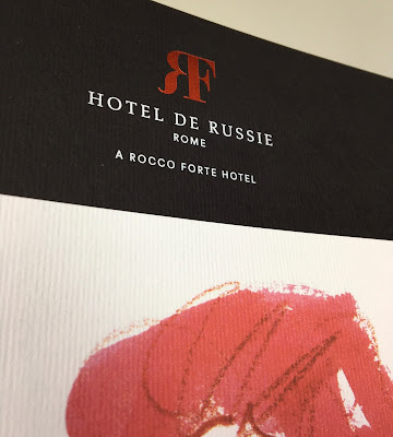
Hotel de Russie - Rome

Located between two of Rome’s most picturesque piazzas, Piazza di Spagna and Piazza del Popolo, Hotel de Russie is one of the Eternal City’s most prestigious luxury hotels. An enduring favourite of artists and writers, stars and politicians, Hotel de Russie was dubbed “paradise on earth” by French poet Jean Cocteau in 1917. The hotel incorporates a stunning Mediterranean tiered Secret Garden, with rose bushes, orange trees and mature pine.

This the brochure for the hotel, which follows the new brand identity for Rocco Forte Hotels, created by Pentagram.
Size of the brochure is 266 x 204mm, portrait and is saddle stitched. The cover is an unusual format as there is an 8pp cover with 140mm wide flaps and there is an outer jacket, only 210mm high, also with 140mm flaps. It is the first time I've seen this combination and the effect is superb...
Click on images to enlarge
The materials used for the covers is our Dali range, which is a 'felt-marked' paper with a linear effect and a natural, tactile feel. If you click on the image below, you will be able to see the texture in the paper.
Click on images to enlarge
The cover is on Dali Nero 200gsm and is hot foil blocked in matt white and copper foil. The jacket is printed on Dali, Candido, 160gsm and is litho printed in CMYK on one side only.
Click on images to enlarge
The 16pp text is printed offset litho on our Marazion Ultra 135gsm, chosen because of it's dead matt flatness which would reproduce the interior images well without a glossiness which would detract from the classic look and feel of the hotel.
click on images to enlarge
The brochure has a beautiful, quality feel and flows in the hand superbly. The combination of photography, materials and quality print makes this a wonderful piece of print.
Design is by Pentagram. The excellent print, repro and finishing is by Gavin Martin Colournet, based in Greenwich, South London.

https://www.roccofortehotels.com/hotels-and-resorts/hotel-de-russie/
https://www.pentagram.com/ 
https://www.gavinmartincolournet.co.uk/
Posted by Justin Hobson 08.06.2020