Monday, 6 July 2020

Hackney Winter Night Shelter Annual Report

Each winter, Hackney Winter Night Shelter (HWNS) provides food, shelter and a warm welcome to homeless people in Hackney. They help get their guests out of homelessness and into homes. A project of Hackney Doorways, HWNS is a grassroots project run by volunteers from Hackney churches and the local community providing a meal and a bed for homeless people at 7 different venues around Hackney.

This is their annual report for the latest financial year...
The size of the publication is 225x152mm, portrait and is a 28pp, self cover on our Omnia 120gsm. The design uses bold, solid colours made out of CMYK...
As you can see from the image below, there is lots of colour and images with CMYK dark areas - loads of ink going down and it looks great on the Omnia, reproducing bright vibrant colours as well and the darker shadowy areas - all with an uncoated tactile feel and unlike many of the publications featured on this blog, which are printed offset litho, this has been digitally printed on an HP Indigo press. The colours are strong and punchy and the whole publication has a matt, tactile look and feel - in fact I can honestly say, every bit as good as litho!
Although Omnia was never originally developed for digital, we now keep it as a stock item with "sapphire treatment". This treatment is often applied to more unusual papers and provides a "key" so that the inks (which are different to litho inks) work on the paper surface. The great thing is the job just doesn't look and feel like a digital job.
The look and feel of the whole publication is very uncoated and tactile but there is absolutely no loss of detail as you can see in the detail image below...
This 28pp self cover publication flows superbly in the hand.
An interesting feature is that it is saddle stitched but has a square back! ..as you can see below. It is produced on a Morgana PowerSquare machine which produces this SquareBack™ finish.
The result is the book sits nice and flat and the finishing is well done, with no cracking on the spine.
Creative Director is Louise Desborough at Loud Creative. The job was printed and finished by digital print company Typecast Colour, based in Paddock Wood, Kent.

https://www.hwns.org.uk/
https://www.loud-creative.com/
http://www.typecast.co.uk/ 
Posted by Justin Hobson 06.07..2020

Thursday, 2 July 2020

Jobs from the past - Number 128

Regular followers of this blog will know that my first post of every month is a "job from the past" so that I can show some of the really good work from years gone by and this publication is from 2000. 

My Ford Mondeo - Sardinia 2000
This very industrial looking notebook was produced for the Ford Motor Company by Imagination, who have worked for Ford for many years and still do. This notebook was presented to participants of a Ford Mondeo symposium held on the beautiful island of Sardinia.
The book has a deliberately "workshop manual" feel. Size is A5 (148x210mm) Landscape and is wire-o-bound with a silver wire. The covers are produced on our Construction Blackstone 1500mics and the 60pp text is printed on Neptune Unique 170gsm.
The text is printed CMYK throughout and the text in this particular edition is in Hungarian!
The cover is silkscreen printed in three colours, silver, white and dark grey.
If you aren't familiar with Construction Blackstone, it is what is often described as a "millboard". It is produced on a board machine which makes up the board using wet layers of fibres, which is similar to the way Greyboard is produced, but this is not a Greyboard! This is a hard, dense, 100% recycled board with extraordinary rigidity and stiffness. It has a dark grey colour and a very hard surface. The below image shows the recycled, flecky nature of the surface with the Ford logo silkscreened in silver on the outside back cover.
The below image shows a detail of the wiro and the 1.5mm thick covers.
Concept and design is by Imagination. The print, silkscreen and wire-o-binding is by Gavin Martin with Phil Le Monde handling the project ...back in the days when they were based in West Norwood!

https://imagination.com/
https://www.gavinmartincolournet.co.uk/
Posted by Justin Hobson 02.07.2020

Tuesday, 30 June 2020

New paper bottle to rival glass

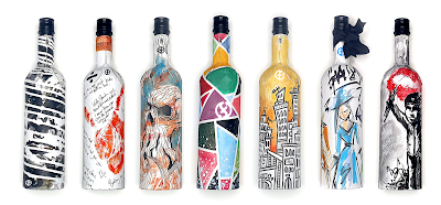
Today, the Frugal Bottle has been launched. Hailed as "the biggest innovation for wine and spirits since the launch of the glass bottle" the 75cl Frugal Bottle is made from 94% recycled paperboard with a food-grade liner to hold wine or spirits. It can be refrigerated and keep liquids cooler than glass.
With thanks to Frugalpac for images - www.frugalpac.com
The Frugal Bottle, which is comparable in cost to a labelled glass bottle, is the brainchild of British sustainable packaging firm Frugalpac. This UK company creates and supplies recycled paper-based products with the lowest carbon footprint that are easily recycled again so they don’t need to go to landfill. The Frugal Bottles are made at Frugalpac’s facility in Ipswich.
With thanks to Frugalpac for images - www.frugalpac.com
The first wine to go on sale in the Frugal Bottle is from the award-winning Italian vineyard Cantina Goccia. 3Q is an unwooded Sangiovese red with a hint of Merlot and Cabernet Sauvignon.

Concept designs for Frugal Bottles...
With thanks to Frugalpac for images - www.frugalpac.com
It's great to see such an environmental innovation, which can help reduce the carbon footprint of the drinks industry. You can read more about this innovative product here: https://www.frugalpac.com/frugal-bottle-the-recycled-paper-wine-bottle-that-thinks-outside-the-wine-box/

https://www.frugalpac.com/
https://www.cantinagoccia.com/
Posted by Justin Hobson 30.06.2020

Thursday, 25 June 2020

Stardream Print Processes book

Stardream is a market leading pearlescent and metallic paper range produced by the Cordenons paper mill in Italy. Many designers and printers have become fans of the light irridescent finishes and the dual sided deep metallic finishes which do truly shimmer. Stardream is used for a wide range of applications, including cover, presentation folders, invitations, greetings cards and luxury packaging.

This is the new "Print Processes book" which demonstrates the wide variety of print processes that you can achieve using this paper range.
The cover image is printed offset litho in CMYK on Stardream Copper 285gsm and the result is stunning - just look how good a CMYK image can look, even on a relatively deep shade such as the Copper. What many people forget is the litho inks are transparent, what this means is that if you print on a colour, the colour will come through and it also means that if you print on a pearlescent/metallic substrate, the printed result will be pearlescent/metallic and take on the shimmer of the surface printed on.
The size of the presenter is 230x220mm and the wiro-bound inserts are 210mm square. The first page is hot foil blocked using Foilco Ref 6815 copper foil on Stardream Anthracite 285gsm.
Click on images to enlarge
Page two is is printed using Thermographic printing (thermography) in red and black.
Thermo (as it is commonly called) is a great process and can produce a gloss or matt raised surface. In this instance, the result is a gloss finish, printed on Stardream Rose Quartz 120gsm
Stardream is also suitable for digital print processes and the below rainbow image is printed on Stradream Crystal Digital 240gsm on an HP Indigo Press
The next page is french folded and is lasercut...
Click on images to enlarge
The sample printed on the Stardream Silver (above & below) is just the most simple and yet effective sample. It is printed in just 1 colour offset litho as a halftone (or some people refer to it as a montone) and as mentioned before, because litho inks are transparent, the printed result is pearlescent/metallic and takes on the shimmer of the Stardream surface.
and the grand finale of the book, really is amazing at is is the simplest, yet crazily effective process. The below watchface is digitally printed in white using a dry toner press (this was a Ricoh)
...and here is a detail image
...and below shows the deep blue colour (Stardream Lapislazuli 285gsm) that it was printed on.
Digital white (toner) is an incredibly stunning effect and a very economical price, so it's definitely worth looking into.

My thanks to the paper mill, Gruppo Cordenons for supplying us with the tools to show the Stardream range in the very best light. If you would like one of these new books, please email me: justin@fennerpaper.co.uk

http://www.cordenons.co.uk/
http://www.gruppocordenons.com/en/
Posted by Justin Hobson 25.06.2020

Tuesday, 23 June 2020

Shakies go Green...

James Ellis are a greeting card publisher who have been publishing their own ranges of cards since 1997. Based in Bristol, they actually print and make all their cards in the UK (so no horrible carbon footprint to China!). You'll find their ranges of cards in Paperchase, Waitrose, Harrods and John Lewis and all good card shops! 

They’ve been manufacturing their 'shakies' cards since 2003 and they have undergone quite a few style changes, but items shaking around within the card idea has more or less remained the same.
In an effort to be as environmentally friendly as possible, the latest change has been to ditch the plastic panel on the front of the card which forms the pocket for the shakeable items to move in. By removing the plastic and replacing it with a translucent paper, which is itself printed, the appearance of the card has changed little but is now recyclable. The paper chosen for this job is our Spectral, Digital White 110gsm from the Reflex Paper Mill in Germany.

...and you can see the way the coloured paper discs move around.
The size of the card is 176x127mm and the board which form the cards and the window are from our Dali range. If you aren't familiar with the Dali range, it is a 'felt-marked' paper with a linear effect and a natural, tactile feel. If you click on the image below, you will be able to see the texture in the paper.
Click on images to enlarge
...and you can see (above) the printing on the translucent Spectral. The digital printing is by Pureprint on their HP Indigo presses and the result is superb.

To make the cards as green as possible, they have eradicated the use of glitter, the plastic and replaced the outer bag by applying a peelable pricing label.
James Ellis have also signed up for 1% for the Planet scheme where companies commit to giving 1% of their turnover to environmental non-profit organisations.

This card is designed by Katherine Hartley and my thanks to James for sharing these new samples with me.

https://www.jamesellis.com/ 
https://www.pureprint.com/
Posted by Justin Hobson 23.06.2020

Friday, 19 June 2020

Jerwood Photoworks Awards

The Jerwood/Photoworks Awards support photographers, or artists using photography, to make new work and significantly develop their practice. The Awards are a collaboration between Jerwood Arts and Photoworks, supported by Official Print Partner Spectrum Photographic. The Awards particularly seek to encourage artists and photographers exploring new approaches to photography, and/or whose practice is experimental. Photoworks is a registered charity and the only organisation with a national remit for photography in England. Their work is supported by public funding through Arts Council England’s National Portfolio under the directorship of Shoair Mavlian.
Presented every two years, the Awards are open to arts practitioners using photography who are within 10 years of establishing their practice. There is no age limitation and no requirement for formal education or qualifications. This publication marks the second awards with awards to Alejandra Carles-Tolra, Sam Laughlin, and Lua Ribeira.
The awards publication is A5 (210x148mm) portrait and is PUR bound with a 4pp cover and 48pp text.
The 4pp cover is on Omnia 320gsm and the 48pp text is on Omnia 150gsm.
Click on images to enlarge
The brochure is printed offset litho in four colour process throughout with a full out silver solid printed on the cover. As always (...this is the plug for the paper!) the images look superb on the Omnia; the fleshtones in particular look absolutely stunning (see below) and the reproduction of the dark shadowy areas (see above) look amazing - keeping all the detail in those heavy areas of CMYK together which would be completely lost on a traditional uncoated paper.
Fleshtone detail...
Click on images to enlarge
The black and white images of Sam Laughlin (below) look amazing...
The size and combination of weights is just right and the book flows superbly in the hand. The text is printed on Omnia 150gsm.
Returning to the cover and another very good reason that Omnia was chosen for this project. On most traditional uncoated papers, metallic inks can look flat and silver can end up just looking grey, but as I hope the below image demonstrates, the metallic silver really does look amazingly metallic on Omnia with the uncoated texture.
Below shows the very neat PUR binding.
The design of this amazing awards catalogue and also of the awards identity is by Dean Pavitt and it was kind of him to send me copies with a lovely note...
The excellent printing is by Ashley House Printing, based in Exeter, Devon.

https://photoworks.org.uk/project_category/jerwoodphotoworks-awards/
https://www.ashleyhouse.co.uk/
Posted by Justin Hobson 19.06.20