Monday, 13 December 2021

Fenner Paper 2022 Diary x4!

If you are a wonderful customer and therefore a deserving user of our papers! ... you will be receiving your new 2022 diary in the next week or so and here's a sneak preview...
Four diaries? Well, just one diary but there are four different covers! ...which one will you get? This year we have collaborated with both the St Bride Foundation and the International Society of Typographic Designers (ISTD).This year’s cover was designed by Andrew Long and printed by the St Bride Chapel, St Bride Library’s workshop team.
The diary itself has been designed by David Coates, independent designer and board director of ISTD. The internal pages are typset in Foundry Unie from The Foundry Types. As in previous years, the diary is 230x162mm, portrait and retains the popular 'month to view' format. The 40pp text is simply printed in one colour, offset litho, on our lovely Offenbach Bible 60gsm, which has a superb opacity and a good writing surface making this an ideal paper for a diary or notebook.
The cover is printed in three specialson our NEW PaperWise, made using 100% agricultural waste and completely unbleached. The above shows all four cover designs, front and back covers. The design was inspired by Chaostype, a process invented in the late nineteenth century by Cincinnati printer John Franklin Earhart that relied upon the unpredictable and random qualities of hot lead chaos. Below are some test sheets produced back in the Summer...
Andrew Long together with the four different covers in the St Bride Library workshop...
My thanks to all the collaborators and thanks also to Commercial Type for the use of their Commercial Classics catalogue for use on the cover design. They are recreations of historical typefaces inspired by the punches, matrices, specimens and smoke proofs held at St Bride Library. 

If you are one of our worthy clients (!), you should be receiving one of our diaries in the post but if you would rather have it sent to your home than the office or if you want to make sure you are in our address book, drop me an email: justin@fennerpaper.co.uk
 Posted by Justin Hobson 13.12.2021

Friday, 10 December 2021

Nat-ional-Re-con-struct-ion Book Launch

Nat-ional-Re-con-struct-ion is a self-promotional project by Studio Sutherl& exploring the visual and verbal language of flags and national identity.
"Flags are a potent symbol of national identity: an example of visual communication in its purest form. Their shapes represent the land, sea and sky. Suns, moons and stars. Solidarity, religion and freedom. Their colours represent physical and emotional attributes. At a time when the world is riven with nationalist tensions, global challenges and diseases, it’s a small flag raised for play and creativity."
On Wednesday evening, Jim Sutherland hosted a book launch at D&AD where he spoke about the project together with writer and poet Nick Asbury.
...and there was a whole table of flags to be cut up and reconstructed
Jim Sutherland gave a talk explaining how the project began and it's evolution through D&AD workshops to the eventual production of the book.
The Nat-ional-Re-con-struct-ion book is 115 x 200mm, Landscape and is digitally printed in a limited edition of just 200 copies with 50 different cover designs.
The text is digitally printed (HP Indigo) on our lovely Offenbach Bible 80gsm.
"Nat-ional-Re-con-struct-ion explores the visual and verbal language of flags and national identity. This book is an excercise in deconstruction and reconstruction. At a time when the world is riven with nationalist tensions, global challenges and diseases that respect no borders, it is a small flag raised for play and creativity."
The book is beautifully printed and bound by Boss Print.

It was a wonderful evening and so good to get out and meet people physically again. There are still copies available, so you can still buy a copy HERE.
Posted by Justin Hobson 10.12.2021

Wednesday, 8 December 2021

The Monocle Christmas Catalogue

Monocle is a premium media brand with print, audio and online elements, not to mention their ever expanding retail network and on-line business. The Monocle Shop is at street level in six cities - London, Zurich, Merano, Hong Kong, Tokyo and Toronto. The shop keeps everything from luggage and clothes to stationery and furniture and this is their Christmas catalogue from 2019...

The finished size is 216x102mm, portrait and is a 16pp folded format folding out to a flat size of 405x432mm.
The above folds out to reveal the first spread below...
Click on images to enlarge
...and then folding out again, left and right.
and then folding up to reveal the full spread below.
The below image shows both sides.
The whole publication is all printed offset litho on our Offenbach Bible 60gsm ...and it looks and feels absolutely gorgeous - it flops and folds in a delightful way when handling the publication as I hope these images demonstrate. The below image shows the way it folds.
Click on images to enlarge
Print quality is superb as I hope the image below demonstrates, fleshtone reproduction is excellent.
Design is by the team at Monocle. The publication is printed offset litho, CMYK throughout. The excellent print is by Park Communications, who are based in East London.

Posted by Justin Hobson 08.12.2021

Wednesday, 1 December 2021

Jobs from the past - Number 145

Regular followers of this blog will know that my first post of every month is a "job from the past" so that I can show some of the really good work from years gone by...

HRP Textile Conservation Studio 
Five Year Review 1991-1996

This is beautifully produced report produced by the Historic Royal Palaces in 1996. It has a fantastic, tactile quality and the design makes the most of the rich subject matter which the palaces have at their disposal. Based at Hampton Court Palace and originally managed by the William Morris Company, the studio now plays an integral part of the conservation efforts of the HRP.

Size of the brochure is 297x210mm portrait and is perfect bound with a 4mm spine. It has a 4pp cover with a mixture of text papers, combining an uncoated feltmark paper with a high gloss 'real art' paper. The cover features a 55mm square cut out which allows the detail from the 'Departure of Abraham' tapestry from 1540 to show through.
The paper used for the cover is Dali Neve 240gsm on the cover and a combination of Dali Neve 160gsm and Concorde Pure Brilliance 135gsm for the text.
One of the things that makes this a really special publication is the choice of materials used. From a range of different papers shown to the client, the feedback was that "Dali is the paper which most represents the tactility and weave of cloth". I recall that Dali was selected over other linen embossed papers, which were regarded as far too 'Faux'
You can see from these pictures showing the close up detail, how well the detail of the tapestry reproduces and how the subtle feltmark pattern is both tactile and visual conveying the image of woven cloth.
The image reproduction of the high gloss coated paper (Concorde Pure Brilliance 135gsm) is superb - remember, this was in the days when a transparency was scanned, colour separations made and film produced before plates were made - nothing digital going on here! ...and the result is superb. This piece of print looks so fresh and outshines many pieces of print that I pick up and handle today.
Design is by Big Active www.bigactive.com. The designer who worked on the project was Mark Watkins. In 2001 Mark left Big Active moving to Derbyshire, where he established his own studio called LUCK.
 
The job was printed by a company called Penshurst Press based in Tunbridge Wells. Sadly the company is no longer around, however Alan Flack and Martin Darby who worked at there (and produced this job) went on to form their own printing company called Principal Colour and their work still features on this blog from time to time.

Just one final thing I've noticed - due to the mixture of text pages it has been perfect bound rather than section sewn (and PUR was only for longer runs in those days) - well, it is holding together perfectly, with no sign of degradation - not bad for nearly 25 years old!

http://conservation100.hrp.org.uk/about/
www.bigactive.com
www.thisisluck.com
http://www.principalcolour.co.uk/
Posted by Justin Hobson 01.12.2021

Thursday, 25 November 2021

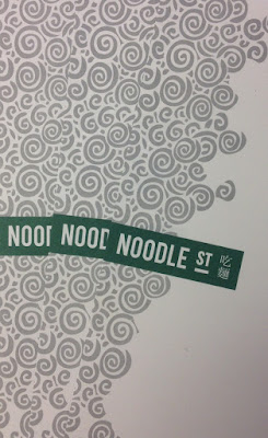
Noodle St

Noodle Street is a traditional Chinese restaurant based in London's busy Canary Wharf. Established in 2010, Noodle Street prides itself of using the freshest ingredients and new dishes from the many and varied regions around China
The new identity has been applied to some swanky new A4 letterheads, printed on Shiro Echo, Bright White 120gsm.
Click on images to enlarge
The stationery is printed in two colours, offset litho. Shiro Echo is 100% Recycled (and FSC accredited) and part of the criteria for this project was that the paper should be recycled.
Detail of noodles!
Print is by Aldgate Press based in London.
Branding and design is by Reason. Design Director is Catherine Hampshire. Thanks to Catherine for sending me file copies and the nice words!
http://noodlestreet.co.uk/
http://www.reasondesign.co.uk/
http://www.aldgatepress.co.uk/
Posted by Justin Hobson 25.11.2021

Monday, 22 November 2021

Packaging Innovations 2021

The capital’s most innovative packaging event is in just over a week. The packaging community will be together at London Olympia for the 11th edition of Packaging Innovations & Luxury Packaging which is unquestionably the leading event for inspirational and bespoke packaging!
Fenner Paper will be there...
We will be showing our packaging ranges alongside the new PaperWise range, together with the team from PaperWise in Holland.
We are on stand C82, so please do come and see us.

You can register for the show here:
Posted by Justin Hobson 22.11.2021
Thursday, 18 November 2021

The Kensington

The Doyle Collection is a carefully curated collection of eight Irish family-owned luxury and urban hotels. Each hotel has a strong identity that is closely connected to its location. Set in the heart of one of London’s most desirable neighbourhoods, The Kensington’s grand stucco façade is characteristic of this affluent 19th Century district. With 126 guest rooms and 24 suites, this is a wonderfully luxurious hotel.
Branding agency, Brave New World  undertook an extensive re-branding exercise of the parent brand and of each individual hotel. The work included everything from strategy to interior design, website, high-profile advertising campaigns and the literature for each hotel.

The size of the brochure is 260x185mm, portrait and is saddle stitched. The cover is printed on an uncoated 300gsm board.  
Click on images to enlarge
The text material chosen was our Omnia, which would beautifully reproduce the photography with the rich interiors and exteriors superbly  ...and it looks wonderful! The 20pp text is on Omnia White 150gsm, printed offset litho in CMYK throughout.
The brochure is saddle stitched using three stitches:
Image reproduction is paramount but it was also important that the publication also projected the tactility of the interiors and in the image below the detail of the upholstery and the extraordinary reproduction of the mirrored surfaces. An ordinary feeling silk or gloss coated paper wasn't an option, so Omnia fitted the bill perfectly.
Click on images to enlarge
Omnia is a very bulky paper but with a 20pp text and the saddle stitching, it lays nice and flat allowing each spread to be enjoyed without 'fighting' against the binding.
Branding and creative direction is by Brave New World. The designer on this project is Caroline King. Print by 21 Colour, based in Glasgow.

https://www.doylecollection.com/hotels/the-kensington-hotel
http://bravenewworld.co/
http://www.21colour.co.uk/
http://www.carolinelking.com/
Posted by Justin Hobson 18.11.2021