Thursday 17 February 2011

Macallan Invitation

This is a really beautifully designed and well executed invitation. It's been a difficult one to photograph, so you'll have to go with my description!
This invitation, from Scotch whisky manufacturer Macallan is to a VIP viewing of a exhibition titled "Masters of Photography: A Journey". Albert Watson (awarded the prestigious Royal Photographic Society’s 2010 Centenary Medal) was invited by The Macallan to weave a visual narrative of the long and romantic journey beginning in the bewitching forests of Spain (where the oak for sherry barrels is grown) and ending at The Macallan’s spiritual home in Scotland.

Sitting by the envelope in the picture above, it might look like a fairly standard invitation but it is anything but ordinary.

The finished size of the invitation (as you see it below) is 140x175mm. The printed card is 128x163mm but as you can see from the picture below, it is held in place with two angled die cuts...
...and as you can see below, the card is held into a large format print, folding out to 420x525mm.
The photographic print is printed on our lovely Offenbach Bible 60gsm with the 'mono' image being reproduced in CMYK. The card insert is on Matrisse 250gsm, simply printed in black only and hot foil blocked in silver.

Design is by BOB Design and the designer on the project is Tom Green.

Print, foiling and hand finishing was done by Robert Young at R.Young & Son ...and we (at Fenner Paper) made the bespoke black envelopes (160x195mm) out of Notturno 140gsm.

Thirty-six individually customised bottles of The Macallan dating from 1946, were produced for the project. Each bottle is paired with a signed, one-off, specially commissioned Watson platinum print and will be sold at a reserve price of £10,000! At the private view were David Bailey, Bianca Jagger and Mary McCartney but sadly Justin Hobson was unable to make the event. The exhibition is now touring around the world.

http://www.themacallan.com/
http://www.bobdesign.co.uk/
http://www.ryoungprint.com/
Posted by Justin Hobson 17.02.2011

Tuesday 15 February 2011

Eye 78 - Seven colour marathon!

There's a post which Simon Esterson has recently put on the Eye Blog which is well worth reading. Written by Eye editor John L. Walters, it is one of those rare pieces of writing which actually describes the production of a piece of print in a very real and understandable way. It mainly focuses on the lengths that were taken at Pureprint to reproduce the cover for Eye 78, which is a detail of a Joost Grootens map, using the same colours as on the original book  Atlas Of The New Dutch Water Line.  

...also about the section on our Colorset Solar 120gsm which printed in colour in this issue (that's colour onto coloured paper if you get what I mean!)

Anyway, I'm not going to say anymore about it except that it is well worth a read... 

Posted by Justin Hobson 15.02.2011

Friday 11 February 2011

See Opposite

This is the latest example of Pentagram's superb holiday mailings from the festive season of 2010. These pieces are never really “cards”! Pentagram mailings typically involve puzzles or another kind of visual diversion and this is no exception.


This year’s booklet features a series of antigrams illustrated with shadowy silhouettes. An antigram is a rare type of anagram. The object of the exercise is to discover a word or words that are the opposite of those printed using the same letters. The antigrams can be worked out with the help of a clue and the illustrations. The above and below pics show the illustration with the clue, Stargazers. The Antigram is No More Stars. The answer is Astronomers. Frustratingly clever!

 ...and this is the page with the answers:
The books are A6 landscape 148x105mm with an 8pp cover and a 28pp text. The paper chosen is Modigliani which is a feltmarked paper with a texture reminiscent of a watercolour paper. The cover was produced using Modigliani Nero 200gsm and the text on Modigliani Neve 145gsm. It has been beautifully printed in two colours (pantone specials) by Gavin Martin. Cover is hot foil blocked with a matt white foil. Another lovely feature is the "plate sinking" which is where a panel in the printed areas on the right hand pages have been de-bossed and not forgetting the singer sewing in black thread through the spine.
All in all, a beatifully produced job. Creative director on the project is Angus Hyland and the designer is Fabian Herrmann. Print production was handled by Gary Bird at Gavin Martin.

http://www.pentagram.com/
http://www.gavinmartin.co.uk/
Posted by Justin Hobson 11.02.2011

Wednesday 9 February 2011

Zoe Williams Stationery

This is a lovely suite of stationery designed for writer and journalist Zoe Williams. The 'Z W' logo, is cleverly constructed from punctuation marks.
The stationery is hot foil blocked in gloss black foil only and has been beautifully done by IST Printing Services - based in Ayrshire - they do some lovely stuff - well worth having a look at their site: http://www.istprintingservices.co.uk/
Due to the colour pallette chosen, this stationery incorporates our lovely Colorset (100% Recycled) and a different (and much more expensive!) coloured paper stock from another paper merchant based in Hull (...guess who, guess what?) but they compliment themselves perfectly!

The clever and thoughtful design is by Maddison Graphic based in Ely.

http://www.maddisongraphic.com/
http://www.istprintingservices.co.uk/
Posted by Justin Hobson 09.02.2011

Monday 7 February 2011

Big Questions...

At the end of last year, King’s College London launched a worldwide development campaign with a sub-brand developed by Johnson Banks called "World questions King's answers".

Rather than the traditional donations campaign, this project poses a series of questions that the world faces, such as How do we cope with an ever-ageing population? What will it take to eradicate poverty? Why can’t we find better treatments for cancer?

The campaign aims to raise funds for new posts and programmes, build new facilities and create new student opportunities across the campuses. Johnson Banks developed a multi-channel campaign, including a booklet, leaflets and gift forms (and they also did a very nice badge!) 
The main booklet is A6 portrait (105x148mm) with a 4pp cover and 16pp text, saddle stitched. Because of the vibrant colours chosen, the material chosen for the job is Omnia (280gsm and 120gsm) which meant that a vibrant punchy result was achieved...
The printed literature demonstrates a well executed project, excellent print and reproduction and finishing on what on the face of it looks to be quite a simple job. But what you might not have spotted is that those white borders around the edge of the solids is only 5mm - you only have to be 1mm out on the finishing on this A6 size piece, for this job to look poor and the copies sent to me are all spot on. Print is by Cantate in Battersea and thanks to Jason Maclaren at Cantate for sending me file copies.

http://www.kcl.ac.uk/
http://www.johnsonbanks.co.uk/
http://www.cantate.biz/
Posted by Justin Hobson 07.02.2011

Friday 4 February 2011

Alex Parrott's 2009

This month The Design Conspiracy in London has been celebrating it's tenth birthday.

To celebrate, they asked 10 people they have collaborated with over the years; clients, artists, illustrators and photographers to interpret a given year in whatever way they wished. The only constraints were the size, must be 10" x 10" and must feature the year numerically or typographically, the rest was up to them! The pieces are now displayed in their gallery space at Stukeley Street.

Independent and freelance designer, Alex Parrott (who's appeared on this blog before) was one of the 10 collaborators asked to produce a piece of work for the year 2009.

Alex's piece is called:  2009 / Redaction

"The exposure of MP's expenses dominated headlines throughout 2009 and the redacted expense forms which fascinated me from both a political and visual perspective, inspired this extravagant metallic foil blocked artwork"

Below is the piece that Alex produced which is hot foiled blocked in a red solid over a black 2009.
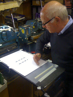
Alex had this individual piece produced by foiling company Paw Print on our Avebury Recycled Wove 170gsm. The material (which also has a cotton content) was chosen because of it's neutral white shade and good compressibility (which means the foil sits nicely into the paper).

Alex kindly sent some pictures showing the foiler, Tony Hooper, actually foiling the paper and I thought it would be worth posting these as many people reading this won't actually have an idea what someone working at a hand operated foiling machine looks like:
The exhibition runs from 3rd February - 28th February, Monday - Friday – 10am - 6.30pm at 12 Stukeley Street, London WC2.

http://www.thedesignconspiracy.com/
pawprint@btconnect.com
http://www.alexparrott.co.uk/
Posted by Justin Hobson 04.02.2011

Thursday 3 February 2011

KPMG Survey - Good news for print!

Print has a place in the world of new media, as most people still prefer to read offline, according to a survey by KPMG.
According to the latest survey, which spoke to 2,241 people, 86% of consumers prefer to consume media offline, with the most popular reason a preference for reading physical copies.

The survey also showed that the web still has a way to go to achieve print's respectability, and more importantly its ability to make money from a cover price. Only 24% of respondents that had read magazine said they hadn't paid for it and while 26% of newspaper readers did not pay. In comparison, 80% of online magazine readers and 92% of online newspaper readers did not pay.

David Elms, head of media at KPMG, said: "Despite the increase in the use of digital media, certain activities such as outdoor events, watching television and reading books and magazines remain hugely popular. This highlights that old and new media will co-exist and evolve together over time."

However, the continuing move into the digital world was more than apparent as compared to the previous six month survey, there had been a small increase in the proportion reading digital books. The survey backed up claims that printers need to learn to work alongside new media, as 60% claimed that they consumed more media than before.

So maybe print won't be KING but at least it has a place!
You can read the full survey here:
http://rd.kpmg.co.uk/docs/Anytime_Anywhere_-__The_Rising_Demand_of_Media_on_the_Move.pdf

Posted by Justin Hobson 03.02.2011