Friday 14 February 2014

What is ...Thermography?

What is ...Number 2
Regular followers of this blog will know that in the middle of the month, I publish a "What is ....? post. The article covers various aspects of paper, printing and finishing in greater depth. However, many of these subjects are complex, so these posts are only intended to be a brief introduction to the topic.

What is ...Thermography?
Thermography is a print process, also known as thermographic printing. The finished result being a raised image or type produced by the use of heat with a slight 'orange peel' effect.

These days, thermography is based on an offset litho printing process. The image/type area is printed offset litho with a special slow-drying litho ink (it doesn't contain dryers or hardeners so that it remains wet). The sheets are then loaded onto the thermography machines which are usually constructed with three sections connected by a conveyor belt - worth pointing out that it's a continuous process.

The sheet is dusted (while wet) with a fine powdered thermo-polymer followed by a gentle vacuuming to remove the excess powder from the non-imaged and dry ink areas.

The printed and dusted sheet is then carried via a conveyor through a radiant oven system and exposed to temperatures up to 700 degrees Celsius! The conveyor goes through the oven in 2 to 3 seconds during which the powder starts filming at the edges, (in effect bubbling and raising up the powdered areas). It is then fed into a convection cooling section where the polymer becomes 'fixed' (solid/hard)

This process has traditionally been used for letterheads and stationery. Researching this article, I even found out that the menus (1st class) on the Titanic had been thermographed! In those days the ink was applied by letterpress and the powder applied by hand before being placed through the heat tunnel. As I understand it "craft" Letterpress printers still produce thermography manually.
There are different grades (particle sizes) of powder which are suitable for different applications - solid areas to fine type. There are a range of colours and now, also a range of metallic and transparent thermo powders - you can even encapsulate glitter in the transparent ink, so the process is incredibly versatile.
Thermography became popular in the "glossy" 1970's although it was often regarded as just being a cheaper alternative to "engraving/die-stamping". In the 1980's with the advent of laser printers, thermo letterheads became problematical because the inks caused a problem with being re-heated. Since then, the powder manufacturers, Caslon, have developed a laser printer, resistant powder.  
 
Thermography is not a particularly widely used process in commercial printing, although it is a very popular effect used for greeting cards and in some social stationery.
 
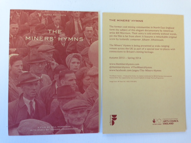
Back in the early 1990's (early in my career in paper!) I used to deal with an US paper mill called French Paper based in Niles, Michigan. Back in those far off days, they employed a design agency called Duffy based in Minneapolis, to create their promotional swatches and the designer was Charles S. Anderson. The imaginative and creative use of thermography on the literature is one thing that particularly impressed me. Unlike when I had seen thermo used in the UK, this was used in a much more random way, complimenting the litho printing. Hopefully these pictures will give you an idea of what I mean.  

 
I hope this has explained enough about the process. There are a few specialist thermo printers in the UK and a few general printers with thermo equipment. I am particularly grateful to Brian Frost and Darren Crowe at Abbot Print in Sussex for their guidance and help for this article.
 
Posted by Justin Hobson 14.02.2014


Wednesday 12 February 2014

This week is Green Week...at the LCC

Green Week is an event hosted at the London College of Communication (LCC) where staff and students are encouraged to take part in workshops, talks, installations and exhibitions. This year the subject of Green Week is SURVIVAL and during the week, the events will seek to investigate how designers, filmmakers, journalists, photographers and communicators are responding to the issues of our time.

The programme for the week has been printed at the LCC on their own Heidelberg B2 press by the resident technicians Tony Yard and Scott House. 
The booklet is 148x105mm (A6) portrait and is a 16pp self cover - which is a very "green" format - that is to say it is made up out of one SRA3 sheet which maximises both the press format and the paper. The book shows the timetable of events happening throughout the five days (10-14th February 2014)
The edge of each of the pages is coloured, which relates to the timetable in the front. A nice touch although this makes it more challenging from a print finishing point of view, but as you can see from the picture below, it's been very successfully achieved.
 
The programme is printed on our Shiro Echo, White 80gsm (100% recycled) from Favini in Italy - just perfect for Green Week. Printed CMYK offset litho throughout.
 
Publication design is by Tom Box. Cover illustration is by Josie Molloy.
 
There are many events which are free to go to, so have a look at the links below and see if one takes your fancy.
 
Conscientious Communicators was formed in 2011 at London College of Communication to develop and consolidate a community of practice around environmental and social creativity. Thanks to Course Director, Sarah Temple for getting me involved.
  
Posted by Justin Hobson 12.04.2014

Tuesday 11 February 2014

Colorset 350gsm

Many of you will know that last year we started to bring in our Colorset range in 350gsm. The range is now complete, so we have ALL colours in 120gsm, 270gsm and 350gsm - all in B1 size (700x1000mm) ...and with SRA2 in 350gsm as well!

For those of you not familiar with Colorset, it is our range of coloured text and cover papers which is also 100% recycled and more competitively priced than some other well known brands of coloured paper! There are 26 colours including black and white and here is the updated swatch:
It's also worth pointing out that the black shade - Colorset Nero, is available in 120, 170, 270 and 350gsm.
If you would like the updated swatch, please drop me an email and I'll pop one in the post
justin@fennerpaper.co.uk
Posted by Justin Hobson 11.02.2014

Thursday 6 February 2014

Breaking Down Barriers

Thames Reach is a London based charity which helps homeless and vulnerable people to live in decent homes and offers support to build supportive relationships. The ultimate goal is to end street homelessness.

Thames Reach’s work has been brought to life in this new report which looks at how the organisation is equipping people to find their own solutions to overcome homelessness and social exclusion. Entitled ‘Breaking Down Barriers’, the report features case studies of Thames Reach staff and the people who use its services, and identifies the key themes for the next three years which form the basis for the 2013-2016 Thames Reach business plan.
The size of the report is 235x165mm, portrait, saddle stitched. The format is 32pp self cover - which at this size means that the whole report is printed on one sheet of B1 paper - this was part of the brief to be a cost effectively produced piece of literature.
The report is printed on our Shiro Echo, Bright White 120gsm (100% recycled) Printed CMYK offset litho throughout.
The black saddle stitches are offset from their normal position and aligns with the grid on which the text is designed.
A clear, concise and cost effective communications tool, the review is essential for raising awareness and pitching increased funding from both the public and local authorities.
 
Design is by Imagination. Creative direction and design is by Gareth Nicholls.
 
The publication is printed offset litho in four colour process (CMYK) by Pureprint. Stuart Tanner at Pureprint managed the print production and my thanks to Stuart for supplying me with some file copies.

www.thamesreach.org.uk
Posted by Justin Hobson 06.02.2014

Tuesday 4 February 2014

Jobs from the past - Number 52


Regular followers of this blog will know that my first post of every month is a "job from the past" so that I can show some of the really good work from years gone by...

Association Gallery Leaflets 1997-2000
The Association of Fashion & Advertising Photographers (AFAP, although it later became AFAEP when editorial photographers were embraced) was originally founded in 1968, changing its name to The Association of Photographers in 1993.
 
During the late 1990's the AOP had their gallery and exhibition space at 81 Leonard Street, EC2 and the gallery manager was Alex Steele-Mortimer. Being a self funded 'trade body', resources were extremely limited, although the subject, brief and raw material was fantastically creative.  Alex commissioned Frost Design for the promotional leaflets for quite a long period. They stick in my mind as being incredibly simple, yet because of their powerful use of cropped, interesting images, single colour print and quality paper they had a consistency and quality that stands high today.

The finished size is 210x95mm (roughly a DL format) and is 12pp, folding out to a flat size of 210x570mm.
The format of this leaflet works particularly well as the text concertinas into the folded spine. This works particularly well for this type of leaflet as because it effectively creates a spine and the foredge of text - some leaflets fall open in all directions! This is neat and tight and as a result feels less like a leaflet and more like a piece of less throwaway literature.  
Text on the inside reads at 90degrees to the outer. Some people may disagree but I find this a very easy to read and inviting publication.
 Picture below shows the way the text folds into the spine
The papers used were a variety of the period, and depended on the use of the one colour that they were being printed (don't forget this was a time when one colour litho printing was substantially cheaper than CMYK!). Materials used were Matrisse 140gsm, Modigliani Neve 145gsm, Redeem 100% Recycled 130gsm etc....
The crops of the fantastic images were always good. Below is the cover of June/Sept 97 edition with photograph by Spencer Rowell:
Below is a selection of covers from my collection.
Click on image to enlarge
Creative director was Vince Frost who now runs Frost in Australia. Various designers worked on these jobs in that period but I know for certain that Andrew Collier, Melanie Mues and Sonya Dyakova were responsible for the majority. They are all now independent designers working in London.

Print was offset litho by The House Of Naylor, one of the last printers based in Clerkenwell, they are no longer in existence.

http://www.the-aop.org/
www.muesdesign.com
www.atelierdyakova.com
http://www.frostdesign.com.au/
Posted by Justin Hobson 04.02.2014

Friday 31 January 2014

The Miners' Hymns

The Miners' Hymns is a film by American artist Bill Morrison, set in the former coal mining communities in North East England. The film is entirely without words, the soundtrack featuring an original score by Icelandic composer Jóhann Jóhannsson. The film depicts the hardship of pit work, increasing mechanisation, the role of trade unions in organising and fighting for workers’ rights. The film uses archive footage from different eras spanning 100 years – from early footage of primitive conditions, through large scale mechanisation up to the miner's strike of 1984-5.

The promotional literature consisting of flyers and cards. They are reminiscent in their look and feel of leaflets that were used when printing a leaflet to be handed out during large meetings and rallies was the only effective way to disseminate information to a large audience, rather than the social media of today.
Printed in just one colour, offset litho, they are printed on our Colorset (100% recycled) coloured range. The A5 flyers are printed on our Colorset Lemon 120gsm.
The A6 postcards are printed on Colorset, Sandstone 350gsm (also printed in one colour)
Design is by London design agency ARPA (A Research Projects Agency). The studio is run by creative partners Jasmine Raznahan and Ted Lovett.
The film is currently on a tour around the North east of England until the end of February and is supported by the Arts Council. Print is by Principal Colour.

http://theminershymns.com/
http://www.a-r-p-a.com/
www.principalcolour.co.uk
Posted by Justin Hobson 31.01.2014

Wednesday 29 January 2014

The Wimpole Building

This is simply one of those really amazing projects which has lots of different features. It's a property brochure for an amazingly high specification building. The Wimpole Building was formerly the Western District Postal Office built in 1909. The redevelopment of the offices in the building retains the original Portland Stone façade which is an impressive frontage on Wimpole Street.
 
The book is an impressive 330x250mm and has a hard "case-bound" cover. On the front cover there is a high gloss white panel with a hot foil and emboss which is platesunk. Very beautiful. The cover is printed on a linear embossed covering paper.
The overall thickness of the book is 12mm thick
The material chosen for the text pages is our Omnia 150gsm. This material has a high bulk, required as effectively this is only a 28pp text. The photography has reproduced brilliantly on the Omnia, as has the beautiful flat pale mint, solids...
Above is the opening spread, showing the impressive façade. The picture below shows the spread which is one of the lovely features of this project. The pages are double thickness (folded back on themselves and glued) and in the die cut corner slots are individually inserted photographic prints, as in a traditional photograph album.
Close up to show inserted photographs:
There are two spreads with the inserted photographs.
The remaining pages show the interior and exterior of the building from a variety of different angles.
Lovely grey flat solids for the floorplans, which also have two throw-outs.
Design is by Egelnick and Webb. Creative Directors are Toby Egelnick and Malcolm Webb.  There are some beautiful touches, really high production values which make this a truly exquisite piece of literature. Royal London Asset Management, CBRE and  Strutt & Parker commissioned Egelnick and Webb for the whole branding exercise, including the website and hoardings:
http://www.egelnickandwebb.com/case-study/cbre/the-wimpole-building-website

Printing of the sales brochure is by Identity, based in Paddock Wood, Kent and they have made a superb job of it - colour reproduction is fantastic - the solids look amazing as do the colour images. The finishing with the inserted pictures and throw-outs is stunning.
 
Posted by Justin Hobson 29.01.2014