Friday 21 September 2018

L'Amateur de Thés

L'Amateur de Thés is a Japanese restaurant and Tea specialists based in Pau, Southern France. The menus and stationery paper is produced on our Offenbach Bible 60gsm.

Here is the description about the project by the design studio Work in Process....

The Visual identity created for the gastronomic restaurant l'Amateur de Thés in Pau, on the occasion of its move to the Halles district. Rectilinear graphics and typography, sequence and rhythm, to represent the chef Yuri Nagaya’s rigour and precision. Simplicity, to reflect her humility and calm. A poetic and modern tone of voice to translate her experimental cuisine between Japanese technique and products from the southwest of France. Our intervention focused on the logo design, a deconstruction of the letter ‘a’ to gradually result in a symbol imitating a Japanese object or architectural element. From there we have worked on a series of symbols, typographic arrangements (using Px Grotesk by Nicolas Eigenheer), menus, communication documents, packaging, website lamateurdethes.fr, signage and pictograms, as well as some interior details.
Click on images to enlarge
The literature is blind embossed whilst the logo and the little details are all foiled in black on Offenbach Bible 60gsm.
click on images to enlarge
Work in Process is the studio of Claire Colnot and Amish Shah, who work in between France and London.

The superb foiling and embossing has been produced by Pyrénées Dorure Découpe who are based in Morlaas in France.

https://lamateurdethes.jimdo.com/
http://pyrenees-dorure.com/
http://www.work-in-process.eu/
Posted by Justin Hobson 21.09.2018

Monday 17 September 2018

London Centre for Book Arts is Five!

This week I received a lovely invitation to an Open Studio event celebrating 5 years of the LCBA which takes place this coming weekend on Sunday 23 September...
The London Centre for Book Arts (LCBA) is an artist-run, open-access studio based in East London. The studio provides education programmes for the community and access to resources for artists, designers and makers. I visited and wrote about LCBA in 2013 here.
 
The LCBA mission is to foster and promote book arts and artist-led publishing in the UK through collaboration, education, and by providing open-access to printing and binding facilities; a space for hands-on experience, knowledge sharing and skills exchange.  
It was lovely to receive a personal note, and it was great when I realised that the card was printed letterpress on our very own Colorset (100% Recycled) Lemon 270gsm.

It is free to attend but it is recommended that you register HERE.

With thanks to Simon Goode and Ira Yonemura.
www.londonbookarts.org
Posted by Justin Hobson 17.09.2018

Thursday 13 September 2018

Chromolux celebrates 60 years!

There are many paper companies which can claim to have been around for hundreds of years, but there are very few brands which have been in existence for sixty years.

First produced and sold in 1958, Chromolux is sixty years old this year.

Here I am with Karsen Kahmann, sales manager for Zanders on their stand at the Packaging Innovations exhibition at Olympia yesterday for an impromptu Chromolux 60th Birthday party!
Chromolux is a 'cast coated' paper which has a very high gloss and lustre and has an international reputation for quality and we are pleased to be their UK stockist.
https://zanders.de/en/home.php
Posted by Justin Hobson 13.09.2018

Monday 10 September 2018

Cath Kidston - 25 years

This year Cath Kidston celebrates their 25th anniversary. The brand was established in London’s Holland Park, with Cath selling car boot finds and vintage fabric. When the business became more established, she began to create her own Modern Vintage designs, her first being floral ironing boards and statement wallpaper.

Almost 25 years later, the brand now has over 200 stores worldwide and has become synonymous with classic British design, internationally famous for unique floral prints and bright, playful patterns.

Cath Kidston have produced this lovely little pocketbook sized booklet to celebrate in 25 chapters. The size is A6 (148x105mm) portrait and is saddle stitched. The 4pp cover is on our Omnia 150gsm and 52pp text is on Marazion Ultra 90gsm, which means that it sits nice and flat.
The job is printed offset litho throughout and the cover is printed CMYK plus a silver. On most traditional uncoated papers, metallic inks can look flat and silver can just look a bit grey, but as I hope the above image demonstrates, the metallic silver really does look metallic on Omnia.
Click on images to enlarge
The text is printed in colour, also digitally printed on our Marazion Ultra 90gsm. This is a lightweight paper with a matt coating but which has an amazing bulk, tactile feel and excellent opacity for 90gsm. It feels just right for this project, because it just flops over wonderfully and sits nice and flat.
Click on images to enlarge
The reproduction on the Marazion Ultra is exceptionally good, remembering this is a 90gsm paper, as you can see from the detail image below...
The 52pp sits nice and flat:
The saddle stitches are perfectly executed - spine in beautifully creased, no cracking.
Design is by Sarah Mulligan. The job was produced by the Inspired Thinking Group (ITG). Printing is by Pureprint.

https://www.cathkidston.com/
http://www.itg.co.uk/
https://www.pureprint.com/
Posted by Justin Hobson 10.09.2018

Thursday 6 September 2018

Colorset - 8 new colours

For those of you not familiar with Colorset, it is our range of coloured text and cover papers which is 100% recycled and more competitively priced than some other well known brands of coloured paper! A few years ago we started to bring in our Colorset range in 350gsm, so we now have ALL colours in 120gsm, 270gsm and 350gsm - all in B1 size (700x1000mm).
We have now further developed the range with 8 new colours, making this a collection of 36 shades.
The new shades include five light shades and three deep shades. The new shades are Blush, Warm White*, Glacier, Storm, Hopsack*, Charcoal*, Spearmint* and Deep Blue (Note: four of the new shades with an asterisk* are virgin fibre)
The Colorset brand identity and swatch design was created by The Chase, some years ago but it's still going strong! Creative director on the project was Harriet Devoy and the designer was Monica Pirovano.

If you would like the updated swatch, please drop me an email and I'll pop one in the post
justin@fennerpaper.co.uk
Posted by Justin Hobson 06.09.2018

Monday 3 September 2018

Jobs from the past - Number 107

Regular followers of this blog will know that my first post of every month is a "job from the past" so that I can show some of the really good work from years gone by and here's one from 2009...

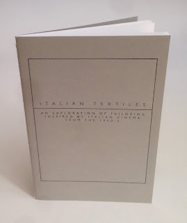
Italian Textiles
This project is a collaboration between the Italian Trade Commission and Central St Martins with the aim of promoting the use of Italian fabrics by fashion students. The students were invited to inspiration from a specific period in British fashion history - the 1960's - when the majority of men, irrespective of their social position, wore a tailored suit as normal day wear.

Size of the brochure is 210x148mm (A5) portrait and is singer sewn. The cover is printed on a 350gsm cover material from that other "Hull based" paper merchant! The 28pp text is printed on our Colorset White (100% Recycled) 120gsm 
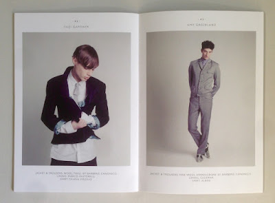
Colorset has a rough, tactile "toothy" surface but it still prints extremely well, as you can see from the images with fabrics and fleshtones below...

Click on images to enlarge
The excellent printing is by London based printer, Push, who are based in Bermondsey. The singer sewn binding is superbly executed....
Creative direction is by Rob Meyers at RBPM Studio. Photography is by Pelle Crepin.

Posted by Justin Hobson 03.09.2018

Thursday 30 August 2018

Long & Waterson

 ...just the cover makes the difference!

Here's an interesting project which is well worth a look, because of the high quality finishing processes and the way the cover is used to add to the quality and feel of the whole project.
This 48pp brochure is for a new residential development but the content is much more that of a magazine with eight writers and articles about the area, the architecture and the geography. The finished size is 380x285mm, portrait and is singer sewn. The 48pp text is printed on an uncoated paper.
The cover is printed on our Crush, Corn 250gsm and in fact it isn't printed using ink, it is simply hot foil blocked in a black gloss foil on both the front and back cover.
As you can see from the image below, the foiling looks amazing and you can see the subtle specks in the paper.
Quality of the singer sewing is superb
Design is by Ignite, who are based in Hoxton Square in London. You can read more about the project here.

Print is by Gavin Martin Colournet.

https://longandwaterson.com/
http://ignitetv.com/
https://www.gavinmartincolournet.co.uk/
Posted by Justin Hobson 30.08.2018