Friday 20 November 2020

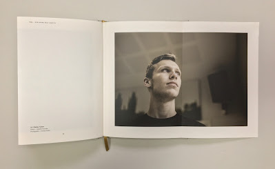
PEEL Limited Edition Book

‘PEEL’ is an exploration of self-identity. As a reaction to the scrutiny young people undergo through social media, Marksteen Adamson created the PEEL programme which works with groups of young people and uses photography and poetry to help them explore their identity and who they are rather than just focussing on what they look like. Social media, self-expression and self-identity present growing problems for young people, and there is growing evidence that this pressure is contributing more and more to mental health issues.
Launched in 2017, the project is the culmination of a three-year study, that has acted as the foundation and prototype for the training programme. The PEEL project has been developed into curriculum based resources to enable educators and service providers to run the programme.
This limited edition book comprises 30 studies, each with their own unique poem and photographic portrait and containing the latest statistics. Size is A5 (210x148mm) portrait has 114pp of text (plus the throw outs) in a 'casebound' cover and section sewn binding.
Click on images to enlarge
The amazing thing about this book is that each of the 30 case studies is printed across a right handed 'throw out' in the book.
The book is printed Offset Litho on GardaPat 13, Klassica 115gsm. For readers not familiar with GardaPat 13, it's a fully coated paper but it really does have a dead flat MATT surface. There are many papers on the market which profess to be matt - some which incorporate the word matt in the name, but aren't! Apart from the high quality matt surface, this paper has an extraordinarily high bulk (thickness).
It is hard to describe the 'dead flat' mattness that is a characteristic of this coated paper but the print result is totally flat as you might see in the below images...
Click on images to enlarge
Gardapat Klassica is a pale ivory shade and is perfect for colour reproduction as well as the solid colour and metallic gold used for the statistic section...
The reproduction and printing is excellent and does the superb photography justice, however the feature that is most amazing about this book is the attention to detail in the binding - it is simply incredible.
If you look at the above image showing the foredge of the book, it looks perfectly even, in fact it's flawless - but then consider that 30pages of this book are throwouts! It is points of a millimetre perfect!

The inside sewing is perfect as you can see in the image below...
...and the spine is equally as perfect.
Marksteen Adamson is co-founder of Cheltenham marketing and brand agency ASHA. Design of the book is by the team at ASHA with designers Scott McGuffie, Simon Dryland, Emily Kane and Hannah Mapleston.

The superb print and even more exceptional binding is by Boss Print, who are based in West London. A truly amazing piece of print and binding.

Posted by Justin Hobson 20.11.2020

Tuesday 17 November 2020

Christmas comes early...

Well, that's not quite true as these lovely cards are actually from last year, but I didn't receive copies until later, so it never seemed the right time to write about Christmas!

These gatefold cards are A5 (210x148mm) and are printed offset litho in CMYK plus a metallic gold special on our Omnia 320gsm. Below is a birdseye view...
The below image is the inside of the card, laid out flat... 
Click on images to enlarge
The above picture shows the outside, laid out flat, showing the die cut which represents the "doors" to the Gin Shop. The card is embossed and printed with a tinted gloss UV varnish. Unlike most uncoated products, you can successfully gloss UV varnish on Omnia (with a single hit) and it works really well - as you can see in the below pic...
Click on images to enlarge
In the same way, Omnia also really works with metallic inks, this really does look gold  and not a dirty brown (which can happen on other uncoated papers!) as you can see below...
Omnia is a really bulky board and this has been beautifully creased.
Design is by Studio Minerva and production management is by Andrew Smith at AAA&P Consulting. Printing is by Banbury Litho

Friday 13 November 2020

2021 Koehler Calendar

I have just received some copies of the Koehler Paper Group's 2021 calendar. Koehler make a wide variety of papers and supply us with Creative Print amongst others. Koehler pride themselves on producing an individual calendar every year, which is always produced locally and this 2021 calendar is no exception.

The calendar is produced by Selina Haas Design. Whilst a student in 2014, Selina produced a successful advertising campaign promoting the Black Forest area. After graduating from university in Freiburg, she set up her own studio, next door to her parent's cuckoo clock factory in Schonach. 
The calendars are 500mm square in size and are printed on a variety of the different plain and embossed uncoated boards produced by Koehler.
The images are all compositions showing features of the Black Forest area, the trees, the animals and lots of cuckoo clocks! Printing is by Druckerei Herbstritt.
I have been given 10 of these individual calendars for the readers of this blog. They are available on a first come first serve basis, so if you would like a copy, please email me justin@fennerpaper.co.uk ...but hurry!

https://www.koehlerpaper.com/en/

Posted by Justin Hobson 13.11.2020

Tuesday 10 November 2020

VIP Preview invitation

Paddington Square is the highly anticipated development in west London which will revitalise the area and also feature a new icon for the London skyline by Renzo Piano Building Workshop.

This is the beautifully produced invitation for the VIP preview held at the Chiltern Firehouse last November.

Size of the invitation is 215mm square and looks stunning.

The square on the front of the invitation is hot foil blocked in Rainbow SHLR from Foilco and the type printed in "Just Black 700" which is one of Foilco’s most popular pigment foils and has a Gloss finish.
The invitation is printed on SUMO, which is our a heavyweight, thick board manufactured by FAVINI in Italy. It is available in black and white and the consists of 1mm, 1.5mm, 2mm up to a whopping 3mm thick ...seriously chunky! Last year, the range was extended to include a small range of colours - five new shades all available in 1mm thick.
This invitation is produced on Sumo, White 2mm thick, which is really substantial and the result is absolutely dead FLAT - unlike the risky business with duplexing boards together which can result in a warped finish...
The hot foil stamping looks superb, sinking into the thick board and giving a wonderful, tactile, quality. 
Design is by property marketing specialists Wordsearch. Designer on the project is Ana Iugulescu and the artworker is Alex Shannon. Printing is by Trident Printing in London.

Friday 6 November 2020

The Marylebone

The Doyle Collection is a carefully curated collection of eight Irish family-owned luxury and urban hotels. Each hotel has a strong identity that is closely connected to its location. Set in the heart of London, minutes from Oxford Street, The Marylebone has 252 beautifully appointed guest rooms and suites, a host of facilities and an 18 metre swimming pool!
Branding agency, Brave New World undertook an extensive re-branding exercise of the parent brand and of each individual hotel. The work included everything from strategy to interior design, website, high-profile advertising campaigns and the literature for each hotel.
The size of the brochure is 260x185mm, portrait and is saddle stitched. The cover is printed on an uncoated 300gsm board.
Click on images to enlarge
The brochure is saddle stitched using three stitches:
The text material chosen was our Omnia, which would beautifully reproduce the photography with the rich interiors and exteriors superbly ...and it looks wonderful! The 20pp text is on Omnia White 150gsm, printed offset litho in CMYK throughout.
Image reproduction is paramount but it was also important that the publication also projected the tactility of the interiors and in the image below the detail of the brasserie and the reproduction of the culinary fare. An ordinary feeling silk or gloss coated paper wasn't an option, so Omnia fitted the bill perfectly.
Click on images to enlarge
Omnia is a very bulky paper but with a 20pp text and the saddle stitching, it lays nice and flat allowing each spread to be enjoyed without 'fighting' against the binding.
Branding and creative direction is by Brave New World. The designer on this project is Caroline King. Print offset litho by 21 Colour, based in Glasgow.

Posted by Justin Hobson 06.11.2020

Tuesday 3 November 2020

Jobs from the past - Number 132

Regular followers of this blog will know that my first post of every month is a "job from the past" so that I can show some of the really good work from years gone by and this publication is from the noughties. 

The Chase - 2004
From humble beginnings in a Manchester suburb, the Chase began with the ambition of providing a level of creativity that challenged the dominant London design groups. Now 34 years on, they are one of the most awarded creative consultancies in the world. Ben Casey (co-founder) still oversees The Chase and is also Professor at the University of Central Lancashire.  
This newspaper style format is a large finished size at 420x310mm and is a 12pp self cover, saddle stitched.
Click on images to enlarge
It is printed Offset Litho on our Redeem 100% Recycled 100gsm which is has a neutral white shade which gives the publication a 'newspaper' feel which really suits the editorial work that is being shown and which prints amazingly, as I hope these images show...
This publication was produced around the time that Harriet Devoy left Johnson Banks to join The Chase and set up the new London office. Since running the London office, Harriet joined Apple and was D&AD president last year. 
Below image shows the way the 12pp text sits nice and flat...
The publication isn't as light as a newspaper but it flows freely in the hand.
Design is by The Chase. I think it was printed by the New Leaf Press in Manchester, who have since closed.

Posted by Justin Hobson 03.11.2020