Tuesday 30 January 2018

No Pressure

The No Pressure 2017 exhibition is a presentation of work by the graduating students of The University for the Creative Arts Epsom. The show is a culmination of BA (Hons) Graphic design work and reflects the final word from students before finishing their degree. The Exhibition ran for 4 days out of Shop 8, at Brick Lane, as part of the Free Range Design week. The space provided a platform for the work of emerging creatives to be showcased and connect with a London based audience.
This is the broadsheet publication that was produced to accompany the exhibition. The finished size is 300x195mm, which folds out to 780x600mm. It is printed offset litho, CMYK, one side and one colour, black on the reverse.

The first spread opens like this....
...and this is the inside spread
Click on images to enlarge
It is printed on our Redeem 100% Recycled 80gsm. For those readers not familiar with this paper, it is an uncoated with a neutral white (slightly grey) shade giving the publication a feel which really works with the images and most importantly, the pages which are purely type.

You can see from the image below, the way that it folds in on itself. This format is usually called a 16pp parallel fold.
On the inside, it is printed in just black. There are four images used in the inside:
As you can see from the detail image below, the images have also printed spectacularly well and the solid blacks are good too. Printing is by Gavin Martin Colournet and they have made an excellent job of it. Dave Miller liaised with the students, taking care and attention that they understood the process as they are not used to buying print.
The design of the literature is by Charlie Smith, on of the students at UCA.

The rest of the graduating students are as follows:
Jennifer Abbott Stephanie Andrew Charlie Anker-Smith Rachel Brandon Anna Brooks Harry Brown Paige Burton Cady Carolissen Sadia Choudhury Zemeka Clarke Beth Dadson Folayemi Davis Emma Farquharson Devanté Ferguson Mark Ferreira Natalie Francis Chris Frewin Emily Harlow Rachael Hayes Maria Jacob Alexandre Ciarán Jones Fatima Khawam Nick Kwong Rebecca Lennon Sandy Matta Daniel Merrett Claire Moisset Kee-Anna Morgan Chuka Okechukwu Deji Olabisi Dianne Pereyra-Aylas Amy Phu Jadon Sanders Jamie Sawyer Roselinda Sowole Penelope Speer Emma Sprules Santhyah Suthagar Rose Tierney Kieran Viney Dale Watson Danielle West Sarah Willmott

http://smcharlie.com/
http://nopressure-ex.com/
http://www.uca.ac.uk/life-at-uca/locations/epsom/
https://www.gavinmartincolournet.co.uk/
Posted by Justin Hobson 30.01.2018

Saturday 27 January 2018

Abram Games, Designs with Type

Abram Games is acknowledged as being one of the 20th Century's greatest image makers, his work is now a fascinating record of social history. For over 60 years he produced some of Britain’s most memorable images including the war years as Official War Poster Artist producing over one hundred posters. He was the designer of the Festival of Britain emblem and his clients included the United Nations, London Transport, British Airways, Shell, the Financial Times, Guinness and of course book jackets for Penguin books. He also created the first animated BBC on-screen ident in 1953.

This small booklet was designed to accompany a talk by his daughter, Naomi Games, to the Wynkyn de Worde society.
The size of the publication is A6 (148x105mm) portrait and is saddle stitched. It is a 16pp self cover and is digitally printed (HP Indigo) on our Omnia Natural 120gsm.
Click on images to enlarge
The work in this booklet is a combination of his work before WW2, during WW2 (as the only official War Poster Artist) and his work in peacetime.
Click on images to enlarge
The publication is digitally printed by Typecast Colour, based in Paddock Wood, Kent. It was printed on their Xerox digital press and the result is excellent. The great thing is the job just doesn't look and feel like a digital job, which is mainly down to the choice of substrate.
As a 16pp 'self cover' saddle stitched publication, it sits nice and flat.
Booklet design is by Paul Harpin. Printing is by Typecast based in Paddock Wood in Kent.

I have a few file copies of this publication available, so if you would like one, please drop me an email (justin@fennerpaper.co.uk)

It's also just worth pointing out that the work of Abram Games, along with many other pioneering Jewish émigré designers is being shown in the 'Designs on Britain' exhibition at the Jewish Museum in London until  15th April

https://www.abramgames.com/about
http://www.typecast.co.uk/
Posted by Justin Hobson 27.01.2018

Tuesday 23 January 2018

Yateley Papers

Yateley Papers is a partnership between Trudi Savin and Sophie Morton. The business was born out of a shared passion for both traditional block printing techniques and a love of utterly gorgeous home, desk and stationery accessories. For 10 years Trudi ran the studio at Tobias and The Angel in Lingfield (Surrey) before establishing Yateley.

Yateley Papers produce stylish handmade desk stationery and home accessories all covered in their own bespoke designs inspired by their extensive experience of block printing on textiles. All products are made and hand prepared exclusively in Great Britain.

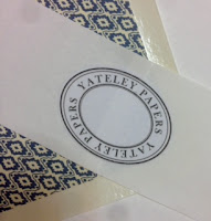
This is their set of five luxurious A6 notecards plus envelopes
The Yateley collections are all from patterns made using hand block printing, a careful balance of traditional techniques and modern technologies. These cards feature a blind embossed border (about 3mm wide). The printing is done using an HP Indigo press.
Click on images to enlarge
Accompanying the cards are these wonderful quality, diamond flap envelopes made using Zeta Hammer, Natural 120gsm (see below pic) which are lined envelopes  ...so the pattern you see printed in the image below is not printed on the inside of the envelopes but on a separate liner (printed on our StarFine) which is stuck inside the envelope. They are gorgeous.
Click on images to enlarge
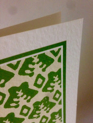
The cards are all printed on our Zeta Hammer, Natural 350gsm, which has a wonderful texture and is totally sympathetic to the block prints.
It is hard to photograph the texture of the cards, but I have done my best....
Click on images to enlarge
Reverse of the cards
http://www.yateleypapers.co.uk/
Posted by Justin Hobson 23.01. 2018

Saturday 20 January 2018

Workshop at The Cass

Just before the Christmas holidays I was asked by Lecturer, Angharad Lewis, to run a workshop at The Sir John Cass School of Art (London Metropolitan University) known affectionately at the Cass.

The title of the workshop was: "Formats and materials for cost effective publications"

 I took the students through the briefest summary of papermaking and different types of materials and lead onto how papers are printed commercially and why it is the size of this machinery which dictates why materials are available in certain sizes and what the limiting factors are in producing publications.
Using interesting examples of commercially produced work, I demonstrated formats and how publications can be produced with an eye to economy. Using plain sheets of paper, I demonstrated how you can make an economical publication but with an interesting format. Using the information I told them about, I asked the group to use a single sheet of paper to explore their own formats and ideas.
It was a really interesting morning and I thoroughly enjoyed it. The students came up with some interesting ideas and formats - it's amazing what you can can achieve with a single sheet of paper.

My workshop was one of a number of workshops held that day. In the afternoon there were talks by a number of practising designers. I stayed to listen to the talk by Kate Moross.
Kate gave a very interesting talk about how to make a living as a designer. It was a really engaging talk and she gave some excellent advice.
http://www.londonmet.ac.uk/schools/the-cass/
https://www.studiomoross.com/
Posted by Justin Hobson 20.01.2018

Monday 15 January 2018

The Disasters of Everyday Life

BlainSouthern is a contemporary art gallery with galleries in London and Berlin. It was started in September 2010 by Harry Blain and Graham Southern, who had sold their previous gallery, Haunch of Venison, to Christie's.

For their first exhibition with Blain|Southern, Jake and Dinos Chapman expand on their career-long preoccupation with Francisco Goya’s series of etchings, The Disasters of War. The Disasters of Everyday Life presents, for the first time, their latest body of sculptural work in a dialogue with three full sets of Goya’s prints, each set substantially reworked in a different way by the Chapman brothers. You can read more about the exhibition here.
This is the invitation to the private view held in October. The front of the invitation is an image from the exhibition photographed by Prudence Cuming.
Click on images to enlarge
The invitation is A5 (148x210mm), Landscape and is printed Offset Litho and hot foil blocked on one side. The invitation side, below, is printed in a cool grey solid and is hot foil blocked in metallic gunmetal foil.
Printing is by Identity, based in Paddock Wood, Kent and they have made a superb job of it - colour reproduction and the muted solid colours look superb - the hot foil blocking is perfectly executed (Identity are one of the few printers to have hot foil blocking facilities 'in-house')
The invitation is printed on our Omnia 320gsm and is duplexed (to 640gsm) making it over 1mm thick. The use of Omnia means that the image has reproduced faithfully, however the invitation still has an uncoated tactile feel. The solid grey on the reverse looks and feels great and of course, foiling looks great on Omnia as it has a high bulk and therefore settles into the sheet well.
https://www.blainsouthern.com/
http://www.identityprint.co.uk/
Posted by Justin Hobson 15.01.2018

Wednesday 10 January 2018

F&F Kids Collection

This is the latest kidswear collection from F&F. This season, the look is stylish trousers and dresses in corduroy, to printed long sleeve tees and shirts, not forgetting the latest on-trend cuts and washes in kids' jeans.

The format is A5 portrait and is saddle stitched with two wires. The cover is on Gmund Bier from that other well known, Hull based, paper company and is beautifully hot foil blocked in a pigmented, matt yellow foil.
The 20pp text (plus 2pp throwout) is printed on our Shiro Echo, Bright White, 120gsm which is 100% Recycled, made by Favini.
Click on images to enlarge
There is a "2pp throwout" at the back of the book, revealing miniature images taken on the same shoot.
The quality of the art direction, photography, repro, print and finishing is superb. The paper also happens to have performed brilliantly - fleshtones and close up detail looking superb, as you can see from the detail image below:
Shiro Echo 120gsm is quite bulky but 28pp sits well without the gap in the middle "gaping" too much.
Art direction and design is by London creative agency Odd. The excellent print, repro and finishing is by Gavin Martin Colournet, based in London E3.

https://www.tesco.com/
http://www.oddlondon.com/
http://www.gavinmartincolournet.co.uk/
Posted by Justin Hobson 10.01.2018


Monday 8 January 2018

The May Fair

The May Fair Hotel was first opened by King George V in 1927 and offers over 400 luxury hotel bedrooms, including 12 suites, a discreet spa, a Mediterranean-inspired restaurant and a Casino. Located in Stratton Street in the heart of Mayfair the hotel also sports the May Fair Bar, breathtaking Crystal Room and opulent Danziger Suite, which between them have played host to some of London's most extravagant 20th Century society events.

This publication shows what the hotel can offer for the Christmas period, from private dining to events and parties. The size of the publication is an elegant tall thin format, which is 313 x 112mm, portrait.
This 12pp 'self cover' is printed on our Omnia 200gsm, which is the perfect weight - it doesn't need a heavier cover weight, it flows and feels good in the hand.
The book is printed Offset litho throughout in CMYK plus a metallic gold pantone 'special' ink. This is one very good reason that Omnia was chosen for this project. On most traditional uncoated papers, metallic inks can look flat and gold can just look a bit brown, but as I hope the images above and below demonstrate, the metallic gold type really does look metallic on Omnia.
The four colour imagery looks superb...
Image reproduction is paramount but it was also important that the publication also projected the tactility of the interiors and in the image below the detail of the table settings and the reproduction of the glassware. An ordinary feeling silk or gloss coated paper wasn't an option, so Omnia fitted the bill perfectly.
Printing is by Stuart Van Den Bergh at Intaglio Communications based in London.

http://www.themayfairhotel.co.uk/
http://www.intaglioltd.co.uk/
Posted by Justin Hobson 08.01.2018