Friday 30 March 2018

Preen Home

Preen By Thornton Bregazzi was founded in 1996 by Justin Thornton and Thea Bregazzi, built on an aesthetic of darkly romantic and effortlessly modern, juxtaposing the masculine with feminine and mixing of hard and soft. Their debut collection at London Fashion Week for Spring Summer 2001 established the brand’s essence of punkish sensibilities with vintage elements and hand crafted details

Preen by Thornton Bregazzi has now expanded to include Preen Home – an opulent offering of soft furnishings
Size of the brochure is 330x240mm, portrait and is singer sewn. The text material chosen was our Omnia, which would beautifully reproduce the photography with the delicate patterns and dark colours superbly - without forgetting the fleshtones ...and it looks wonderful! There is a 4pp cover on Omnia 200gsm and 16pp text on 120gsm.
Click on images to enlarge
Unlike many of the look-books featured on this blog, which are printed offset litho, this has been digitally printed on an HP Indigo press. The colours are strong and punchy and the whole publication has a matt, tactile look and feel - in fact I can honestly say, every bit as good as litho!
Although Omnia was never originally developed for digital, we now keep it as a stock item with "sapphire treatment". This treatment is often applied to more unusual papers and provides a "key" so that the inks (which are different to litho inks) work on the paper surface. The great thing is the job just doesn't look and feel like a digital job. Below is a detail shot showing the excellent fleshtone reproduction.
Click on images to enlarge
Below shows the detail of the red thread used on the singer sewing - just beautiful!
Omnia is a very bulky paper, and the 200gsm cover just works perfectly with the format and the singer sewing
The art direction is by Mark and Chris Thomson and the quality of the direction and photography (by Ash Reynolds) is matched by the exceptional digital print by Screaming Colour.

http://www.preen.eu/
http://www.studiothomson.com/
http://www.screamingcolour.com/
Posted by Justin Hobson 30.03.2018

Tuesday 27 March 2018

New papers and new processes

Kestrel Press are a family owned printing company based in Irvine in Scotland which was founded over 40 years ago. However, unlike many established printers, this is a company that continues to innovate and explore new materials. Their work has appeared on this blog before here.

We have recently introduced two new materials which Kestrel Press have embraced as they realised their potential with the design community. The first product is our BlackGold which is our new range of intense black from Gruppo Cordenons.

Kestrel have produced some A4 folders using BlackGold 290gsm and they are printed using their "seeing is believing" strapline which they are applying to their promotions to demonstrate their innovations in digital printing.
The size of the 4pp folder is 300x215mm, portrait and is printed using clear digital print, which looks like a cross between varnish and clear foil blocking and works brilliantly on the BlackGold.
Click on images to enlarge
The inside of the folder is printed in white, again printed digitally and the result is really crisp and sharp. Both of these processes have been printed on their Ricoh digital press with the special attachments which make white and clear printing possible. Because these are processes which are produced in the normal pass through the press and not an "after" process, it means they are much more cost effective than traditional processes such as foil blocking or UV varnish.
The 4pp folder has a glued flap with a 140mm pocket and slits for a business card. The business cards are also printed on BlackGold but are triplexed with our Colorset Magenta 270gsm as the middle layer. 
Click on images to enlarge
The business cards are also clear printed on the reverse.
The second material used for experimentation is our new SIXTIES paper, which is 60gsm. These sheets are 320x450mm and is also surprisingly printed in white....
The white is printed on the front, but as you can see from the image below, even though it is printed white, you can still see the show through
This new SIXTIES is 60gsm and is a fine quality, similar to our Offenbach Bible in many ways but with one major difference - unlike a genuine bible paper which has a high opacity, this new paper has the same translucency as a tracing paper - but it feels like a normal paper! ...as I hope you can see from the picture below:
...and this further sheet which is printed in black (and a small amount of red) on both sides of sixties making an image out of type.
The results are truly superb and it is great when a printer takes the time and trouble to examine and experiment with new materials that they then show to their customers.

My thanks to Graeme Ferguson at Kestrel for sending me these samples and for taking the time to experiment with their new processes on these new materials.

http://www.kestrelpress.com/
Posted by Justin Hobson 27.03.2018

Friday 23 March 2018

Working at RBB

RBB Economics is a specialist in the field of economics of competition law. Attracting and employing the best post-graduate level employees is essential to their business. This piece of literature is designed to inform and attract potential candidates to the business.
The size is A5, portrait and is saddle stitched with a 20pp text. This brochure cleverly works by neatly dividing itself into two, the introduction and Insights It is made around a 4pp cover with a flap on the inside back cover and the cover is cut 20mm short, the first 8pp of text is cut 10mm short and printed with a green band and the Insights section, which is printed solid grey is the full width of A5

This clever format enables the content to be separated, the more formal text of the introduction with the more informal 'insight' section with images and quotes. Very effective. The below image shows the short pages:
The cover is printed on our StarFine White 350gsm, which is an uncoated text and cover range. The cover is printed two specials (grey and green). Text is printed on our Marazion Ultra 135gsm and is printed in CMYK throughout Marazion Ultra was chosen because of it's matt flatness. Marazion Ultra is a simple but effective choice of materials. This project has a lovely engaging feel, the combination of uncoated and coated materials being just right.
Birdseye view showing the short cover, text and flap on inside back cover ....
The below image shows the card inserted in the flap at the back of the brochure showing the global locations. Also printed on StarFine White 350gsm.
Art direction and design is by Hatton Garden based consultancy, 400. Creative Director is Paul Dennis, designer on the project is Andrew Pitchford. Print and finishing is by Pureprint

www.rbbecon.com
www.400.co.uk
http://www.pureprint.com/
Posted by Justin Hobson 23.03.2018

Tuesday 20 March 2018

Fletcher's Cottage Spa

Fletcher’s Cottage Spa is the luxurious spa set on the Archerfield Estate, which is less than an hour from Edinburgh. The estate features a golf course and several houses which can be booked in their entirety for weddings and celebrations. The spa has been featured in the Sunday Times Travel Top 6 British Spas and the Tatler Spa Guide.

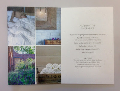
This is the pocket menu, which lists the stunning array of massages and treatments available.
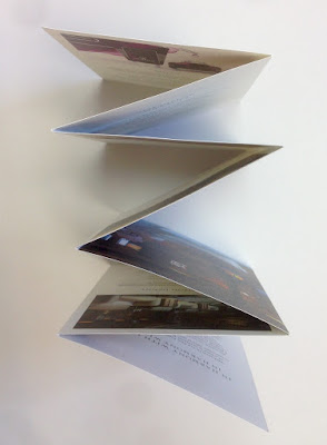
The format is a 14pp, long concertina, held together with a 'belly band'. The finished size is 145mm x 100mm, folding out to 145mm x 980mm.
The birdseye view below shows how it works...
Click on images to enlarge
Above shows the front cover. The clever way this concertina format works, means that you can view it in spreads, as you can see below....
The 14pp concertina is printed on Crush, Corn 200gsm and the bellyband is printed on Crush Coffee 250gsm, which are a perfect combination.
Click on images to enlarge
Below shows the whole publication spread out, so you can see both sides:
Now one of the important things to point out is that this publication is printed digitally ...yes, even though it's 980mm long! It is printed on a Ricoh 5100 by DTP Print in Edinburgh and they have not only made an excellent job of the printing, there are a couple of other details that are worth pointing out too. The belly band is 45mm wide. The icon is beautifully die cut and it registers right over the printed icon ...just perfect!
Also, most bellybands are glued or stuck with a sticker, which makes them impossible to replace! ...however this band has a clever and well fitting die cut semi circle and slit, which works perfectly.
Creative direction and design is by Katherine Scott at Studio Thought Process based in Edinburgh.
 
If you aren't familiar with Crush, it is one of our ranges made by FAVINI in Italy and is made using 15% residues from the industrial processing of agricultural processing. As a result, the paper does have inclusions and a "rustic" feel, which you might just be able to see from the image detail below:
Click on images to enlarge
With thanks to Sonya Beaumont at DTP Print for sending me file copies.

https://www.archerfieldhouse.com/spa/
http://studiothoughtprocess.com/
http://www.dtpprint.co.uk/
Posted by Justin Hobson 20.03.2018

Friday 16 March 2018

Roksanda Accessories

In the decade since it launched at London Fashion Week in 2005, the ROKSANDA fashion house has evolved an unmistakable woman-centered design aesthetic. The brand is favoured by Kate Middleton and Michelle Obama and is described as "Sophisticated and feminine yet playful and effortless, its iconic ready-to-wear and accessories are instantly recognisable...."

This is the promotional literature produced for their accessories/handbag collection. The format is a very simple 8pp broadsheet. Size is 594mm x 420mm folding to 297mm x 210mm.
Above image shows the front, folding out to the spread below...
...and then out into the full broadsheet below:
The paper chosen is our Omnia 120gsm - because it would work with the rich detail that is present in the images but that would give a natural look and tactile feel. It is printed offset litho in four colour process (CMYK) and there is no loss of detail, which is what can often happen printing on an uncoated paper, just superb reproduction. Printed one side only, the reverse is left plain white and unprinted.
Creative direction and design is handled by the in house team at Roksanda. Print is by Avenue Litho who are based in Hackney (London E8) - interestingly, they also have hot foil blocking in house!

http://roksanda.com/
http://www.avenuelitho.com/
Posted by Justin Hobson 16.03.2018

Monday 12 March 2018

Season 03 Zine

This is issue 03 of SEASON  - a cross between a fashion magazine and a football zine. This publication reveals the preferences and rituals of fashion and football fans. Their perspectives on the world’s most popular sport are explored in thoughtful and intimate ways, focusing on why these fans care and what they wear.
Featuring interviews, essays, photography and more from up-and-coming creatives, SEASON aims to kick off a dialogue acknowledging how modern football and fashion play into each other. Issue 03 examines LOVE and how the reader demonstrates their love for football.  
Size is 240x165mm, portrait (very economical format on a B1 press). It uses lightweight materials sympathetic to the feel of a zine. It has a 4pp cover on 130gsm and a 68pp text on 100gsm. Both cover and text is on our Redeem 100% Recycled 100gsm and is printed offset litho. The paper is a neutral white shade gives the publication a 'newspapery' feel which really works with the images and zine design. 
Click on images to enlarge
Many of the spreads which are purely type work particularly well with the paper - the neutral white just works with black type superbly.
At 70pp it is at the limit of saddle stitching - only because it can get a bit "gappy" in the middle. In my opinion this is acceptable, but were the gap or gape to get much larger, it could start to look a bit ugly.
As it is, the zine just flows beautifully. Pages turn easily and is an excellent example where the design, the print and the paper work in synergy. It has a wonderful quality about it - a really interesting, well put together piece of literature.
Season is published by Felicia Pennant. The designer is Natalie Doto. Production and print is by Park Communications

http://www.season-zine.com/
https://www.instagram.com/season_zine/
http://www.parkcom.co.uk/
Posted by Justin Hobson 12.03.2018